Dental Software Comparison Website Template
The Estimate Smart Dental Proposal Landing Page Template is a comparison-table landing page built for dental practice teams who need to turn treatment plan confusion into clear case acceptance. It showcases an interactive proposal builder through a dark fintech dashboard aesthetic, letting visitors toggle between their current workflow and a streamlined alternative before clicking through to a live sandbox demo.
by Rocket studio
Quick summary
This landing page template is purpose-built for dental practice teams selling high-value treatment plans. It uses an animated comparison table, a product screenshot hero, and a click-through call to action flow to show potential patients and practice decision-makers exactly how a polished interactive proposal changes case outcomes. No forms on page. Just clarity, then a click.
Who this template is for
This template speaks directly to the people who feel the financial sting of a patient walking out the door after a quote conversation goes sideways. It is built for teams operating at every scale of the dental industry, from solo offices to large multi-location groups.
- Dental clinics and multi-site dental service organizations whose operations directors need to cut time-per-quote and lift case acceptance across every chair.
- Solo practitioners in general dentistry or cosmetic dentistry who watch high-value implant and restoration cases stall because patients cannot decode a handwritten estimate.
- Office managers in dental practices who spend significant time on the phone re-explaining coverage gaps and insurance plans to frustrated patients.
What problem this template solves
A dental practice loses revenue not because the clinical work is weak, but because the proposal experience is confusing. Patients who cannot understand their out-of-pocket costs after a treatment conversation often delay or abandon care entirely. This is true across general dentistry, cosmetic dentistry, preventive dentistry, and specialized treatments like orthodontic treatment or implant placement. The landing page exists to make that problem visible and then immediately show the solution.
- Patients receive itemized procedures, insurance coverage breakdowns, and payment options on one interactive screen, so they can make informed decisions without a follow-up call.
- Dental practice teams replace scattered quote documents and phone tag with a single polished proposal that supports patient centered care and raises patient satisfaction.
- Practice decision-makers see the value proposition proven through a live, side-by-side comparison before they ever fill in a form.
What you get with this template
This is a single-page landing page structured around a scroll-driven Interactive Explorer experience. Every section earns its place by handing the visitor something to interact with rather than just text to read. The layout is a well designed landing page that guides practice buyers from curiosity to demo click with precision.
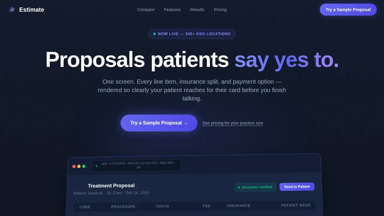
- A hero section with a pixel-perfect product screenshot floating on a deep navy background, showing a real posterior implant treatment plan with extraction, bone graft, and implant crown line items.
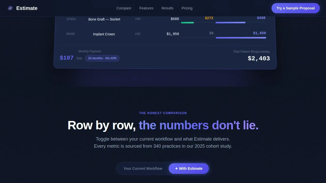
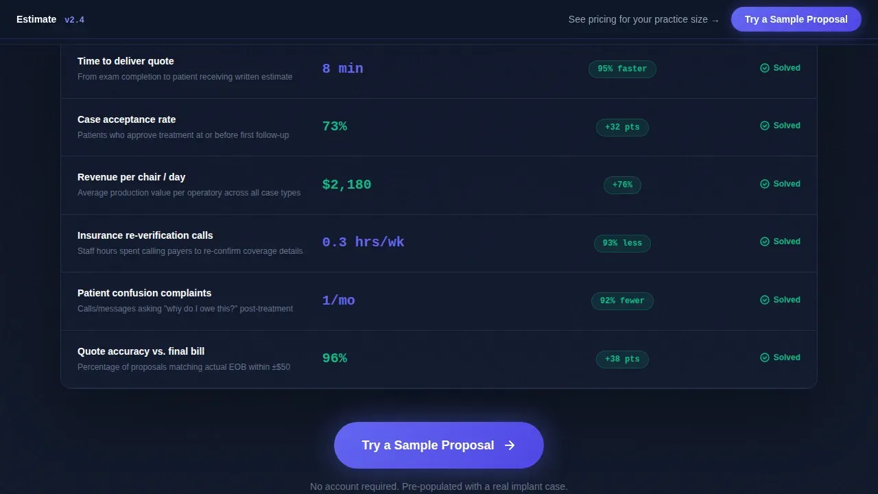
- An animated comparison table letting visitors toggle between their current workflow and the proposal platform, with live cell transitions showing time-per-quote, acceptance rate, and revenue-per-chair changing in real time.
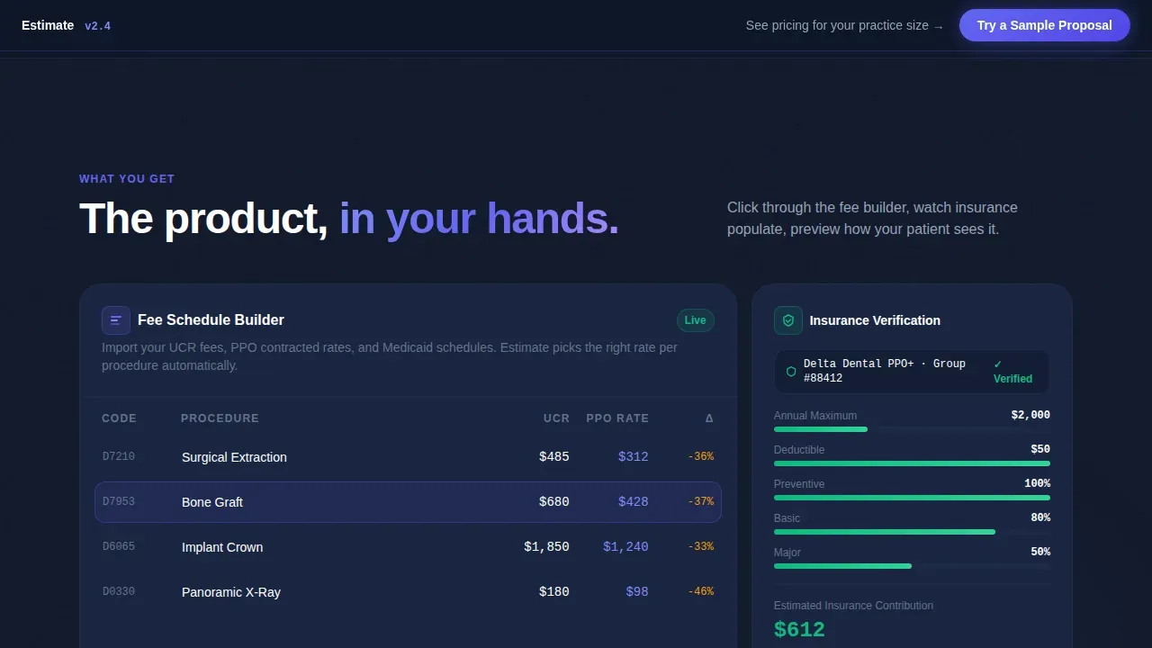
- A feature bento grid with a fee schedule builder, insurance verification simulator, and a patient-facing preview visitors can flip between dark and branded modes, plus counter-animated results metrics and a full-width closing call to action section.
Feature list
This landing page template delivers a tightly scoped set of interactive and visual components, each grounded in the source brief. Every feature below is included in the template as described.
Animated Comparison Table Toggle
The core interactive engine of this landing page. Visitors flip between "Your Current Workflow" and "With Estimate" using a single toggle. Cells animate to show shrinking quote times, rising acceptance rates, and increasing revenue figures. This is the moment the value proposition lands without a single word of persuasion copy doing the heavy lifting.
Product Screenshot Hero with Perspective Tilt
The hero header displays a pixel-perfect product screenshot of the proposal builder mid-use. A real-looking treatment plan for a posterior implant case sits at the center, showing three line items with an insurance coverage column partially filled in green, a patient responsibility column in indigo, and a payment toggle set to 24 months. The screenshot floats on the navy background with a subtle perspective tilt and a soft indigo glow beneath it. High quality images like this create a stronger emotional connection than stock photos ever could.
Sticky Call to Action Bar
After the visitor scrolls past the hero, a slim sticky bar pins to the top of the viewport with the primary call to action: "Try a Sample Proposal." This call to action reappears as a full-width button after the comparison table and again at the page close, creating consistent pressure without being aggressive. Prominent, action-oriented calls to action placed above the fold and repeated throughout the page are a proven conversion pattern for a well designed dental landing page.
Feature Bento Grid with Interactive Simulators
An asymmetric bento grid houses three clickable components: a fee schedule builder, an insurance verification simulator that auto-populates mock data, and a patient-facing proposal preview with a dark and branded mode switcher. Visitors experience the product firsthand. This approach supports a seamless user experience and gives potential patients and practice buyers a deeper understanding of the platform before committing.
Counter-Animated Results Metrics
A dedicated results section uses GSAP counter animations to display specific outcome metrics: acceptance rate lift, time saved per quote, and revenue per chair. These figures animate as the visitor scrolls into view. Social proof in motion is more memorable than a static stat, and these counters anchor the page's credibility alongside any patient testimonials or customer testimonials blocks.
Click-Through Demo Flow with No On-Page Form
There is no form on this landing page. The primary call to action routes visitors directly into a pre-populated sandbox proposal they can edit immediately. A secondary text link routes to a plan breakdown page. This frictionless path converts visitor curiosity into hands-on muscle memory, supporting strong patient engagement with the product before any commitment is asked.
Page sections overview
| Section | Purpose |
|---|---|
| Hero: Product Screenshot | Display proposal builder screenshot with headline, perspective tilt, and indigo glow to anchor dental practice value |
| Sticky Call to Action Bar | Keep the primary demo call to action visible throughout scroll after the first viewport |
| Animated Comparison Table | Let visitors toggle between current workflow and platform benefits with live cell transitions |
| Feature Bento Grid | Showcase fee schedule builder, insurance simulator, and patient preview in clickable asymmetric layout |
| Results and Proof | Animate acceptance rate, quote time, and revenue metrics; display customer testimonials |
| Final Call to Action | Full-width closing section with "Try a Sample Proposal" primary button and secondary pricing link |
| Footer | Linear single-row footer with contact details and navigation essentials |
Design & branding system
The visual identity follows a Dashboard Pro theme built on the Electric Indigo color system. The aesthetic feels like opening a fintech app at midnight: precise, luminous, and deliberate. It sets this dental landing page apart from the soft pastels typical of dental care marketing and signals a product built for serious practice operators.
- Color palette: deep app-shell navy (#0F1729) for the background shell, electric indigo (#6366F1) for interactive states and data highlights, cool slate (#94A3B8) for secondary text and table borders, and crisp white (#FFFFFF) for card surfaces and cell backgrounds.
- Typography system: Plus Jakarta Sans in bold weights for headings, DM Sans for body copy, and JetBrains Mono for all data fields and numeric values, keeping the proposal builder feel consistent with the landing page shell.
- Visual style avoids stock photos and clip-art. The product screenshot is the hero image. High quality images of the actual interface replace generic patient photos, reinforcing brand identity through authentic product representation.
Mobile & speed optimization
This landing page template is built desktop-first, matching the natural workflow of a dental practice proposal builder. However, the template includes responsive mobile treatment so the landing page remains usable and visually appealing across mobile devices. Mobile optimization is essential for any dental landing page, since over 50% of internet traffic comes from mobile devices, and some reports place that figure closer to 90% for dental-category searches.
- Layout reflows cleanly on smaller screens, keeping the comparison table scrollable and the sticky call to action bar functional on mobile devices for easy navigation.
- Interactive components including the payment toggle, dark and branded mode switcher, and the comparison table toggle remain operable via touch input, ensuring accessibility for visitors arriving on phones or tablets.
- Server Components handle static sections to keep the initial load lean, while Client Components power the interactive table and GSAP counter animations, supporting fast initial rendering that keeps users engaged.
How this template helps you convert
A well designed landing page for a dental practice software product needs to do more than look polished. It needs to move a skeptical buyer from "interesting" to "I need to try this." This template earns the click by letting visitors experience the product's clarity before asking for anything.
- The animated comparison table makes the cost of the current workflow visible in real time. Visitors watch time-per-quote shrink and acceptance rates climb as they toggle between columns, turning an abstract value proposition into a concrete, felt difference. A clear call to action immediately follows this moment of realization, so the page converts visitors at peak motivation.
- The frictionless click-through flow removes form friction entirely. Instead of a lead form, the call to action drops visitors into a pre-populated sandbox proposal they can interact with immediately. This approach builds long term relationships with practice buyers by demonstrating value before requesting commitment, and it supports patient experience thinking from the first touchpoint onward.
Other information about this template
This section covers additional context that helps dental practice teams and agency builders evaluate the template against their marketing strategy and business plan before building.
- The landing page template is designed for the US dental market, using English copy and USD formatting throughout the proposal builder mockups and comparison table cells.
- The page can support a marketing strategy focused on raising awareness for dental services across a comprehensive range of treatment areas, including cosmetic procedures, orthodontic treatment, general dentistry services, preventive care, and specialized care for conditions like gum disease.
- The proposed timeline for building and customizing this landing page is short. Using templates for dental proposals can save time and ensure a professional presentation, and this template's scoped section structure makes it straightforward to adapt.
- The template supports a dental practice's online presence by providing a visually appealing, conversion-focused landing page that can make a significant difference in how potential patients and potential clients perceive a practice before ever walking through the door.
- A dental landing page built on this template can improve search engine rankings by offering a focused, single-goal page structure without navigation links that scatter visitor behavior. Regular testing and optimization of the landing page are necessary to ensure it meets conversion goals, and the template's modular sections make iterative changes straightforward.
- Dental clinics looking to raise awareness for their clinic's services offered, from oral health maintenance to cosmetic dentistry landing pages for specific procedures, can adapt this template's section structure to match diverse needs across their patient base.
- The template does not include a contact form on the landing page itself. Contact details and practice-specific information are handled through the footer and the linked pricing page.
- The executive summary of what this template delivers: a dentist landing page experience that turns proposal confusion into case acceptance by letting the product speak for itself through interaction, not persuasion alone.
- Health insurance portability considerations are not embedded in the template legally, but the insurance breakdown mockup within the proposal builder screenshot models how dental practices can communicate insurance plans and coverage gaps clearly to new patients.
- The template's comprehensive approach to visitor behavior, from the hero scroll through the comparison table to the sandbox click, supports a well designed landing page that can track visitor behavior patterns when connected to a compatible analytics layer by the team implementing the template.
- Dental professionals building a new landing page for a proposal tool, a free consultation offer, or any patient centered care initiative will find the section structure adaptable to a comprehensive range of dental services and practice sizes.
- Patient photos are intentionally absent. The design philosophy prioritizes product screenshots over patient photos or stock photos, keeping the landing page's visual hierarchy honest and tool-focused.
Theme
Dashboard Pro
Creative direction
Interactive Explorer
Color system
Electric Indigo
Style
Comparison Table
Direction
Click-Through
Page Sections
Animated Comparison Table Toggle
Product Screenshot Hero with Perspective Tilt
Sticky Call to Action Bar and Repeated Ctas
Feature Bento Grid with Interactive Simulators
Counter-animated Results Metrics and Social Proof
Frictionless Click-through Demo Flow
Related questions
Who is this landing page template designed for?
Does this landing page include a lead capture form?
Can this template support dental services beyond implant cases?
How does the animated comparison table work for potential patients and practice buyers?
Is this template suitable for mobile devices?



