AI for Financial Services Professional Website Template
Parse is a split-screen landing page template built for AI-powered financial document processing platforms. It pairs a live code-snippet header with head-to-head spec comparisons, letting fintech and financial services teams show prospects exactly how their product outperforms legacy optical character recognition pipelines. The design runs on a void-black and holographic-violet palette that feels precise, modern, and built for technical buyers.
by Rocket studio
Quick summary
Parse is a single-page, split-screen landing page template designed for AI document processing products in financial services. It opens with a live code animation, moves through head-to-head spec comparisons, and closes with a clear call to action. The design is sharp, dark, and technical, built to convert fintech CTOs, compliance officers, and operations leads.
Who this template is for
This template is built for founders and teams launching or marketing an AI-powered document processing product in financial services. It speaks directly to technical and operational buyers who need proof before they commit.
- Fintech CTOs tired of maintaining brittle optical character recognition pipelines
- Compliance officers at regional banks whose analysts still copy-paste from PDFs into spreadsheets
- Operations leads at insurance firms watching headcount grow with document volume
What problem this template solves
Financial services teams drown in unstructured documents: loan applications, KYC packets, compliance filings, and earnings reports. Communicating how an AI product solves this faster and more accurately than legacy tools is genuinely hard. A generic SaaS landing page does not do the job.
- Visitors need to see real output, not marketing claims, before they trust a new processing pipeline
- Enterprise buyers need specific metrics to build an internal business case
- The gap between legacy optical character recognition and transformer-based extraction must be visible and undeniable
What you get with this template
You get a fully structured, single-page layout with every section pre-built for a document intelligence product. The template is opinionated and conversion-ready out of the box.
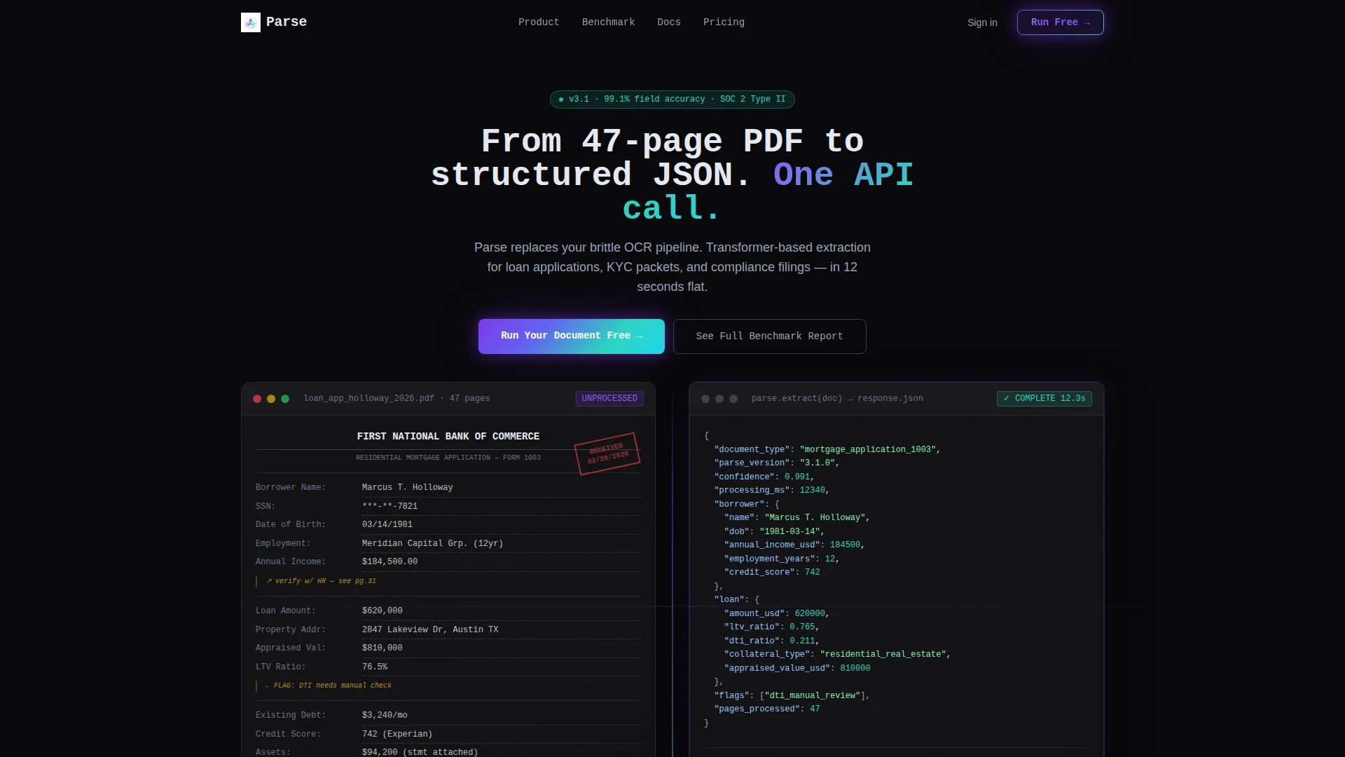
- A split-screen header with a live JSON typing animation showing raw document input versus structured data output
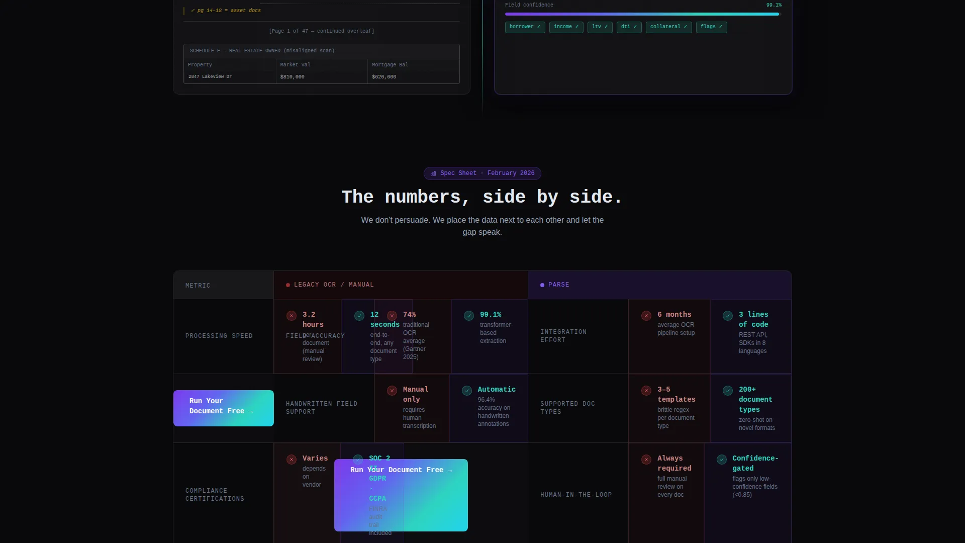
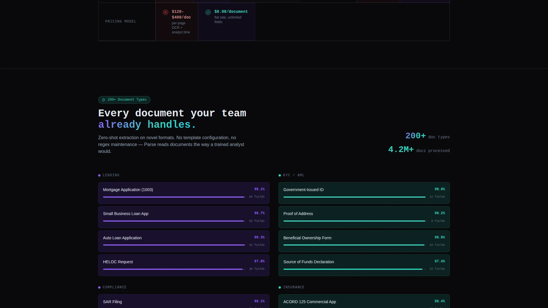
- A scrollable spec-sheet body with head-to-head comparison panels covering accuracy, speed, supported document types, and pricing
- Dual call-to-action paths: a sandbox call to action and an email-gated benchmark report for enterprise buyers
Feature list
This template ships with purpose-built sections and visual components that are grounded in the source brief. Every feature below is reflected in the design direction.
Live Code Snippet Header
The header splits the screen fifty-fifty. The left panel shows a redacted loan application with handwritten margins and misaligned tables. The right panel displays a JSON output block where fields type out character by character, each value highlighted in holographic violet as it populates. A single headline fades in above: "From 47-page PDF to structured JSON. One API call."
Head-to-Head Spec Comparison Panels
Each scroll reveals a new spec row. Left side shows the old way: legacy OCR, manual review, regex pipelines. Right side shows the product: transformer-based extraction, confidence scores, human-in-the-loop fallback. Metrics are specific and placed side by side so the gap speaks for itself.
Repeating Sandbox Call to Action
The primary call to action, "Run Your Document Free," appears at the header and repeats after every third spec row. It links to a live sandbox where visitors drag and drop a PDF and watch extraction happen in real time. The repetition is deliberate and tied to scroll depth.
Email-Gated Benchmark Report
A secondary conversion path offers "See Full Benchmark Report" behind an email gate. This path is designed for enterprise buyers who need internal ammunition before a procurement decision. It captures high-intent leads without interrupting the primary flow.
AI Iridescent Color System
Void black forms the background. Holographic violet drives primary actions and data highlights. Shimmer teal marks secondary accents and success states. Pale silver handles body text and table borders. Iridescent gradients appear only on interactive surfaces, progress bars, and code block edges so every highlight feels earned.
Startup Velocity Visual Theme
The Startup Velocity theme keeps the page electric but controlled. No stock photography, no illustrations. Just code, numbers, and structured output placed next to unstructured input. The aesthetic is the product demonstration.
Page sections overview
| Section | Purpose |
|---|---|
| Split-screen header | Show raw document input versus live JSON output side by side |
| Headline fade-in | Deliver the core value proposition in one line |
| Spec row: accuracy | Compare field accuracy between legacy OCR and AI extraction |
| Spec row: speed | Place processing time numbers side by side |
| call to action block one | Prompt sandbox trial after the first two spec rows |
| Spec row: documents | List supported document types versus legacy limitations |
| Spec row: compliance | Show compliance certifications and review workflow |
| call to action block two | Repeat sandbox trial prompt at mid-scroll |
| Spec row: pricing | Compare pricing model transparency |
| Benchmark report gate | Capture enterprise leads with an email-gated report |
| Final call to action block | Close the page with the primary sandbox action |
Design & branding system
The color palette is built around contrast and restraint. Iridescent accents appear only where they earn attention, keeping the dark background dominant and the data readable.
- Void black (#09090B) as the primary background, holographic violet (#7C3AED) for primary actions and highlights, shimmer teal (#2DD4BF) for success states, and pale silver (#E2E8F0) for body text and borders
- Iridescent gradients restricted to interactive surfaces, progress bars, and code block edges to prevent visual noise
- No photography or illustration; the visual language is entirely code, structured data, and typographic contrast
Mobile & speed optimization
The split-screen layout is designed with responsive behavior in mind. On smaller screens, the fifty-fifty panels stack vertically so the code animation and document preview remain legible without horizontal scrolling.
- The JSON typing animation is contained in a code block that scales cleanly across breakpoints
- Spec comparison rows reflow to a single-column stacked layout on mobile so metric pairs remain readable
- Call-to-action buttons remain full-width and accessible at every scroll depth on all screen sizes
How this template helps you convert
The page earns the click before asking for anything. By the time a visitor reaches the email gate, they have already seen real output from the product.
- The live code-snippet header creates an immediate "aha" moment: visitors see their exact problem on the left and the solved output on the right before reading a single word of marketing copy.
- The spec-sheet format removes persuasion pressure by letting specific numbers do the work, "12 seconds versus 3.2 hours per document" and "99.1% field accuracy versus 74% with traditional OCR" are placed side by side with no editorializing.
- The dual-path conversion funnel captures both self-serve buyers through the sandbox call to action and enterprise buyers through the benchmark report gate, maximizing lead coverage across decision-maker types.
Other information about this template
This template is built on the Startup Velocity theme and uses the AI Iridescent color system. Both are designed for technical product launches where credibility and precision matter more than warmth or lifestyle imagery.
- The template style is Split Screen (50/50), and the header concept is Code Snippet, making it a strong fit for developer-facing or API-first product pages
- The creative direction follows a Spec Sheet format, which suits products where measurable outcomes are the primary sales argument
- The landing page direction is Comparison/Versus, meaning the layout is purpose-built to position a new product against an established but inferior incumbent
- The category is Technology, subcategory AI for Financial Services, and the niche is Financial Services AI Document Processing
Theme
Startup Velocity
Creative direction
Spec Sheet
Color system
AI Iridescent
Style
Split Screen (50/50)
Direction
Comparison/Versus
Page Sections
Split-screen Code Snippet Header
Scrollable Spec Comparison Rows
Repeating Sandbox Call to Action
Enterprise Email-gate Section
AI Iridescent Color System
Related questions
Who is this landing page template designed for?
Can I customize the spec rows and comparison metrics?
Does the template include the live JSON typing animation?
How does the email gate for the benchmark report work?
Is this template suitable for document types beyond loan applications?



