No-Code Enterprise Software Professional Website Template
Fabric is a no-code ERP landing page template built for operations-focused businesses ready to ditch the spreadsheet stack. It combines a hub-and-spoke anchor navigation, a live comparison matrix, and a visual-canvas hero to show exactly how teams can connect inventory, HR, finance, and procurement in one place, without writing a single line of code.
by Rocket studio
Quick summary
Fabric is a single-page no-code ERP landing page template with hub-and-spoke anchor navigation. It walks visitors through six ERP pillars, a side-by-side comparison matrix, and a conversion-focused call to action flow. The design uses a glassmorphic palette that feels like a rain-lit glass office at night: dark, structured, and quietly powerful.
Who this template is for
This template is built for founders and operators who need to present a no-code ERP platform to a business audience that is done with workarounds. It speaks directly to the people making the buying decision, not the developers.
- COOs at manufacturers with 50 to 500 employees who have outgrown spreadsheets
- Finance directors at logistics firms stitching together disconnected billing and warehouse tools
- Agency founders managing multiple operational workflows across too many browser tabs
What problem this template solves
Most ERP product pages either overwhelm visitors with feature lists or undersell the actual capability. Neither approach wins the skeptical buyer. This template solves that by letting visitors compare on their own terms, pillar by pillar, before the pitch lands.
- Visitors arrive skeptical and leave having already scored your platform against their current stack
- The anchor nav removes friction by letting users jump straight to the ERP module they doubt most
- The call to action generates a personalized migration map, so the ask feels like a service, not a sales push
What you get with this template
You get a fully structured, single-page landing page layout designed specifically for no-code ERP positioning. Every section is purposeful and conversion-ready, from the animated hero to the sticky comparison bar at the bottom.
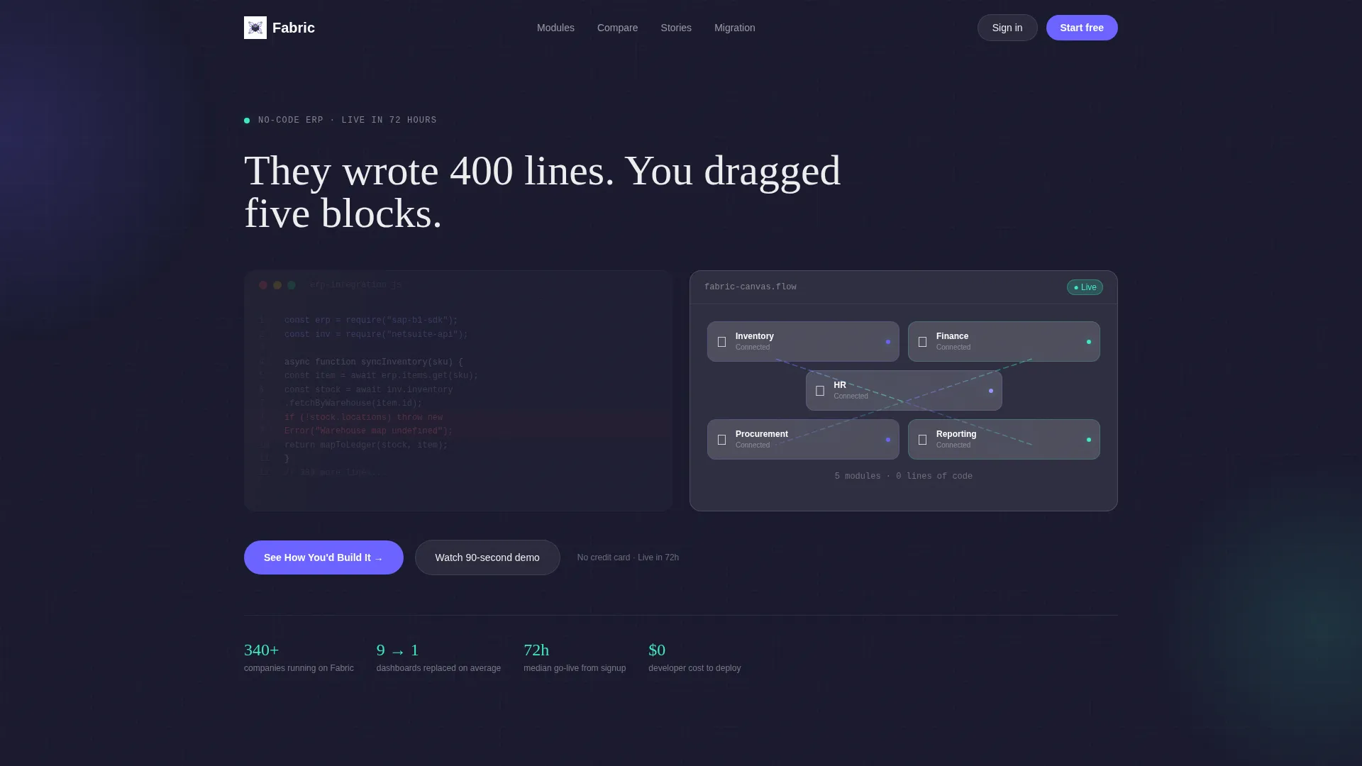
- A split-screen code-versus-canvas hero section with a self-typing headline and animated module flow
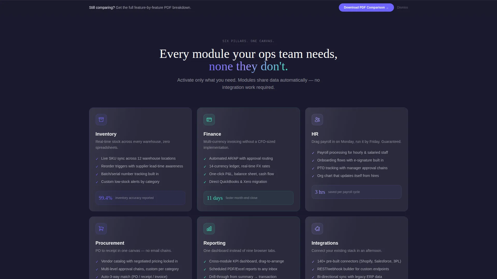
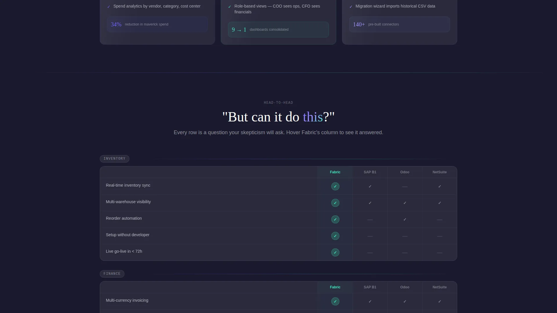
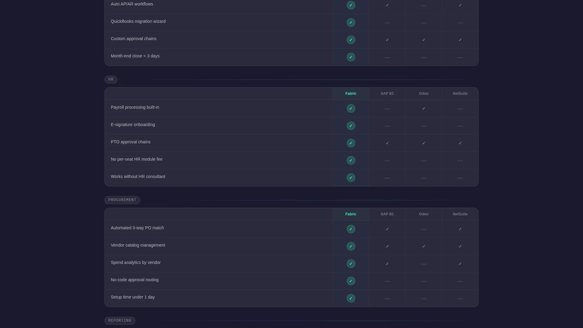
- A sticky anchor navigation bar linking to six ERP pillar sections, each with its own frosted comparison table
- An interactive module picker call to action and a secondary sticky bar with a gated PDF download prompt
Feature list
This template is built around a specific set of purposeful design and layout capabilities. Each feature serves a clear role in the visitor journey.
Split-Screen Code Versus Canvas Hero
The header opens with two panels side by side. The left shows twelve lines of ERP integration code with a red error underline and a blinking cursor. The right shows the same workflow built visually in Fabric's canvas. As the headline types itself, the code side dims and the visual side brightens.
Hub-and-Spoke Anchor Navigation
A sticky top navigation bar lists six ERP pillars: Inventory, Finance, HR, Procurement, Reporting, and Integrations. Each link scrolls directly to its dedicated section. Visitors can move through the page in any order, going straight to the module that matters most to them.
Frosted Comparison Matrix
Each pillar section includes a frosted-glass comparison table. Fabric sits in the leftmost column, and each row covers a specific capability. Fabric's cells glow mint on hover, making wins visible at a glance without any hard sell.
Interactive Module Picker call to action
The primary call to action opens a module picker where visitors select their current tools from a dropdown and check the workflows they need automated. The template then generates a personalized migration map, turning the call to action into a tailored deliverable.
Gated PDF Sticky Bar
A secondary sticky bar sits at the bottom of the page with the prompt "Still comparing?" Visitors can enter a single work email to download a full feature-by-feature PDF breakdown. The gate is minimal and the offer is specific.
Glassmorphic Visual System
The entire template uses a glassmorphic color system built on deep workspace charcoal, frosted panel white at 12 percent opacity, electric iris for active states, and soft mint for success indicators. Animated gradient lines connect module cards to show live data flow across the visual canvas.
Page sections overview
| Section | Purpose |
|---|---|
| Split Hero Header | Contrast code complexity against visual simplicity |
| Sticky Anchor Nav | Let visitors jump to any ERP pillar directly |
| Inventory Pillar | Compare real-time inventory sync capabilities |
| Finance Pillar | Show multi-currency invoicing and billing features |
| HR Pillar | Cover payroll, approvals, and workforce modules |
| Procurement Pillar | Detail supplier and purchase order workflows |
| Reporting Pillar | Highlight custom dashboards and data output |
| Integrations Pillar | Surface supported tool connections and data bridges |
| Module Picker call to action | Deliver a personalized migration map per visitor |
| Sticky Download Bar | Capture emails with a gated PDF comparison offer |
Design & branding system
The visual identity follows a Directory and Discovery theme rendered in a glassmorphic style. The palette is intentionally dark and structured, built to feel like a well-organized workspace rather than a flashy product demo.
- Deep workspace charcoal (#1A1A2E) as the primary background, electric iris (#6C63FF) for active states and module highlights
- Frosted panel white at 12 percent opacity (#FFFFFF1F) for floating card surfaces, soft mint (#3EEBBE) for hover wins and success states
- Monospaced terminal typography on the left hero panel, with animated gradient connection lines across the visual canvas on the right
Mobile & speed optimization
The layout is structured to remain navigable and readable across screen sizes. The anchor navigation and comparison tables are designed to work within compact viewports without losing usability.
- Sticky anchor nav collapses cleanly for smaller screens so pillar access stays one tap away
- Frosted panel cards and comparison tables are built to stack vertically on mobile without breaking the visual hierarchy
How this template helps you convert
This template earns the conversion before the call to action appears. Visitors spend time inside the comparison matrix, scoring your platform against their current tools, so by the time they reach the call to action, the decision is mostly made.
- The comparison matrix lets visitors validate Fabric pillar by pillar, so trust builds through browsing, not through claims
- The interactive module picker turns the primary call to action into a personalized output, lowering resistance and raising perceived value
- The gated PDF sticky bar captures undecided visitors at the moment they are still weighing options, with a low-friction single-field form
Other information about this template
This template is part of a broader no-code enterprise software category and is designed to position a platform confidently against established alternatives in the ERP market.
- The comparison matrix is structured to sit alongside well-known ERP platforms, making it suitable for versus-style landing pages targeting buyers who are actively evaluating options
- The module picker dropdown includes logo-level tool references such as QuickBooks, SAP, Zoho, and similar platforms, giving the call to action recognizable context for mid-market buyers
- The template style is Hub and Spoke with Anchor Nav, the creative direction is Feature Matrix, and the header concept is Code Snippet, all drawn from the matched intersection context for this no-code ERP niche
Theme
Directory & Discovery
Creative direction
Feature Matrix
Color system
Glassmorphic
Style
Hub & Spoke (Anchor Nav)
Direction
Comparison/Versus
Page Sections
Split-screen Code Versus. Canvas Hero
Hub-and-spoke Anchor Navigation
Frosted Glassmorphic Comparison Matrix
Interactive Module Picker Call to Action
Gated PDF Download Bar
Related questions
Who is this landing page template designed for?
Can I customize the six ERP pillar sections for my platform?
How does the interactive module picker work in this template?
Do I need coding skills to edit this template?
What makes the comparison matrix different from a standard feature table?



