Brutalist Dental Lab CRM Landing Page Template
Fabricate is a Bold Brutalist landing page template built for dental lab CRM platforms. It uses a full-viewport terminal header, a modular card grid, and a Stats-First layout to turn raw operational data into an immediate, trust-building experience. The Void and Violet palette and oversized monospaced typography make every metric impossible to ignore.
by Rocket studio
Quick summary
Fabricate is a single-page, click-through landing page template designed for dental lab management software. It opens with a live-API terminal header, moves through a modular card grid where every card leads with an oversized metric, and ends with a fixed mobile call-to-action bar. The design is Bold Brutalist, data-first, and built to push visitors into a demo.
Who this template is for
This template is purpose-built for vertical software products that serve operational, data-heavy industries. It is especially suited to teams building or marketing a dental lab CRM platform where the product's intelligence is the most convincing selling point.
- Lab owners running teams of fifteen to eighty people who bill multiple doctors and track turnaround metrics
- Software founders and marketers launching a dental lab management tool who need a landing page that proves value before asking for a sign-up
- Agencies building SaaS landing pages in clinical or industrial verticals where raw data presentation outperforms lifestyle imagery
What problem this template solves
Dental lab operations are often managed on whiteboards and spreadsheets. Cases fall through the gap between technician and front desk. A generic SaaS landing page cannot communicate that kind of specific operational pain. Fabricate solves the presentation problem by leading with the numbers lab owners already track obsessively.
- Visitors land on a page that mirrors their own daily dashboard, which instantly signals product relevance
- The stats-first card structure replaces vague feature descriptions with proof points that speak directly to remake rates, turnaround hours, and missed billing recovery
- The fixed mobile call-to-action bar and repeated demo links reduce friction at every scroll depth, so qualified visitors never have to hunt for the next step
What you get with this template
You get a fully structured, single-page landing page with every section mapped to a specific conversion role. The layout is modular, so individual cards can be swapped or reordered without breaking the grid system.
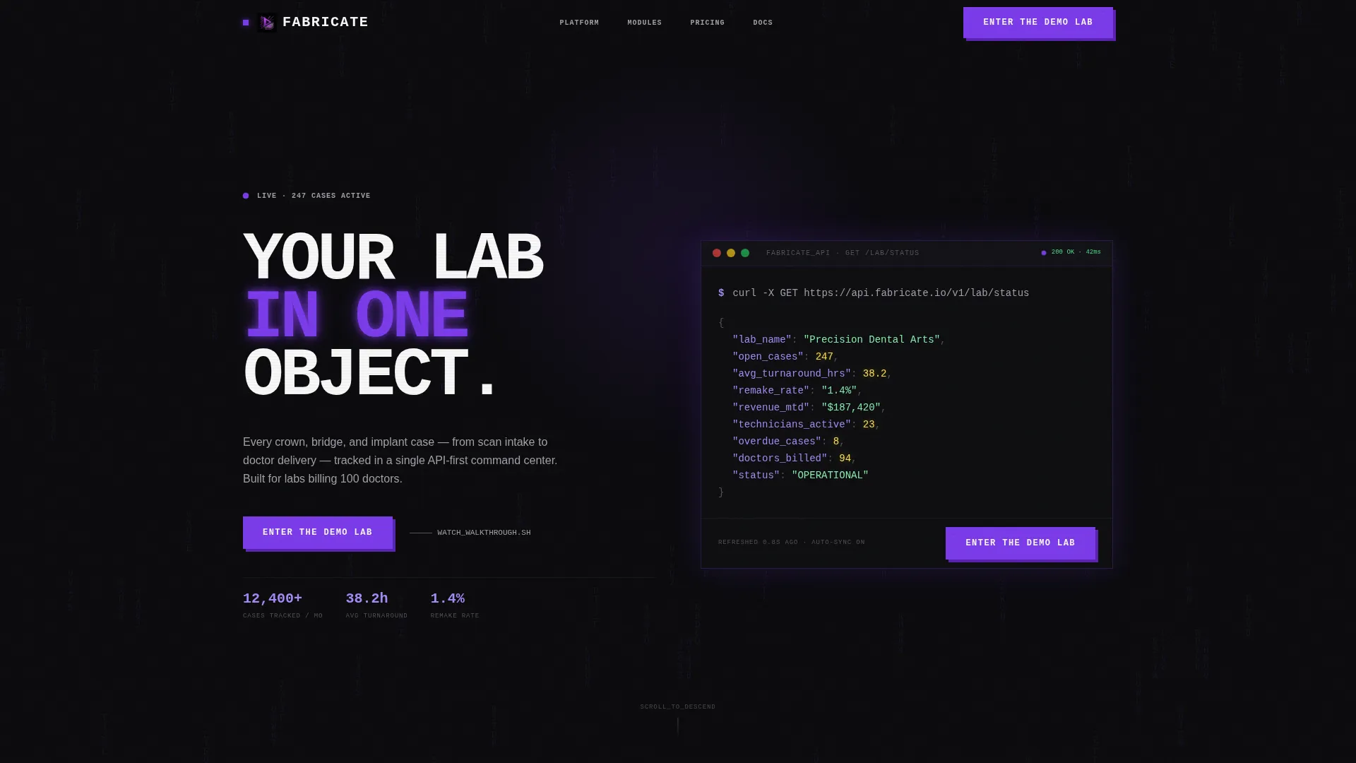
- A full-viewport terminal header block with a JSON code snippet displaying live lab metrics and a primary violet call-to-action button
- A modular card grid where each capability card opens with an oversized stat and closes with a secondary demo link
- A fixed bottom call-to-action bar for mobile visitors, ensuring the demo entry point is always visible
Feature list
This section describes the core layout and design capabilities delivered inside the Fabricate template.
Full-Viewport Terminal Header
The header fills the entire screen with a dark terminal interface. It renders a JSON response object in monospaced font, showing fields for open cases, average turnaround hours, remake rate, and monthly revenue. The headline stamps across the top-left in oversized condensed type. A violet call-to-action button with no rounded corners sits inside the block.
Stats-First Modular Card Grid
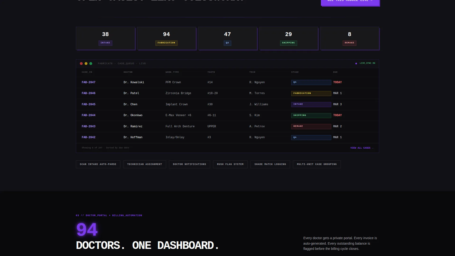
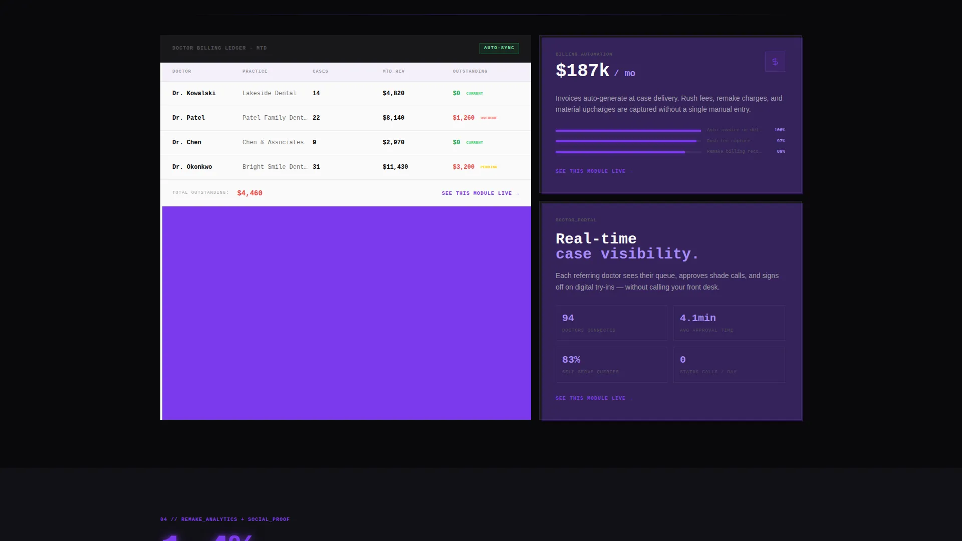
Every card in the grid leads with a single metric rendered at a minimum of 72 pixels. The first row delivers three immediate gut-punch numbers: cases tracked, average turnaround reduction, and revenue recovered from missed billings. Each subsequent card expands a specific capability such as case tracking, doctor portal, billing automation, or remake analytics.
Secondary Demo Entry Links
Beneath each feature card, a text link reads "See this module live" and routes visitors to the demo environment with a defined entry point. This pattern repeats across every card row, keeping the conversion path visible without interrupting the content flow.
Fixed Mobile Call-to-Action Bar
On mobile viewports, a persistent bottom bar keeps the primary call-to-action anchored at the screen edge throughout the entire scroll. Visitors never lose access to the demo entry point regardless of how far down the page they read.
Void and Violet Branding System
The color system uses absolute void black as the page background, electric violet for all interaction states and glowing metrics, muted titanium for receding secondary elements, and clinical white reserved for card surfaces and body type. The palette creates a single-source-of-light visual effect that directs attention precisely.
Brutalist Typography Scale
Stats render at a minimum of 72 pixels. Explanatory copy renders at 14 pixels. This extreme size contrast enforces visual hierarchy without relying on color alone. All data and headers use a monospaced or condensed typeface, reinforcing the terminal and lab-instrument aesthetic throughout.
Page sections overview
| Section | Purpose |
|---|---|
| Terminal Header Block | Displays live JSON lab metrics and primary call-to-action |
| First Stats Row | Hits with three immediate oversized numbers to anchor credibility |
| Case Tracking Card | Expands crown, bridge, and implant tracking capability with a lead metric |
| Doctor Portal Card | Shows the doctor-facing delivery and communication module via a stat |
| Billing Automation Card | Leads with revenue recovered to frame the billing feature |
| Remake Analytics Card | Opens with remake rate data before describing the analytics capability |
| Fixed Mobile Bar | Keeps the demo call-to-action pinned during mobile scroll |
Design & branding system
The visual identity is Bold Brutalist with a Void and Violet color system. There are no rounded corners, no drop shadows, and no decorative imagery anywhere on the page. Cards sit directly on the void background as stark white rectangles, and all interaction states pulse in electric violet.
- Colors: absolute void black (#09090B) for the background, electric violet (#7C3AED) for highlights and buttons, muted titanium (#A1A1AA) for secondary elements, and clinical white (#FAFAFA) for card surfaces and readable type
- Typography: monospaced and condensed typefaces throughout, with stats at a minimum of 72 pixels and explanatory text at 14 pixels to create aggressive, unavoidable hierarchy
- No hero imagery, no stock photography, and no decorative borders; the product data is the visual centerpiece
Mobile & speed optimization
The template is structured for a clean mobile experience without sacrificing the brutalist aesthetic. The card grid reflows into a single-column layout on smaller screens, and the fixed bottom bar ensures the primary call-to-action is never off-screen.
- The fixed mobile call-to-action bar pins the "Enter the Demo Lab" button to the bottom edge of the viewport throughout the entire scroll session
- Card content reflows vertically so oversized stats remain dominant and readable on narrow screens without horizontal overflow
- The terminal header adapts its JSON display to fit smaller viewports while preserving the monospaced font and violet glow effect
How this template helps you convert
The page is structured as a click-through landing page with a single conversion goal: getting visitors into the live interactive demo environment. Every design and layout decision works toward that one action.
- The terminal header confronts visitors with real operational metrics before any feature claim is made, establishing credibility in the first scroll position and making the "Enter the Demo Lab" button feel like the logical next step rather than a commitment
- The stats-first card grid delivers approximately twelve data points across the full scroll depth, each one describing a pain point the target visitor already experiences daily, so that clicking the demo link feels like confirming a conclusion they reached on their own
- The fixed mobile call-to-action bar and repeated secondary demo links eliminate dead zones in the conversion path, ensuring a qualified visitor can act at any point in the page without scrolling back to the top
Other information about this template
Fabricate is categorized under Technology and sits within the Dental Lab Vertical SaaS subcategory. It is a specialized template built for a focused niche rather than a general-purpose SaaS page.
- The template style is a Card Grid layout with modular sections, meaning individual feature cards can be updated or reordered to match a product's specific feature set
- The header concept is a Code Snippet block, a design choice that communicates technical depth and product intelligence without requiring any actual backend integration in the static template
- The creative direction is Stats-First Impact, a pattern borrowed from financial and operational dashboards that prioritizes proof over promise throughout the scroll experience
- The landing page direction is Click-Through, meaning every element is optimized toward one goal: moving the visitor into the demo environment

Theme
Bold Brutalist
Creative direction
Stats-First Impact
Color system
Void & Violet
Style
Card Grid (Modular)
Direction
Click-Through
Page Sections
Full-viewport Terminal Header
Stats-first Modular Card Grid
Brutalist Typography Scale
Fixed Mobile Call-to-action Bar
Void and Violet Color System
Secondary Demo Entry Links
Related questions
Can I adapt the card grid to show different features than the ones in the template?
Do I need real data to use the terminal header?
Is this template suitable for a product outside the dental lab industry?
What is the primary call-to-action this template is built around?
How does the fixed mobile bar work with the rest of the page?



