Specialist IT Services & Consulting Comparison Website Template
Failover is a single-page disaster recovery landing page template built for rapid-response infrastructure services. It leads with a live metrics header, a head-to-head comparison table, and incident timeline case studies. The design uses a dark Acid Digital palette to signal urgency and precision, driving visitors toward an app download and a 14-day unrestricted trial.
by Rocket studio
Quick summary
Failover is a high-intensity landing page template for a managed disaster recovery service. It opens with a full-viewport animated stats wall, then walks visitors through a side-by-side stack comparison, real incident timelines, and a dual conversion path, app download plus a risk-score calculator. Every section leads with a number before an explanation.
Who this template is for
This template is built for teams who cannot afford downtime and need to prove it to stakeholders before the next incident. It speaks directly to technically literate buyers who respond to evidence, not marketing copy.
- CTOs at mid-stage startups who have recently closed a Series B round and recognize that a four-hour outage could erase monthly recurring revenue
- DevOps leads at SaaS companies running on thin redundancy who need a credible recovery plan they can present internally
- Compliance officers at fintech companies who require audit-ready recovery logs and want a clear service comparison before committing
What problem this template solves
Most disaster recovery service pages bury their strongest proof points in text-heavy paragraphs. Buyers who are already under pressure do not have time to read their way to confidence.
- Decision-makers need hard numbers upfront, recovery time objective (RTO), recovery point objective (RPO), and cost-per-incident, not a wall of assurances
- Comparison-shopping is the real buying behavior; buyers arrive with an existing stack and need a direct column-by-column contrast before they act
- Trust gaps form quickly when a recovery service cannot demonstrate real outcomes; incident timelines and live counters close that gap before the visitor scrolls past the fold
What you get with this template
You get a fully structured, single-page layout that puts data at the center of every scroll depth. The template is built to convert skeptical, high-stakes buyers through credibility signals and a frictionless download path.
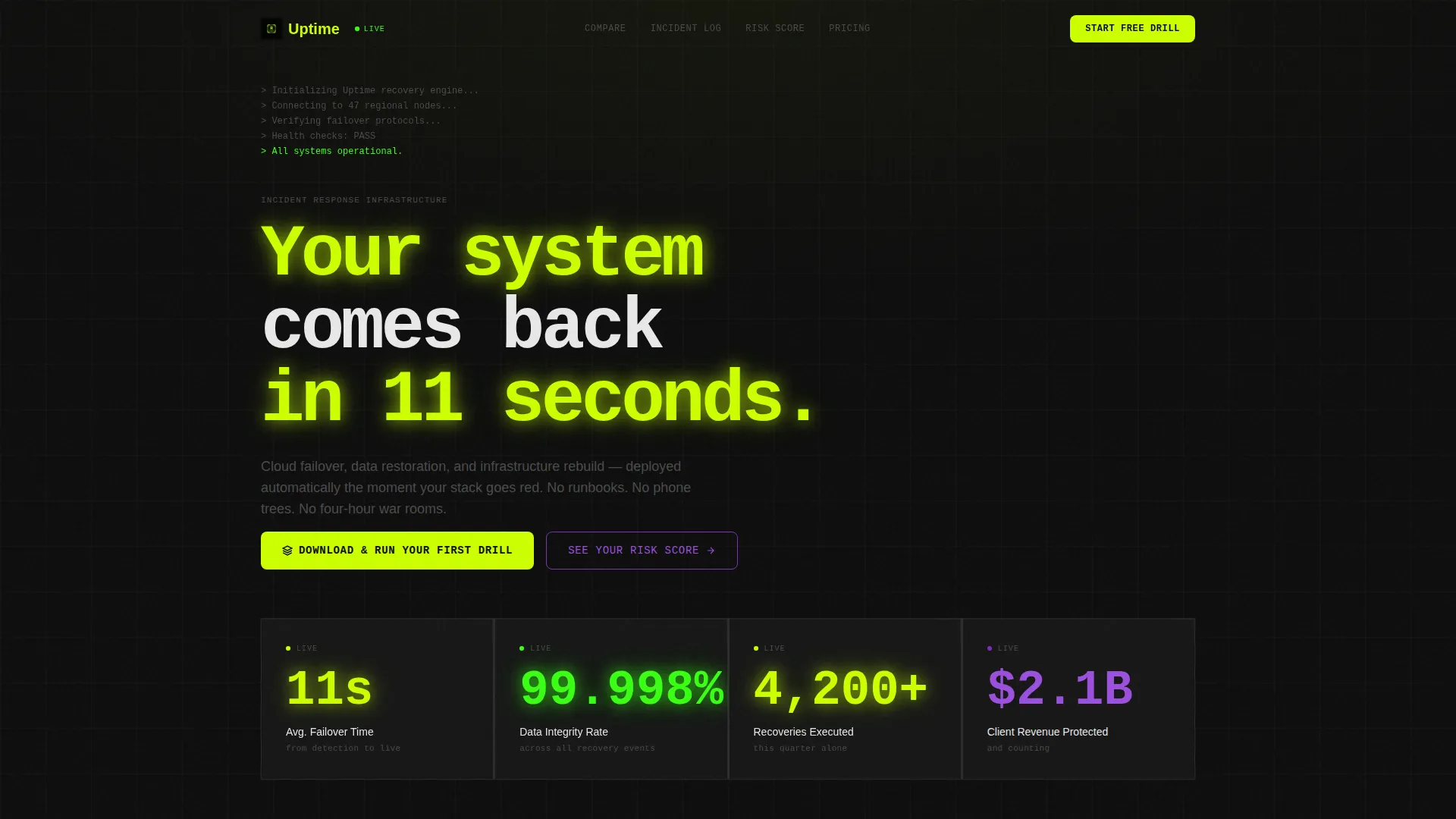
- A full-viewport animated stats header with live counters for failover time, data integrity rate, recoveries executed, and revenue protected
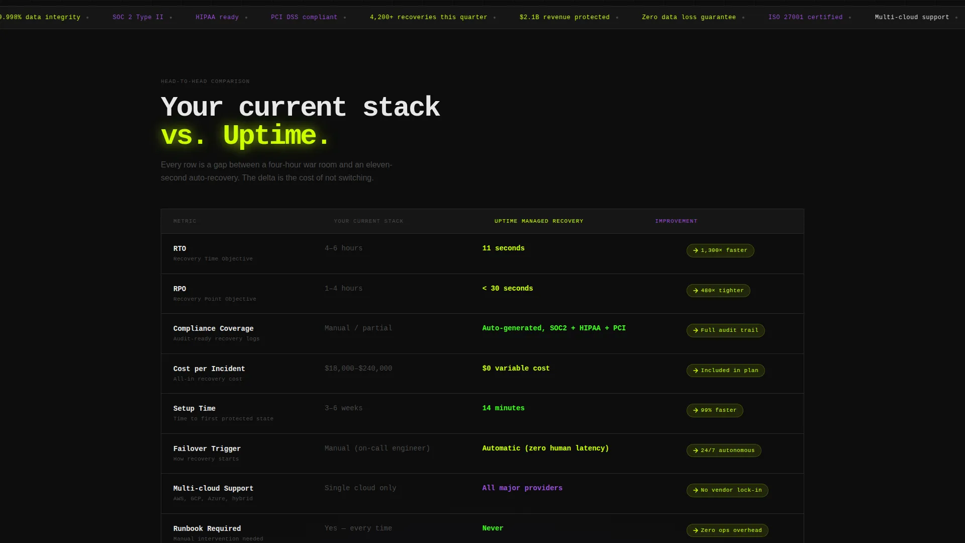
- A structured comparison table contrasting your current stack against managed recovery across RTO, RPO, compliance coverage, cost-per-incident, and setup time
- Incident timeline case studies, a dual-call to action conversion flow with platform selector and email gate, and a sticky mobile bottom bar
Feature list
This template packages every conversion-critical component a disaster recovery service landing page needs, in the exact order that moves a high-stakes buyer from skepticism to action.
Animated Live Stats Header
The header fills the full viewport with animated counters: 11-second average failover time, 99.998% data integrity rate, 4,200-plus recoveries this quarter, and 2.1 billion dollars in client revenue protected. Each number renders in sequence like a boot log, accompanied by a micro-pulse animation. The effect signals operational proof before the visitor reads a single line of body copy.
Side-by-Side Comparison Table
The core of the page is a structured table comparing your existing stack against the managed recovery service. Columns cover RTO, RPO, compliance coverage, cost-per-incident, and setup time. Each row animates its performance delta in electric chartreuse as it enters the viewport, making the advantage impossible to miss.
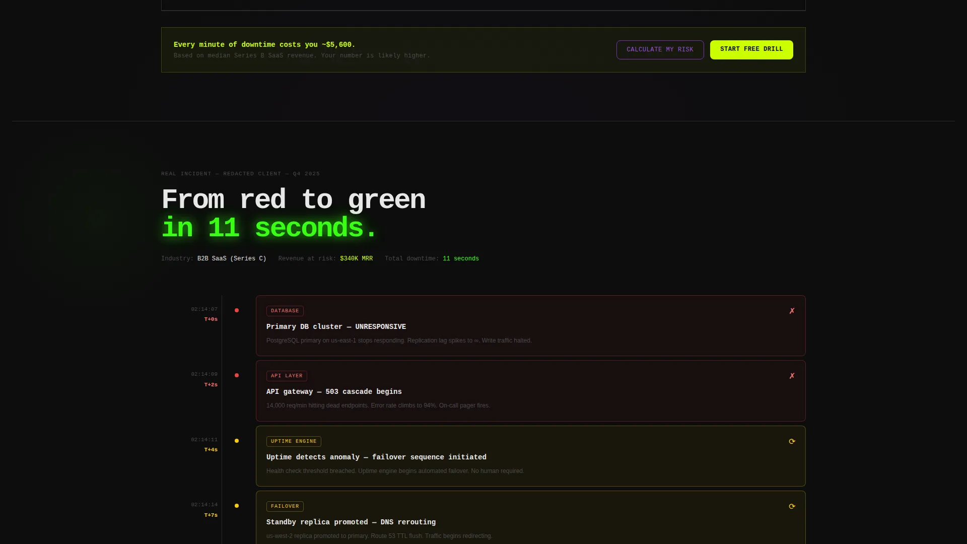
Incident Timeline Case Studies
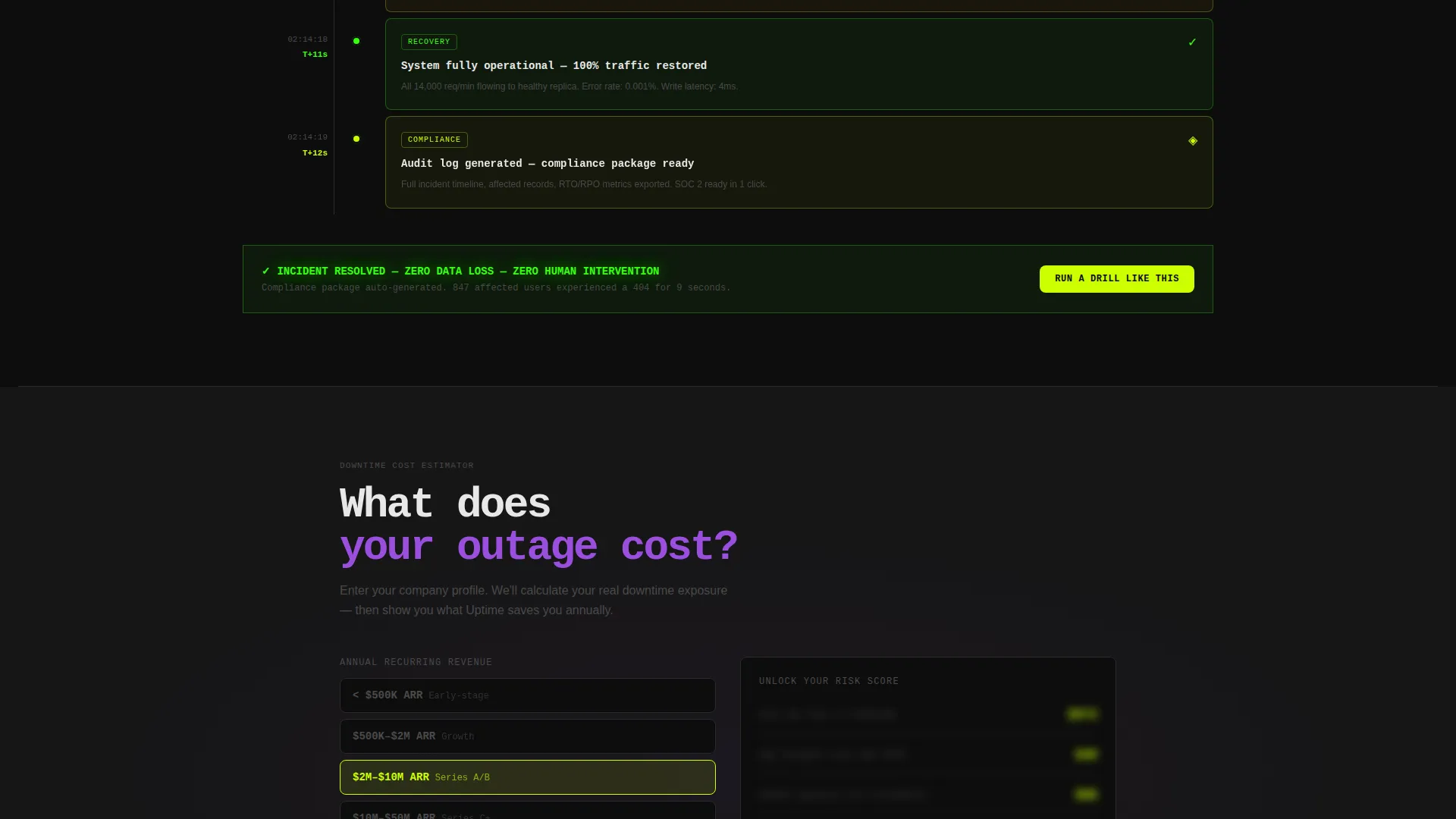
Case studies appear as minute-by-minute incident timelines rather than testimonial quotes. Each timeline shows detection, failover trigger, and restoration confirmation as a sequential log. This format gives compliance officers and DevOps leads exactly the evidence format they trust.
Dual Conversion Path
The primary call to action reads "Download and Run Your First Drill" and is positioned directly after the comparison table. A secondary path offers a risk-score calculator that estimates downtime cost based on company size and stack. Both paths gate on a single work-email field, converting curiosity into a qualified lead.
Sticky Mobile Bottom Bar
On mobile, the primary download call to action persists as a sticky bottom bar throughout the scroll. Tapping it opens a platform selector for iOS, Android, or desktop agent. This keeps the conversion path accessible without interrupting the reading flow.
Platform Selector and Trial Gate
After the visitor taps the primary call to action, a lightweight platform selector appears for iOS, Android, and desktop agent. A single work-email field then unlocks a 14-day unrestricted trial. The flow is intentionally minimal to reduce drop-off at the final conversion step.
Page sections overview
| Section | Purpose |
|---|---|
| Animated Stats Header | Opens with live performance counters to establish credibility immediately |
| Comparison Table | Contrasts current stack against managed recovery across five key metrics |
| Incident Timeline Cases | Shows real outage scenarios minute by minute to build operational trust |
| Download call to action Block | Drives primary app download with platform selector and email gate |
| Risk Score Calculator | Converts passive visitors into qualified leads through an interactive cost estimator |
| Sticky Mobile Bar | Keeps the download call to action persistent throughout the mobile scroll |
Design & branding system
The visual identity follows a Startup Velocity theme expressed through an Acid Digital color system. Every color choice carries a specific signal role, nothing is decorative. The overall effect feels like a dark-mode incident dashboard running at 2 AM, where every bright element screams signal against noise.
- Void black (#0D0D0D) as the primary background, electric chartreuse (#CCFF00) for live data points and primary calls to action, and terminal phosphor green (#39FF14) for success states and confirmation pulses
- Synthetic violet (#7B2FBE) reserved for secondary accents and hover states, reinforcing interactive depth without competing with the primary signal colors
- No hero imagery or stock photography; all visual weight comes from data, animated counters, and typographic hierarchy, consistent with the Stats-First creative direction
Mobile & speed optimization
The template is structured with mobile conversion as a first-class concern. The sticky bottom bar and minimal email gate ensure the download path is never more than one tap away, regardless of scroll depth.
- The sticky bottom bar pins the primary call to action at the bottom of the screen on mobile devices throughout the entire page scroll
- The platform selector and single-field email gate reduce friction at the final conversion step, keeping the path from interest to trial as short as possible
- Animated counter elements and viewport-triggered table row animations are scoped to their sections, so visual effects load progressively as the visitor scrolls rather than all at once
How this template helps you convert
This template is engineered around the buying behavior of technically literate, high-pressure decision-makers. Every structural decision serves a specific conversion role.
- The stats header neutralizes skepticism before the visitor reaches the first paragraph, anchoring the service's credibility in hard numbers rather than claims
- The comparison table addresses the most common objection, "my current stack is good enough", by quantifying the gap column by column with animated delta highlights
- The dual conversion path captures both high-intent visitors ready to download and lower-intent visitors who need a cost-impact nudge, turning the risk-score calculator into a lead qualification tool
Other information about this template
This template is a strong fit for disaster recovery service providers competing in the IT Services and Consulting space, where buyers routinely compare managed recovery options before making a purchase decision.
- The template style is a Comparison Table landing page, which is particularly effective in categories where the service differentiates on measurable performance metrics such as RTO and RPO
- The Stats-First creative direction and Startup Velocity theme make the design especially relevant for technology-sector buyers who trust dashboards and operational data over testimonial-style persuasion
- The Acid Digital color system and terminal aesthetic are intentionally aligned with the visual language familiar to DevOps leads and infrastructure engineers, the core audience for this service
Theme
Startup Velocity
Creative direction
Stats-First Impact
Color system
Acid Digital
Style
Comparison Table
Direction
App Download
Page Sections
Animated Live Stats Header
Side-by-side Comparison Table
Incident Timeline Case Studies
Dual Conversion Path
Sticky Mobile Bottom Bar
Platform Selector and Trial Gate
Related questions
Who is this landing page template designed for?
Can I customize the metrics shown in the animated stats header?
How does the comparison table work?
What is the risk-score calculator and how does it convert visitors?
Does this template support a free trial offer?



