Fairway - Powerful Golf Booking Landing Page Template
Fairway is a dashboard-style golf booking landing page template built for tee time apps that compete on data and price. It features a live tee time grid, dynamic pricing comparisons, AI recommendation flows, and course condition scores, all wrapped in a dark, iridescent visual identity that makes the product itself the hero.
by Rocket studio
Quick summary
Fairway is a single-page, data-dense landing page template for golf tee time booking apps. It leads with a real-time tee time grid, a cross-platform pricing comparison tool, and AI-powered slot recommendations. The dark iridescent design signals precision and luxury. Every scroll section proves a specific capability with numbers, making the product case before asking for a sign-up.
Who this template is for
This template is built for teams and founders launching or marketing a golf booking app that competes on pricing intelligence and course data. If your product surfaces inventory, compares rates, or recommends tee times algorithmically, Fairway gives that story a visual stage.
- Golf app developers and product teams who want a high-converting landing page that shows the product in action
- Mobile app marketers targeting serious golfers who make data-driven booking decisions
- League organizers and golf travel operators who need a page that communicates depth and reliability at a glance
What problem this template solves
Most golf booking pages rely on lifestyle photography and vague value promises. That approach leaves data-savvy golfers unconvinced. Fairway solves the credibility gap by showing the product itself as the hero, live inventory grids, price comparisons, and condition scores replace stock imagery.
- Golfers leave booking sites when they cannot verify pricing against other platforms in real time
- App landing pages rarely communicate the technical depth behind features like AI recommendations or dynamic pricing
- Conversion tools that calculate actual savings outperform static calls to action, and this template is built around that mechanic
What you get with this template
You get a complete, single-page layout built around the Comparison/Versus conversion model. Each scroll section isolates one product capability and supports it with data-forward visuals rather than promotional copy.
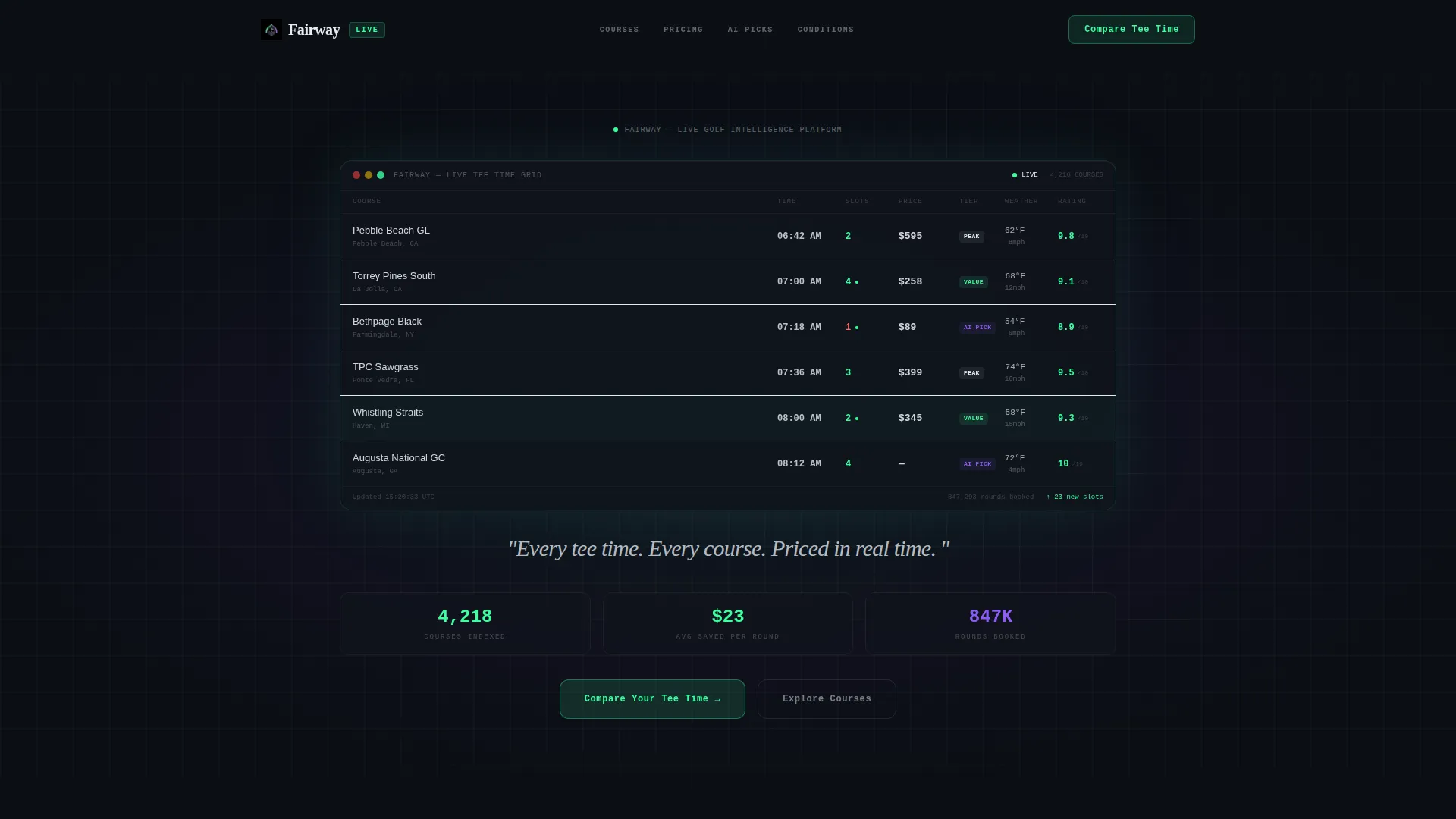
- A full-bleed dark header with a glowing tee time grid interface, animated headline, and weather micro-icons
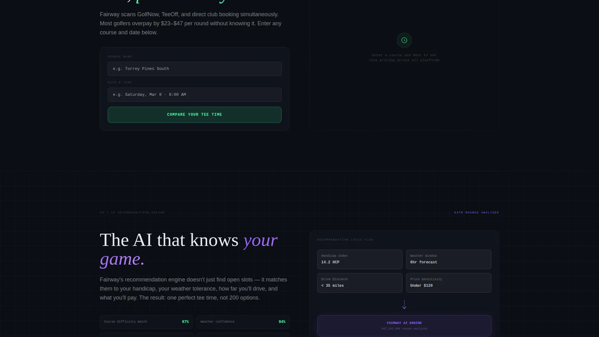
- Inline comparison tool where visitors enter a course and date to see live price differences across booking platforms
- Course condition score panels, AI recommendation flowchart section, and a fixed bottom-bar app download call to action
Feature list
This template delivers six purpose-built sections, each designed to prove a specific capability of your golf booking app.
Live Tee Time Availability Grid
The header hero displays a real-time tee time grid showing course names, open slot counts, price tiers color-coded in holographic green, and weather micro-icons. The grid is designed to feel like a working product interface, not a mock-up.
Dynamic Pricing Comparison Engine
A dedicated section shows the same Saturday tee time slot across multiple booking platforms side by side. Fairway's price is highlighted in holographic green, letting visitors calculate savings without leaving the page.
AI Recommendation Flowchart
This scroll-triggered section visualizes the app's recommendation logic as an animated flowchart. Inputs include handicap, weather window, drive distance, and price sensitivity, making the AI process transparent and easy to trust.
Course Condition Score Panels
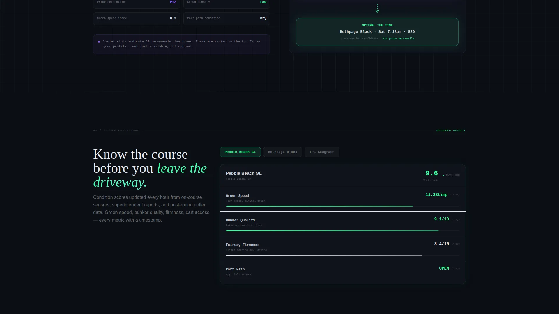
Each course condition breakdown covers green speed, bunker quality, and cart path status. Every metric carries a timestamp, communicating that the data is current and operationally useful.
Inline Price Comparison Tool
The primary call to action opens an inline tool. The visitor types a course name and date, and the template surfaces a comparison table with savings highlighted automatically. This mechanic earns the conversion by showing real value before asking for a sign-up.
Fixed App Download Bar
A secondary call to action sits fixed at the bottom of the viewport. It activates only after the visitor interacts with the comparison tool, ensuring the prompt to download the app arrives at the right moment in the visitor's decision process.
Page sections overview
| Section | Purpose |
|---|---|
| Dark hero grid | Introduce the live tee time dashboard and set the product-as-hero tone |
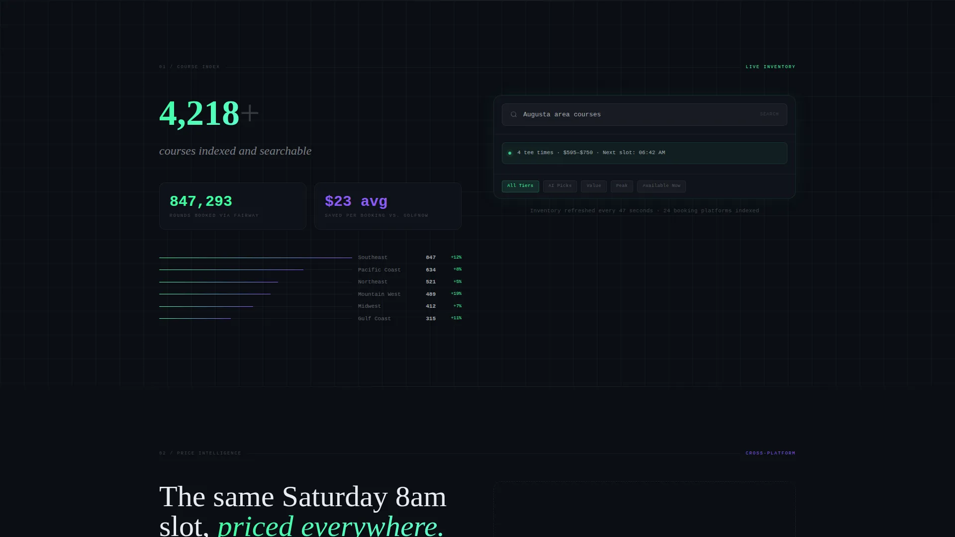
| Course index proof | Display "4,200+ courses indexed" with a live search demonstration |
| Pricing comparison engine | Show the same slot across platforms with savings highlighted in green |
| AI recommendation flow | Animate the recommendation logic using inputs like handicap and weather |
| Course condition scores | Present green speed, bunker quality, and cart path data with timestamps |
| Inline comparison tool | Let visitors enter a course and date to calculate real savings live |
| Fixed download bar | Deliver the app download call to action after the visitor has engaged with comparisons |
Design & branding system
The visual identity follows a Dashboard Pro theme built on the AI Iridescent color system. The palette is designed to feel like a luxury fintech launch screen applied to the golf world.
- Core colors: void black (#0B0E14) for backgrounds, holographic green (#3DFFA2) for available slot indicators, spectral violet (#8B5CF6) for pricing intelligence overlays, and shifting pearl white (#E8ECF1) for typography and card surfaces
- Iridescent gradients appear on card borders and hover states; green pulses gently on live-availability indicators; violet marks premium or AI-recommended time slots
- The header glow radiates outward from the dashboard user interface like light from a screen in a dark room, establishing the data-first creative tone from the first scroll position
Mobile & speed optimization
The template is structured around a dashboard-first layout that translates cleanly to smaller viewports. Data grids, comparison tables, and score panels are designed to remain readable at mobile screen sizes without losing their density or visual hierarchy.
- Compact card surfaces and fixed bottom-bar placement ensure key calls to action stay accessible on touch devices
- Section-by-section scroll pacing keeps the heavy data presentation digestible on any screen size
- Animated elements such as the scroll-triggered flowchart are scoped to specific sections, keeping layout complexity manageable
How this template helps you convert
The Comparison/Versus conversion model is built into the page structure from the first section to the last. Every design and layout decision is aimed at converting informed, skeptical golfers who want proof before they act.
- The inline comparison tool lets visitors see their actual savings against competing platforms before any call to action is shown, removing the need for persuasion copy and letting the numbers do the work
- The fixed app download bar activates only after the visitor engages with the comparison, which means the download prompt reaches users who have already seen the value argument and are closer to converting
- Scroll-triggered animations and timestamped data panels maintain engagement across the full page, reducing drop-off before the visitor reaches the primary conversion point
Other information about this template
Fairway is part of the Dashboard Pro theme family within the AI Iridescent design system. It is purpose-built for the golf course and tee time app niche and can support a range of app marketing use cases within that category.
- The Spec Sheet creative direction means every section is written and structured like a product brief, not a brochure, which suits technically confident audiences
- The template style is a Dashboard/Data Grid layout, making it well-suited for app landing pages where the interface itself is the strongest selling point
- Teams building in the golf technology space will find the color system and section cadence ready to adapt to their specific course inventory, pricing logic, or regional market positioning
Theme
Dashboard Pro
Creative direction
Spec Sheet
Color system
AI Iridescent
Style
Dashboard/Data Grid
Direction
Comparison/Versus
Page Sections
Live Tee Time Availability Grid
Cross-platform Pricing Comparison
AI Recommendation Flowchart
Course Condition Score Panels
Inline Savings Comparison Tool
Activation-gated App Download Bar
Related questions
What type of page is this template designed for?
Can this template work for a golf app that does not include AI recommendations?
Who is the intended audience visiting the page built with this template?
Does the comparison tool require a live data connection to function?
Is this template suitable for a mobile app marketing campaign?



