Feast — Premium Service Landing Page Template
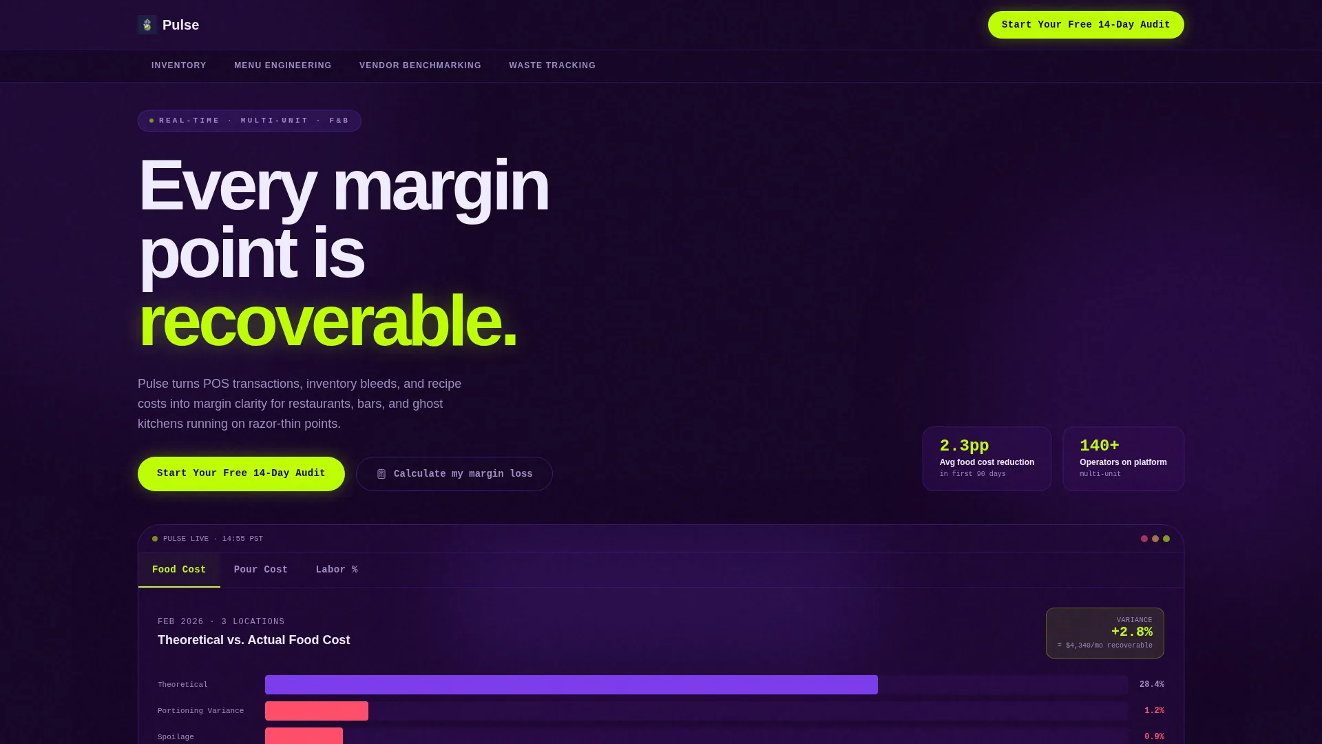
Pulse is a food and beverage analytics dashboard landing page built for multi-unit restaurant operators, beverage directors, and ghost kitchen managers. It combines a margin recovery calculator, a feature tab switcher, and hub-and-spoke anchor navigation to turn real food cost, pour cost, and labor data into a compelling case for a free trial signup.
by Rocket studio
Quick summary
Pulse is a single-page, anchor-nav landing page template for a real-time food and beverage analytics dashboard. It leads with a margin recovery calculator, then walks operators through four spoke sections covering inventory, menu engineering, vendor benchmarking, and waste tracking. The visual identity is built on a dark indigo palette with electric lime reserved for the numbers that matter.
Who this template is for
This template is built for operators who live and die by food cost percentages. It speaks directly to the people who open Monday morning profit-and-loss reports and already know the news is not good.
- Multi-unit restaurant operators monitoring food cost creep across locations
- Beverage directors tracking pour-cost variance shift by shift
- Franchise general managers and ghost kitchen operators running on tight margins
What problem this template solves
Most food and beverage operators cannot easily connect point-of-sale (POS) transaction data, inventory movement, and recipe costs in one view. The result is margin loss that is slow, silent, and hard to reverse without clear data.
- Food cost percentages climb past 32% before anyone notices the cause
- Pour-cost variance hides across shifts, buried in raw data that takes too long to review
- Labor percentage and revenue rarely appear side by side, making it hard to act on the relationship
What you get with this template
You get a fully designed, single-page hub-and-spoke landing page that is ready to customize for a food and beverage analytics product. Every section flows toward one outcome: a free trial signup.
- A three-tab header panel showing Food Cost, Pour Cost, and Labor % dashboard views
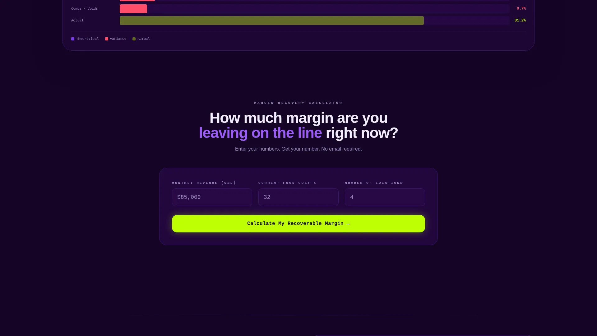
- A margin recovery calculator that outputs projected annual savings before asking for anything
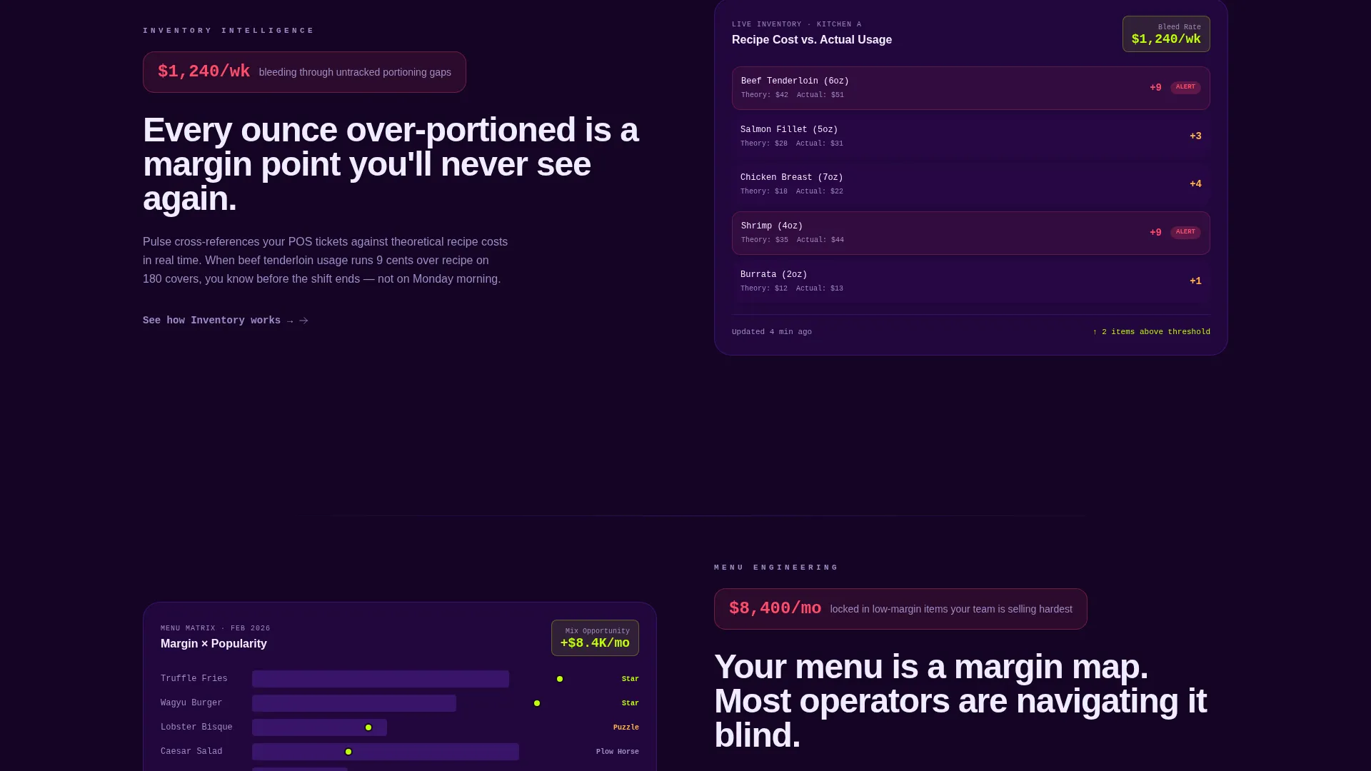
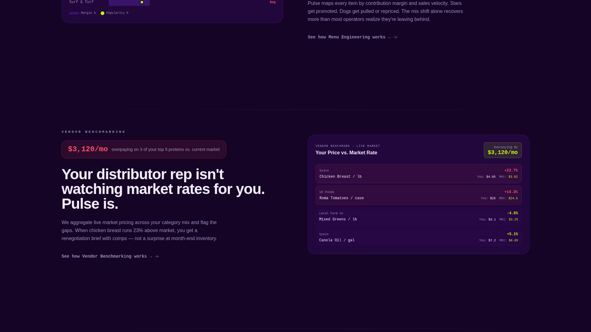
- Four anchor-nav spoke sections for Inventory, Menu Engineering, Vendor Benchmarking, and Waste Tracking
Feature list
This template is built around conversion-focused components that feel native to a real analytics product. Each piece below is drawn directly from the template brief.
Feature Tab Switcher Header
Three clickable tabs sit above a live-styled dashboard panel. Selecting Food Cost reveals a waterfall chart comparing theoretical versus actual cost. Pour Cost switches to a shift-by-shift heatmap. Labor % renders a stacked area chart against a revenue overlay. Each view includes one insight callout annotated in electric lime.
Margin Recovery Calculator
The calculator sits just below the header and accepts three inputs: monthly revenue, average food cost percentage, and number of locations. The output displays projected annual savings instantly in electric lime type. This gives every visitor a personalized dollar figure before any signup friction appears.
Hub and Spoke Anchor Navigation
A persistent anchor navigation bar links to four spoke sections: Inventory, Menu Engineering, Vendor Benchmarking, and Waste Tracking. Each spoke opens with the specific dollar problem it solves, then reveals the dashboard view that addresses it. Navigation stays locked to the top of the viewport alongside the primary call to action.
Escalating Spoke Sections
Each of the four spoke sections follows the same persuasion structure. It names the cost problem, shows the relevant dashboard view, and closes with a text link reading "See how [section name] works." This pattern builds a cumulative case across the page without repeating itself.
Click-Through Call-to-Action System
The primary call to action, "Start Your Free 14-Day Audit," appears in electric lime on indigo. It is locked to the anchor nav bar and appears again immediately after the calculator output. No form lives on this page. The goal of every element is a single click to the trial signup page.
Dark Dashboard Visual Language
The template uses a POS-screen aesthetic throughout. Deep terminal indigo backgrounds, charged violet for active states and data highlights, and white-hot platinum for typography and card surfaces create a dense, credible product feel. Electric lime appears only on positive-delta indicators and call-to-action buttons.
Page sections overview
| Section | Purpose |
|---|---|
| Feature Tab Switcher | Show Food Cost, Pour Cost, and Labor % dashboard views on click |
| Margin Recovery Calculator | Let visitors input their own numbers and see projected annual savings |
| Anchor Navigation Bar | Keep primary call to action and spoke links visible throughout the page scroll |
| Inventory Spoke | Open with the inventory cost problem, then reveal the dashboard solution |
| Menu Engineering Spoke | Frame menu margin issues and show the engineering dashboard view |
| Vendor Benchmarking Spoke | Expose vendor cost variance and the benchmarking dashboard panel |
| Waste Tracking Spoke | Define waste as a dollar problem and present the tracking dashboard |
Design & branding system
The visual identity channels a Startup Velocity aesthetic built around a single controlling idea: a POS screen glowing in a dim back office at midnight. Every color has a specific job, and nothing is decorative.
- Deep terminal indigo (#2D0A4E) as the primary background, charged violet (#7C3AED) for active navigation states and data highlights, and white-hot platinum (#F0EDFF) for typography and card surfaces
- Electric lime (#BEFF03) used exclusively for positive-delta data indicators and call-to-action buttons, making those elements phosphoresce off every dark surface
- Dense, data-rich panel layouts that feel like real product screenshots rather than marketing illustrations
Mobile & speed optimization
The layout is designed to stay readable and functional at smaller viewport sizes. The anchor nav and calculator are central to the conversion flow, so both are built to work on touch screens.
- The margin recovery calculator inputs and output are structured for clear tap interaction on mobile devices
- The feature tab switcher adapts so each dashboard view remains legible without horizontal scrolling
- Spoke sections stack vertically on narrow screens, preserving the problem-then-solution narrative on every device
How this template helps you convert
Every structural decision on this page points toward one click. The conversion logic is deliberate and sequential.
- The calculator delivers a personalized dollar figure before any commitment is requested, making the value tangible before friction appears.
- The anchor nav keeps the "Start Your Free 14-Day Audit" call to action visible at every scroll depth, so the decision to click is never more than a glance away.
- Each spoke section closes with a secondary text link, catching visitors who respond to feature clarity rather than the opening dollar shock from the calculator.
Other information about this template
This template is part of a broader food and beverage software category designed for analytics-first products. It is built for teams that want to launch a professional, persuasive dashboard landing page without building from scratch.
- The template style is Hub and Spoke with Anchor Navigation, a structure well suited to products with multiple distinct feature areas that share one conversion goal
- The creative direction is Calculator-First, meaning the persuasion engine runs on the visitor's own numbers rather than static marketing copy
- The theme is Startup Velocity, which prioritizes momentum, density, and data credibility over decorative layouts
- This template works well for food and beverage analytics platforms, restaurant management software products, and bar or ghost kitchen operations tools that need a landing page before a trial or demo flow
Theme
Startup Velocity
Creative direction
Calculator/Tool First
Color system
Electric Indigo
Style
Hub & Spoke (Anchor Nav)
Direction
Click-Through
Page Sections
Feature Tab Switcher with Dashboard Views
Margin Recovery Calculator
Hub and Spoke Anchor Navigation
Escalating Spoke Sections
Click-through Call-to-action System
Related questions
Does this template include an actual working calculator?
Is there a form on this page?
Can I change the spoke section topics?
How many calls to action does the template include?
Who is this template best suited for?



