Feedback - Dynamic Education Landing Page Template
The Feedback education landing page template transforms the tired end-of-semester survey into an interactive conversation tool. Built for educators and ed-tech teams, it showcases real-time pulse checks, anonymous voice notes, and sentiment heatmaps inside a bold Brutalist and Glassmorphic design. The comparison table format lets visitors explore the difference between traditional surveys and modern feedback collection firsthand.
by Rocket studio
Quick summary
This single-page template presents an education feedback request platform through a feature-rich comparison table layout. Visitors move through three interactive demo tabs, explore live micro-interactions, and land on a single frictionless download prompt. The design pairs Bold Brutalist structure with Glassmorphic color depth to make the case visually before any word is read.
Who this template is for
This template speaks directly to the people caught between students who disengage and administrators who demand proof of improvement.
- Adjunct professors managing multiple course sections across campuses who need faster, honest feedback loops
- K-12 department heads replacing unread paper evaluations with something students actually engage with
- Education technology coordinators who need to demonstrate measurable student voice initiatives to stakeholders
What problem this template solves
Traditional course surveys arrive too late, feel impersonal, and produce data nobody acts on. This template addresses that gap by showing visitors exactly what a living feedback platform looks like in practice.
- End-of-semester surveys miss early disengagement signals that could have been caught mid-course
- Anonymous feedback formats often feel disconnected, making students less likely to respond honestly
- Educators lack a clear, visual way to compare stale survey tools against a responsive, real-time alternative
What you get with this template
You get a fully structured, interactive single-page layout designed to demonstrate an education feedback platform from first scroll to final tap.
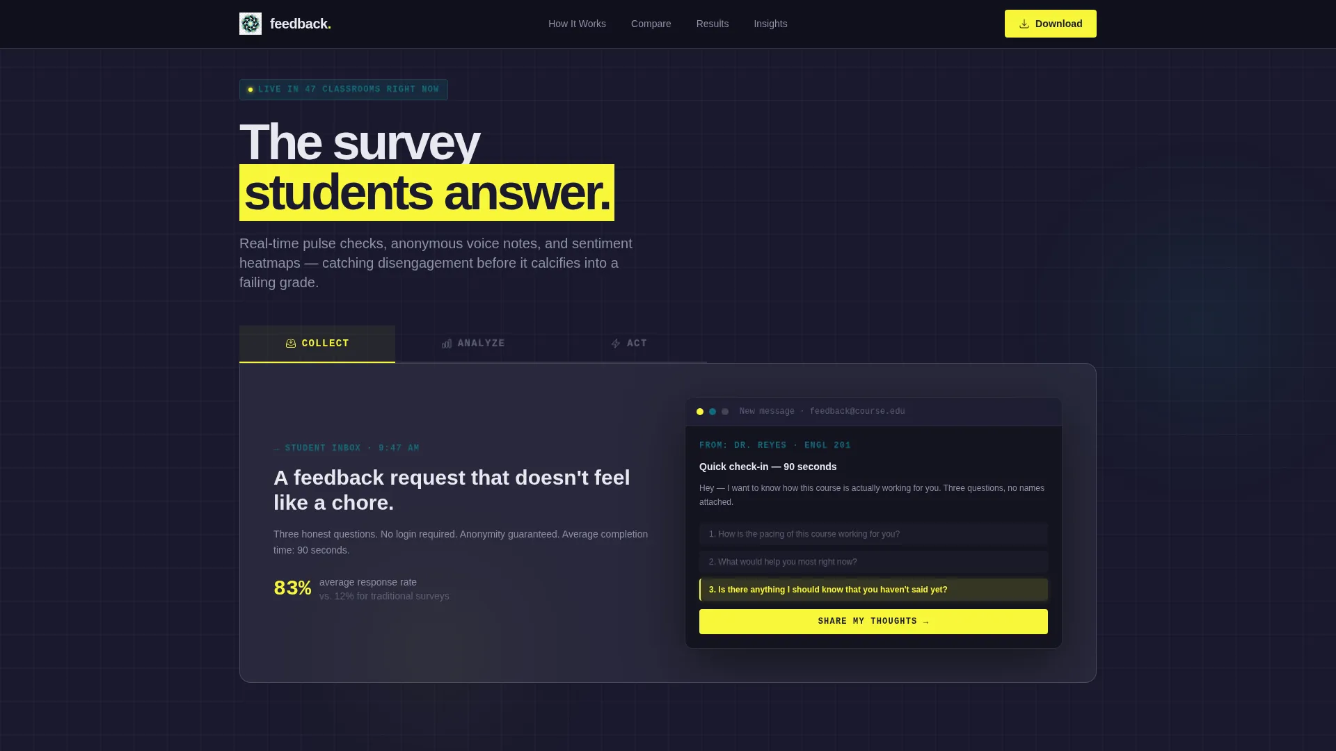
- A Feature Tab Switcher header with three frosted glass tabs labeled "Collect," "Analyze," and "Act," each revealing a distinct live mockup
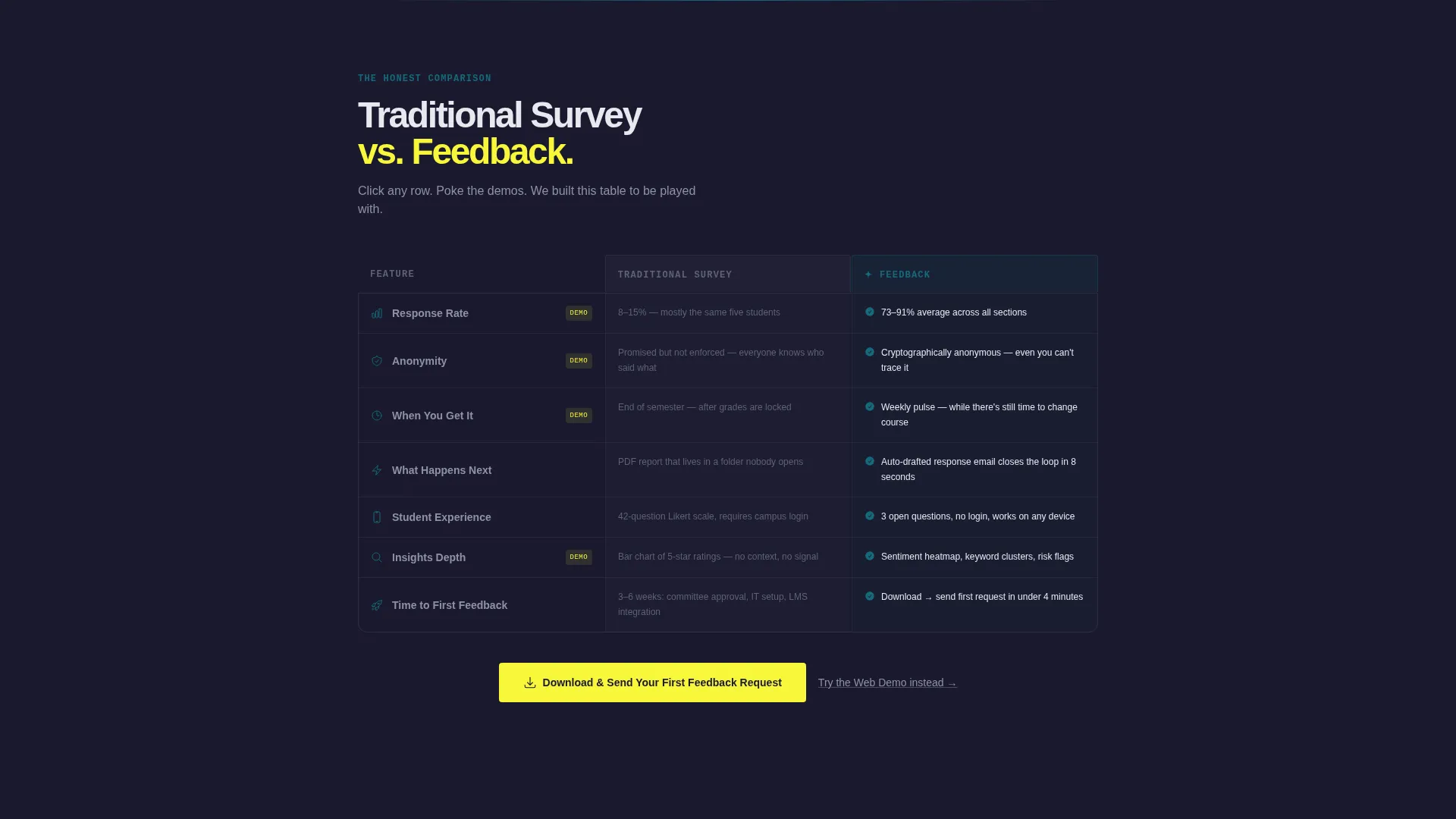
- An interactive comparison table where rows expand into micro-demos, including a live response-rate counter and a real-time message de-identification preview
- A primary app download call-to-action placed in the sticky header and repeated after the final table row, with a secondary web demo path for desktop visitors
Feature list
This template ships with a specific set of interactive and visual components drawn from the platform's core feedback loop.
Feature Tab Switcher Header
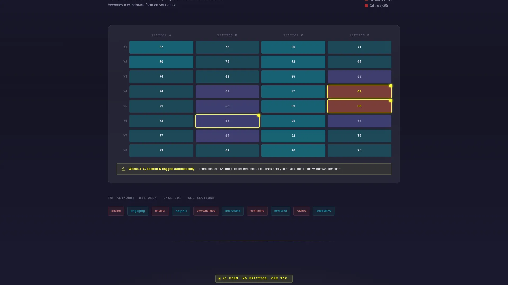
Three frosted glass tabs sit heavy across the top of the viewport. Each tab click swaps the visible panel with no easing, giving the interface a concrete-slab weight that reinforces the platform's directness. "Collect" shows a glowing inbox mockup, "Analyze" reveals a sentiment heatmap with anonymized gradient circles, and "Act" displays a generated follow-up email draft closing the feedback loop.
Interactive Comparison Table
The comparison table pits "Traditional Survey" against the feedback platform column by column. Each row is clickable and expands into a functional micro-demo. This turns a static feature list into a hands-on experience that earns the download before any call to action appears.
Live Response Rate Counter
Clicking the response rate row inside the comparison table triggers an animated counter. Visitors watch the number climb in real time, making the platform's engagement advantage tangible rather than claimed.
Real-Time Message De-Identification
The anonymity row lets visitors type a sample message directly into the table. The text transforms as they type, visually demonstrating how student submissions are de-identified before reaching an educator's view.
Frictionless App Download Flow
The primary call-to-action reads "Download and Send Your First Feedback Request." It appears in the sticky header and again after the final comparison row. The download button detects the visitor's operating system and displays the matching store badge automatically.
Sentiment Heatmap Mockup
The "Analyze" tab surfaces a course roster rendered as a sentiment heatmap. Individual student faces are replaced by anonymous gradient circles, communicating at a glance where disengagement is forming across a class.
Page sections overview
| Section | Purpose |
|---|---|
| Feature Tab Switcher | Introduces Collect, Analyze, and Act tabs with live panel mockups |
| Collect Tab Panel | Shows a feedback email landing in a student inbox with highlighted phrases |
| Analyze Tab Panel | Displays a sentiment heatmap across an anonymized course roster |
| Act Tab Panel | Previews a generated action-item reply email closing the feedback loop |
| Comparison Table | Lets visitors toggle and click rows to explore platform advantages interactively |
| Sticky Header call to action | Keeps the primary download prompt visible throughout the scroll |
| Secondary Demo Path | Offers a browser-based sandbox link for desktop visitors |
| Final Download Row | Repeats the primary call-to-action after the last comparison table row |
Design & branding system
The visual identity fuses Bold Brutalist structure with a Glassmorphic color system, producing a page that feels like a brutalist campus library caught at dusk.
- Color palette uses deep chalkboard black (#1A1A2E) as the base, frosted translucent white (#E0E0E0 at 40% opacity) for card surfaces, electric highlighter yellow (#F7F739) for accent strikes and hover states, and institutional teal (#16697A) anchoring headers and interactive borders
- Backgrounds layer frosted glass cards over stark dark planes, while comparison columns float with visible blur-backdrop edges and yellow slashes cut through text like an emphatic annotation
- Tab transitions are abrupt with no easing, panels swap like concrete slabs sliding on rails to reinforce the platform's no-nonsense directness
Mobile & speed optimization
The template is built with a single-page scroll flow that keeps interactions accessible across screen sizes without fragmenting the user journey.
- The sticky header and download button remain visible on smaller screens, preserving the primary conversion path throughout the entire scroll
- The OS-detecting download button removes the need for form fields, keeping the mobile experience friction-free and tap-ready after the interactive demos have made the case
How this template helps you convert
This template earns the conversion before asking for it. Every interactive element reduces the gap between curiosity and commitment.
- The three-tab header immediately demonstrates the platform's core loop, letting visitors experience Collect, Analyze, and Act before reading a single feature description
- The interactive comparison table replaces passive reading with hands-on exploration, so the decision to download is informed and personal rather than a leap of faith
Other information about this template
This template belongs to the Education Email Templates subcategory within the Technology category, targeting the Education Feedback Request Email niche. It is designed as a comparison table landing page and pairs well with teams evaluating tools in this space.
- The template style is a Comparison Table layout, purpose-built to position a feedback platform against traditional survey alternatives
- The creative direction follows an Interactive Explorer approach, meaning scroll behavior and component interactions drive product understanding rather than static copy
- The header concept is a Feature Tab Switcher, a pattern suited to platforms with a multi-stage workflow that benefits from visual demonstration
Theme
Bold Brutalist
Creative direction
Interactive Explorer
Color system
Glassmorphic
Style
Comparison Table
Direction
App Download
Page Sections
Feature Tab Switcher with Live Mockups
Interactive Comparison Table
Live Response Rate Animation
Real-time Message De-identification Demo
Os-detecting Download Button
Sentiment Heatmap Mockup Panel
Related questions
Who is this landing page template designed for?
Does this template require form fields to convert visitors?
Can the comparison table rows be customized?
What makes the tab transitions feel different from a standard slider?
Is this template suitable for desktop and mobile visitors?



