Pet Care Marketing Automation Landing Page Template
Fetch is a pet care marketing automation landing page template built for veterinary clinics, groomers, and boarding facilities. It showcases a platform that unifies appointment reminders, post-visit follow-ups, review requests, and rebooking nudges in one automated engine. The hub and spoke layout guides visitors through each workflow with a feature matrix, product screenshots, and real client proof points.
by Rocket studio
Quick summary
Fetch is a single-page, hub and spoke landing page template for a pet care marketing automation platform. It connects appointment reminders, review requests, and rebooking nudges into one control-room-style interface. The template uses a Carbon Fiber color system and a sticky anchor nav to guide practice managers, kennel owners, and multi-location pet care brands toward a personalized demo.
Who this template is for
This template is built for businesses and teams operating in the pet care space who need to show a complex software platform clearly and persuasively on a single page.
- Veterinary clinic practice managers who currently juggle separate tools for email, SMS, and social outreach
- Kennel and grooming business owners who lose repeat bookings because follow-ups never get sent
- Multi-location pet care brands that need unified client messaging without a marketing coordinator at every site
What problem this template solves
Pet care businesses lose repeat revenue quietly. A client comes in for a nail trim, no one follows up, and they book elsewhere next time. The Fetch template solves the presentation problem of making that invisible automation visible and trustworthy to a skeptical buyer.
- Practice managers need to see the platform working before they commit to a demo
- Overwhelmed owners need to understand in seconds how automation replaces their manual follow-up stack
- Multi-site operators need confidence that a single platform can scale across locations without adding headcount
What you get with this template
The template delivers a complete, production-ready landing page layout structured around five distinct workflow spokes, each with its own feature matrix, product screenshot, and client proof block.
- A sticky anchor navigation bar linking to five spoke sections: Reminders, Reviews, Rebooking, Campaigns, and Reporting
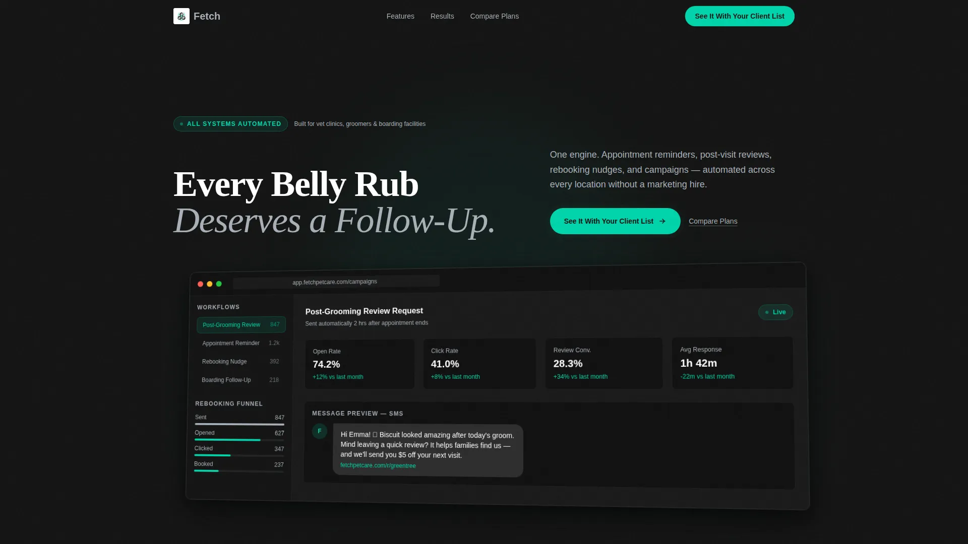
- A hero section featuring a product screenshot of the campaign dashboard with a headline set in clean white sans-serif above it
- A primary call-to-action button and a secondary comparison link placed consistently throughout the scroll path
Feature list
This template ships with a tightly designed set of components built specifically for converting software buyers in the pet care automation space.
Sticky Anchor Navigation Bar
A fixed nav bar labels each spoke section by workflow type: Reminders, Reviews, Rebooking, Campaigns, and Reporting. The primary call-to-action button stays visible here as the visitor scrolls, so the path to the demo is never more than one click away.
Product Screenshot Hero Section
The header places a pixel-perfect campaign dashboard screenshot at the center of the page. The screenshot is angled five degrees for dimension, floats on a deep black background with an ambient shadow, and shows a live-looking post-grooming review sequence with open rates, click-throughs, and a rebooking funnel in the sidebar.
Spoke-by-Spoke Feature Matrix
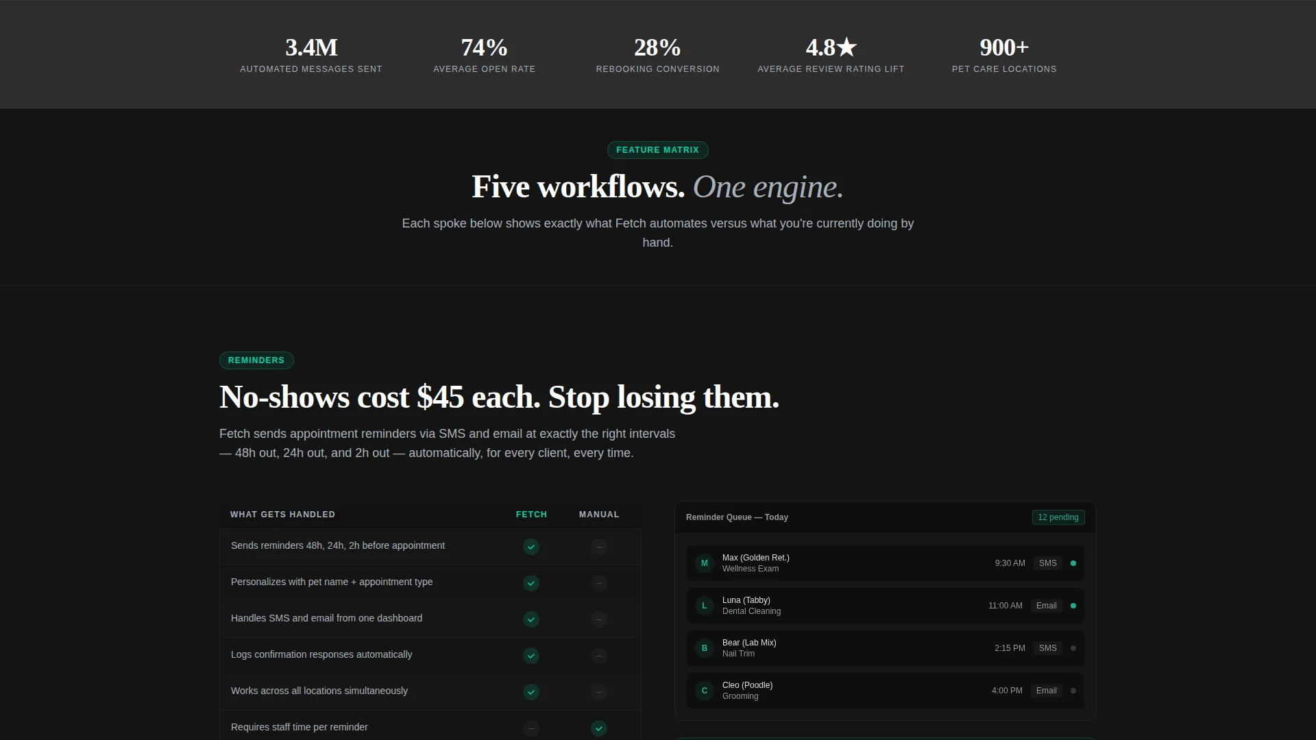
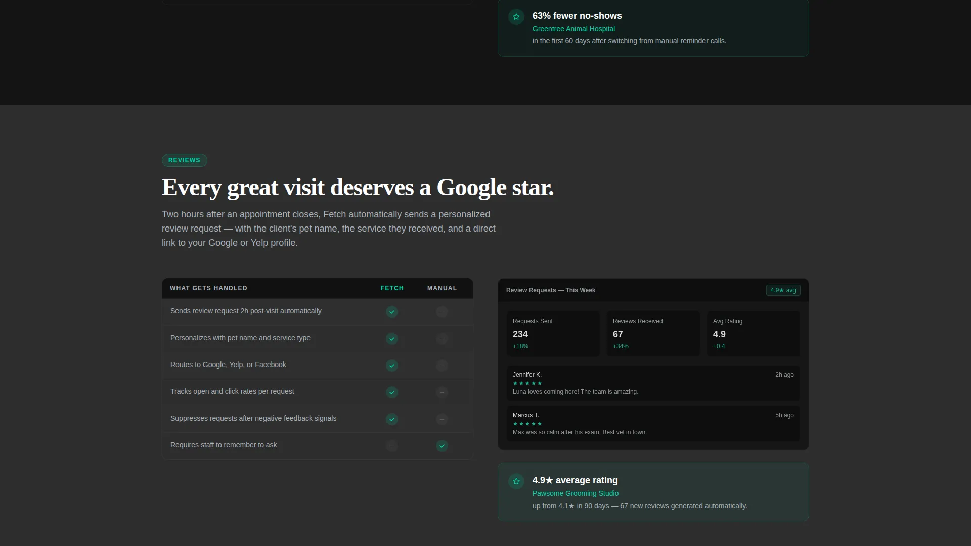
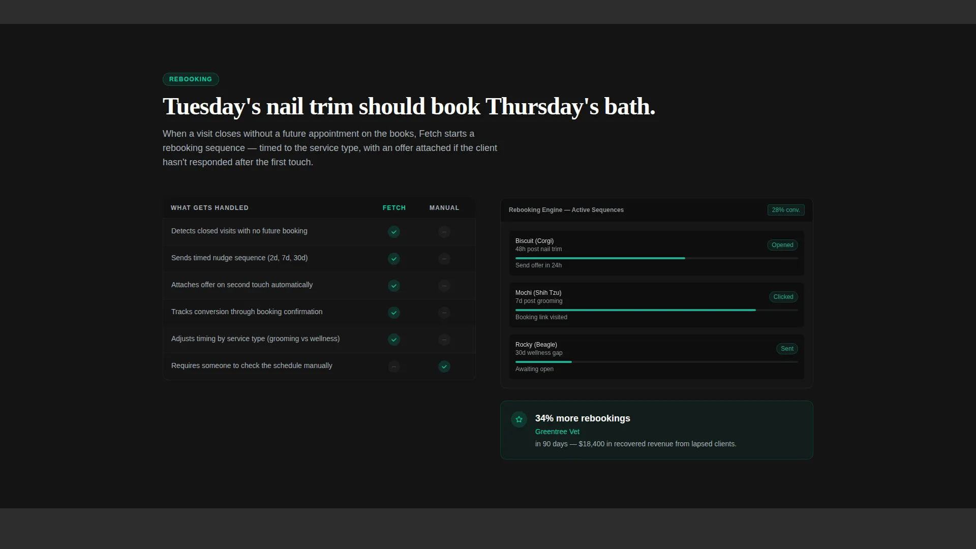
Each of the five spoke sections opens with a comparison grid showing what the platform automates versus the manual alternative. Checkmarks appear in electric teal and gaps appear in muted gray, making the value contrast immediately readable without a wall of text.
Client Proof Metric Blocks
After the feature matrix in each spoke, a focused product screenshot dissolves into a single client metric block. The rhythm of grid, screenshot, and proof repeats consistently across all five spokes, building visitor trust and scan momentum as they move deeper into the page.
Dual Call-to-Action Structure
The primary button, labeled "See It With Your Client List," appears first under the hero screenshot and then again in the sticky nav. A secondary text link, "Compare Plans," sits beside it for bottom-funnel visitors evaluating pricing, giving both early-stage and late-stage buyers a clear next step.
Carbon Fiber Visual System
The entire template uses a four-color Carbon Fiber palette applied with strict rules: deep cockpit black and brushed graphite alternate as section backgrounds, cool instrument silver carries all body text, and electric teal appears only on active states, toggles, and call-to-action surfaces.
Page sections overview
| Section | Purpose |
|---|---|
| Hero Dashboard Header | Anchors attention with a product screenshot and headline |
| Sticky Anchor Nav | Keeps workflow navigation and call to action visible at all times |
| Reminders Spoke | Demonstrates automated appointment reminder workflows |
| Reviews Spoke | Shows post-visit review request automation and results |
| Rebooking Spoke | Highlights automated rebooking nudge sequences |
| Campaigns Spoke | Covers multi-channel campaign management features |
| Reporting Spoke | Presents performance metrics and conversion data |
| Client Proof Blocks | Delivers real metric evidence after each feature matrix |
| Primary call to action Section | Drives click-through to a personalized demo environment |
| Compare Plans Link | Supports bottom-funnel evaluation without a form |
Design & branding system
The visual identity follows a Directory and Discovery theme using a Carbon Fiber color system. Every design decision reinforces the feeling of a high-performance control room rather than a typical software marketing page.
- Backgrounds alternate between deep cockpit black (#141414) and brushed graphite (#2D2D2D) to create visual depth between each spoke section
- Cool instrument silver (#A8B0B8) carries all body text and secondary labels, keeping the dark layout readable without feeling harsh
- Electric teal (#00D4AA) is reserved exclusively for active states, toggles, and call-to-action surfaces, making every clickable element pulse against the dark field
Mobile & speed optimization
The template is designed with a lean component structure that supports fast loading and clear rendering across screen sizes, consistent with the platform's control-room visual language.
- The sticky anchor nav collapses cleanly on smaller screens so workflow spoke links remain accessible without crowding the viewport
- Section backgrounds, teal call-to-action surfaces, and the angled hero screenshot are structured to render crisply on both desktop and mobile displays
How this template helps you convert
Every structural decision in this template is designed to earn the click before asking for it, removing friction for visitors who have never heard of the platform and for those who are already close to buying.
- The product screenshot hero shows the platform working immediately, so visitors arrive at a moment of proof rather than a moment of pitch, building early credibility before any feature claim is made.
- The repeating grid, screenshot, and proof rhythm across five spokes creates compounding trust so that by the third spoke the visitor is scanning faster and moving naturally toward the demo button.
- The dual call-to-action structure serves both early-stage explorers and late-stage evaluators in one layout, ensuring no bottom-funnel visitor bounces because they needed a pricing comparison first.
Other information about this template
This template is built as a hub and spoke landing page, meaning all navigation flows from a central sticky bar back into focused spoke sections rather than across separate pages. It is best suited for software-as-a-service platforms in the pet care vertical that need to demonstrate workflow depth on a single scrollable canvas.
- The "See It With Your Client List" call-to-action is designed to push visitors to a personalized demo environment where they enter their clinic name and see a simulated workflow, not a generic product tour
- The template contains no on-page form, keeping the conversion path frictionless and deferring data capture to the demo environment
- The Carbon Fiber palette and Directory and Discovery theme position the product as technical and precise, which aligns with the trust signals that practice managers and operations-focused buyers respond to
Theme
Directory & Discovery
Creative direction
Feature Matrix
Color system
Carbon Fiber
Style
Hub & Spoke (Anchor Nav)
Direction
Click-Through
Page Sections
Sticky Anchor Navigation Bar
Product Screenshot Hero Section
Spoke-by-spoke Feature Matrix
Client Proof Metric Blocks
Dual Call-to-action Structure
Carbon Fiber Visual System
Related questions
Who is this landing page template designed for?
Does this template include a contact form or lead capture form?
Can the five spoke sections be renamed or reordered?
What makes the feature matrix layout effective for software sales?
Is this template suitable for a multi-location pet care brand?



