API-First Enterprise Software Professional Website Template
Fetch is a dark-themed, dashboard-style landing page template built for headless content management system products. It combines a full-bleed terminal aesthetic with a Problem-to-Solution narrative arc, live-style code snippet panels, and zero-friction call-to-action design. The layout targets developers, CTOs, and growth engineers who need to present an API-first content platform with speed and confidence.
by Rocket studio
Quick summary
Fetch is a single-page landing page template designed for API-first content management platforms. It opens with a dark full-bleed hero featuring a live dashboard mock, then guides visitors through a pain-metric problem grid, an animated architecture diagram, and tabbed code snippet panels. Every section is built to move technically minded buyers from curiosity to installation in one scroll.
Who this template is for
This template speaks directly to the people shipping content infrastructure, not managing it from a marketing suite. It is built for technically fluent builders who need a credible, high-signal landing page fast.
- Seed-stage CTOs wiring their first API-powered storefront who need a page that matches their product's technical seriousness
- Growth-team engineers migrating off a bloated legacy content management system who want to show stakeholders a clean alternative
- Solo indie hackers treating their content layer like plumbing, where the presentation needs to just work without days of design effort
What problem this template solves
Most developer-tool landing pages either look like a marketing brochure or an undressed GitHub readme. Neither converts a technical buyer who arrives skeptical. Fetch closes that gap by pairing honest pain metrics with concrete, copyable solutions.
- Legacy content management workflows are slow, plugin-heavy, and opaque, and most templates have no visual language to communicate that gap
- Developer audiences distrust pages that lead with promises instead of proof, making vague hero sections a conversion killer
- Marketers and developers on the same team need different things, and the template's dual-audience structure addresses both without compromise
What you get with this template
Fetch delivers a complete, single-page layout structured around a clear narrative: here is the problem, here is the architecture, here is the code, here is how to start. Every section is pre-built and ready to customize.
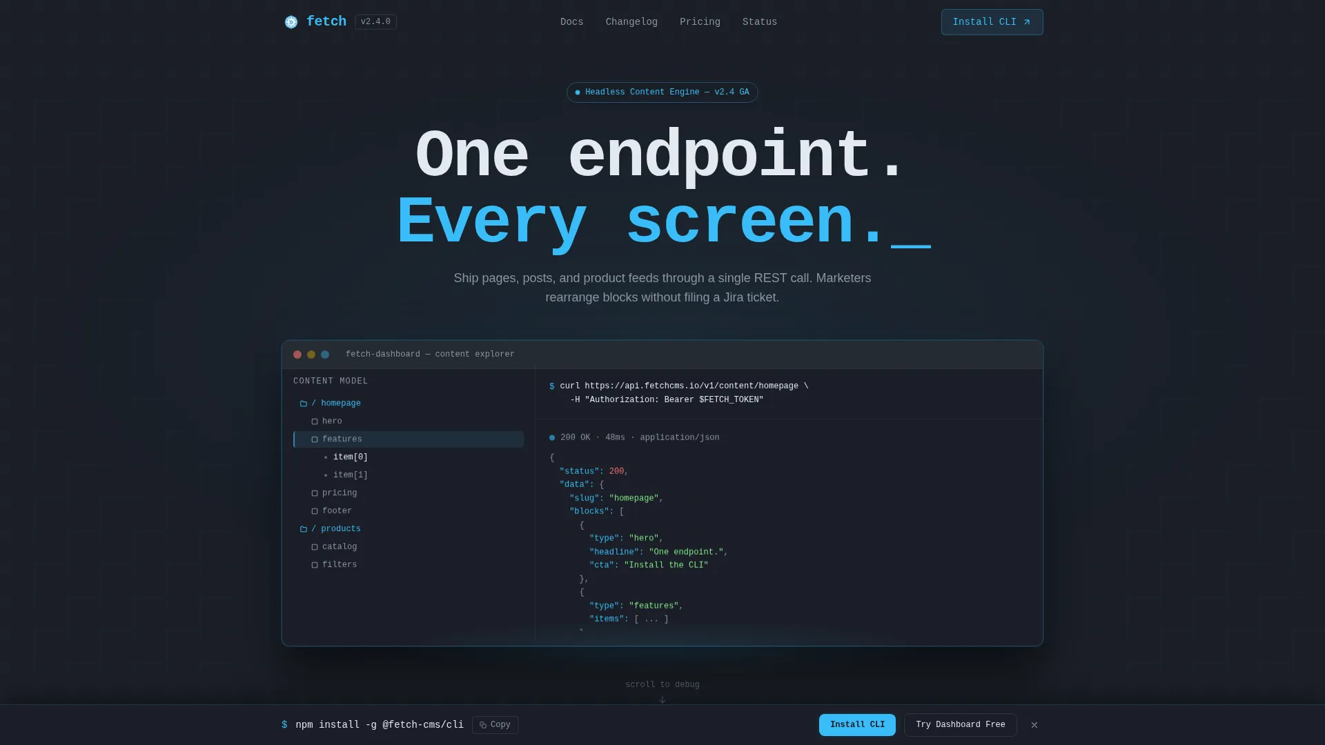
- A dark full-bleed hero with a radial glow effect, a dashboard mock showing a content model tree and a JSON response panel, and a blinking
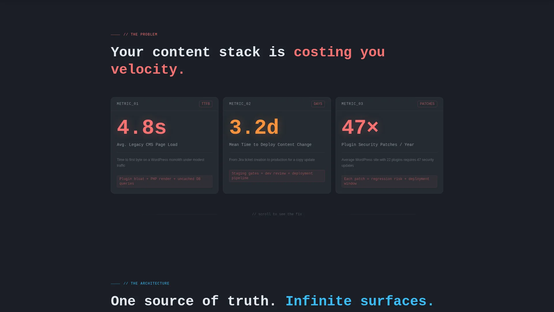
curlcommand at the top - A three-card problem grid displaying pain metrics with high-contrast stat numbers, an animated architecture diagram with connection lines from a single API node to multiple endpoints, and a tabbed code snippet panel with REST, GraphQL, and SDK examples
- Dual call-to-action placement with a one-click copy-to-clipboard
npm installcommand and a secondary "Try the Dashboard Free" button, repeated in a sticky bottom bar after the code section
Feature list
This template is built around specific design and layout decisions that serve the API-first content management use case directly. Each feature below is present in the template as described.
Dark Full-Bleed Hero with Dashboard Mock
The header fills the entire viewport in deep charcoal slate with a soft radial glow in electric sky blue blooming from center. A live-styled dashboard mock sits inside the glow, showing a content model tree on the left, a JSON response panel on the right, and a blinking curl command at the top. No stock photography is used; the product interface is the visual hero.
Pain Metric Problem Grid
The first scroll section presents three dark cards laid out as a data grid. Each card surfaces a real pain metric from legacy content management workflows, such as page load times, time-to-deploy, and annual plugin security patches. Stat numbers render in red-orange to contrast sharply against the dark card surface, making the problem immediately legible.
Animated Architecture Diagram
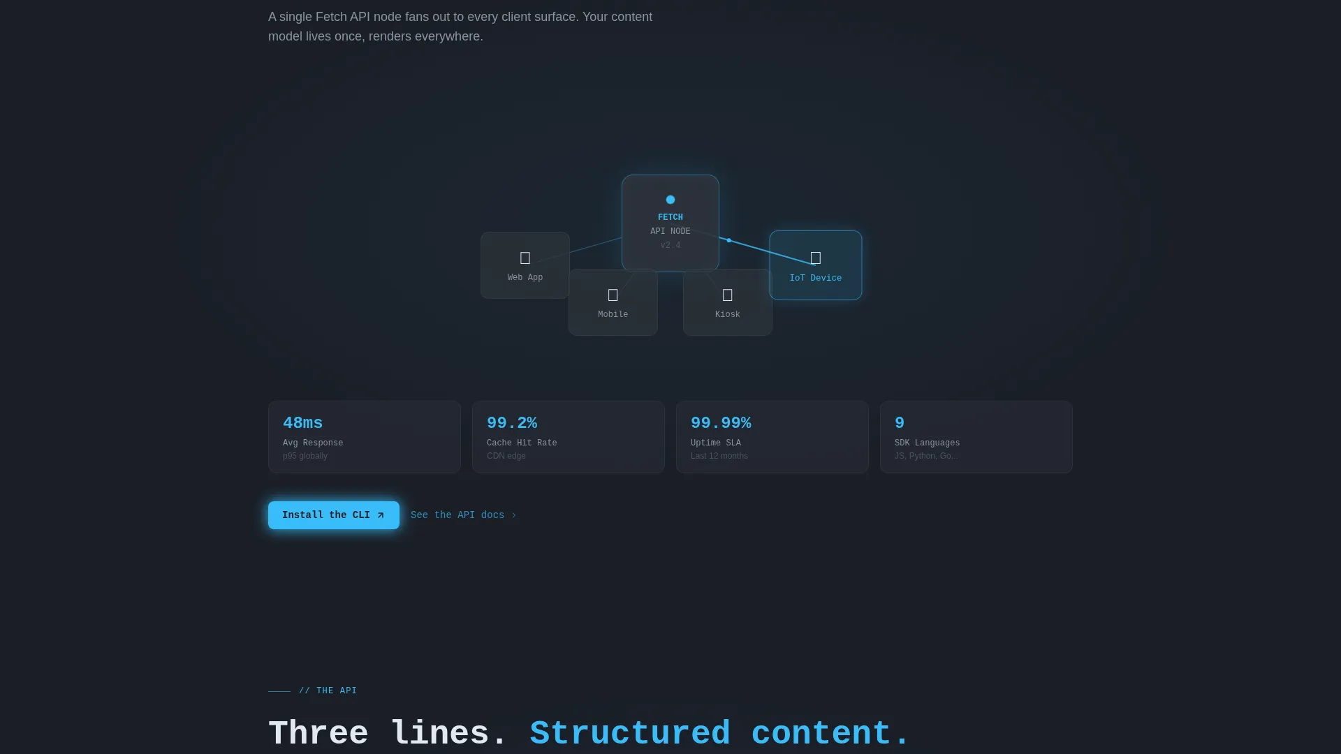
The second scroll section draws connection lines in electric sky blue from a single API node outward to mobile, web, kiosk, and Internet of Things endpoints. The animation triggers on scroll, reinforcing the "one endpoint, every screen" positioning with a visual that technical buyers can immediately read and trust.
Tabbed Code Snippet Panel
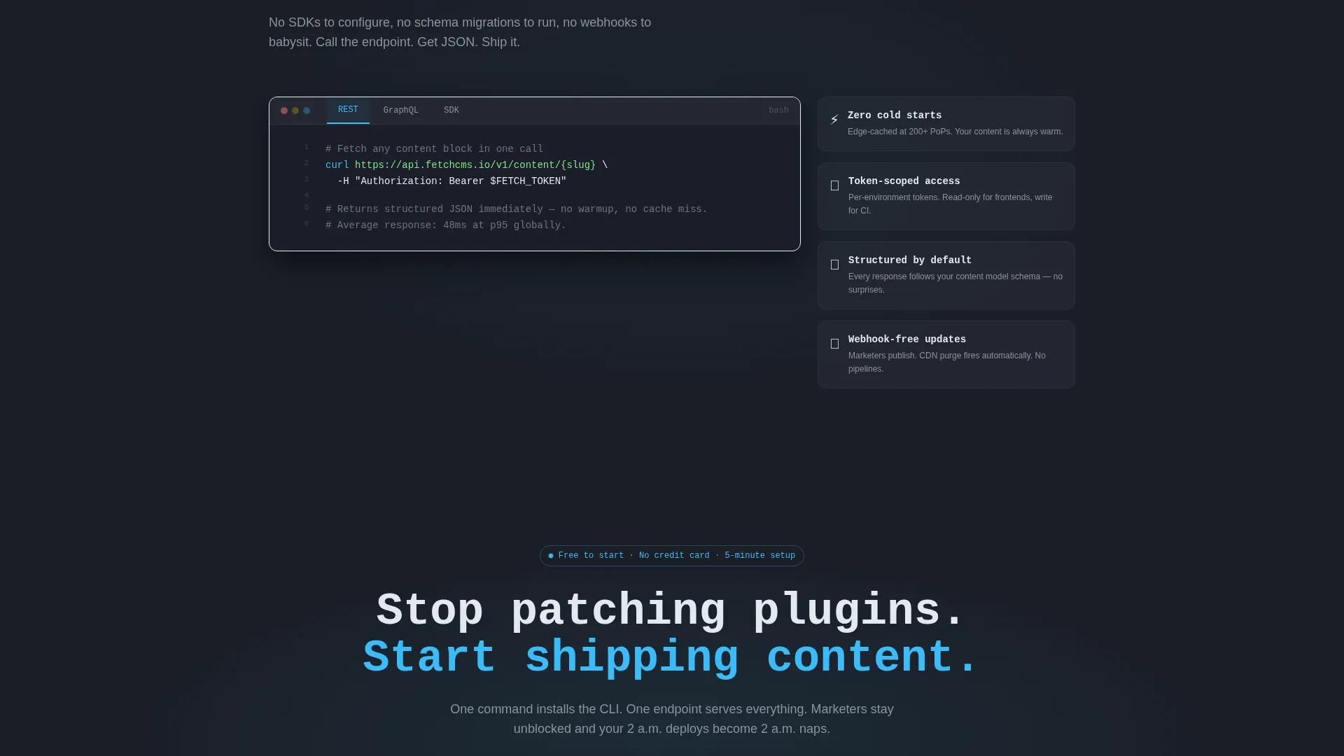
The third scroll section presents a panel with three tabs: REST, GraphQL, and SDK. Each tab shows a minimal three-line fetch call returning structured JSON. Tabs let visitors quickly confirm that their preferred integration path is supported without reading a word of prose.
Zero-Friction Dual call to action Layout
Two calls to action are placed immediately after the architecture section: a primary "Install the CLI" button with a copyable npm install command, and a secondary "Try the Dashboard Free" link to a hosted sandbox. Both calls to action reappear in a sticky bottom bar once the visitor scrolls past the code examples, ensuring the conversion moment is never more than one click away.
Sticky Bottom Conversion Bar
A persistent bottom bar activates after the visitor passes the code snippet section. It repeats both calls to action without interrupting the reading flow, keeping the install command and sandbox link accessible throughout the rest of the page scroll.
Page sections overview
| Section | Purpose |
|---|---|
| Dark hero header | Establish product identity and hook with dashboard mock and headline |
| Problem metric grid | Surface legacy CMS pain points using data-grid stat cards |
| Architecture diagram | Show single-API-node connectivity across all endpoint types |
| Code snippet panel | Demonstrate integration simplicity with tabbed fetch call examples |
| Primary call to action block | Drive CLI installation and sandbox trial after architecture proof |
| Sticky bottom bar | Persist conversion actions across the remainder of the page scroll |
Design & branding system
The visual identity follows a Startup Velocity theme built entirely around a Slate and Sky color system. The result feels like a well-configured code editor at midnight: dark enough that accent elements pop, cool enough that nothing feels loud.
- Background and surface colors use deep charcoal slate (#1B1F27) for full-bleed sections and mid-tone graphite (#2D333B) for card surfaces and code blocks, creating clear depth without adding visual noise
- Electric sky blue (#38BDF8) handles every interactive signal: glow effects, hover rings, accent lines, and architecture diagram connection lines
- Chalk white (#E2E8F0) is used for all body text and endpoint path labels, ensuring readability on dark backgrounds; the headline font is monospaced to reinforce the terminal aesthetic
Mobile & speed optimization
The template is structured for the scroll-first reading behavior common to developers researching tools on a phone or a secondary monitor. The layout decisions support smaller viewports without requiring additional configuration.
- Section-led flow with large tap targets on both call to action buttons means the install command and sandbox link remain accessible on mobile without zooming or horizontal scrolling
- The sticky bottom bar is designed to sit cleanly at the bottom of smaller screens, keeping conversion actions present throughout the scroll without overlapping content
- Code snippet tabs are compact and touch-friendly, allowing mobile visitors to switch between REST, GraphQL, and SDK examples without layout breakage
How this template helps you convert
Every layout decision in Fetch is oriented toward one outcome: turning a skeptical technical visitor into someone who has already typed npm install before they finish reading. The conversion logic is sequential and deliberate.
- The hero dashboard mock and problem metric grid establish credibility immediately, replacing vague claims with visual proof and real numbers, so the visitor arrives at the call to action already trusting the product's premise
- The architecture diagram and tabbed code panel answer the two fastest objections from developer buyers: "Does it fit my stack?" and "How hard is the integration?" Both answers appear before any signup friction
- The sticky call to action bar ensures that once a visitor decides they want to try the product, the copy-to-clipboard install command is always one tap away, removing the gap between decision and action
Other information about this template
Fetch is built specifically for the API-first content management system category, where the typical buyer reads code before they read marketing copy. The template's narrative structure, Problem-to-Solution Arc, is designed for that reading order.
- The template style is Dashboard and Data Grid, making it well suited for products in the headless content management space, API-first enterprise software platforms, and developer tool launches
- The Startup Velocity theme and Slate and Sky color system are consistent choices for technology-category products that need to project technical authority without heavy graphic design investment
- The template works as a standalone launch page for a new headless content management product, a migration-pitch page aimed at teams currently on a legacy monolith, or a side-project showcase for an indie developer building content infrastructure
Theme
Startup Velocity
Creative direction
Problem→Solution Arc
Color system
Slate & Sky
Style
Dashboard/Data Grid
Direction
App Download
Page Sections
Dark Full-bleed Hero with Dashboard Mock
Pain Metric Problem Grid
Animated Architecture Diagram
Tabbed Code Snippet Panel
Zero-friction Dual Call to Action Layout
Sticky Bottom Conversion Bar
Related questions
Is this template suitable for a non-technical audience?
Can marketers edit content blocks without developer help?
Does the template include the sticky call to action bar by default?
Can I use this template for a product other than a headless CMS?
How many pages does this template include?



