Pet Care Booking Software Landing Page Template
Fetch is a hub-and-spoke landing page template built for pet care booking software. It combines a live-code header, a sticky anchor navigation bar, and five interactive spoke sections covering scheduling, clients, payments, staff, and integrations. The template is designed to drive app downloads with a bold visual system and kinetic scroll transitions.
by Rocket studio
Quick summary
Fetch is a single-page landing page template for pet care booking software. It opens with an animated API code snippet, guides visitors through five focused spoke sections via a pinned anchor nav, and closes with a persistent app download call to action. The design runs on a dark Data Command palette built to feel like a mission control dashboard.
Who this template is for
This template is built for software products in the pet care booking space that need to communicate speed, reliability, and depth to their target users. It works especially well when your audience ranges from solo operators to multi-location businesses.
- Solo dog walkers managing recurring appointment schedules without a dedicated tool
- Grooming salon owners currently handling bookings on paper or with mismatched software
- Multi-location boarding facilities that rely on several disconnected tools to run daily operations
What problem this template solves
Pet care service providers face a real coordination gap. Scheduling, client records, staff availability, and payment processing often live in separate places, creating friction and missed appointments.
- Disjointed tools force owners to re-enter the same data across multiple systems
- Paper-based or memory-based scheduling breaks down under volume and recurring appointments
- Potential customers can't immediately see the value of a unified platform from a generic product page
What you get with this template
You get a full single-page layout structured around a central hub with five spoke sections, each containing an interactive micro-demo. Every section is designed to show the product in action, not just describe it.
- An animated code snippet header that demonstrates the platform's real booking API
- A sticky anchor navigation bar linking to five named spokes: Schedule, Clients, Payments, Staff, and Integrate
- Kinetic scroll transitions, color-coded calendar blocks, and a live integration constellation in the final section
Feature list
This template packs a focused set of presentation components that match the product's API-first, scheduling-forward identity.
Animated API Header Block
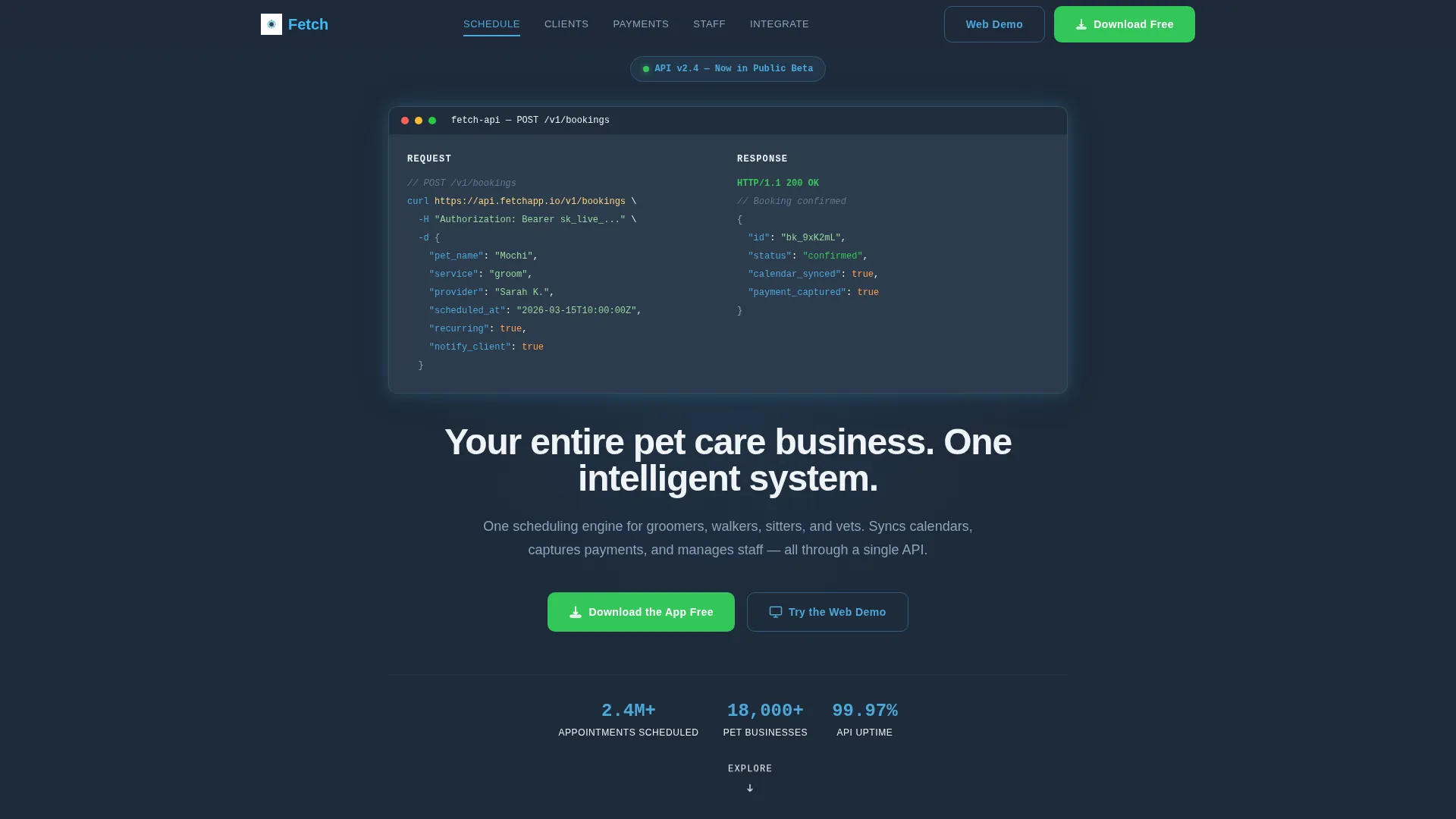
The page opens with a syntax-highlighted POST /bookings code snippet displayed center-frame against the deep slate background. A blinking cursor and line-by-line 200 OK response animation give the impression of a live deployment. The header headline types itself out beneath the code block.
Pinned Anchor Navigation
A sticky nav bar pins to the top of the viewport and holds five spoke labels: Schedule, Clients, Payments, Staff, and Integrate. Each label scrolls the visitor directly to its section. Active states render in clear-sky blue to show position within the page.
Interactive Spoke Sections
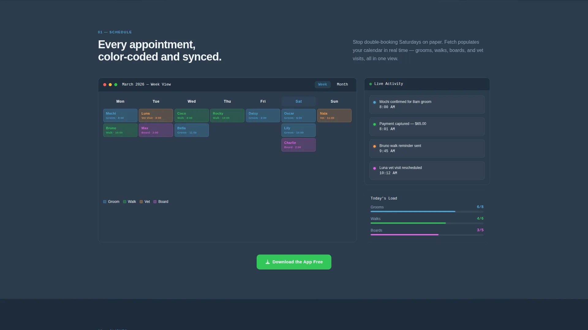
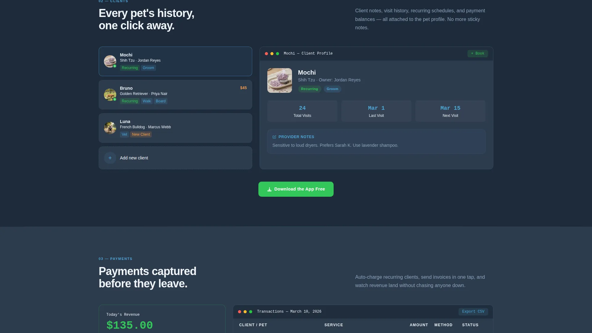
Each of the five spoke sections includes a micro-demo that responds to clicks and hovers. Visitors interact with calendar blocks, client notes, and payment confirmations before they ever read a headline. This hands-on exposure builds product familiarity during the scroll.
Kinetic Scroll Transitions
Section entrances use kinetic motion: cards fan out, calendar blocks populate with color-coded appointments, and notification badges animate into place. The pace accelerates through the page, giving the scroll a sense of momentum and live deployment energy.
Integration Constellation Section
The final spoke section renders a visual constellation of third-party service logos connecting dynamically to a central hub node. This communicates the platform's API-first architecture in a single, readable graphic moment.
Persistent App Download call to action
A confirmation-green "Download the App Free" button appears as a floating element on mobile, at the hub center, and after every spoke section. A secondary "Try the Web Demo" path gives desktop visitors an alternative entry point before committing.
Page sections overview
| Section | Purpose |
|---|---|
| Code Snippet Header | Opens the page with an animated API call and self-typing headline |
| Anchor Nav Bar | Pins to viewport top and links to all five spoke sections |
| Schedule Spoke | Shows unified calendar with color-coded appointment blocks |
| Clients Spoke | Displays synced pet profiles and client notes in context |
| Payments Spoke | Demonstrates payment confirmation flow and processing status |
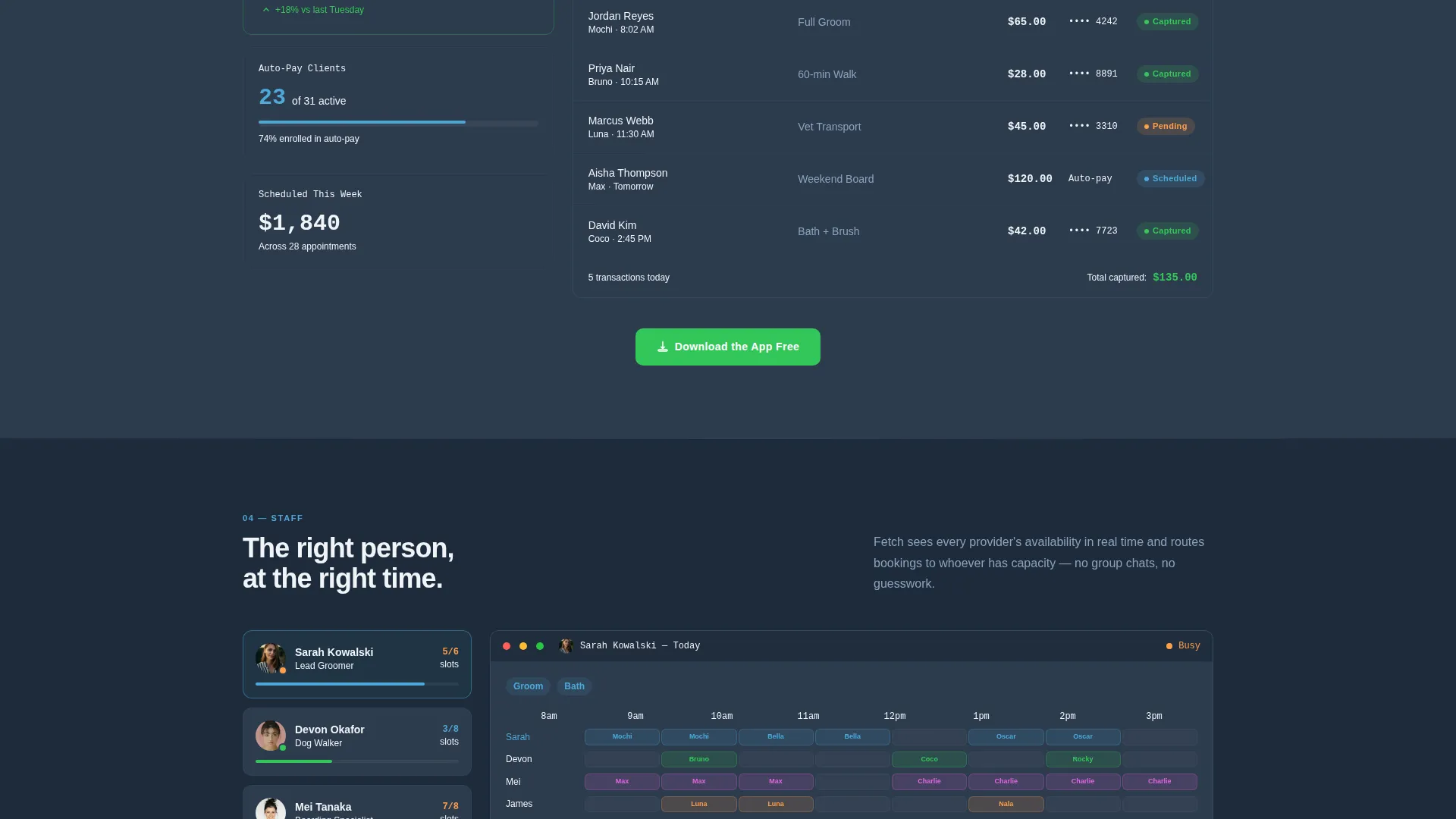
| Staff Spoke | Presents staff availability and assignment management |
| Integrate Spoke | Renders the third-party integration constellation and hub node |
| Hub call to action Center | Repeats the primary app download call to action at page center |
| Section-end calls to action | Places download and demo prompts after every spoke section |
Design & branding system
The visual identity follows a Data Command theme built around the Slate and Sky color system. The palette is intentionally dark and focused, illuminated only where user attention is needed.
- Deep terminal slate (#1E2A3A) as the primary background and operational charcoal (#2D3B4D) for surface layering
- Clear-sky blue (#4DA8DA) for all active states, interactive anchors, and navigation highlights
- Signal white (#F0F4F8) for content surfaces, with confirmation green (#34C759) reserved strictly for success states and the app download button
Mobile & speed optimization
The template is structured to deliver a clear mobile experience alongside the full desktop presentation. The primary conversion path is specifically adapted for smaller screens.
- The "Download the App Free" button pins as a floating element on mobile so the call to action is always reachable
- The anchor navigation and spoke layout are built to maintain clear visual hierarchy at all viewport sizes
- Kinetic transitions are scoped to section entrances, keeping motion purposeful rather than decorative
How this template helps you convert
The template earns the download by putting the product in the visitor's hands before asking for anything. Every design and layout decision points toward a single outcome.
- The interactive micro-demos in each spoke section let visitors experience scheduling, client notes, and payment flows directly, building genuine confidence in the product before they reach the call to action.
- The persistent confirmation-green download button and the secondary web demo path give visitors two clear, low-friction ways to move forward at any point in the scroll.
Other information about this template
This template is categorized under Technology, specifically within the Pet Care Software and Software as a Service subcategory. It is built as a hub-and-spoke single-page layout with an anchor navigation structure, matching the intersection of Launch Energy creative direction and the Data Command visual theme.
- The template style is Hub and Spoke with Anchor Navigation, designed for products that have multiple distinct feature areas to communicate in a single scroll
- The header concept is a Code Snippet, making it especially suited to API-first or developer-adjacent software products targeting technical or semi-technical buyers
- The landing page direction is App Download, meaning every layout decision, call to action placement, and visual hierarchy choice prioritizes driving visitors toward the mobile app install action
Theme
Data Command
Creative direction
Launch Energy
Color system
Slate & Sky
Style
Hub & Spoke (Anchor Nav)
Direction
App Download
Page Sections
Animated API Code Snippet Header
Sticky Anchor Navigation Bar
Interactive Micro-demos Per Section
Kinetic Scroll Transition System
Integration Constellation Visual
Persistent Multi-point Download Call to Action
Related questions
Who is this template designed for?
Can I adapt the spoke sections for my specific features?
What makes the header different from a standard hero section?
How does the app download call to action work across the page?
Is this template suitable for a software product that targets non-technical users?



