Pet Care Portal Landing Page Template
Fetch is a scroll-reveal pet care landing page template built for portals that help pet parents manage vet appointments, vaccinations, prescriptions, and boarding from one place. With a glassmorphic design system, progressive animations, and a comparison-driven layout, it gives pet care software a polished, conversion-focused first impression that feels instantly modern.
by Rocket studio
Quick summary
Fetch is a single-page, scroll-reveal landing page template for pet care customer portals. It combines a glassmorphic visual system with launch-energy animations and a versus-style comparison table to communicate the value of a unified pet management dashboard. The design speaks directly to multi-pet households, independent veterinarians, and pet sitters who need one reliable place for everything.
Who this template is for
This template is built for teams and professionals who need a high-impact landing page for a pet care portal product. It works equally well for early-stage software products and established pet care platforms looking to refresh their first impression.
- Multi-pet households juggling appointments across several vet clinics
- Small-practice veterinarians who want to compete with corporate chains
- Pet sitters and dog walkers who need real-time access to feeding schedules and allergy lists
What problem this template solves
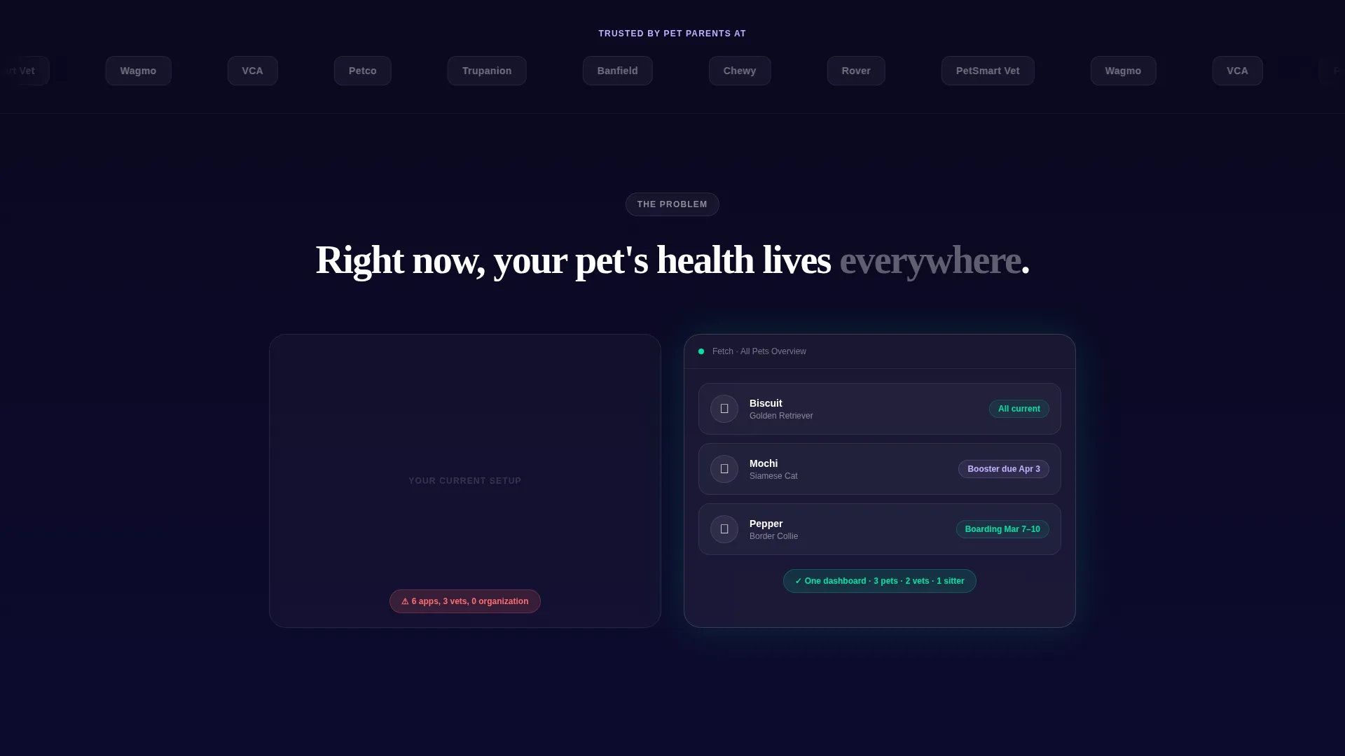
Pet care information is scattered. Vaccination records live in a drawer, appointment reminders arrive as texts, and prescription refills require a phone call. This template presents a clear case for why a single portal fixes that chaos, and it does so visually before a visitor reads a single line of copy.
- Communicates the contrast between the old fragmented way and a clean, unified dashboard
- Replaces abstract product claims with a tangible mock account visitors can explore
- Lowers signup friction with a progressive form that asks only for email and pet count first
What you get with this template
You get a complete, section-led landing page ready to deploy as a pet care portal marketing page. Every section is designed with a specific persuasion role, from credibility at the top to conversion at the bottom.
- A scroll-reveal layout where every section animates into view with progressive, accelerating timing
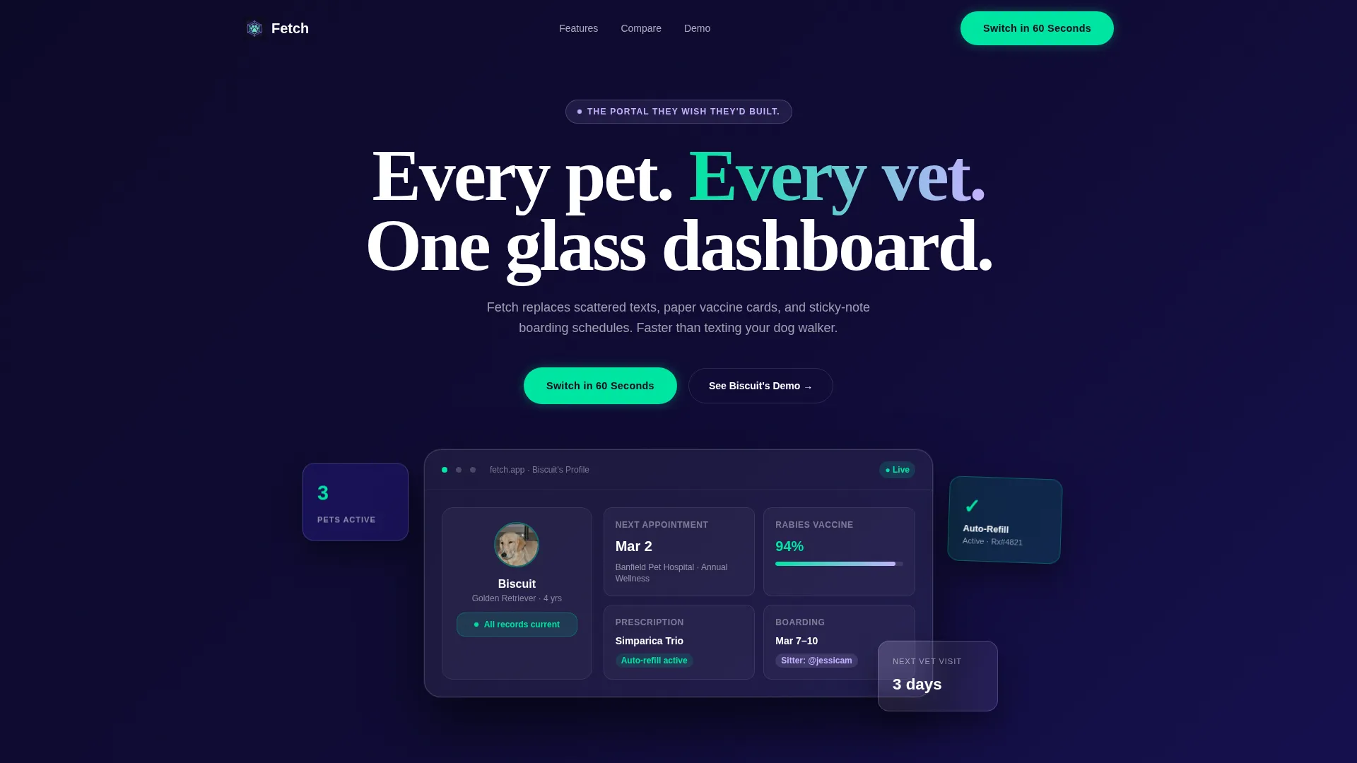
- A frosted-glass hero card featuring a realistic mock dashboard with pet profile details
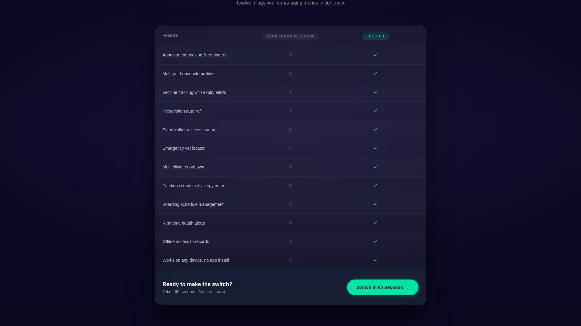
- A twelve-row comparison table, a sticky mobile call-to-action bar, and a zero-commitment interactive demo path
Feature list
This template includes a focused set of purposefully designed components. Each one serves the single goal of converting a visitor into a portal user.
Glassmorphic Dashboard Hero
The hero section features a frosted-glass card showing a realistic mock pet profile. Visitors see a golden retriever named Biscuit with a next vet visit, vaccine status, and active prescription refill displayed. The visual establishes product credibility before any copy does the work.
Scroll-Reveal Progressive Animations
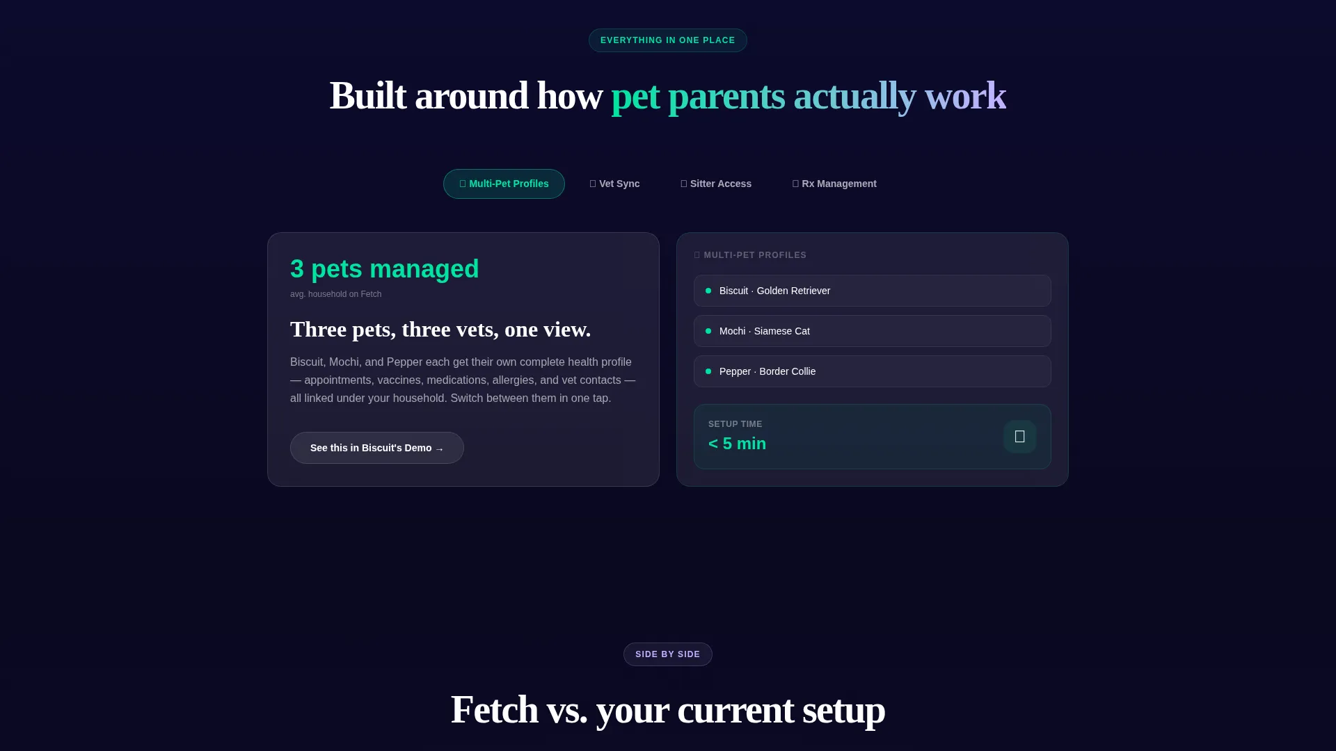
Every section arrives with a distinct entrance animation rather than simply appearing. Feature cards fly in with accelerating timing as the visitor scrolls deeper, building rhythm like a product launch countdown. The pacing tightens intentionally as the page progresses.
Versus Comparison Table
A frosted-glass comparison table anchors the lower third of the page. It compares the portal against a generic current setup across twelve rows covering appointment booking, vaccine tracking, multi-pet profiles, prescription management, sitter access sharing, and emergency vet location. The portal column pulses in electric mint while each checkmark appears with a micro-animation.
Interactive Demo Preview Path
A secondary call-to-action invites visitors to explore a fake pet profile before committing to signup. This zero-commitment preview lets users click through a sample account, building desire through direct interaction rather than static screenshots.
Progressive Signup Form
The signup form starts with just two fields: email address and number of pets. Pet names and current vet clinic fields appear only after the visitor completes the first field. This reduces the perceived effort of signing up and keeps early drop-off low.
Infinite-Scroll Logo Bar
The header opens with a horizontal parade of pet industry partner logos scrolling left in a continuous loop. A single line in soft lilac sits above the bar, and the frosted-glass hero card appears below it. The sequence establishes trust on arrival, before the product is explained.
Page sections overview
| Section | Purpose |
|---|---|
| Logo Bar Header | Establish instant credibility with industry partner logos |
| Lilac Tagline Line | Set tone with a single punchy positioning statement |
| Frosted Hero Card | Show a realistic mock dashboard to create product desire |
| Chaos Reveal Section | Contrast the old fragmented approach visually |
| Portal Assembly Reveal | Replace the chaos with the clean interface building itself |
| Accelerating Feature Cards | Highlight portal capabilities with timed scroll animations |
| Comparison Table | Pit the portal against a generic setup across twelve rows |
| Primary call to action Block | Drive signups with the "Switch in 60 Seconds" prompt |
| Demo Account Path | Offer a zero-commitment interactive pet profile preview |
| Progressive Signup Form | Capture email and pet count with a low-friction entry point |
| Sticky Mobile Bar | Keep the primary call to action visible during mobile scroll |
Design & branding system
The visual identity runs on a glassmorphic color system built around layered depth and luminance. Backgrounds shift from deep launch-night indigo to near-black as the visitor scrolls, while frosted cards float above with one-pixel luminous borders.
- Core palette: translucent frost white at 40% opacity, deep indigo (#1B1464), electric mint (#00E5A0) for actions and success states, and soft lilac (#C4B1FF) as a glow accent behind cards and modals
- Depth is created through blur and luminance rather than hard shadows, giving every surface a freshly wiped smartphone screen quality
- The mint color activates on success states and primary actions, so the visitor's eye follows the intended path through the page
Mobile & speed optimization
The template is designed with a mobile-first interaction layer. The sticky bottom bar keeps the primary call to action reachable at any scroll position on smaller screens.
- The progressive form flow works on touch screens, expanding new fields only after the first field is completed
- Scroll-reveal animations are timed to feel responsive rather than delayed, maintaining the sense of momentum on all device sizes
How this template helps you convert
The layout follows a deliberate persuasion sequence. Every design decision serves a specific conversion role, from the first logo that appears to the final form field.
- The logo bar and mock dashboard hero build trust and product desire before any claim is made, removing the skepticism a visitor brings to a new product page.
- The chaos-to-clarity reveal sequence makes the problem visceral and the solution obvious, so the comparison table that follows feels like a natural conclusion rather than a sales pitch.
- The dual call-to-action structure gives hesitant visitors a low-risk path through the interactive demo, while committed visitors can go straight to the progressive signup form.
Other information about this template
This template is categorized under Technology with a focus on the Pet Care Software and SaaS subcategory. It is built specifically for the pet care customer portal niche, and its design system, animation style, and layout choices all reflect that context.
- The Startup Velocity theme and Launch Energy creative direction make this template well suited to product launches and beta waitlist campaigns
- The Scroll Reveal (Progressive) template style means each section has a distinct entrance, making the page feel like a live product demonstration rather than a static brochure
- The Comparison/Versus landing page direction is especially effective for portals entering a market where the main competitor is a disorganized manual setup rather than a named rival product
Theme
Startup Velocity
Creative direction
Launch Energy
Color system
Glassmorphic
Style
Scroll Reveal (Progressive)
Direction
Comparison/Versus
Page Sections
Glassmorphic Dashboard Hero Card
Scroll-reveal Progressive Animations
Twelve-row Comparison Table
Interactive Demo Account Path
Progressive Signup Form
Infinite-scroll Logo Bar
Related questions
Can I customize the mock pet profile shown in the hero card?
How does the progressive signup form work?
Can the comparison table rows be edited?
Is this template suitable for a product launch or beta waitlist campaign?
Where does the interactive demo call-to-action link?



