Fetch - Trusted Veterinary Landing Page Template
Fetch is a split-screen veterinary directory landing page template built for mobile app promotion. It pairs a simulated clinic search map with a live pet profile card, guiding worried pet owners from search to signup in just a few taps. With a freemium conversion flow and a clean Slate and Sky visual system, it turns a first visit into a confident action.
by Rocket studio
Quick summary
Fetch is a single-page, split-screen landing page template designed to promote a veterinary mobile app. It places a simulated clinic finder beside a live pet health wallet, walking visitors through the product before asking them to sign up. The design is calm, modern, and built around a freemium conversion path that delivers value first.
Who this template is for
This template is built for founders and product teams launching a veterinary mobile app to general pet-owning audiences. It works equally well for teams targeting consumer pet owners and veterinary professionals as separate audience segments.
- Mobile app developers and product marketers in the veterinary software space
- Startup teams promoting a pet care directory or clinic-finder application
- Veterinary professionals wanting a dedicated "Add Your Clinic" acquisition path
What problem this template solves
Finding a trusted veterinarian at the wrong hour is stressful. Most app landing pages describe features instead of showing them, leaving anxious pet owners with no reason to stay or sign up. This template removes that friction.
- Visitors explore a guided product simulation before committing, so the download feels like a natural next step
- The two-step signup form asks only for zip code and pet type first, lowering the barrier to entry
- A clean split between pet-owner and clinic-provider funnels keeps the call to action relevant for every visitor type
What you get with this template
You get a fully structured, single-page layout that doubles as an interactive product demo. Every section is crafted to move a visitor from curiosity to conversion without relying on stock lifestyle photography.
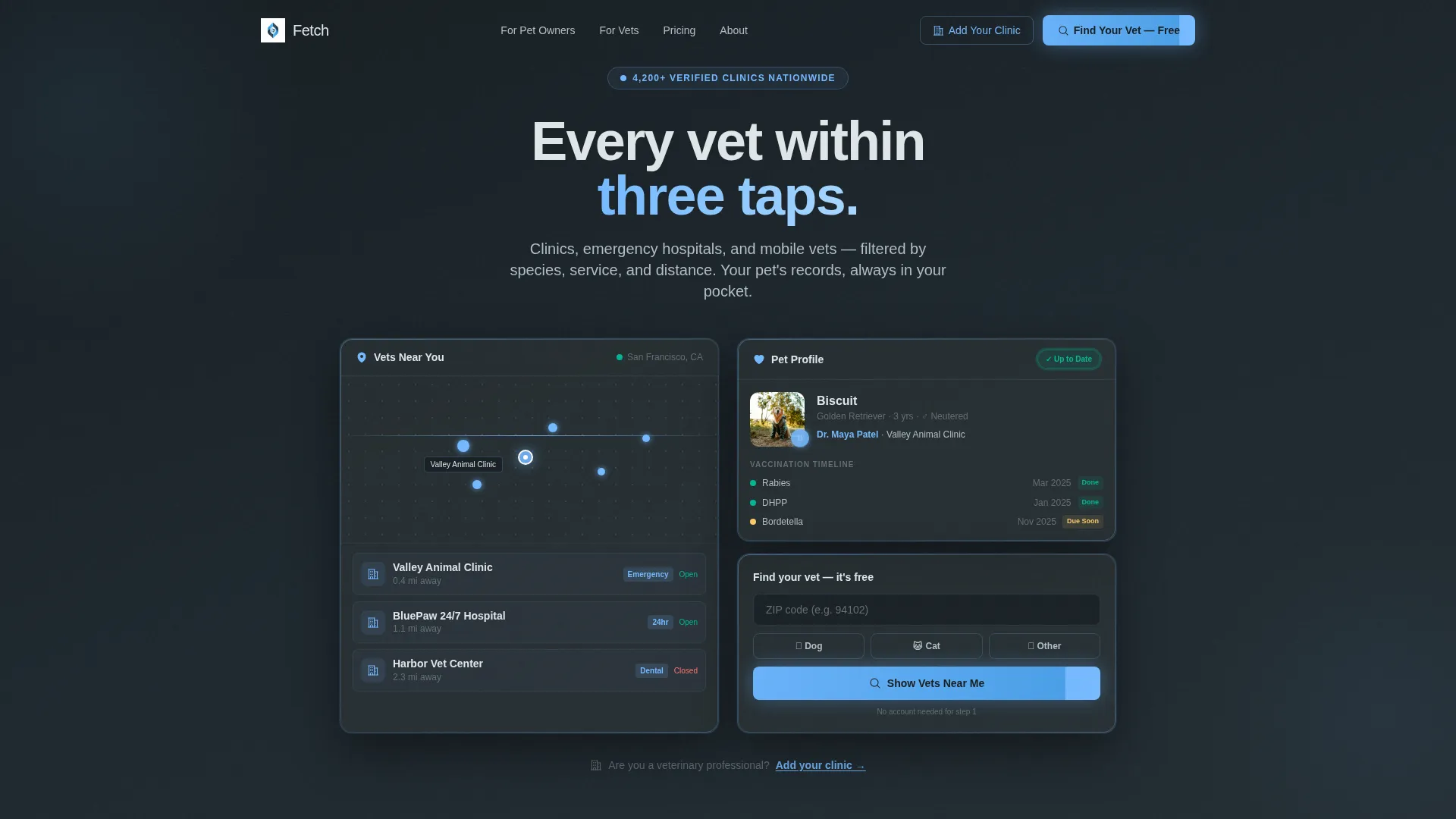
- A 50/50 split-screen header with a frosted Dark Glass Panel design showing a clinic search map and a pet profile card
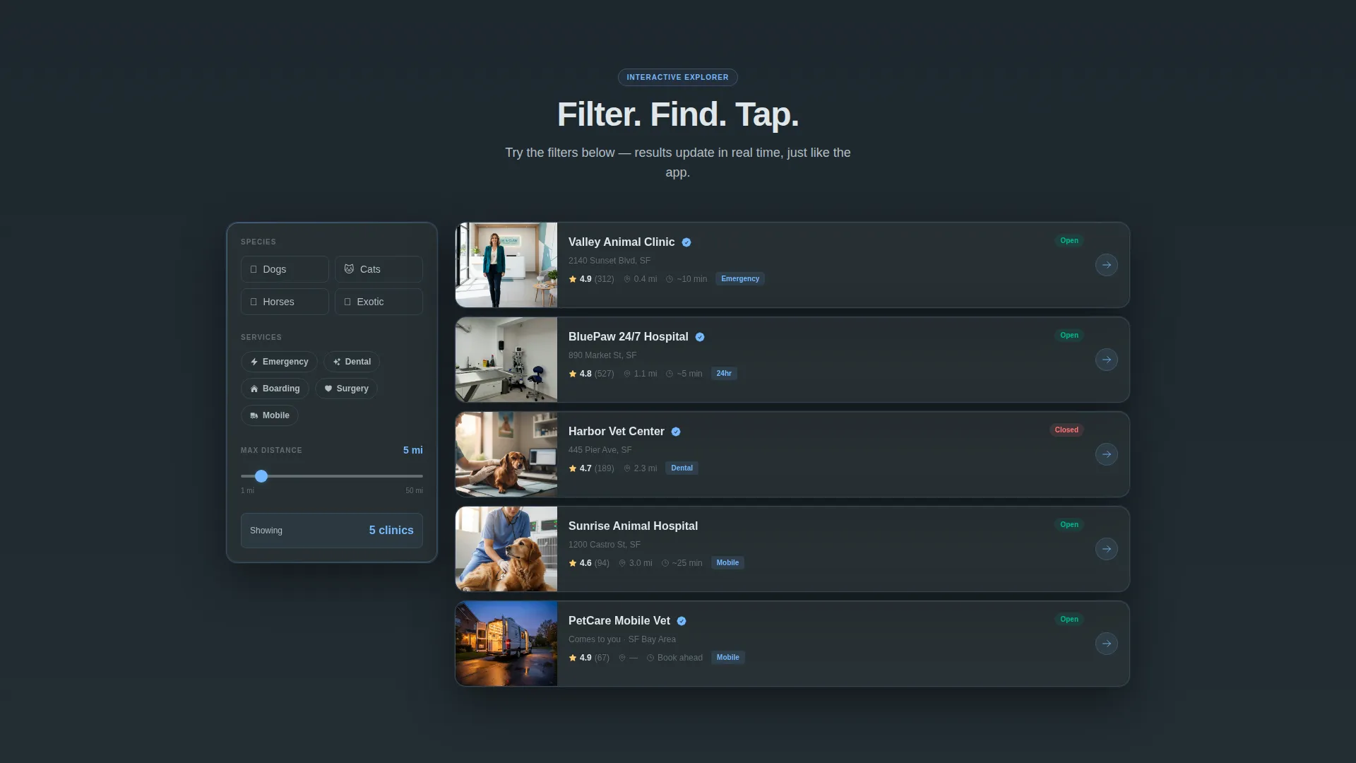
- An Interactive Explorer scroll flow with live-filter sidebar, animated search results, and layered feature reveals
- A two-step freemium signup form paired with a secondary "Add Your Clinic" path for veterinary professionals
Feature list
This template comes with carefully considered components built around the needs of a veterinary app launch. Each section earns its place.
Split-Screen Header Layout
The header divides the viewport into two equal panels. The left panel shows a clinic search map with glowing blue location pins. The right panel displays a pet profile card with a photo, vaccination timeline, and an "Up to Date" status badge. No lifestyle photography is needed because the product interface is the visual.
Interactive Explorer Scroll Flow
As visitors scroll, they interact with a guided simulation of the app. A live-filter sidebar on the left offers species toggles, service filters, and a distance slider. The right panel responds with animated search results. This design lets visitors feel the product before they download it.
Layered Feature Reveal Sections
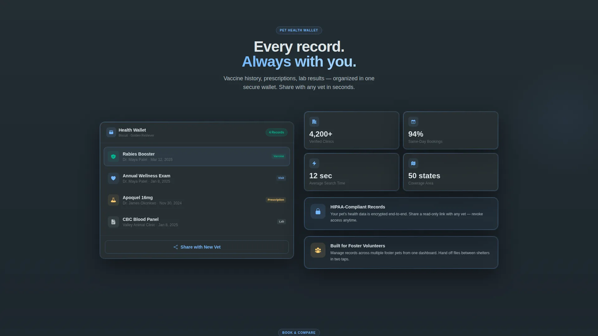
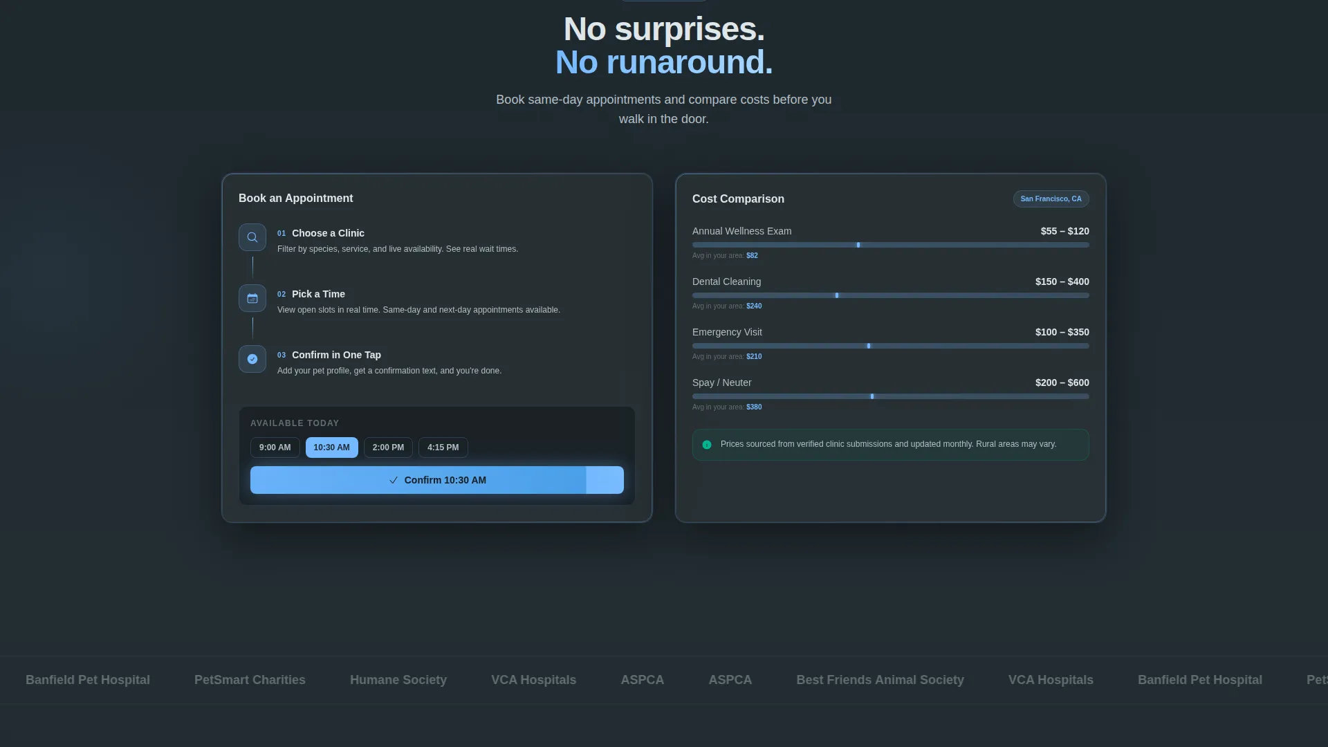
Each scroll section uncovers a deeper layer of the app: clinic profiles with verified reviews, a pet health wallet, an appointment booking flow, and a cost-comparison tool. Visitors discover features progressively rather than reading a static list.
Two-Step Freemium Signup Form
The primary conversion path is built around a two-step form. Step one asks only for zip code and pet type. Step two, shown after results appear, collects email and name. Value is delivered before credentials are requested, which reduces drop-off at the form.
Dual Conversion Funnel
Two calls to action serve two distinct audiences. "Find Your Vet - Free" targets pet owners seeking clinic access. "Add Your Clinic" targets veterinary professionals who want to list their practice. Both paths are visible and clearly separated throughout the page.
Frosted Dark Glass Panel Design
The header uses two translucent, frosted-glass cards floating over a deep slate background. Subtle gradient lighting along each panel edge creates the impression of a premium device screen suspended in space. The effect communicates quality without requiring custom photography.
Page sections overview
| Section | Purpose |
|---|---|
| Split-Screen Header | Introduce app via dual frosted glass panels with map and pet profile |
| Primary call to action Block | Anchor "Find Your Vet - Free" button above the fold |
| Interactive Filter Sidebar | Let visitors toggle species, services, and distance in a live simulation |
| Animated Search Results | Show real-time response to filter selections in the right panel |
| Clinic Profile Reveal | Display verified clinic profiles with reviews as visitors scroll |
| Pet Health Wallet | Present vaccination records and health history storage feature |
| Appointment Booking Flow | Walk visitors through the in-app scheduling experience |
| Cost Comparison Tool | Demonstrate the clinic cost-comparison feature layer |
| Secondary call to action Block | Repeat "Find Your Vet - Free" after the interactive explorer |
| Provider Signup Path | Offer "Add Your Clinic" entry point for veterinary professionals |
| Two-Step Form | Collect zip code and pet type first, then email and name |
Design & branding system
The visual identity follows a Directory and Discovery theme built on the Slate and Sky color system. Every color choice reinforces the feeling of a clean, modern clinic viewed through a calm, overcast morning window.
- Deep charcoal slate (#2D3436) for primary backgrounds, clinical blue-gray (#636E72) for secondary surfaces, open-sky blue (#74B9FF) for interactive highlights and active states, and soft cloud white (#DFE6E9) for card surfaces and text fields
- Frosted translucent glass panels with subtle gradient edge lighting create a premium device-screen aesthetic without photography
- The overall palette reads as professional without being clinical, and calm without feeling cold
Mobile & speed optimization
The split-screen layout is engineered to translate naturally to smaller screens, matching the mobile-first context of its target audience. A pet owner searching for a vet at midnight is almost always on a phone.
- The 50/50 split adapts to a stacked single-column flow on narrow viewports, keeping both panels readable and tappable
- Interactive filter elements and the two-step form are sized for thumb-friendly use without requiring pinch or zoom
- The guided simulation scroll flow is structured so each section loads as a discrete visual layer, keeping the experience smooth on mobile connections
How this template helps you convert
Every design and copy decision in this template points toward one outcome: turning a first-time visitor into an active app user or a listed clinic provider. The conversion logic is built into the structure itself.
- The Interactive Explorer places the visitor inside the product immediately, making the download feel like a continuation of something they have already started rather than a new commitment.
- The two-step form withholds the email field until after results are shown, so the visitor has already received value and has a concrete reason to complete the signup.
- The dual-funnel structure means every visitor sees a call to action that matches their role, whether they are a pet owner looking for care or a veterinary professional seeking new clients.
Other information about this template
This template is part of the broader veterinary software and SaaS category, sitting at the intersection of consumer mobile app marketing and professional directory tools. It is well suited for teams building in the veterinary mobile app niche who need a single, high-converting page to anchor their launch or growth campaign.
- The template style is Split Screen (50/50), and the page type is a single landing page, not a multi-page website
- The creative direction is Interactive Explorer, meaning the scroll experience itself acts as the product demonstration
- The header concept is Dark Glass Panels, a design choice that positions the app as a premium product using interface visuals rather than stock imagery
- The conversion direction is Freemium and Trial, with a primary free-access path and a secondary professional onboarding path running in parallel
Theme
Directory & Discovery
Creative direction
Interactive Explorer
Color system
Slate & Sky
Style
Split Screen (50/50)
Direction
Freemium/Trial
Page Sections
Split-screen Header with Glass Panels
Interactive Explorer Scroll Flow
Layered Feature Reveal Sections
Two-step Freemium Signup Form
Dual Conversion Funnel
Frosted Dark Glass Panel Aesthetic
Related questions
Who is this template designed for?
Does this template include a working app or live database?
Can I change the colors and branding to match my product?
Why does the signup form use two steps instead of one?
Is this template suitable for multi-species or rural veterinary contexts?



