Fieldwork — Swift Operations Landing Page Template
Dispatch is a modular card grid landing page built for mobile beauty platforms that route stylists, estheticians, and massage therapists to homes, hotels, and event venues. It combines a dark Startup Velocity visual theme with animated feature cards, a live code-snippet header, and a freemium signup flow designed to turn overwhelmed field service operators into confident, paying users.
by Rocket studio
Quick summary
Dispatch is a single-page landing page template for salon and spa field service management platforms. It uses a modular card grid layout, animated version-reveal scroll behavior, and a code-snippet hero to communicate real-time scheduling power. The design targets mobile beauty business owners who manage independent contractors in the field and need to replace manual coordination with a smarter dispatch engine.
Who this template is for
This template is built for founders, operators, and product teams building software for the mobile beauty industry. It speaks directly to business owners managing five to fifty independent contractors across scattered locations.
- Mobile beauty platform operators who route stylists, estheticians, and massage therapists to clients
- Software teams launching a salon and spa field service management product and needing a conversion-focused landing page
- Growth marketers running freemium or free-trial acquisition campaigns for scheduling or dispatch tools
What problem this template solves
Managing a mobile beauty team without dedicated software means constant friction. Last-minute rebookings over group texts, revenue lost to no-shows, and Sunday-night route-building drain time and focus from running the actual business.
- Operators lack a clean way to show prospects how their dispatch platform works before asking for a signup
- A generic landing page cannot convey real-time scheduling speed or the "product in motion" feeling that earns trust
- No visual hierarchy exists to separate entry-level features from advanced capabilities like route optimization and automated rebooking
What you get with this template
You get a fully structured, single-page layout that walks visitors through a software product launch experience. Every section is built to communicate capability, build momentum, and close on a low-friction freemium signup.
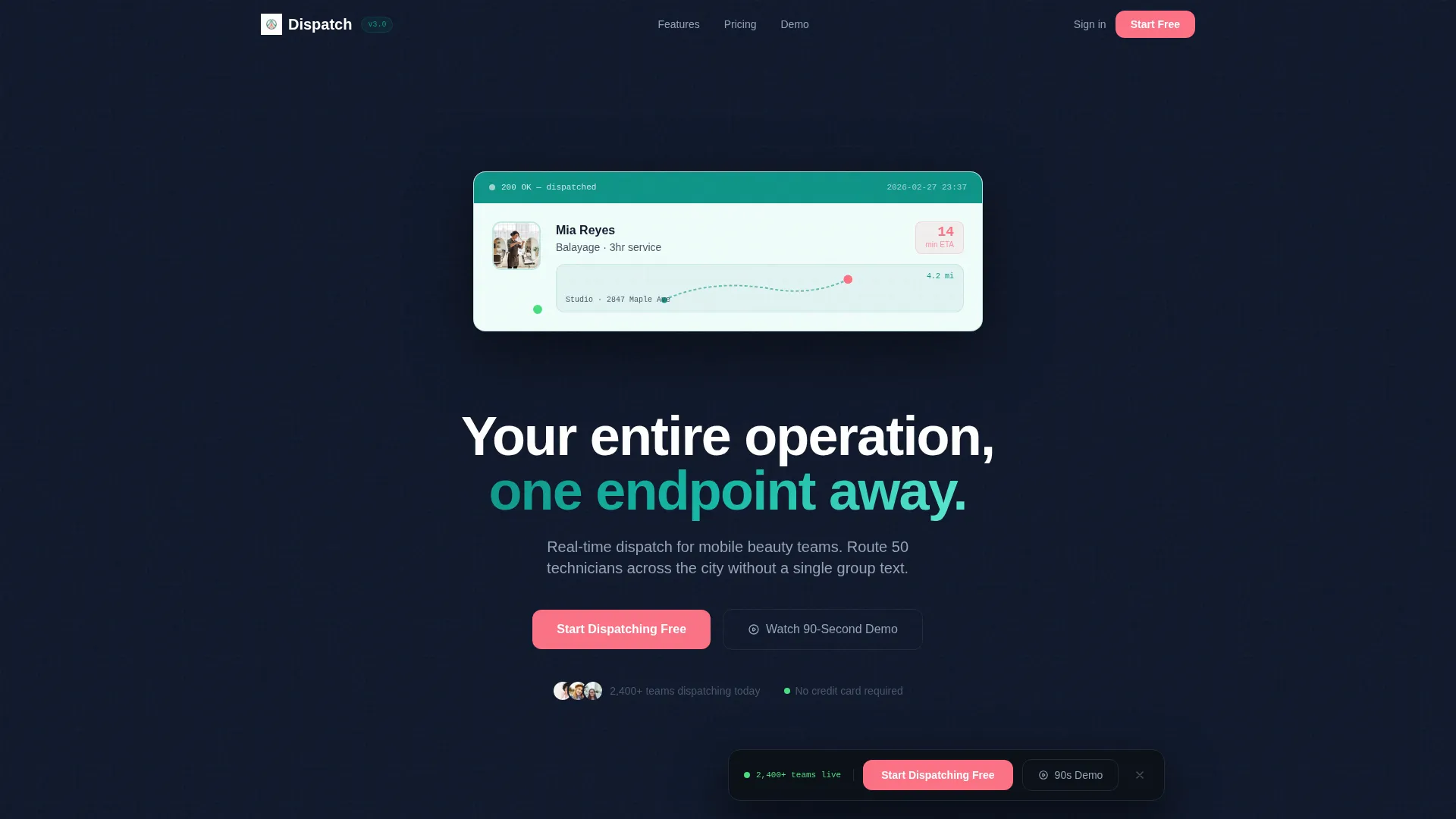
- An animated code-snippet hero section that transitions from a live API call to a clean appointment card with a map pin
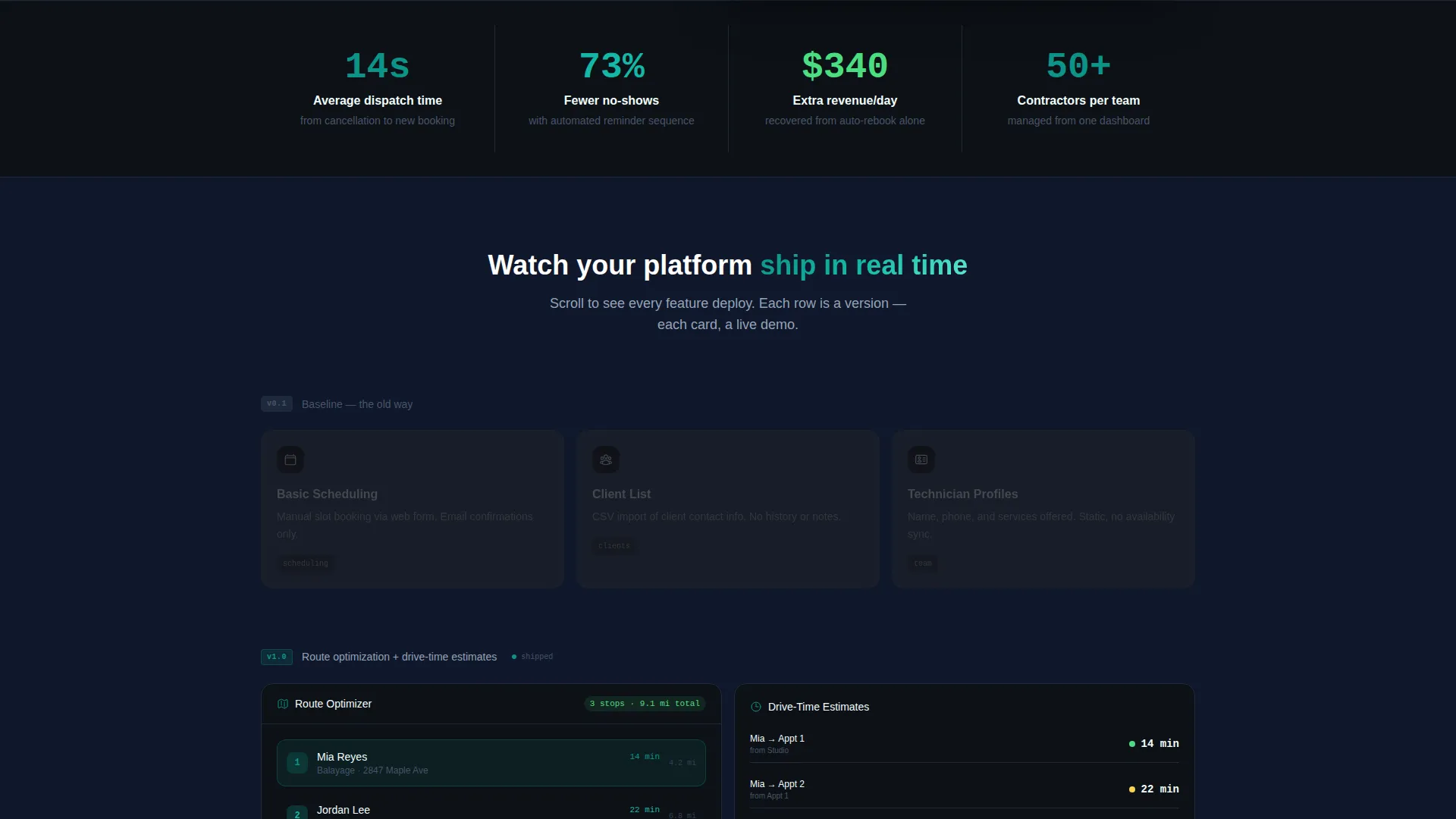
- A versioned card grid system where rows snap in with micro-animations as the visitor scrolls, simulating a product shipping features in real time
- A floating bottom bar with a primary coral call-to-action button and a ghost-outlined demo button, activating after the second card row
Feature list
This section covers the core built-in capabilities included in the Dispatch template.
Animated Code-Snippet Hero
The header opens with a syntax-highlighted POST request that types itself line by line. A 200 OK response flashes, then the entire code block dissolves into an appointment card showing the technician's name, service details, and a pulsing map pin. The headline fades in beneath: "Your entire operation, one endpoint away."
Versioned Card Grid Layout
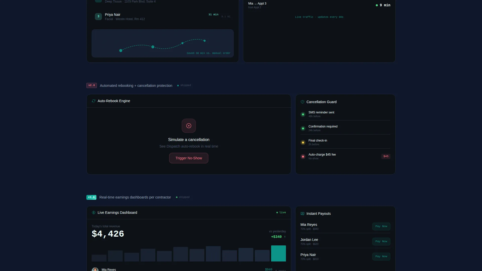
Cards are organized into rows tagged v0.1 through v3.0. Each row introduces a new capability tier: basic scheduling, route optimization, automated rebooking, and real-time earnings dashboards. Rows snap in with micro-animations as the visitor scrolls, making the product feel like it is evolving live on the page.
Interactive Mini-Demo Cards
Every feature card functions as a micro-interaction rather than a static screenshot. Visitors can engage with each card to experience the tool in a simulated way before they ever reach the signup form. This means the call to action arrives after the visitor has already imagined using the product.
Floating Conversion Bar
A sticky bottom bar pins the primary call-to-action to the viewport after the second card row. It holds two paths: "Start Dispatching Free" in hot coral and "Watch a 90-Second Demo" as a ghost-outlined secondary button. The bar stays visible throughout the scroll, removing the need to hunt for the signup.
Single-Step Signup Form
Clicking the primary call-to-action opens a streamlined one-step form. It collects business name, technician count via a slider from 1 to 50 plus, and an email address. No credit card is required, keeping the entry barrier as low as possible for freemium conversion.
Teal Catalyst Color System
The color system pairs deep teal as the primary action color with near-black slate backgrounds, cool mist white card surfaces, and hot coral reserved for notifications and urgency badges. The palette communicates both the precision of a developer tool and the warmth expected from a beauty services brand.
Page sections overview
| Section | Purpose |
|---|---|
| Code Snippet Hero | Opens with a live-typed API call that resolves into an appointment card and headline |
| Version Row v0.1 | Establishes the baseline: basic scheduling, client list, technician profiles |
| Version Row v1.0 | Introduces route optimization and drive-time estimates with a snap-in animation |
| Version Row v2.0 | Reveals automated rebooking triggered by cancellations |
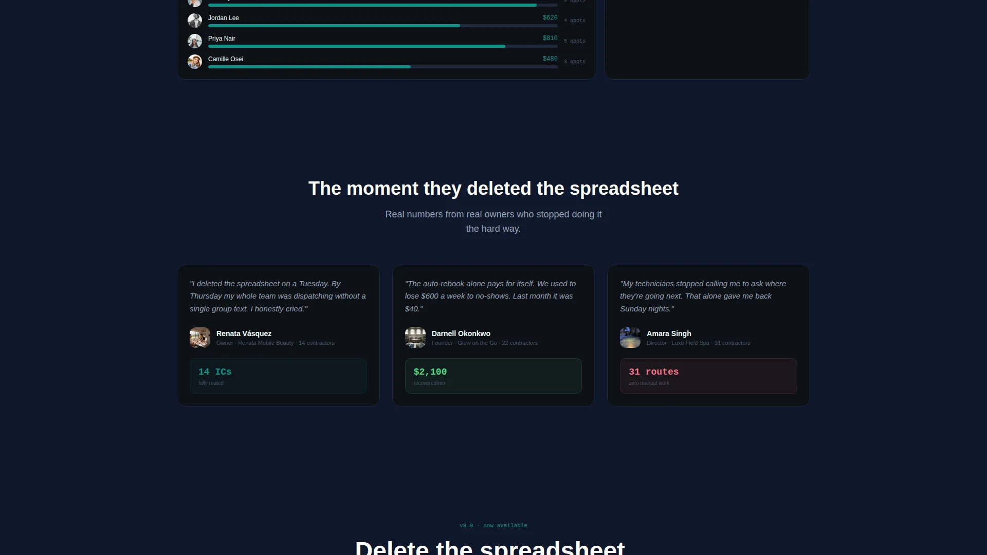
| Version Row v3.0 | Shows real-time earnings dashboards per contractor |
| Floating call to action Bar | Pins primary and secondary conversion actions to the bottom of the viewport |
| Freemium Signup Form | Single-step form collecting business name, technician count, and email |
Design & branding system
The Dispatch template uses a Startup Velocity theme expressed through the Teal Catalyst color system. The visual language is dark and focused, borrowing cues from developer tools while staying grounded in beauty industry warmth.
- Deep launch-pad teal (#0D9488) for primary buttons and key interactive elements, near-black slate (#0F172A) for section backgrounds, and cool mist white (#F0FDFA) for card surfaces
- Hot coral (#FB7185) used exclusively for notification badges, urgency indicators, and the primary call-to-action button to draw the eye at critical decision moments
- Syntax-highlighted typography in the hero section gives the page a terminal aesthetic that immediately signals a modern, technically capable platform
Mobile & speed optimization
The modular card grid structure is built to perform across screen sizes. Each card row is self-contained, making the layout naturally adaptable to narrower viewports without breaking the versioned scroll narrative.
- Card modules stack cleanly on smaller screens, preserving the version-reveal animation sequence and the scroll-triggered snap-in behavior
- The floating conversion bar remains pinned and accessible on mobile, keeping the primary call-to-action reachable without requiring the visitor to scroll back to the top
- The single-step signup form uses a slider input that functions smoothly on touch devices, reducing friction for mobile visitors completing the freemium signup
How this template helps you convert
The Dispatch template is engineered around a single conversion insight: visitors who experience the product before the signup form are far more likely to complete it. Every design and content decision supports that principle.
- The animated hero dissolves from a technical API call into a friendly appointment card, bridging the gap between developer credibility and everyday usability in the first ten seconds of the visit.
- The versioned card grid builds momentum section by section, so by the time the visitor reaches the floating call-to-action bar, they have already watched the product grow from basic scheduling into a full dispatch engine.
- The two-path conversion bar removes hesitation by offering a zero-commitment demo alongside the freemium signup, catching both ready-to-act visitors and those who need one more proof point.
Other information about this template
The Dispatch template is a strong fit for teams positioning their salon and spa field service management platform against manual coordination workflows. It is also well-suited for product launches where the goal is to demonstrate capability quickly and collect free-trial leads at scale.
- The template is built on a card grid (modular) structure, making individual sections easy to reorder, replace, or extend as the product roadmap evolves
- The Launch Energy creative direction means the page works especially well for early-stage platforms that want to communicate momentum and product velocity to early adopters
- The freemium and free-trial conversion model built into the page aligns naturally with the no-credit-card signup flow, reducing drop-off at the final conversion step
- Color tokens and version labels are editable, so teams can adapt the v0.1 to v3.0 roadmap narrative to reflect their own feature release sequence
Theme
Startup Velocity
Creative direction
Launch Energy
Color system
Teal Catalyst
Style
Card Grid (Modular)
Direction
Freemium/Trial
Page Sections
Animated Code-snippet Hero Section
Versioned Card Grid with Scroll Animations
Interactive Feature Cards
Floating Dual-path Conversion Bar
Single-step Freemium Signup Form
Teal Catalyst Color System
Related questions
What kind of business is this landing page built for?
Does this template include the signup form and call to action bar?
Can I change the version labels and card content?
Is a credit card required in the signup flow shown on the page?
How does the animated hero section work?



