Premium & Landing Page Template
Pixel is a Figma landing page template built for interface design courses that teach the way real studios work. It uses a zigzag case study layout, a botanical color palette, and an event registration flow to move visitors from curious to enrolled. The design feels as organized as the course it promotes, every section intentional, every element in its place.
by Rocket studio
Quick summary
Pixel is a single-page Figma template designed for interface design course creators. It follows a zigzag alternating layout driven by a real-world case study narrative. The botanical color system, editorial header, and event registration structure combine to create a landing page that earns trust before it asks for a click.
Who this template is for
This template was designed for course creators, independent design educators, and studio professionals who want to promote a live cohort or skills course online. It works especially well when the audience is designers and developers who respond to proof over promises.
- Interface design instructors launching a live cohort with limited enrollment seats
- Product and user experience educators who want their course page to reflect the quality of their teaching
- Developers or career-switchers who create courses targeting logic-minded learners new to layout thinking
What problem this template solves
Most course landing pages feel generic. They lead with credentials, bury the curriculum, and ask for a sign-up before the visitor has any reason to trust the offer. This template solves that by leading with visual proof and building the argument section by section.
- The case study narrative shows transformation in real time, so visitors understand exactly what they will learn before they reach the form
- The zigzag module structure presents a clear before-and-after arc, replacing abstract promises with concrete skill progression
- The dual conversion path captures both ready-to-commit visitors and those who need a lower-stakes first step
What you get with this template
This template delivers a complete, structured landing page layout ready to customize inside Figma. Every section is organized, labeled, and designed with the course visitor journey in mind.
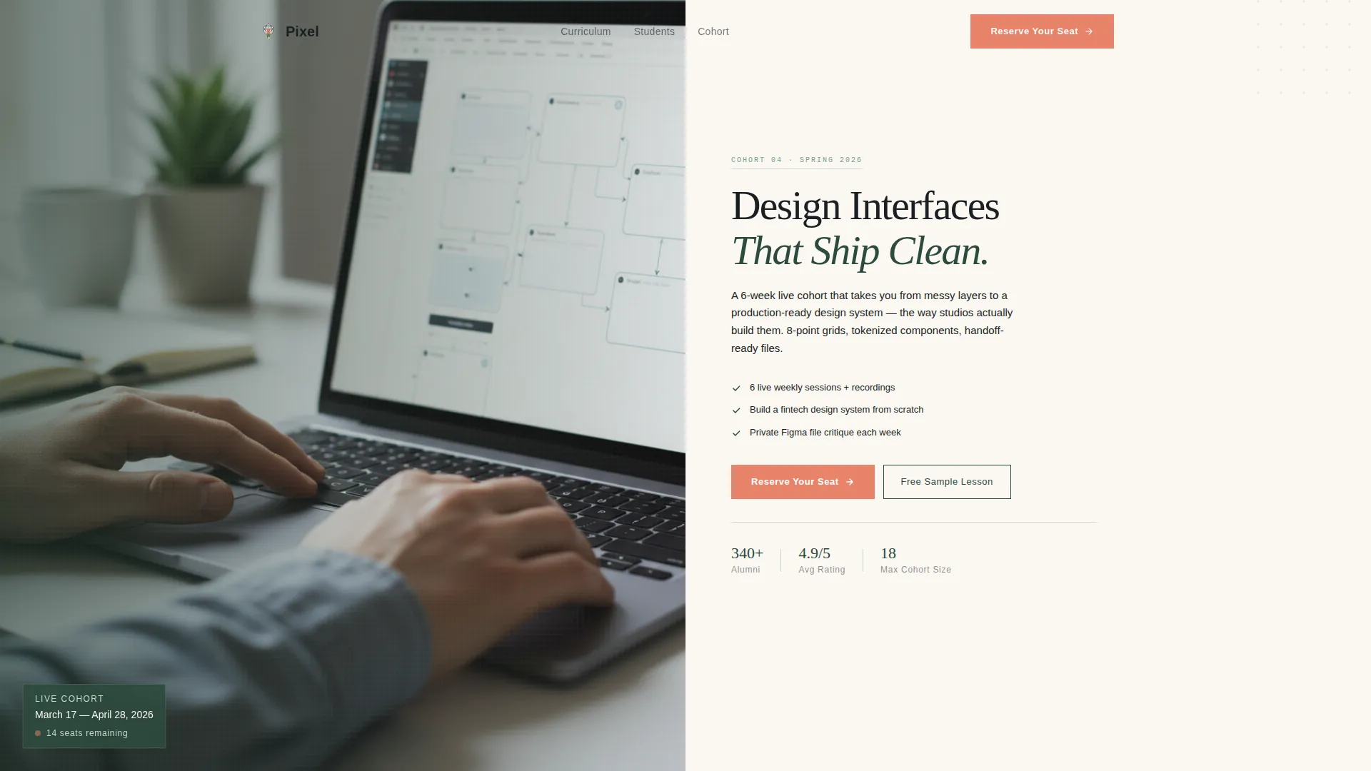
- A half-page editorial header with a photo and text split, a headline, cohort date subline, and a primary coral registration button
- A full zigzag alternating section layout tracing a fintech dashboard from rough wireframe to polished developer-ready file across four course module reveals
- A single-step registration form with a name field, email field, and a "What describes you best?" dropdown, plus a secondary free sample lesson capture path
Feature list
This section covers the core design and structural capabilities included in the Pixel template.
Editorial Half-Page Header
The header splits into two equal halves. The left side holds an over-the-shoulder photograph showing a complex Figma component library on screen. The right side carries the headline "Design Interfaces That Ship Clean," a live cohort date subline, and a single coral call-to-action button. The composition is calm, competent, and editorial in feel.
Zigzag Case Study Layout
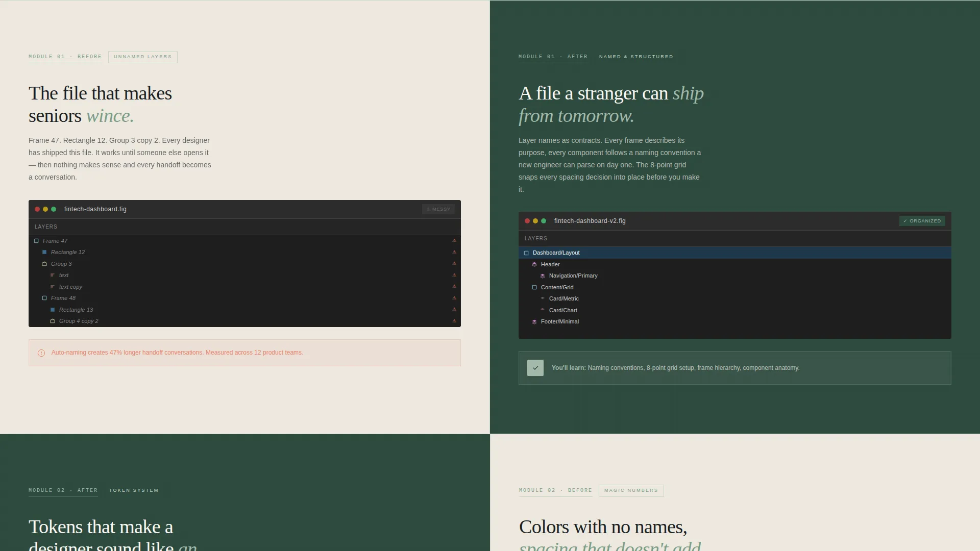
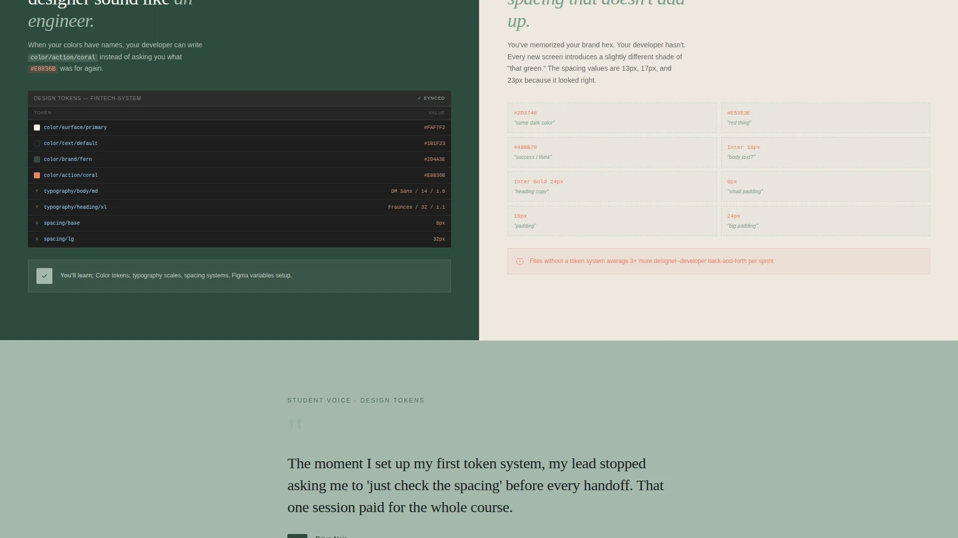
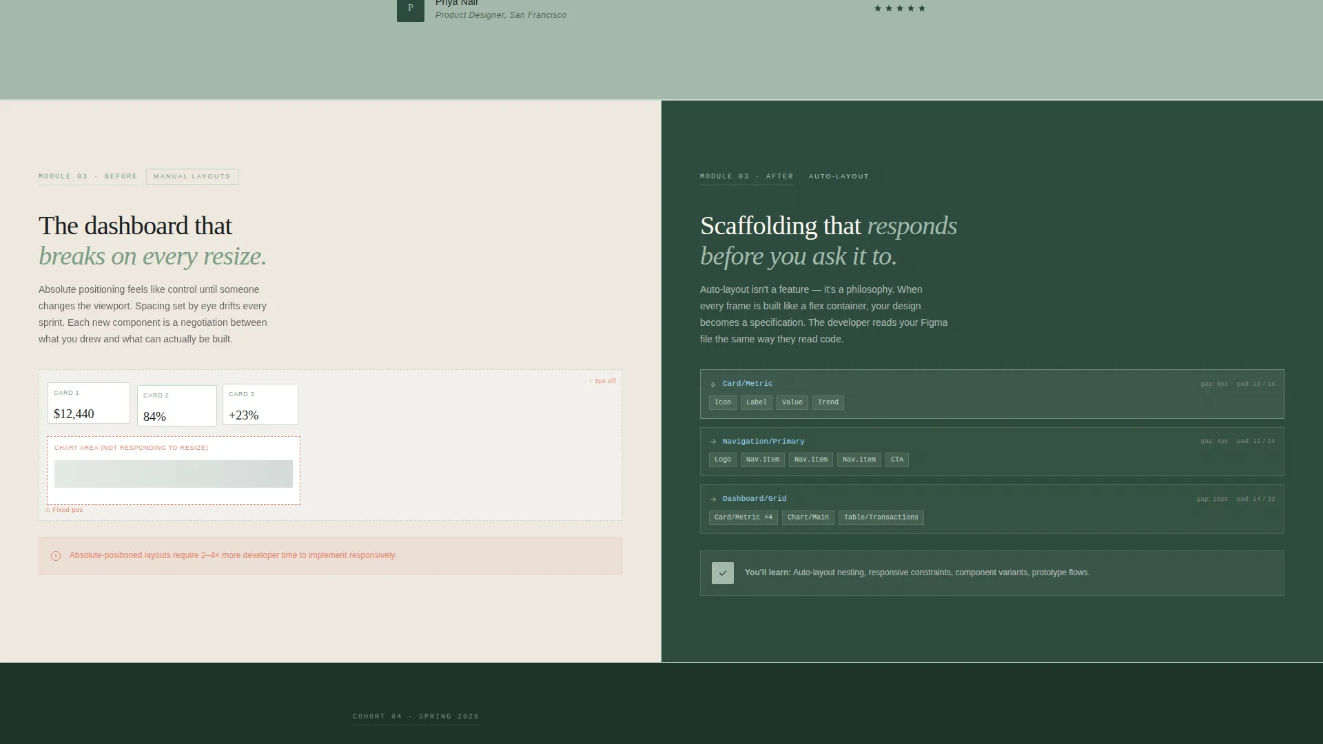
Each alternating section represents one course module. The left side shows a messy "before" state with loose wireframes and unnamed layers. The right side reveals the polished "after" with tokenized components, responsive auto-layout, and annotated handoff screens. The narrative escalates from typography systems through to a full design system.
Student Quote Breaks
Between module reveals, short student quote blocks appear on sage-colored backgrounds. Each quote names a specific skill that changed that student's workflow. These breaks add social proof at natural scroll pauses without interrupting the case study momentum.
Dual Conversion Path
The primary call to action, "Reserve Your Seat," appears in the header, resurfaces after the third module section, and locks into a sticky bottom bar on mobile. A secondary path offers a free sample lesson download, capturing email in exchange for a ten-minute auto-layout walkthrough video.
Single-Step Registration Form
The registration form keeps friction low with just three fields: name, email, and a descriptive dropdown. Dropdown options include self-taught designers, developers learning design, and junior designers preparing for their first product role. This segmentation makes follow-up communication more relevant without adding form complexity.
Botanical Color System
The palette uses deep fern for headers and section backgrounds, warm ivory as the base, muted sage for secondary containers and hover states, and blackthorn for body text. Living coral appears only on calls to action and progress indicators. Every color choice is deliberate, creating a design studio atmosphere that feels structured and confident.
Page sections overview
| Section | Purpose |
|---|---|
| Editorial Split Header | Introduces the course with a photo, headline, cohort date, and primary registration button |
| Module One Reveal | Shows typography system transformation from loose wireframes to named components |
| Student Quote Block | Delivers peer social proof on a sage background between module sections |
| Module Two Reveal | Presents color token progression with before-and-after alternating layout |
| Student Quote Block | Reinforces workflow change with a specific named skill from a student |
| Module Three Reveal | Demonstrates interactive prototyping transformation and annotated handoff screens |
| Sticky call to action Resurface | Re-presents "Reserve Your Seat" after the third module for engaged scroll visitors |
| Module Four Reveal | Completes the case study arc with a full design system as the final course output |
| Registration Form | Captures name, email, and audience segment in a single low-friction step |
| Free Lesson Capture | Offers a sample auto-layout video download as a secondary email capture path |
Design & branding system
The visual identity follows a Corporate Precision theme expressed through a Botanical color palette. The result feels like a design studio inside a glasshouse, structured and purposeful, with quiet warmth.
- Deep fern (#2D4A3E) anchors headers and dark section backgrounds; warm ivory (#FAF7F2) provides breathing room through the middle sections; muted sage (#A3B9AA) frames secondary containers and hover states; blackthorn (#1B1F23) handles all body text
- Living coral (#E8836B) is reserved exclusively for calls to action and progress indicators, appearing sparingly so each instance feels like a deliberate decision rather than decoration
- Typography uses a tight, medium-weight grotesque typeface, keeping headlines compact and editorial while body copy stays readable and clean
Mobile & speed optimization
The mobile layout preserves the landing page's conversion logic even on smaller screens. The sticky bottom bar behavior ensures the primary call to action stays reachable throughout the scroll.
- The "Reserve Your Seat" button locks into a sticky bottom bar on mobile, keeping the registration path visible without interrupting the reading experience
- The registration form is a single step with three fields, keeping mobile form completion fast and friction-free
- Zigzag sections restack cleanly for vertical mobile scroll, maintaining the before-and-after narrative without requiring side-by-side comparison
How this template helps you convert
The page is structured so that every scroll section builds the case for registration before the form appears. Visitors do not reach the sign-up step until they have already watched a full transformation unfold.
- The case study narrative across four module sections turns abstract course promises into a visible before-and-after portfolio arc, so visitors arrive at the form already convinced of the outcome
- The dual conversion path removes the all-or-nothing pressure by giving hesitant visitors a free sample lesson as a low-commitment first step, capturing email without requiring full registration
Other information about this template
This template is built entirely inside Figma, making it straightforward to customize colors, swap photography, update cohort dates, and adjust form copy without rebuilding the layout from scratch.
- The Pixel template is a strong fit for interface design courses, user interface design programs, and any online skill course targeting designers or developer-to-designer career switchers
- The case study structure adapts well beyond fintech, the same before-and-after arc works for courses covering product design, design systems, or any discipline where visual transformation tells the story
- All layer naming, frame structure, and component organization within the Figma file reflect the same precision standards the course itself teaches, so the template doubles as a demonstration of the methodology
Theme
Corporate Precision
Creative direction
Case Study Narrative
Color system
Botanical
Style
Zigzag/Alternating
Direction
Event Registration
Page Sections
Editorial Half-page Header
Zigzag Case Study Module Layout
Student Quote Breaks
Dual Conversion Path
Single-step Registration Form
Botanical Color System
Related questions
Is this template built for a single landing page or a multi-page site?
Can I change the cohort date and course details in the header?
What audience segments does the registration form dropdown include?
Can I add or remove module sections without rebuilding the layout?
Can the free sample lesson path work as a standalone email capture?



