Expert Directory & Marketplace Platforms Professional Website Template
Finder is a scroll-reveal landing page template built for a dentist finder app. It maps nearby dentists, periodontists, and orthodontists, and guides users to book appointments in one tap. The Tech Glass visual identity uses electric indigo, frosted glass surfaces, and pulse cyan accents to create a premium, app-store-quality first impression that earns downloads.
by Rocket studio
Quick summary
Finder is a single-page, scroll-reveal landing page template designed for a dentist discovery and booking app. It combines an animated dashboard preview, progressive section reveals, and dual app download calls to action. The electric indigo color system and Tech Glass theme deliver a polished, flagship-app feel that builds trust from the very first scroll.
Who this template is for
This template suits product teams and founders who are launching or promoting a dental directory or healthcare booking app. It speaks directly to the people who will actually download the app, while giving the product the visual credibility it needs to compete in a crowded category.
- App developers and product teams launching a dentist finder platform
- Healthcare startup founders pitching a dental booking or directory service
- Marketing teams running app download campaigns for dental or broader healthcare verticals
What problem this template solves
Finding a dentist is frustrating. People search late at night, compare across insurance networks, and worry about booking without seeing real reviews. A plain website does not communicate the speed and confidence that a modern app delivers. This template closes that gap.
- Visitors cannot quickly understand what the app does or why it is better
- No visual proof of the app experience means lower download intent
- Desktop users lack an easy path to switch to mobile and complete the download
What you get with this template
You get a fully structured scroll-reveal landing page ready to present your dentist finder app with maximum impact. Every section is designed to demonstrate value, not just describe it.
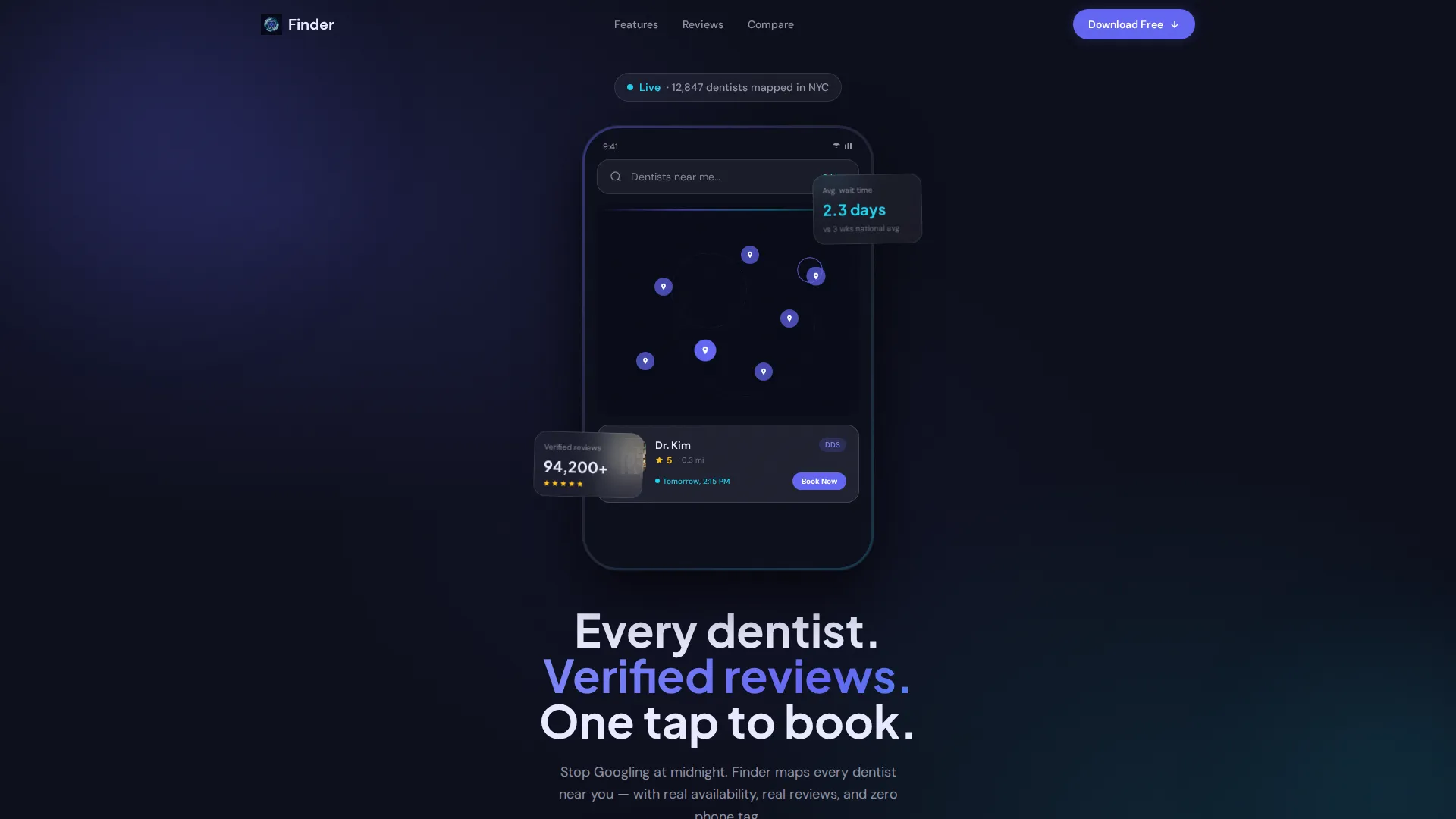
- A device-framed animated dashboard header showing a live map with glowing indigo pins, a dentist card, rating, next available slot, and a Book Now chip
- Progressive section reveals that fan out filters, animate a review card stack, and build a comparison table row by row as the visitor scrolls
- A frosted-glass sticky bottom bar with dual app download calls to action and a secondary "Text Me the Link" path for desktop visitors
Feature list
This template is built around one goal: turning a page visit into an app download. Every built-in component earns its place by demonstrating a specific piece of app value.
Animated Dashboard Header
The header shows a device-framed app screen with a live city map. Glowing indigo pins drop across the grid in real time, and one dentist card is pulled up showing a photo, a 4.9-star rating, the next available appointment slot, and a Book Now chip. A typewriter headline types in letter by letter beneath the device.
Scroll-Reveal Progressive Sections
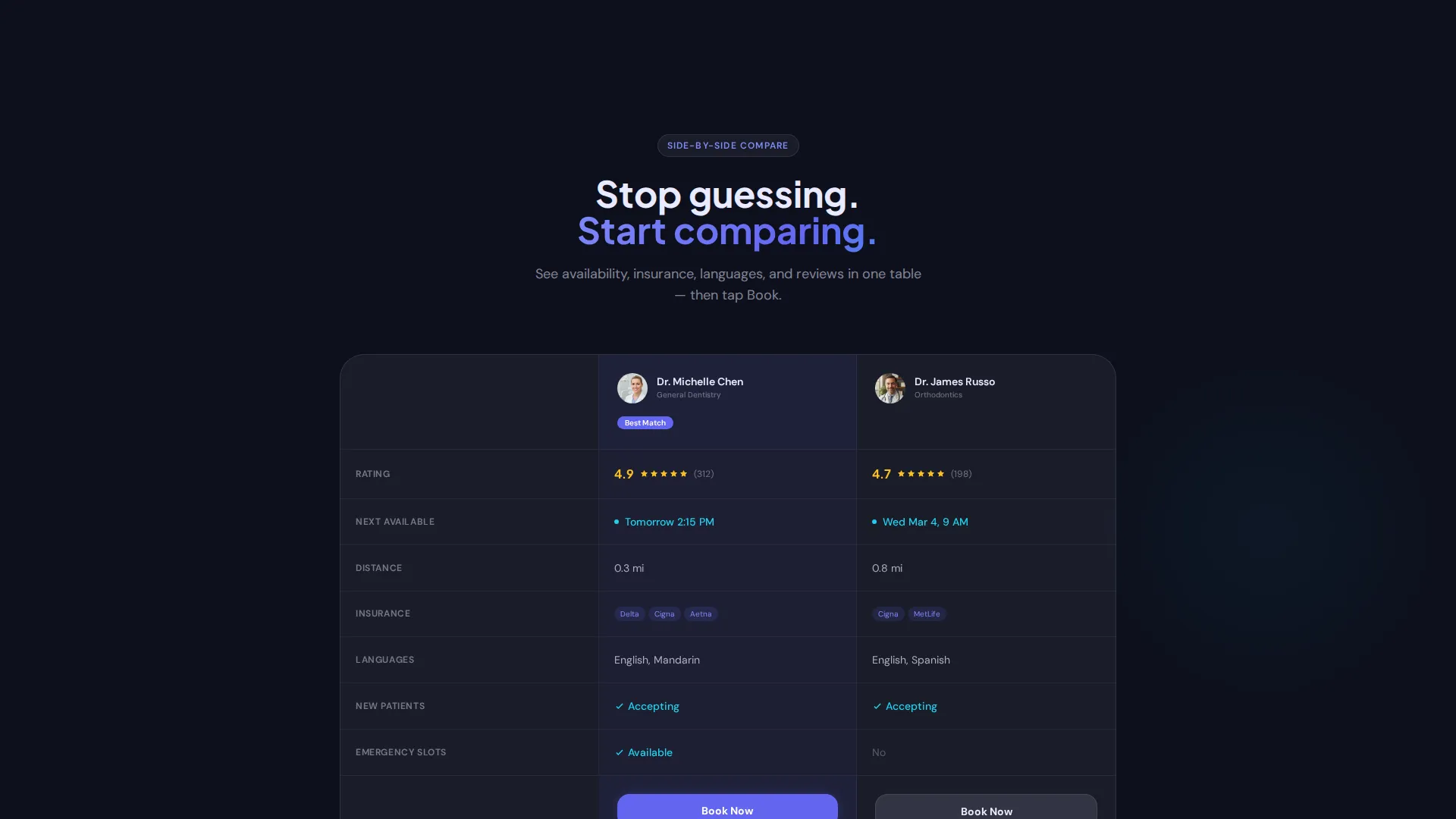
Each section enters the viewport as its own reveal moment. The map finds the user first, then filter cards fan out like a deck, then a review stack animates in, and finally a comparison table builds itself row by row. The experience escalates from static screenshot to animated walkthrough to interactive prototype feel.
Smart Filter Fan-Out
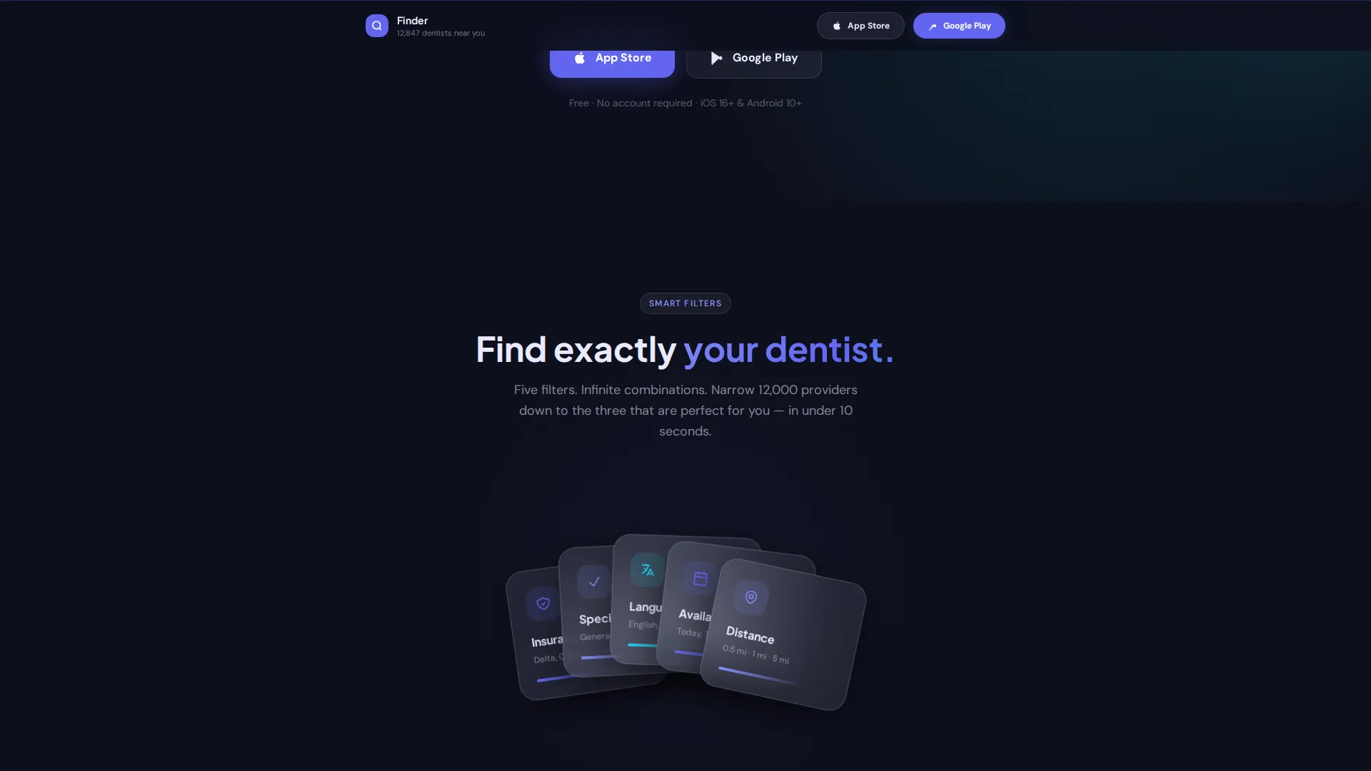
A dedicated filter section fans out cards representing key search dimensions: insurance compatibility, dental specialty, spoken language, and real-time availability. This communicates the app's depth without overwhelming the visitor.
Verified Review Card Stack
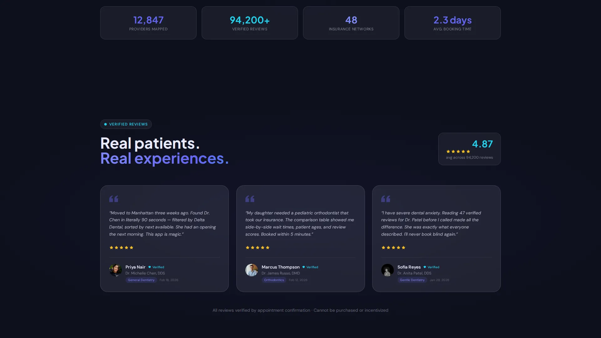
Real patient quote cards animate into view as a stacked deck. The visual treatment signals trust and social proof before the visitor ever reads a single word of the review text.
Sticky App Download Bar
After the first scroll, a frosted-glass bottom bar pins to the screen with "Download for Free" paired with App Store and Google Play badges. There are no form fields and no extra steps. The bar stays visible throughout the entire scroll journey.
Desktop-to-Mobile Handoff
A secondary conversion path offers a single phone number field labeled "Text Me the Link." Desktop visitors who want to switch to mobile can do so with one action, removing the last barrier between intent and download.
Page sections overview
| Section | Purpose |
|---|---|
| Animated Map Header | Establishes the app concept instantly with a device-framed live map and dentist card preview |
| Typewriter Headline | Communicates the core value proposition as the headline types in letter by letter |
| Filter Fan-Out | Shows the depth of search options through an animated card deck reveal |
| Review Card Stack | Builds social proof with animated verified patient quote cards |
| Comparison Table | Demonstrates feature depth by building a side-by-side table row by row |
| Sticky Download Bar | Keeps app download calls to action visible throughout the entire page scroll |
| Text Me the Link | Offers desktop visitors a frictionless path to switch to mobile for download |
Design & branding system
The visual identity is built on a Tech Glass theme that feels like holding a flagship phone in a dark room. Every surface floats on luminous glass layers with soft depth-of-field blur behind it.
- Color system: deep app-shell black (#0D0F1C) as the base, electric indigo (#6366F1) for primary actions and interactive elements, frosted glass white (#E8EAFF) for card surfaces and overlays, and pulse cyan (#22D3EE) for live-status indicators and success states
- Surface treatment: frosted glass cards with soft blur and layered depth create a premium floating effect throughout the scroll
- Motion language: pin-drop animations, typewriter text, card fan-outs, and row-by-row table builds give the page the kinetic energy of an app store feature story
Mobile & speed optimization
The template is structured for visitors arriving from a mobile search like "dentist near me" at any hour. The layout prioritizes immediate clarity and a direct path to download.
- The sticky frosted-glass download bar stays pinned after the first scroll on all screen sizes, keeping the primary call to action always reachable
- The "Text Me the Link" field gives desktop visitors a one-step bridge to mobile, so no download intent is lost at the device boundary
How this template helps you convert
Every design decision on this page is oriented toward earning a single tap: the app download. There are no forms to fill out, no accounts to create, and no friction between curiosity and commitment.
- The animated dashboard header lets visitors experience the app before they download it, replacing skepticism with familiarity and making the download feel like the next natural step
- The sticky download bar with dual platform badges ensures the call to action is never more than a glance away, while the "Text Me the Link" fallback captures desktop visitors who would otherwise drop off
Other information about this template
This template sits at the intersection of the Technology category and the Directory and Marketplace Platforms subcategory, purpose-built for the Dentist Finder niche. It is designed as a scroll-reveal, single-page layout with an Intersection Match Score of 13, reflecting a tightly focused niche alignment.
- Template style: Scroll Reveal (Progressive), where each section enters the viewport as a new capability reveal
- Creative direction: Launch Energy, designed to feel like an app store feature story unfolding section by section
- Header concept: Dashboard Preview, using a device-framed live map as the opening visual anchor
- Landing page direction: App Download, with all calls to action oriented toward App Store and Google Play installs
- Color system: Electric Indigo, anchored in deep black with indigo, frosted white, and pulse cyan
Theme
Tech Glass
Creative direction
Launch Energy
Color system
Electric Indigo
Style
Scroll Reveal (Progressive)
Direction
App Download
Page Sections
Animated Device-framed Dashboard Header
Progressive Scroll-reveal Sections
Filter Fan-out Card Deck
Verified Patient Review Stack
Sticky Frosted-glass Download Bar
Desktop-to-mobile Handoff Field
Related questions
What kind of app is this landing page template designed for?
Do I need to replace placeholder content before launching?
Can the sticky download bar link to both App Store and Google Play?
Who is the target visitor this template addresses?
Does this template help convert desktop visitors who prefer mobile?



