Finetune - Precision Transfer Learning Landing Page Template
Finetune is a modular card-grid landing page built for transfer learning research labs. It opens with a live-style experiment tracker header, then walks technical visitors through architecture specs, benchmark deltas, infrastructure details, and a condensed case study. Every section is designed to earn trust from machine learning engineers and researchers before routing them to a sandbox sign-up.
by Rocket studio
Quick summary
Finetune is a single-page, click-through landing page template for a transfer learning research lab. It combines a Dashboard Preview header with a Spec Sheet card-grid layout to communicate real capabilities to technical buyers fast. The design runs on an Electric Indigo color system and is built to convert qualified researchers into sandbox sign-ups without a single form on the page.
Who this template is for
This template is built for teams that speak in parameter counts, validation curves, and inference latency. It skips generalist marketing language and goes straight to technical proof, which is exactly what this audience needs before clicking anything.
- Machine learning engineers at mid-stage startups who need domain-specific model adaptation on limited labeled data
- Research teams at university hospitals working to classify rare pathologies from small datasets
- Research and development leads who need few-shot adaptation on specialized or restricted imagery
What problem this template solves
Most landing pages for technical AI services lead with vague capability claims and stock photography. That approach fails with engineers and researchers who need to see supported architectures, benchmark results, and infrastructure specs before they trust a product.
- Visitors arrive skeptical and need hard evidence before they will click any call to action
- Generic templates lack the spec-sheet rhythm and data-forward layout that technical buyers respond to
- Without front-loaded proof, qualified researchers leave before reaching the conversion point
What you get with this template
You get a fully structured, modular landing page that presents a transfer learning lab as a credible, production-ready service. Every section is a discrete capability rendered as a technical specification rather than a marketing claim.
- A full-width Dashboard Preview header showing a live fine-tuning run with real visible data points
- Four modular spec cards covering architectures, benchmark deltas, infrastructure details, and a condensed case study
- A persistent "Launch Sandbox" call-to-action bar that appears after the second card and stays visible on scroll
Feature list
This section outlines the core built-in components and layout capabilities included in the Finetune template.
Dashboard Preview Header
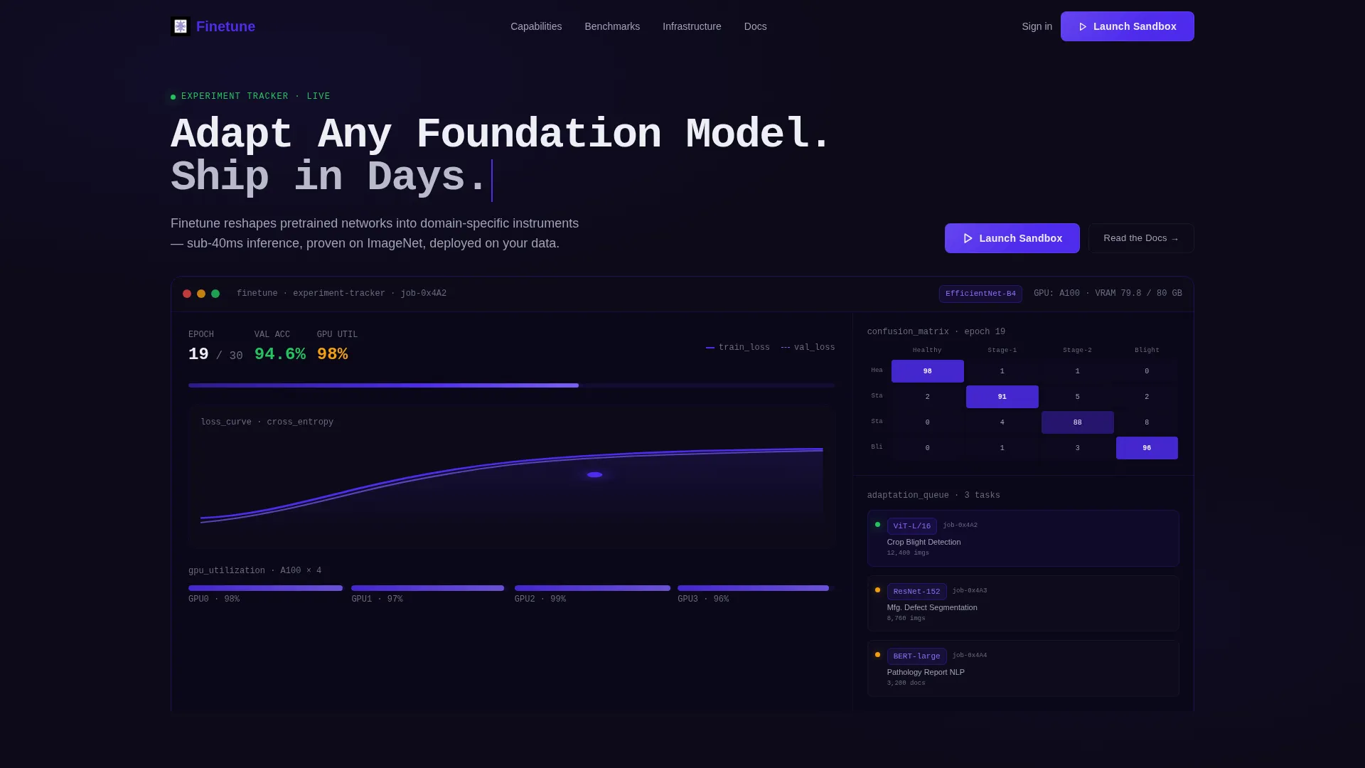
The header renders a pixel-accurate experiment tracker mid-run. Visible data includes a fine-tuning job on EfficientNet-B4 at epoch 14 of 30, validation accuracy at 94.3%, a confusion matrix filling in real time, and a sidebar listing three queued adaptation tasks with dataset sizes and target domains. The product is the interface, and the interface is already working before the visitor reads the headline.
Modular Spec Card Grid
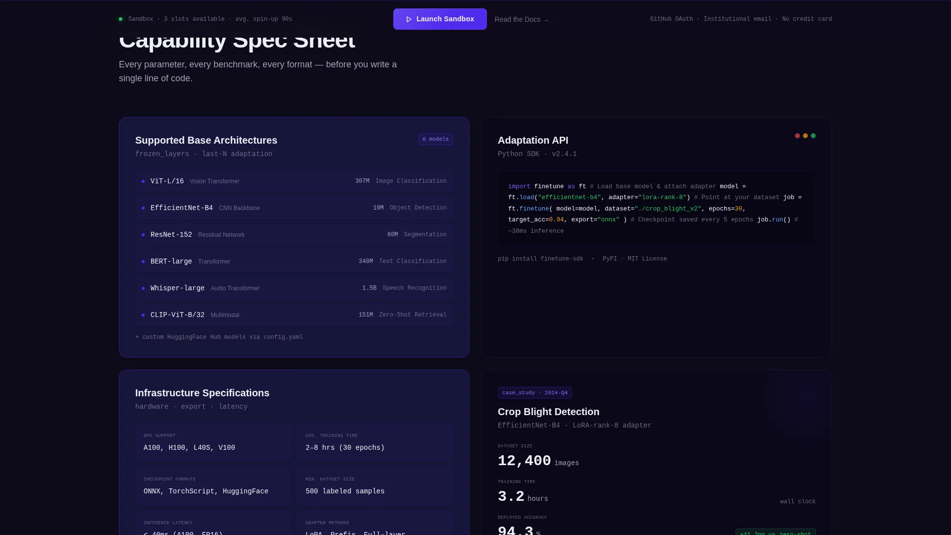
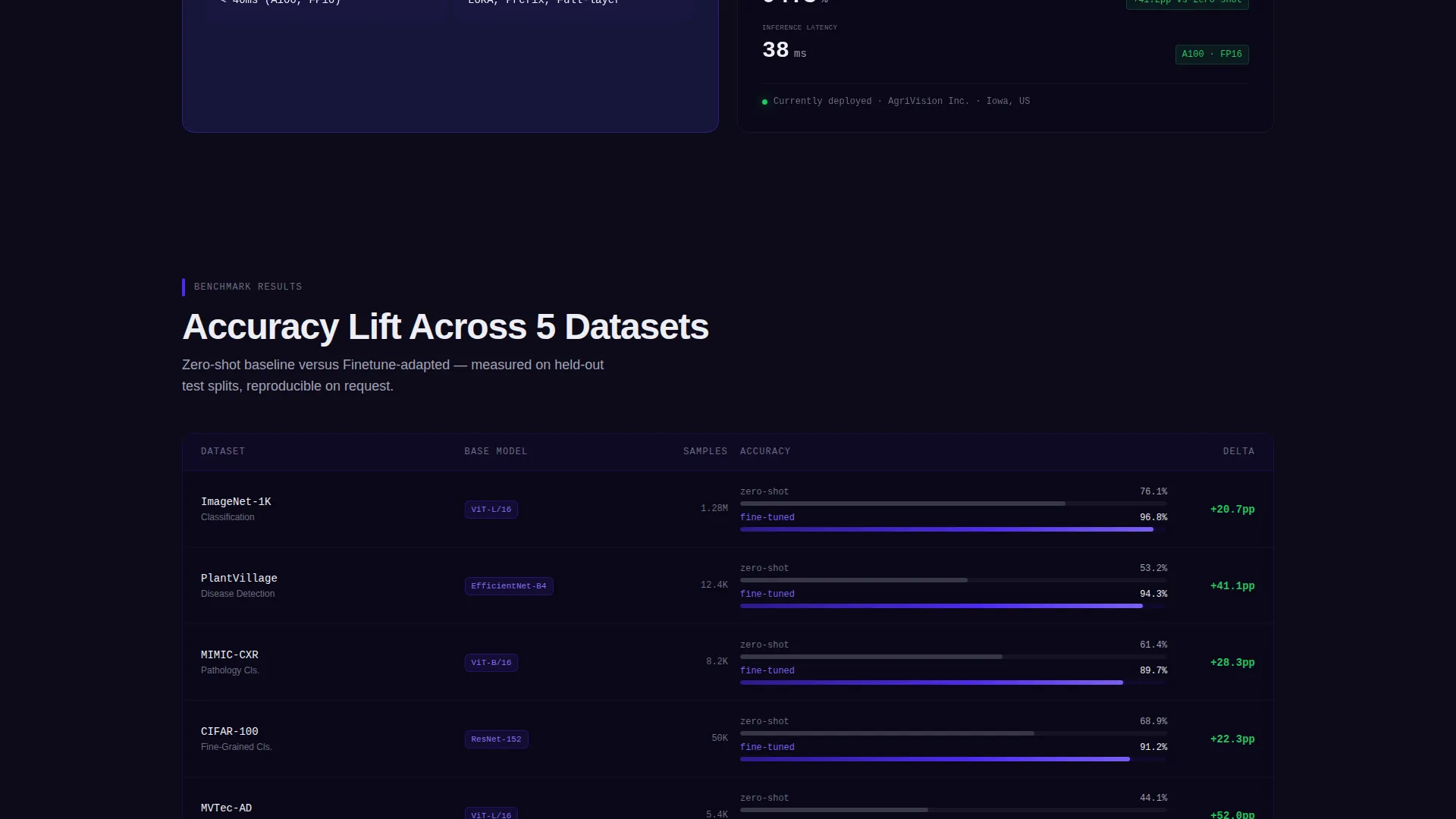
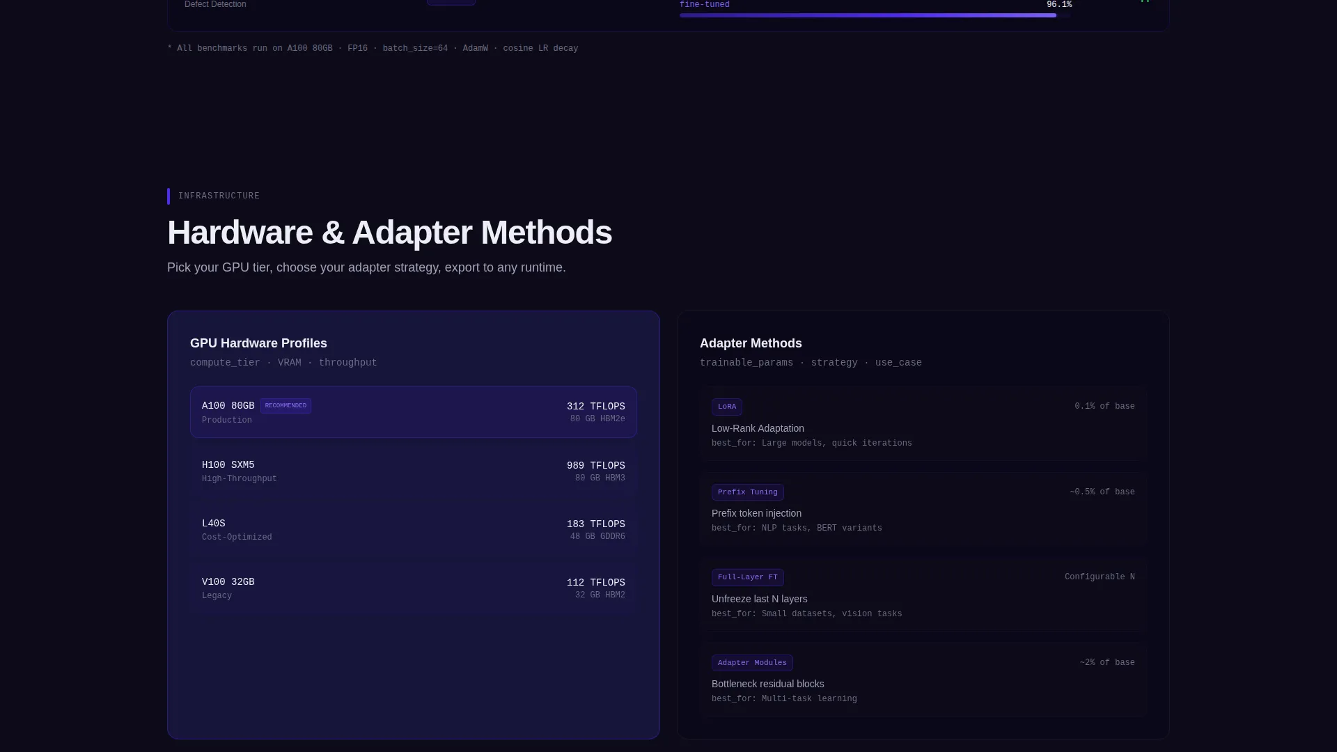
Four cards present each capability as a technical specification. Card one lists supported base architectures with parameter counts. Card two shows benchmark accuracy lifts from zero-shot to fine-tuned across five public datasets. Card three covers infrastructure specs including supported GPUs, average training times, and checkpoint export formats. Card four condenses a real case study into three metrics: dataset size, training hours, and deployed accuracy.
Alternating Card Visual Rhythm
Cards alternate between indigo-bordered data cards and dark-background code-snippet cards. This rhythm creates a layout that feels like tabbing between terminal panes, maintaining visual consistency while differentiating content types at a glance.
Persistent Call-to-Action Bar
A bottom bar carrying the primary "Launch Sandbox" call to action appears after the second card and remains visible as the visitor scrolls. This placement ensures the conversion point stays accessible once the visitor has already seen architecture support and benchmark proof.
Monospace Overlay Headline
The header headline appears as a monospace text overlay reading "Adapt Any Foundation Model. Ship in Days." This typographic choice reinforces the lab's technical identity and signals to engineers that this is a tool built by people who understand their workflow.
Secondary Navigation Link
A "Read the Docs" text link sits beneath the primary call to action. It gives technically cautious visitors a path to deeper validation without abandoning the page, reducing drop-off from researchers who need more evidence before committing.
Page sections overview
| Section | Purpose |
|---|---|
| Dashboard Preview Header | Opens with a live experiment tracker view to establish immediate technical credibility |
| Monospace Overlay Headline | Delivers the core value proposition in engineer-native typography |
| Architecture Spec Card | Lists supported base models with parameter counts for instant compatibility checks |
| Benchmark Delta Card | Shows accuracy lift data across five datasets to prove fine-tuning impact |
| Infrastructure Spec Card | Covers GPU support, training time, and export formats for operational confidence |
| Case Study Card | Condenses one real deployment into three hard metrics |
| Persistent call to action Bar | Keeps the sandbox sign-up accessible throughout the scroll journey |
Design & branding system
The visual identity follows a Dashboard Pro theme built on an Electric Indigo color system. The palette was chosen to feel clinical and focused, like a versus Code window running at full utilization with a violet cursor blinking in the dark.
- Deep terminal black (#0D0B1A) as the page background, electric indigo (#4F2BED) for interactive elements and graph lines, cool zinc (#A1A1B5) for secondary text and axis labels, and phosphor white (#EDEEF4) for card surfaces and primary type
- Monospace typography for headlines and code-snippet cards to reinforce a developer-native identity
- No stock photography and no illustration; the experiment tracker interface itself serves as the hero visual
Mobile & speed optimization
The modular card grid is structured to reflow cleanly across screen sizes. Each card holds a fixed aspect ratio and consistent typographic hierarchy, which supports predictable rendering on smaller viewports without breaking the spec-sheet reading flow.
- Cards maintain equal aspect ratios and typographic scale across breakpoints for visual consistency
- The persistent call-to-action bar is designed to remain anchored and readable on mobile screens throughout the scroll
How this template helps you convert
This template is built around one conversion goal: routing a technically skeptical visitor into a sandbox sign-up. Every layout decision serves that goal by front-loading proof and reducing friction at the click point.
- The header immediately shows a working experiment with real accuracy figures, so the visitor forms a positive first impression before reading a single marketing claim
- The spec card sequence builds a logical evidence trail, moving from architecture support to benchmark proof to infrastructure details, so the visitor reaches the call-to-action already convinced their use case is covered
- The no-form click-through flow routes directly to a sign-up page where GitHub OAuth is the first option, followed by institutional email, removing the friction that typically causes technical visitors to abandon at the conversion step
Other information about this template
This template is purpose-built for the transfer learning niche and carries details that generic technology templates do not include. It is a strong fit for labs, startups, or research groups that need to communicate complex model adaptation services to a technically literate audience.
- The "Read the Docs" secondary link supports visitors who require deeper technical validation before signing up, lowering the barrier for researchers who are early in their evaluation
- The page is structured as a single click-through flow with no embedded forms, keeping the visitor path short and friction-free
- The template style is Card Grid (Modular) under a Dashboard Pro theme, making it straightforward to update individual cards with new benchmark data, architecture additions, or case study metrics as the lab evolves
Theme
Dashboard Pro
Creative direction
Spec Sheet
Color system
Electric Indigo
Style
Card Grid (Modular)
Direction
Click-Through
Page Sections
Dashboard Preview Header
Modular Spec Card Grid
Alternating Card Rhythm
Persistent Launch Sandbox Bar
Monospace Overlay Headline
Secondary Read the Docs Link
Related questions
Who is this landing page template designed for?
Does this template include a contact form or lead-capture form?
Can I update the spec cards with my own benchmark data and architecture details?
What makes the header different from a typical hero section?
Is there a secondary option for visitors who are not ready to sign up?



