Accounting Firm Software Cost Calculator Website Template
Ledger is a split-screen landing page template built for accounting firm payment processing platforms. It pairs a live-looking receivables dashboard with bold, stats-first copy to show prospects exactly what slow payments are costing them. Two conversion paths, a real-time revenue calculator, and a 90-second demo capture leads at every scroll depth.
by Rocket studio
Quick summary
Ledger is a single-page template designed for accounting firm payment processing platforms. It opens with a split-screen dashboard preview, drives urgency through specific financial statistics, and converts visitors through a two-step revenue calculator form. The layout targets managing partners, solo CPAs (Certified Public Accountants), and bookkeeping practices ready to replace slow invoice cycles with faster payment tools.
Who this template is for
This template speaks directly to accounting professionals who lose time and revenue chasing payments. It is built for operators who need a high-credibility landing page that earns trust before asking for a sign-up.
- Managing partners at mid-size accounting firms handling hundreds of outstanding invoices during peak season
- Solo CPAs juggling retainer collection between multiple software tabs
- Bookkeeping practices that need clients to pay faster without a complicated onboarding process
What problem this template solves
Accounting firms often have strong revenue on paper but weak cash flow in practice. The gap between invoice sent and payment received is the core problem this template is designed to address on the page.
- Prospects arrive skeptical; generic claims do not move them. This template leads with specific numbers that make the cost of inaction feel immediate and real.
- The old sales approach buries the value proposition in paragraphs. This layout prosecutes the case with data at every scroll point, so the visitor understands the stakes before the pitch lands.
- Two-step lead capture reduces friction by showing the visitor their own projected recovery figure before asking for contact details.
What you get with this template
You get a complete, conversion-focused landing page layout with every section pre-built and ready to customize. No section requires guesswork; each one has a clear job tied to moving a prospect closer to signing up.
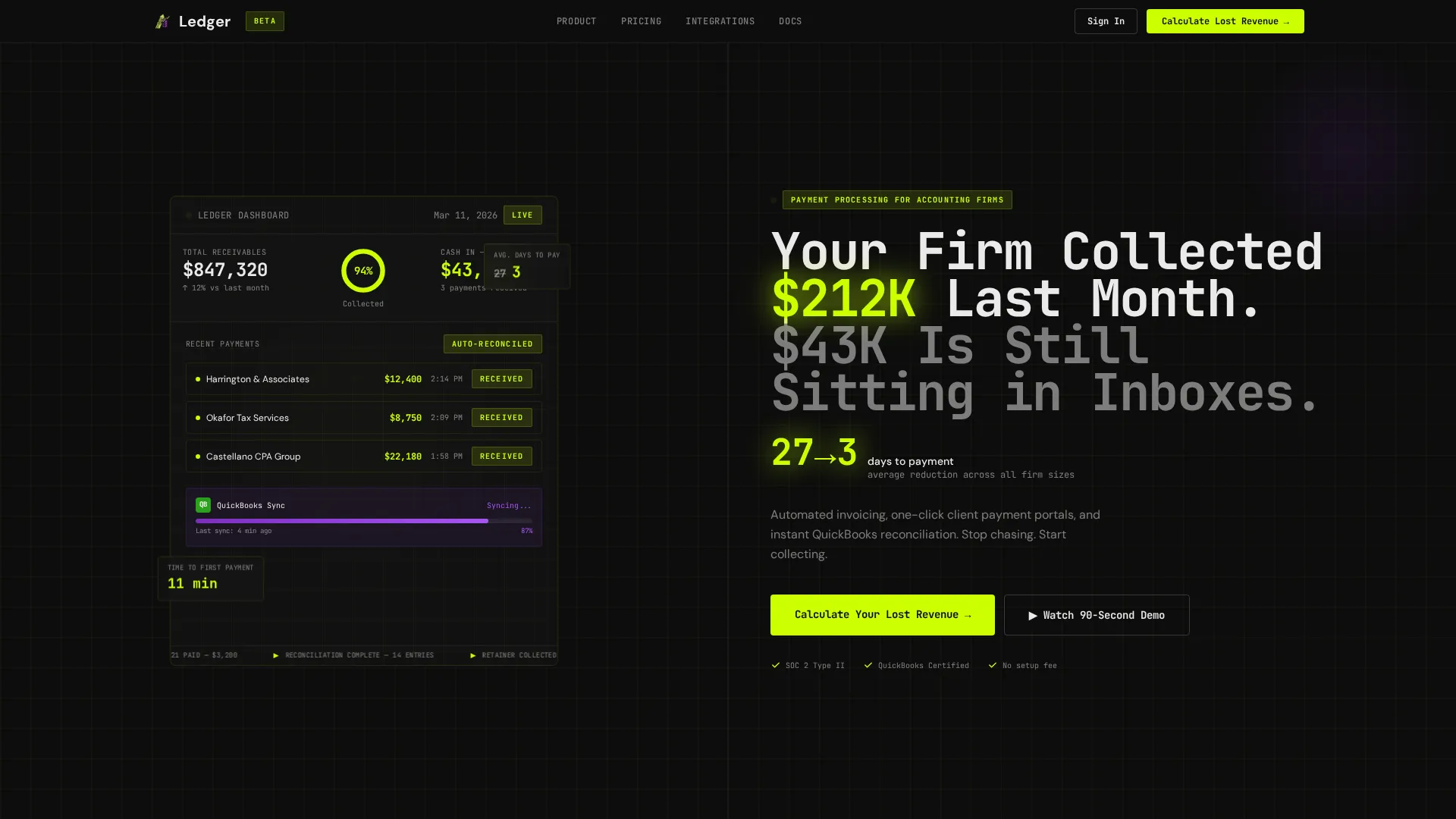
- A 50/50 split-screen header pairing a live-looking payment dashboard with a punchy, number-led headline and a pulsing key stat in chartreuse
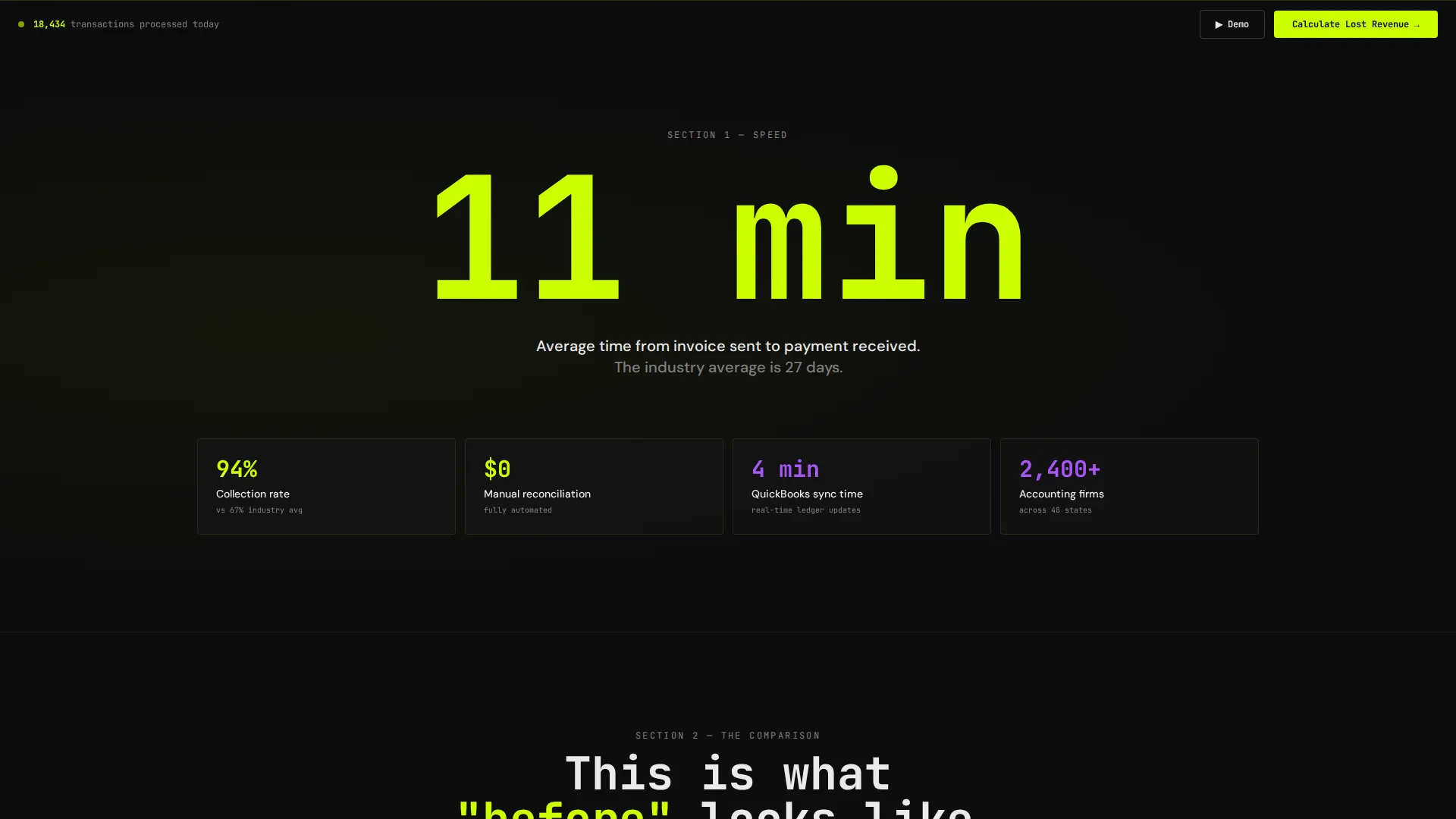
- Three scroll-triggered content sections that each open with a bold statistic before delivering the supporting explanation
- A two-step lead generation form with real-time revenue calculator, plus a secondary "Watch the 90-Second Demo" email capture path
Feature list
This template is built around a focused set of high-impact layout decisions. Each feature serves the same goal: convert a skeptical accounting professional into a qualified lead.
Split-Screen Dashboard Header
The header divides the viewport into two equal halves. The left side displays a live-looking payment dashboard showing $847,320 in receivables, a 94% collection progress ring, three client payments animating in as "Received," and a reconciliation status bar. The right side carries a sharp mono-spaced headline and a pulsing chartreuse stat that reads: average days-to-payment reduced from 27 to 3.
Stats-First Scroll Sections
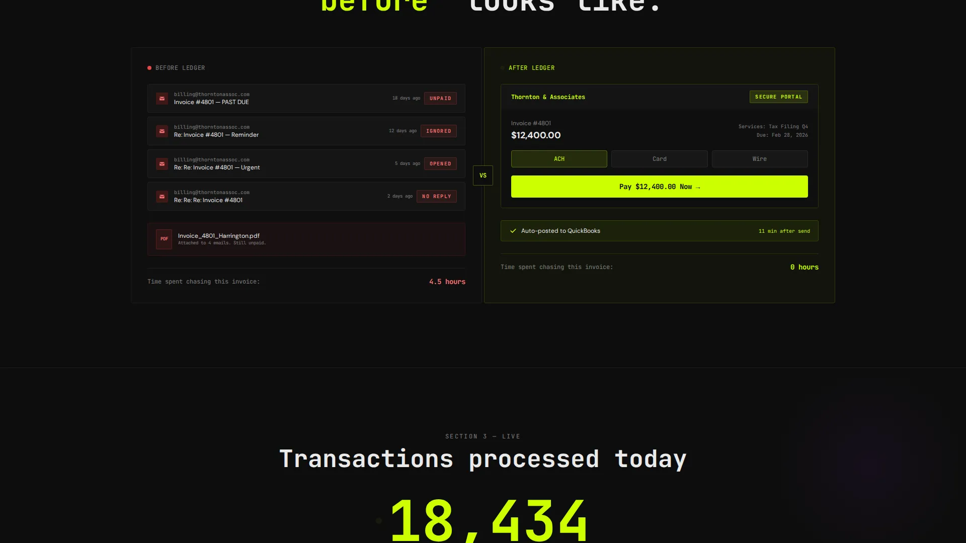
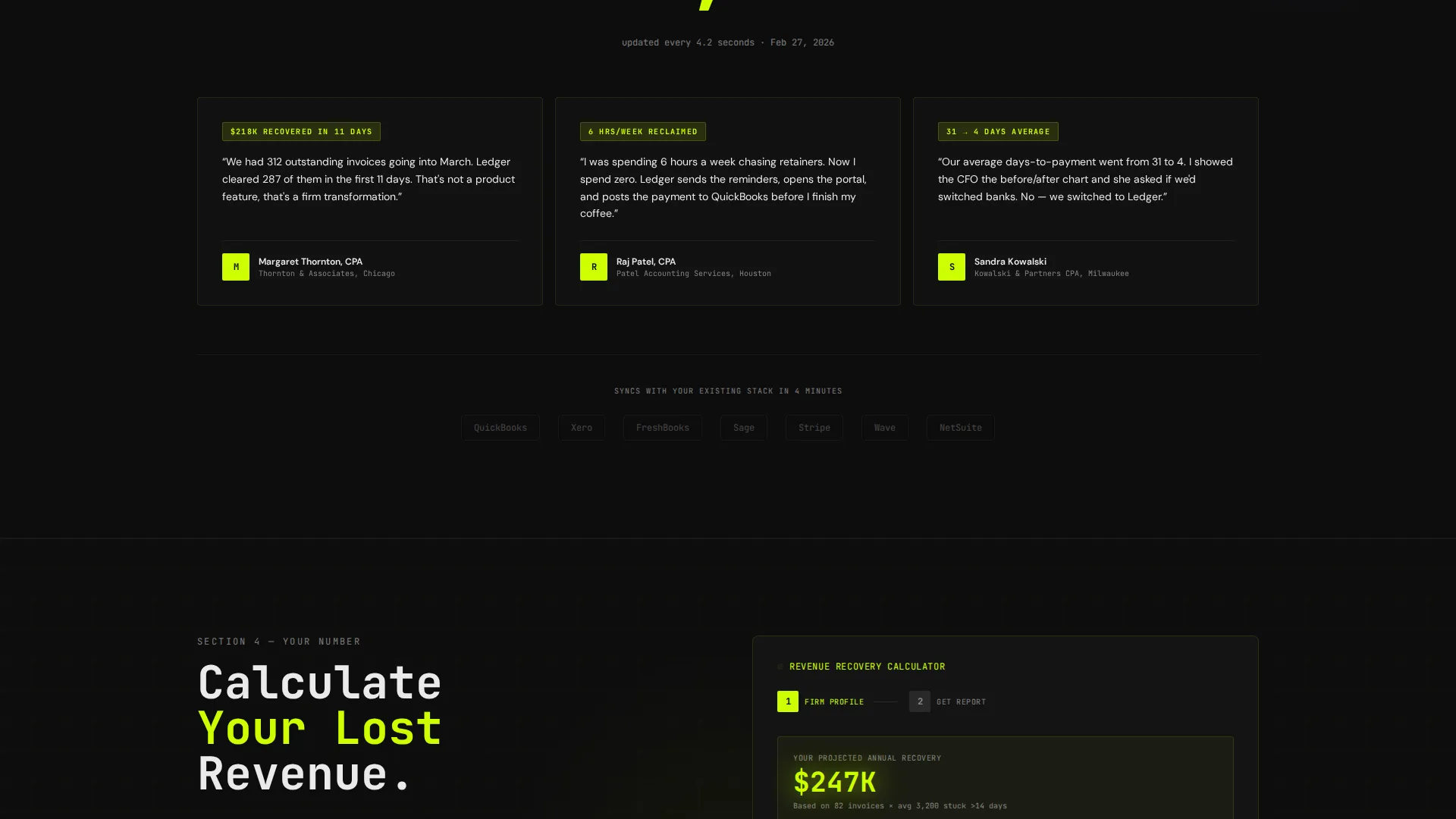
Every major content section opens with a specific, oversized number before the explanation appears. Section one leads with "11 minutes" as the average time from invoice sent to payment received. Section two presents a side-by-side before-and-after comparison of a cluttered email chain versus a branded one-click payment portal. Section three displays a live transaction counter for the current day.
Two-Step Revenue Calculator Form
The primary call to action opens a two-step form. Step one uses sliders for firm size and average invoice value, then instantly renders a projected annual recovery figure. Step two collects name, firm name, email, and accounting software used. The form shows the visitor their own money on the table before requesting any personal details.
Sticky Bottom-Bar Call to Action
After the second scroll, a sticky bar anchors to the bottom of the viewport. It repeats the "Calculate Your Lost Revenue" call to action in chartreuse on black, keeping the primary conversion path visible without interrupting the reading experience.
Secondary Demo Capture Path
Below the fold, a "Watch the 90-Second Demo" prompt offers a lower-commitment entry point. It requires an email address before playback begins, creating a second lead stream for prospects who are not yet ready to complete the full calculator form.
Before-and-After Visual Comparison
Section two splits the screen to contrast the old workflow with the new one. The left panel shows a cluttered email chain with a PDF invoice attached. The right panel shows a clean, branded one-click payment portal. The visual contrast makes the product benefit legible in under three seconds.
Page sections overview
| Section | Purpose |
|---|---|
| Split-Screen Header | Establish credibility with a live dashboard and a number-led headline |
| Stats Hero Block | Stop the scroll with "11 minutes" stat and proof of speed |
| Before and After | Contrast old PDF invoice flow with one-click payment portal |
| Live Transaction Counter | Build real-time social proof with a rolling daily total |
| Revenue Calculator Form | Convert visitors by showing their own projected recovery figure |
| Sticky call to action Bar | Keep the primary conversion path visible after the second scroll |
| Demo Email Capture | Capture lower-intent leads with a 90-second demo gate |
Design & branding system
The visual identity follows a Startup Velocity theme using an Acid Digital color system. The palette is engineered to feel like a fintech command center: precise, fast, and built for people who read dashboards for a living.
- Void black (#0D0D0D) dominates all backgrounds; electric chartreuse (#CCFF00) powers calls to action, hover states, and live data highlights; synthetic violet (#7B2FBE) marks secondary actions and graph accents; interface white (#EAEAEA) handles body copy and card surfaces
- Typography is sharp and mono-spaced in headline positions, reinforcing the dashboard-data aesthetic and signaling precision at a glance
- Card surfaces float above dark backgrounds like real dashboard widgets, giving the layout a layered, high-information density feel without visual clutter
Mobile & speed optimization
The template layout is structured for clean rendering across screen sizes. The split-screen sections adapt so that key content remains legible and the conversion forms stay functional on smaller viewports.
- The 50/50 split-screen header stacks vertically on mobile so the dashboard preview and headline each receive full-width attention
- The sticky bottom-bar call to action remains anchored on mobile, keeping the primary conversion path accessible without disrupting scroll
- Form steps are sized for thumb-friendly interaction, reducing drop-off on the two-step revenue calculator
How this template helps you convert
The conversion strategy is built around showing value before asking for anything. Every layout decision feeds one of two lead capture paths.
- The revenue calculator form leads with a real-time projected recovery figure, so the visitor understands the personal financial stakes before entering their contact details in step two.
- The sticky bottom-bar call to action and the secondary demo email gate together create two active conversion opportunities at every scroll depth, capturing both high-intent and lower-intent visitors without requiring duplicate page sections.
Other information about this template
This template is a strong fit for platforms in the accounting firm software space looking to compete on clarity and speed of value communication. A few additional details worth noting before you customize it.
- The template style is a 50/50 split screen, which makes it well suited for side-by-side product demonstrations and data-versus-outcome storytelling
- The creative direction is Stats-First Impact, meaning the layout is intentionally structured to lead with evidence rather than persuasion paragraphs
- The header concept is a Dashboard Preview, designed to simulate a live product experience before the visitor has signed up
- The lead generation direction means every section serves either the primary calculator path or the secondary demo capture path, with no filler sections in between
- This template can support accounting firm payment processing platforms of various sizes, from solo practitioner tools to multi-partner firm solutions
Theme
Startup Velocity
Creative direction
Stats-First Impact
Color system
Acid Digital
Style
Split Screen (50/50)
Direction
Lead Generation
Page Sections
Split-screen Dashboard Header
Stats-first Scroll Sections
Two-step Revenue Calculator Form
Sticky Bottom-bar Call to Action
Before-and-after Visual Comparison
Secondary Demo Email Gate
Related questions
Who is this landing page template built for?
What are the two conversion paths included in this template?
Can I customize the dashboard numbers and statistics in the header?
Does this template include a sticky call-to-action bar?
What color system does this template use?



