Fitness - High-Converting Email Landing Page Template
Pulse is a fitness email newsletter landing page built for personal trainers, gym owners, and supplement brands. Its dashboard-style layout pairs a bold brutalist design with an iridescent color system to show exactly why generic email templates fail and how Pulse replaces them. Every section escalates the evidence until the decision feels obvious.
by Rocket studio
Quick summary
Pulse is a weekly fitness email newsletter landing page template designed for coaches, gym owners, and supplement brands. It opens with a live code-to-email animation, walks visitors through a problem-and-solution data arc, and closes with a twelve-metric comparison table. The layout is built around proof, not promises.
Who this template is for
This template is built for fitness professionals who send regular emails and need their audience to actually open them. If your current campaigns feel invisible, Pulse gives you a landing page that makes the case for switching.
- Solo personal trainers selling structured programs such as eight-week shred plans
- Boutique studio owners promoting class bookings through weekly sends
- Supplement brands whose email flows feel outdated and underperforming
What problem this template solves
Generic fitness email templates produce weak results. Low open rates, poor click-through rates, and unsubscribe spikes are common pain points that most template buyers silently accept. This landing page makes those problems visible and then dismantles them one section at a time.
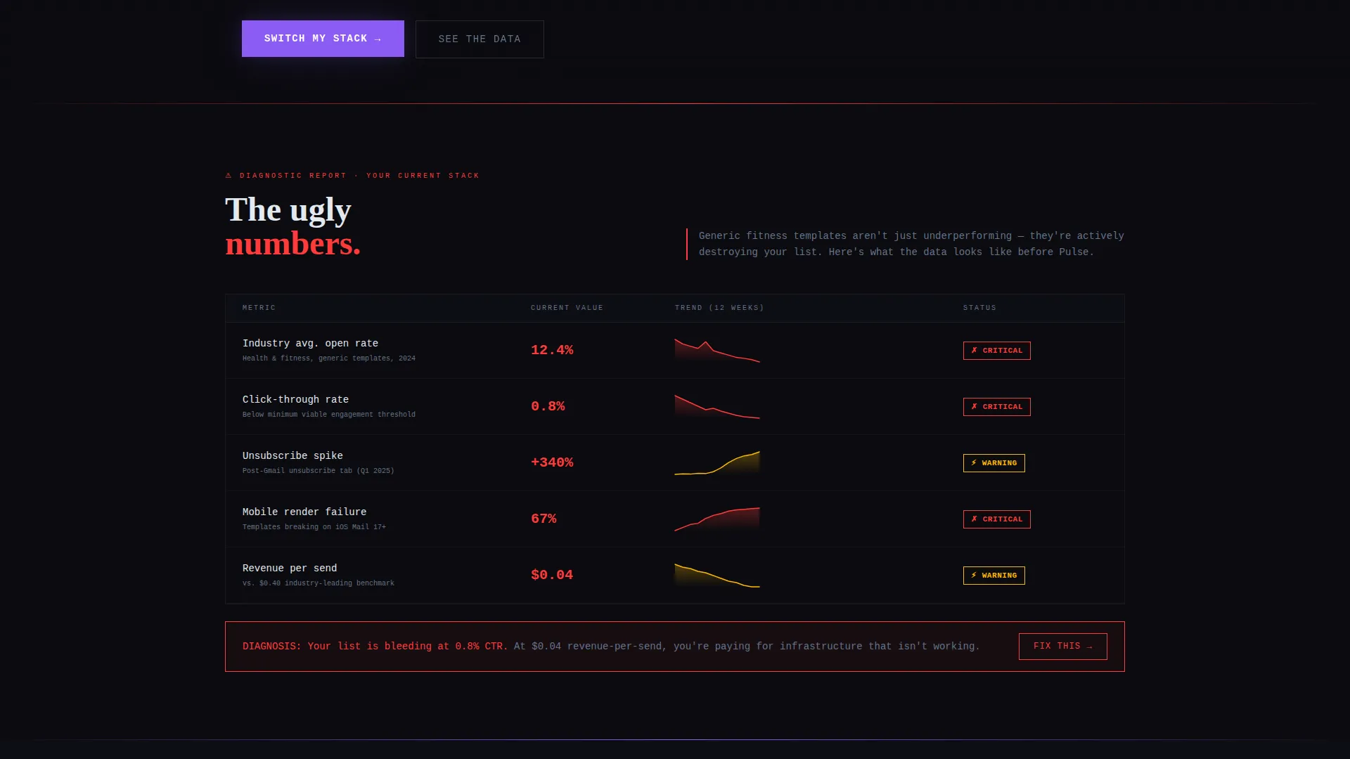
- Visitors see the ugly reality of standard fitness emails first: low open rates, flat click-through rates, and spiky unsubscribe data
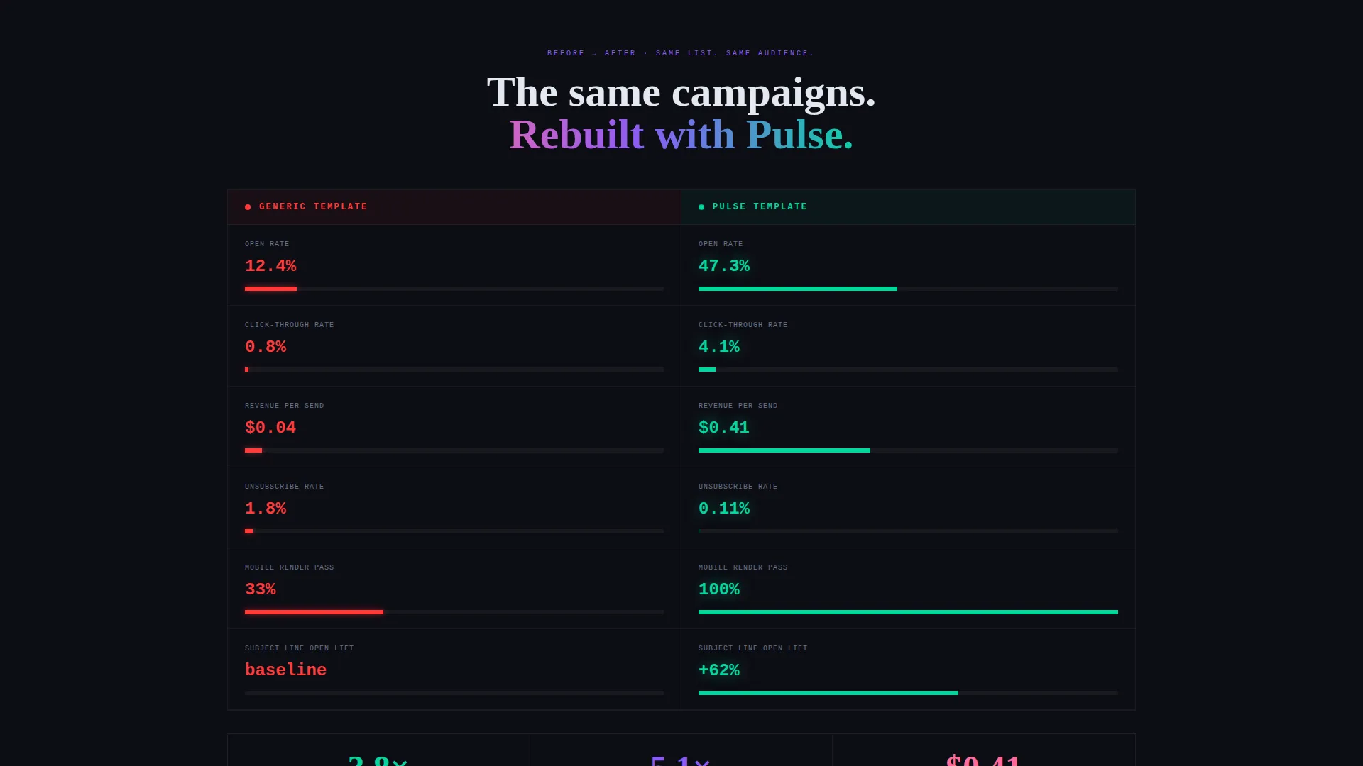
- The layout then mirrors those same campaigns rebuilt with Pulse, showing every metric climbing
- The contrast removes doubt and replaces it with urgency
What you get with this template
You get a single-page landing page built around a dashboard and data grid visual structure. Every section is purpose-built to move a skeptical fitness professional from awareness to action.
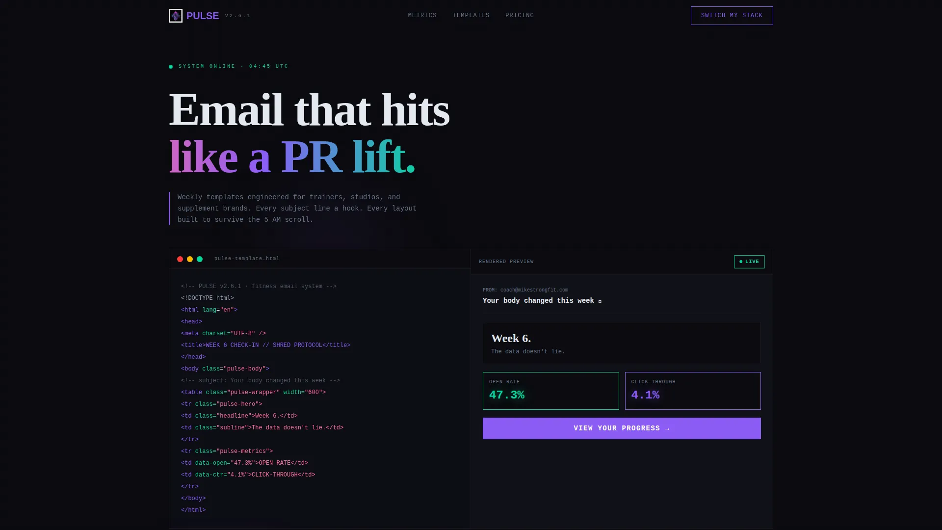
- A full-viewport terminal header that animates from raw HTML code into a rendered email preview
- A brutalist data grid layout that contrasts failing campaign metrics against Pulse-powered results
- A persistent floating call-to-action bar and a split-view twelve-metric comparison table near the bottom
Feature list
This template covers a specific set of built-in sections and visual components, each serving a precise role in the conversion flow.
Live Code-to-Email Header Animation
The header opens as a full-viewport dark terminal window. Syntax-highlighted HTML displays in violet and cyan with a blinking cursor, then compiles live into a rendered fitness email preview. An open rate badge pulses at 47.3 percent while the click-through rate glows green, establishing credibility in the first scroll.
Problem-and-Solution Data Grid
The scroll begins with a brutalist grid exposing real underperformance: 12 percent open rates, 0.8 percent click-through rates, and jagged red unsubscribe charts. At the midpoint, the grid flips to show the same campaigns rebuilt with Pulse. Each number is replaced by its iridescent counterpart trending upward.
Twelve-Metric Comparison Table
A persistent split-view table anchors the lower third of the page. It pits "Your Current Template" against "Pulse Template" across twelve tracked metrics with real numbers. The comparison does the selling before the call-to-action button even appears.
Subject Line and Render Evidence Panels
Mid-page sections display subject line A/B test results, mobile render comparisons, and heatmap overlays showing where thumbs actually tap. Each panel adds another layer of evidence, making the cumulative case feel dense and data-driven rather than promotional.
Brand Color Preview Input
A secondary conversion path offers a single hex-code input field. Visitors type in their brand color and a live template preview regenerates to match. This reduces the perceived gap between browsing and buying.
Floating Call-to-Action Bar
A persistent bar follows the visitor on scroll and repeats the primary call-to-action: "Switch My Stack." It catches intent at any point in the page without interrupting the data narrative.
Page sections overview
| Section | Purpose |
|---|---|
| Terminal Header Block | Opens with live code-to-email animation and pulsing performance badges |
| Problem Data Grid | Visualizes weak metrics from generic fitness email templates |
| Solution Data Grid | Mirrors the problem grid with Pulse-powered metrics climbing upward |
| A/B Test Panel | Displays subject line test results side by side |
| Mobile Render Comparison | Shows how the template renders across common mobile screen sizes |
| Heatmap Overlay Section | Highlights where real subscribers tap inside a fitness email |
| Twelve-Metric Table | Splits current template versus Pulse across twelve tracked data points |
| Primary call to action Block | Anchors the main "Switch My Stack" call-to-action after the table |
| Brand Color Preview | Lets visitors enter a hex code and see a live preview update |
| Floating Scroll Bar | Repeats the primary call-to-action as a persistent bar throughout scroll |
Design & branding system
The visual identity follows a bold brutalist theme with an AI iridescent color system. The palette feels clinical and structured at its base, then bleeds neon at the edges wherever a metric earns a highlight.
- Core colors: void black (#0B0B0F) as background, holographic violet (#8B5CF6) and electric cyan (#06D6A0) for syntax highlights and data accents, interference pink (#FF6B9D) for secondary data callouts
- Typography uses monospaced type throughout, reinforcing the terminal and infrastructure aesthetic
- Grid cells use hard rules and high-contrast borders to keep every data point visually separated and scannable
Mobile & speed optimization
The template is built with mobile-first reading behavior in mind. Its data grids and comparison tables are structured to remain legible on smaller screens without sacrificing the brutalist visual density.
- Thumb-scroll behavior is accounted for in tap target sizing and heatmap-informed layout decisions
- The floating call-to-action bar is designed to stay visible without obscuring key content on mobile viewports
- Mobile render comparisons are included as a dedicated section, so visitors can see exactly how the email template looks on the devices their subscribers actually use
How this template helps you convert
The page is structured as a problem-to-solution arc, meaning every scroll builds evidence rather than making a single pitch up front. By the time the visitor reaches the comparison table, the decision has already been framed for them.
- The terminal header creates an immediate credibility signal by showing real email HTML and live performance badges, establishing that this is a serious product for professionals
- The escalating data grid sequence makes the cost of inaction tangible: visitors see their current reality in stark numbers before they see the Pulse alternative
- The brand color preview input reduces friction by letting visitors personalize the template before committing, making the transition feel smaller and more achievable
Other information about this template
This template is categorized under Technology and Fitness Digital Presence, making it relevant for fitness brands that treat email as a core channel rather than an afterthought. It is a single landing page, not a multi-page website, so the entire conversion flow lives within one scroll session.
- The template style is Dashboard and Data Grid, which suits buyers who respond to evidence and metrics over lifestyle imagery
- The creative direction follows a Problem to Solution Arc, a structure well-suited to buyers who already know something is wrong but haven't yet committed to a fix
- The header concept is a Code Snippet animation, which positions the product as infrastructure rather than a cosmetic upgrade
- The comparison direction is built around Versus framing, giving the visitor a clear before-and-after reference throughout the entire page
Theme
Bold Brutalist
Creative direction
Problem→Solution Arc
Color system
AI Iridescent
Style
Dashboard/Data Grid
Direction
Comparison/Versus
Page Sections
Live Code-to-email Header Animation
Problem-and-solution Data Grid Layout
Twelve-metric Comparison Table
Subject Line and Heatmap Evidence Panels
Brand Color Live Preview Input
Persistent Floating Call-to-action Bar
Related questions
Who is the Pulse template designed for?
What does the terminal header animation actually show?
Can I see how the template looks in my brand colors before purchasing?
How many metrics does the comparison table cover?
Is this a full website or a single landing page?



