Bold Menswear Landing Page Template for Plus-Size Brands
Fitted is a bold menswear landing page built for plus-size men's brands that refuse to settle for shapeless basics. It pairs a dark Ruby and Chrome visual identity with an immersive gallery-plus-detail layout, real-body product photography, and a smart upsell flow that rewards browsing with a styled bundle offer and member pricing unlock.
by Rocket studio
Quick summary
Fitted is a gallery and detail landing page template designed for menswear labels serving big men with style on their minds. The layout uses a deep black-cherry and crushed ruby color system to make product photography feel cinematic. Every section is built to keep a real shopper engaged, moving from first impression to a styled bundle offer without a single moment of friction.
Who this template is for
This template is made for founders, creative directors, and brand teams building in the plus-size men's fashion space. If your label makes clothes that actually fit bigger bodies and you want a page that reflects that confidence, this template was written for your audience.
- Plus-size menswear brands launching a new collection or flagship landing page
- Independent clothing labels targeting big and tall men who expect real-body presentation
- Fashion entrepreneurs who want a premium visual experience without building from scratch
What problem this template solves
Most menswear sites fail the moment a bigger guy opens them. He sees one body type, one set of sizes buried at the bottom, and closes the tab. This template is built to break that pattern by putting fit front and center, on multiple body types, in a visual language that feels high-end rather than apologetic.
- Eliminates the "special section" feeling that drives away confident plus-size shoppers
- Replaces generic product grids with immersive detail panels showing garments on 2XL, 4XL, and 6XL bodies
- Moves buyers from browsing to a styled bundle purchase using a reward-based upsell path
What you get with this template
You get a fully structured single-page layout with every visual and conversion component already in place. The design is ready to receive your product photography and brand copy from the first section to the final call to action.
- A dark full-bleed hero header with glow-lit model photography and a fade-in headline
- A scrollable product gallery with expandable detail panels, parallax card animations, and Ken Burns fabric zoom
- A sticky bundle builder bar, a dynamic upsell offer, and an email-gated member pricing section
Feature list
This template ships with a focused set of components drawn directly from the brief. Each one serves a specific purpose in the shopping experience.
Dark Full-Bleed Hero Header
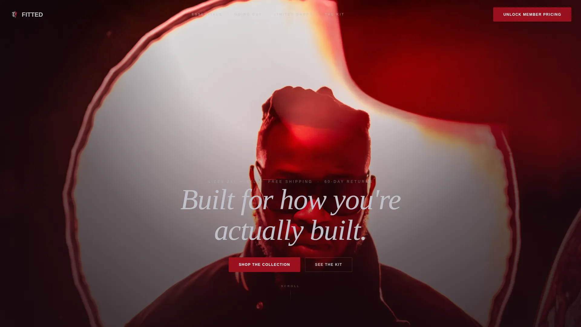
The header spans the full viewport in absolute black fading to black-cherry. A single model is centered, lit by a soft ring light that traces a ruby glow along jacket seams and a chrome zipper pull. The headline "Built for how you're actually built" fades in below the collarbone in chrome silver, setting the tone before a single product card appears.
Immersive Parallax Product Grid
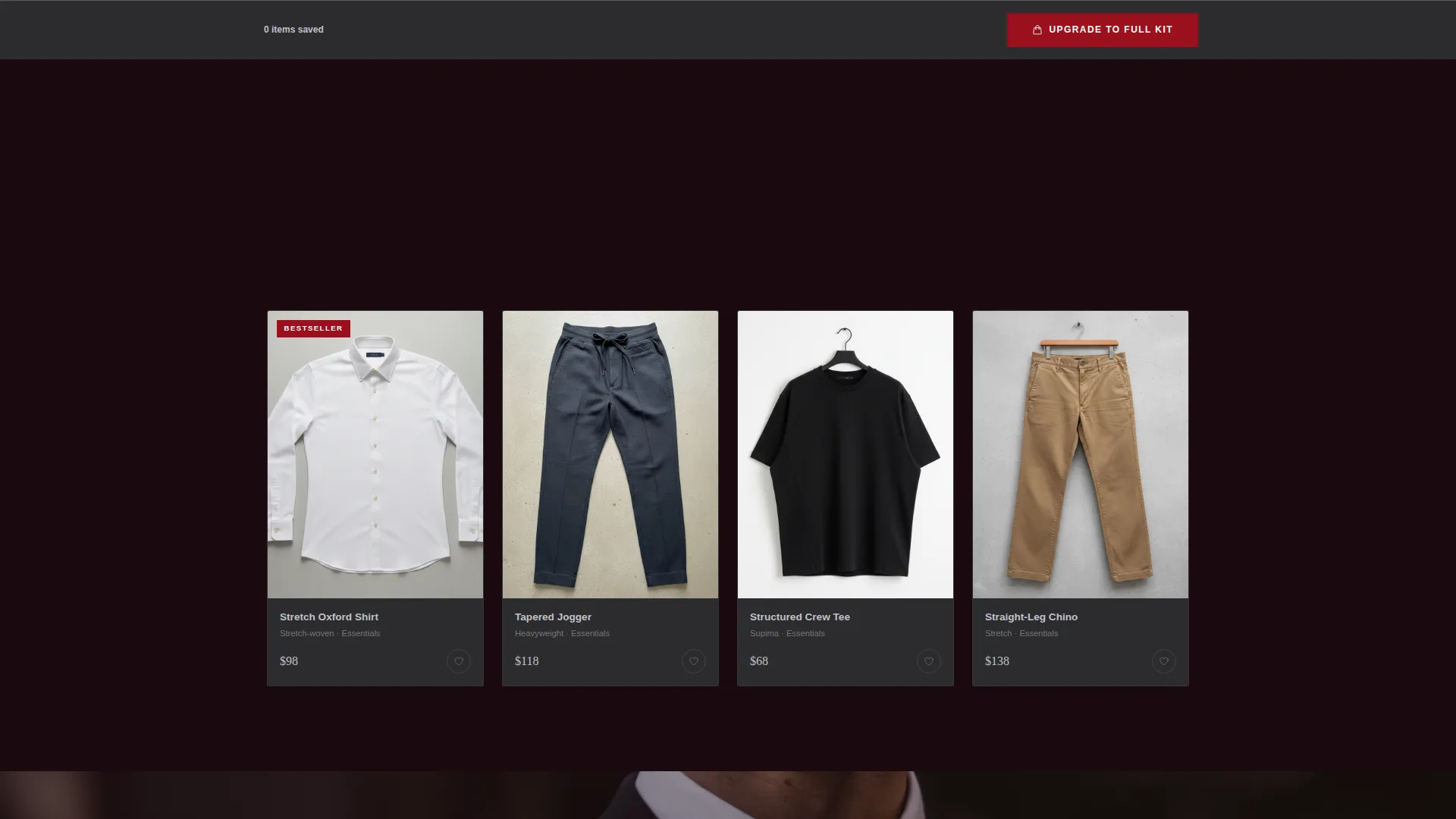
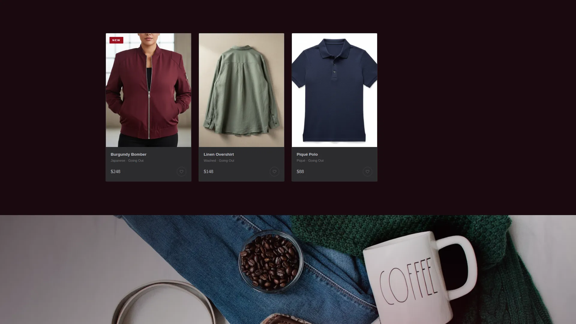
Product cards stagger into view with parallax weight as the visitor scrolls. The grid is organized into escalating collection tiers, from everyday essentials to going-out pieces to limited drops. Each tier feels like unlocking a new floor of a private showroom, keeping the scroll purposeful rather than passive.
Expandable Body-Type Detail Panels
Clicking or hovering any product card opens a full detail panel. The garment is shown on three body types: 2XL, 4XL, and 6XL. A slow Ken Burns zoom moves across the fabric texture, giving the shopper a close look at construction quality without leaving the page.
Lifestyle Photography Interrupts
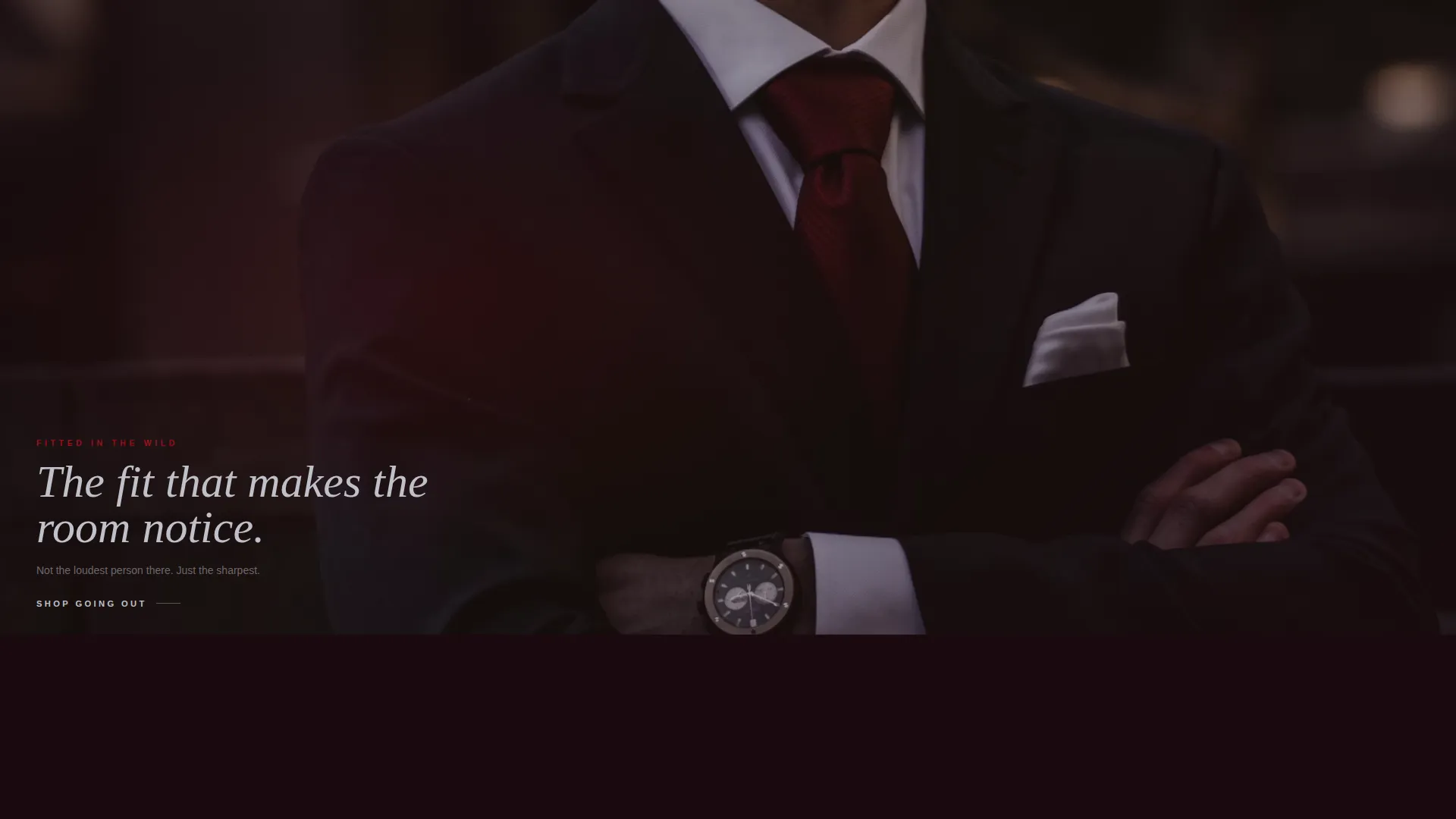
Between product grids, full-bleed lifestyle shots break the scroll. Each image uses the same ruby-and-chrome lighting language as the hero, placing the model in a rooftop bar scene or stepping out of a car. The clothes look inevitable on the body in every frame.
Sticky Bundle Builder Bar
A charcoal sticky bar sits at the bottom of the viewport. As visitors favorite items, the bar assembles a three-piece bundle in real time, showing the jacket, shirt, and jogger together with a ruby-highlighted price saving updating dynamically. The bar makes the value of the bundle visible before the formal upsell offer appears.
Email-Gated Member Pricing Unlock
After the bundle offer demonstrates value, a secondary conversion path invites the visitor to unlock permanent 15 percent off and early access to new drops by entering their email. The offer is positioned as the smart next step, not a pop-up interruption.
Page sections overview
| Section | Purpose |
|---|---|
| Full-Bleed Hero | Opens the page with a glow-lit model and the brand headline |
| Essentials Grid | Introduces everyday core pieces in the base collection tier |
| Detail Panel Expansion | Shows each garment on three body types with fabric zoom |
| Lifestyle Break One | Rooftop bar imagery reinforcing the ruby-chrome visual language |
| Going-Out Grid | Escalates to sharper, dressed-up collection pieces |
| Lifestyle Break Two | Car-exit shot deepening the premium, real-world feel |
| Limited Drops Grid | Presents the highest-tier exclusive pieces in the collection |
| Bundle Upsell Offer | Styled three-piece kit offer triggered after two detail views |
| Sticky Bundle Bar | Persistent bottom bar assembling the bundle as items are favorited |
| Member Pricing Gate | Email capture unlocking 15 percent off and early drop access |
Design & branding system
The color system is called Ruby and Chrome, and it earns that name. Every color choice has a specific role, and together they create a mood that feels like the interior of a luxury car at night: dark leather, red instrument glow, and chrome trim catching streetlight.
- Deep black-cherry (#1A0A10) fills the background, letting product photography float as if lit from within
- Polished chrome silver (#C0C0C8) handles all primary typography and divider lines, feeling machined rather than cold
- Crushed ruby (#9B111E) activates on hover states, call-to-action buttons, and price callouts, pulsing with intention rather than screaming for attention
- Warm charcoal (#2C2C2E) surfaces card backgrounds, keeping product imagery grounded without competing with the hero tones
Mobile & speed optimization
The layout is designed to translate the immersive desktop experience into a clean, scroll-friendly mobile view. Detail panels, sticky bars, and lifestyle interrupts are all structured to work at smaller viewport widths without losing their visual weight.
- Parallax card animations and Ken Burns fabric zoom are contained within the section flow, keeping the mobile scroll smooth
- The sticky bundle builder bar remains accessible at the bottom of the screen on mobile, so the real-time bundle value is always visible
How this template helps you convert
The conversion path in this template is built around earned trust. The shopper sees real bodies wearing the clothes before any sales language appears. By the time the offer lands, buying feels like a natural conclusion rather than a push.
- The expandable detail panels do the selling quietly. Seeing the bomber on a 4XL body next to a 6XL body removes the biggest objection a plus-size shopper carries into any clothing site. The template triggers the primary bundle offer only after the visitor has opened at least two detail panels, so the upsell lands at peak engagement.
- The sticky bundle bar makes the financial case visible without a hard sell. Ruby-highlighted savings update in real time as items are added, and the three-piece bundle price against individual pricing is shown clearly. The member pricing unlock follows as a logical second step, rewarding intent with permanent value rather than a one-time discount.
Other information about this template
This template belongs to the Marketplace Grid theme family, which combines structured editorial grids with high-contrast immersive visuals. It uses the Immersive Visual creative direction, meaning every section transition is intentional and the scroll feels curated rather than paginated.
- Template style: Gallery and Detail, suited for brands with a defined product range and strong visual assets
- Landing page direction: Upsell and Upgrade, with a dual conversion path covering both bundle purchase and email capture
- Header concept: Dark Full-Bleed with Glow, requiring a high-quality model photograph shot against a dark or neutral background
- Category fit: Fashion and Lifestyle, specifically the Plus-Size and Inclusive Fashion subcategory
- The template supports a niche with significant unmet demand, specifically plus-size menswear brands targeting men in sizes 2XL through 6XL who expect structured, tailored fits rather than oversized basics
Theme
Marketplace Grid
Creative direction
Immersive Visual
Color system
Ruby & Chrome
Style
Gallery + Detail
Direction
Upsell/Upgrade
Page Sections
Dark Full-bleed Hero Header
Parallax Product Gallery Grid
Expandable Body-type Detail Panels
Full-bleed Lifestyle Photography Breaks
Sticky Real-time Bundle Builder
Email-gated Member Pricing Section
Related questions
What kind of photography works best with this template?
Can I use this template if I only have one collection to launch with?
How does the bundle upsell get triggered?
Does the sticky bundle bar replace the main call-to-action button?
Is this template suitable for a brand that sells only a few hero products?