Sports Booking & Scheduling Landing Page Template
Fixture is a bold brutalist sports booking landing page built for facility managers who need to fill every court, field, and lane without the chaos of spreadsheets and late-night texts. It combines a live dashboard header, an anchor-nav spoke structure, and a sticky lead-generation bar into one powerful, no-nonsense page designed to turn scrolling managers into booked demos.
by Rocket studio
Quick summary
Fixture is a single-page sports booking and scheduling landing page template. It uses a hub and spoke anchor-nav structure to walk facility managers through every capability, from simple room booking to multi-venue tournament scheduling. The bold brutalist design and feature matrix layout make the platform's depth impossible to miss.
Who this template is for
This template is built for the people who actually run sports facilities day to day. It speaks directly to operators who know the pain of a double-booked court or a confirmation text sent at midnight.
- Leisure centre managers running five-a-side leagues and multi-sport calendars
- School athletics coordinators blocking tracks and fields for trials and events
- Private gym and club owners ready to move beyond phone calls and manual scheduling
What problem this template solves
Most booking pages bury their best features or fail to convince a skeptical facility manager in the first scroll. Fixture solves that by laying every capability out as a direct comparison: what facilities do now versus what the platform delivers.
- Double bookings, phone-call confirmations, and spreadsheet chaos are shown alongside their automated replacements
- Managers who arrive with a specific edge case, like waitlist cascades or recurring league fixtures, find it addressed before they have to ask
- The sticky demo bar captures leads before visitors leave, without interrupting the content experience
What you get with this template
You get a fully structured, anchor-navigated landing page that escalates through scheduling complexity in a logical order. Every section is built as a brutalist card grid that proves platform depth.
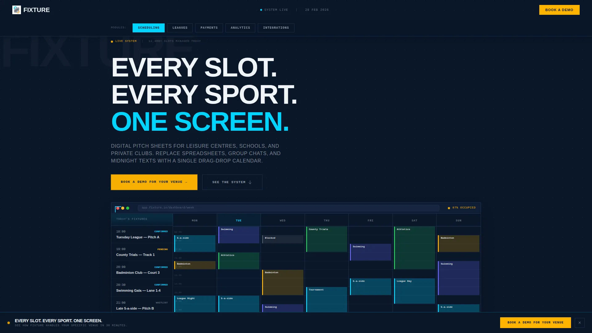
- A dashboard-preview header with a week-view calendar mockup and a real-time occupancy bar at 87%
- Five anchor-nav spokes covering Scheduling, Payments, Leagues, Analytics, and Integrations
- A sticky bottom-bar lead form with three sequential fields and a secondary self-guided demo path
Feature list
This template is packed with purpose-built components. Each one serves the goal of converting a skeptical facility manager into a confirmed demo booking.
Dashboard Preview Header
The header displays a browser-frame mockup of a week-view calendar dense with colour-coded bookings. A sidebar shows upcoming fixtures and a pulsing occupancy bar locked at 87%. The layout is straight-on and brutally flat, styled like a control-room monitor.
Hub and Spoke Anchor Navigation
Five anchor-nav pills sit in a fixed bar below the header: Scheduling, Payments, Leagues, Analytics, and Integrations. Each pill scrolls directly to its matching spoke section. Visitors can jump to the feature most relevant to their operation without losing their place.
Feature Matrix Card Grid
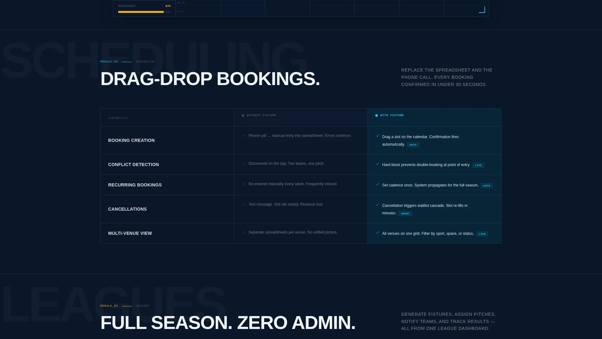
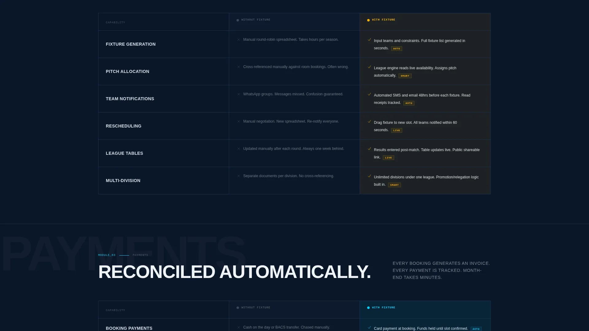
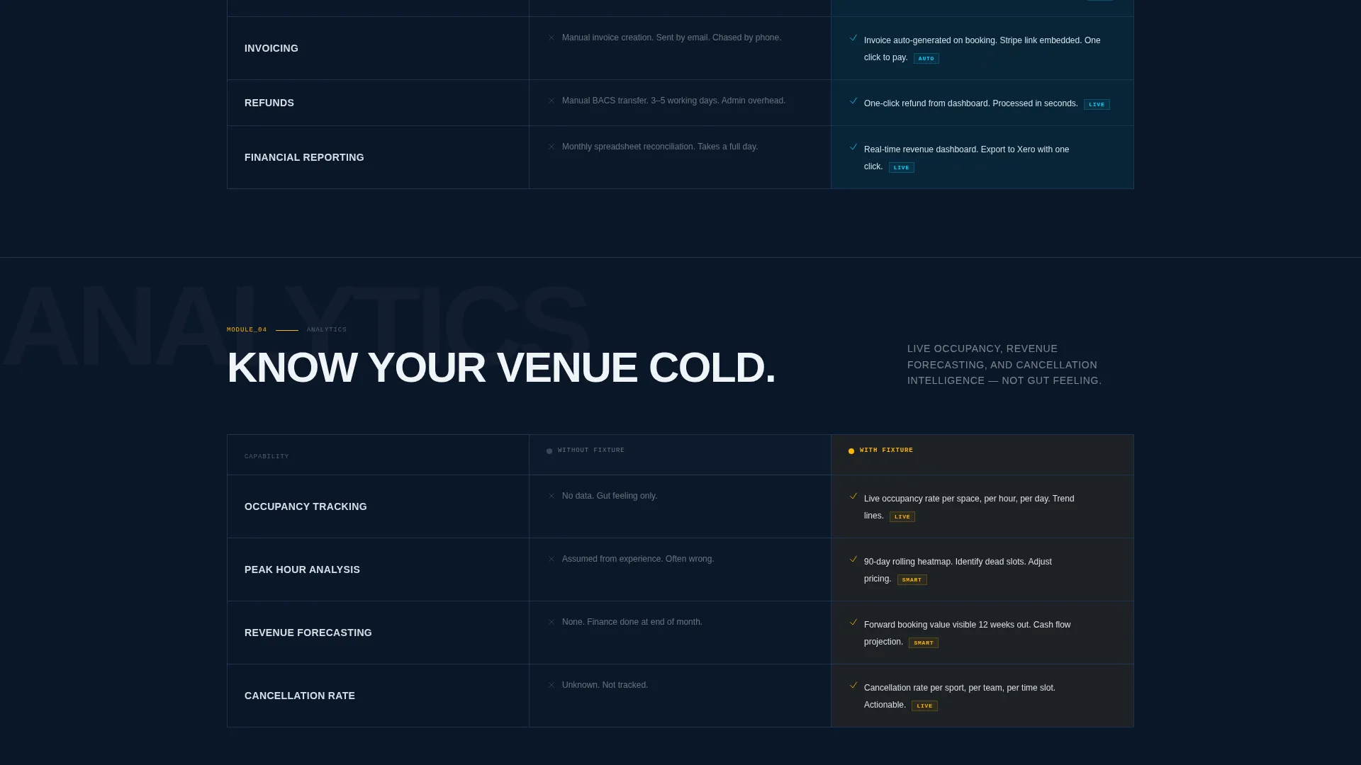
Each spoke section is built as a brutalist card grid comparing current facility practice against platform capability. The grid lines thicken as complexity increases, moving from single room booking through to financial reconciliation. Scrolling feels like inventorying power, not reading a brochure.
Sticky Lead Generation Bar
A bottom bar call to action slides up after the second spoke. It contains three sequential form fields: venue type dropdown, number of bookable spaces stepper, and work email. It stays visible without blocking content, ensuring the conversion path is always within reach.
Self-Guided Demo Path
A secondary conversion option lets visitors access an interactive demo by entering only their email. This path catches managers who prefer to explore before speaking to a team. It runs parallel to the main demo booking form without competing for attention.
Escalating Complexity Sections
The spoke order is deliberate. It starts with simple room booking, then moves to recurring league fixtures, multi-venue tournament scheduling, and finally financial reconciliation. Each level proves the platform handles the scenario the visitor was already worrying about.
Page sections overview
| Section | Purpose |
|---|---|
| Dashboard Preview Header | Establish credibility with a live-data mockup and occupancy indicator |
| Anchor Nav Bar | Fix spoke navigation persistently below the header for quick jumps |
| Scheduling Spoke | Show drag-drop calendar capability against spreadsheet status quo |
| Payments Spoke | Compare manual invoicing with automated payment confirmation flows |
| Leagues Spoke | Demonstrate recurring fixture scheduling for weekly league operations |
| Analytics Spoke | Present reporting and occupancy data in the brutalist card grid format |
| Integrations Spoke | Cover platform connections relevant to multi-venue facility management |
| Sticky Demo Bar | Capture leads with a three-field form that slides in after spoke two |
| Self-Guided Demo Gate | Offer email-only access to an interactive demo for self-service visitors |
Design & branding system
The visual identity is bold brutalist, built to feel like an indoor arena after hours. Every design decision is functional. Nothing is decorative.
- Color palette: deep terminal navy (#0A1628), stadium-floodlight white (#F0F4F8), lane-line cyan (#00D4FF), and whistle-blast amber (#FFB400) reserved for calls to action and live-status indicators
- Typography is oversized and tightly stacked, with monospaced fonts applied wherever data or scheduling figures appear
- Whitespace is treated like a ruled pitch, measured and deliberate, not used as decoration
Mobile & speed optimization
The template is structured for facility managers who check dashboards between sessions, often on a phone or tablet. The layout adapts without sacrificing the brutalist grid logic.
- The anchor-nav bar and sticky demo call to action are designed to remain functional at smaller screen sizes
- The feature matrix card grid reflows to a single column on mobile, keeping comparisons readable without horizontal scrolling
- The header dashboard mockup scales to stay recognisable on narrower viewports without losing the occupancy bar detail
How this template helps you convert
Fixture earns its conversions by proving depth before asking for anything. The layout is sequenced to build confidence, not to rush a click.
- The dashboard header lands the core promise immediately, so a manager knows within seconds whether this platform handles their scale and sport mix.
- The escalating spoke structure mirrors the way a facility manager actually thinks, moving from daily scheduling pain to league complexity to financial reporting, so by the time the demo bar slides up, the visitor has already seen their own problem solved in a screenshot.
- The dual conversion paths, a full demo booking form and a lighter email-only interactive demo, mean the template captures both committed buyers and cautious explorers in the same scroll.
Other information about this template
This template sits at the intersection of sports digital presence and technology, making it a strong fit for operators building or refreshing a sports facility booking platform.
- The template style is hub and spoke with anchor navigation, a format well suited to software products with multiple distinct feature areas
- The creative direction is a feature matrix, meaning the page is structured as a capability inventory rather than a narrative story
- The bold brutalist theme and midnight blue color system give the page a distinct visual identity that stands apart from generic sports website templates
- The lead generation direction means every design and copy decision feeds toward the demo booking form, with the self-guided demo as a lower-friction fallback
- This template is built as a single-page landing page, not a multi-page website, so all content lives within one scrollable, anchor-linked experience
Theme
Bold Brutalist
Creative direction
Feature Matrix
Color system
Midnight Blue
Style
Hub & Spoke (Anchor Nav)
Direction
Lead Generation
Page Sections
Dashboard Preview Header
Hub and Spoke Anchor Navigation
Feature Matrix Card Grid
Sticky Lead Generation Bar
Self-guided Demo Path
Escalating Complexity Spoke Order
Related questions
Who is this landing page template designed for?
What kind of businesses does the feature matrix structure suit best?
How does the lead generation setup work on this template?
Is this template suitable for a facility just starting out with online booking?



