Specialist Space & Advanced Aerospace Comparison Website Template
Flare is a hub-and-spoke landing page template built for space weather monitoring platforms. It combines a credential-first logo bar, spoke-by-spoke comparison tables, and a parallel-test call to action into one disciplined, data-confident layout. The Warm Stone palette and Corporate Precision theme communicate institutional authority without sacrificing clarity or human warmth.
by Rocket studio
Quick summary
Flare is a single-page, anchor-nav landing page template designed for space weather monitoring platforms. It guides satellite operators, grid engineers, and aviation planners through a transparent evidence trail, raw data pipeline to validated forecast model to latency benchmark, before presenting a side-by-side comparison and a no-risk parallel test offer.
Who this template is for
This template is built for technically credible platforms that sell operational intelligence to high-stakes industries. It works best when the product earns trust through process transparency rather than marketing claims.
- Satellite fleet operators who schedule maneuvers around radiation storms and coronal mass ejection (CME) trajectories
- Power grid engineers in northern latitudes who need reliable 72-hour geomagnetic activity forecasts for load-balancing decisions
- Aviation route planners rerouting polar flights when proton flux breaches International Civil Aviation Organization thresholds
What problem this template solves
Most monitoring platform pages lead with claims. Sophisticated buyers in aerospace and defense do not respond to claims; they respond to methodology. This template solves the credibility gap by showing the full data pipeline before asking for anything.
- Visitors cannot tell one alert provider from another when every provider uses the same language
- Technical buyers need to see model validation statistics and latency benchmarks before they will consider switching
- A standard hero-and-features layout wastes the one asset a precision platform actually has: documented process
What you get with this template
You get a fully structured hub-and-spoke landing page with an anchor navigation bar and five dedicated spoke sections. Each spoke is designed to carry both an explanatory process panel and a comparison table, in that order.
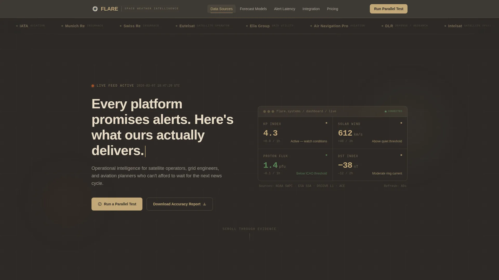
- A slow-scrolling logo bar header featuring client-sector credentials rendered in monochrome sandstone on basalt, establishing authority before any headline appears
- Five anchor-nav spokes covering Data Sources, Forecast Models, Alert Latency, Integration, and Pricing, each with a side-by-side comparison table against "Industry Standard" and "Legacy Providers"
- A primary call-to-action form for a 14-day parallel test with fields for operational sector, current provider, and alert delivery preference (API webhook, email, or SMS), plus a secondary gated report download
Feature list
This section describes the core structural and design capabilities built into the Flare template.
Anchor Navigation Bar
A sticky top navigation bar links directly to each of the five spoke sections. Visitors can jump to Data Sources, Forecast Models, Alert Latency, Integration, or Pricing without losing their place in the page flow.
Logo Bar Header
The header opens with a slow, horizontally scrolling strip of client-sector logos rendered in monochrome sandstone against a deep basalt background. The logos establish sector credibility for roughly four seconds before the headline types in below them.
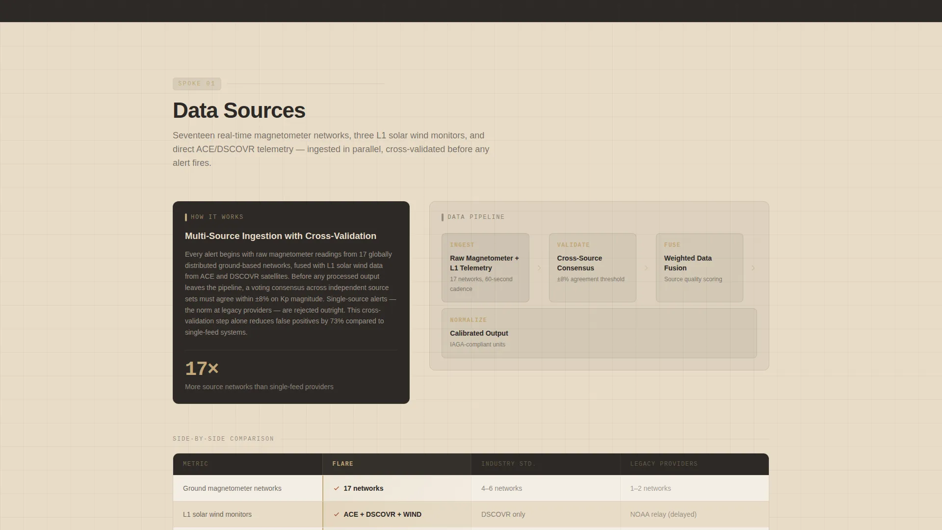
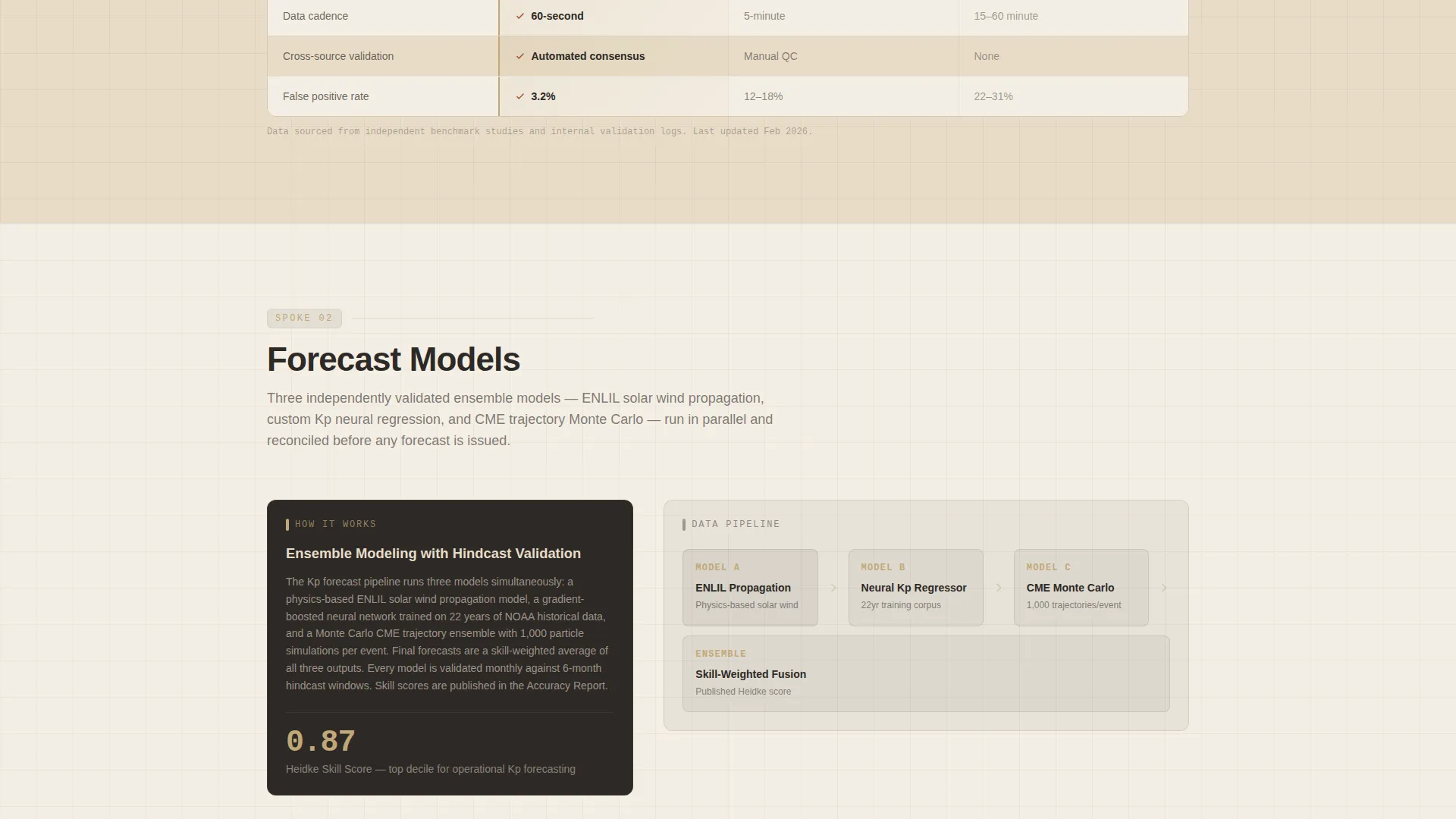
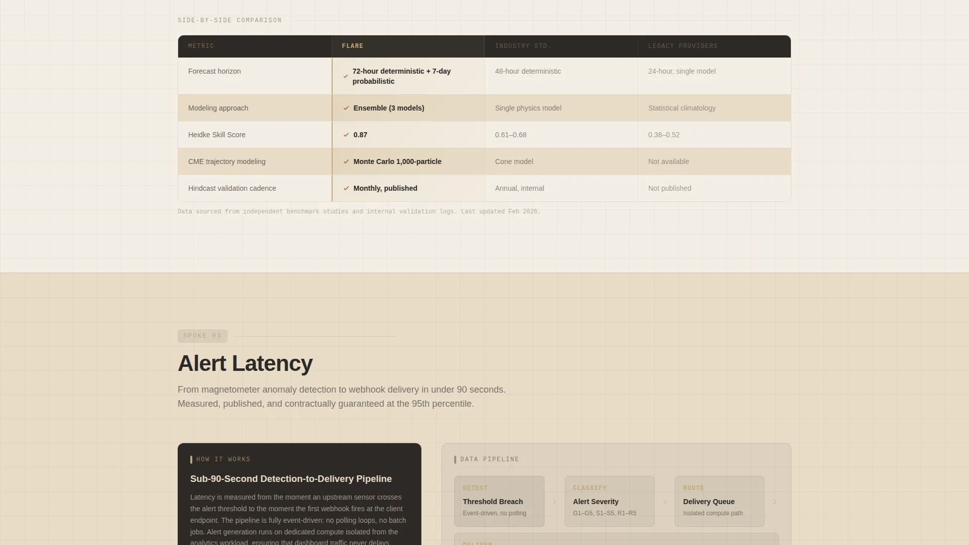
Spoke-by-Spoke Comparison Tables
Each spoke section first walks through how the platform does what it does, naming the pipeline steps and displaying actual historical accuracy percentages. Only after that explanation does a side-by-side comparison table appear, letting the process evidence do the persuading.
Parallel Test Call-to-Action Form
The primary conversion form invites prospects to run a 14-day parallel test alongside their current provider. The form captures operational sector via dropdown, current provider name (optional), and preferred alert delivery method, making the sign-up feel like a low-risk operational decision.
Gated Accuracy Report Download
A secondary conversion path offers a downloadable accuracy report gated behind a work email address. This gives earlier-stage visitors a meaningful next step without requiring a full commitment to the parallel test.
Warm Stone Alert Hierarchy
Iron-oxide red (#A0522D) is reserved exclusively for alert states and comparison-winning checkmarks. Its sparing use means the eye responds immediately when it appears, making critical alert indicators impossible to overlook inside data-dense panels.
Page sections overview
| Section | Purpose |
|---|---|
| Logo Bar Header | Establish sector credibility before any headline |
| Typed Headline | Introduce the comparison-led value position |
| Anchor Navigation Bar | Link directly to all five spoke sections |
| Data Sources Spoke | Explain magnetometer ingestion pipeline, then compare |
| Forecast Models Spoke | Show named models and validation accuracy, then compare |
| Alert Latency Spoke | Display latency benchmarks and historical data, then compare |
| Integration Spoke | Detail API webhook and delivery options, then compare |
| Pricing Spoke | Present pricing structure, then compare against alternatives |
| Parallel Test Form | Capture sector, provider, and delivery preference |
| Accuracy Report Gate | Offer gated report download via work email |
Design & branding system
The Warm Stone palette is applied with a clear hierarchy that keeps data-dense panels readable and alert states visually commanding. Every color choice reflects the geological survey aesthetic: institutional, warm, and serious.
- Quarried sandstone (#C2A878) anchors section backgrounds; polished travertine (#E8DCC8) provides breathing room inside data panels; deep basalt (#2C2926) dominates text, navigation chrome, and the logo bar field
- Iron-oxide red (#A0522D) appears only on alert state indicators and comparison-winning checkmarks, so its presence carries genuine visual weight
- The Corporate Precision theme pairs the Warm Stone system with clean typographic hierarchy and structured grid layouts that communicate operational discipline without feeling cold or sterile
Mobile & speed optimization
The hub-and-spoke layout is designed to remain navigable and readable on smaller screens. The sticky anchor nav and spoke structure help mobile visitors move directly to the section most relevant to their role.
- The anchor navigation collapses cleanly for smaller viewports so that all five spokes remain reachable without excessive scrolling
- Comparison tables are structured for horizontal readability, keeping the three-column layout (this platform, Industry Standard, Legacy Providers) legible across device widths
- The slow-scrolling logo bar is designed to pace itself without creating layout instability on mobile or tablet displays
How this template helps you convert
The conversion architecture is built on a single insight: technical buyers trust process before they trust promises. Every layout decision sequences evidence ahead of the ask.
- The logo bar and typed headline establish credibility and set a comparison-led expectation before the visitor has read a single feature claim, lowering the instinctive resistance that greets most monitoring platform pages.
- The five-spoke structure walks visitors through the full evidence trail, pipeline transparency, named forecast models, latency benchmarks, integration options, and pricing, so that by the time the parallel test form appears, agreeing to it feels like a logical next step rather than a sales commitment.
- The gated accuracy report provides a lower-friction second path for visitors who are not yet ready for the parallel test, capturing work emails from technically qualified leads who are still in an evaluation phase.
Other information about this template
This template is part of the Aerospace and Defense category under the Space and Advanced Aerospace subcategory, designed specifically for the space weather monitoring niche. It was built to align with a high-intent intersection score, meaning the design and conversion architecture reflect how buyers in this niche actually evaluate and purchase operational intelligence tools.
- The hub-and-spoke structure supports up to five anchor-linked spoke sections, each independently expandable with process explanations and comparison tables
- The Comparison and Versus landing page direction means the layout is intentionally optimized for buyers who are already using a competitor and need a clear, evidence-based reason to consider switching
- The Transparent Process creative direction is the organizing principle: every section reveals methodology before stating a conclusion, which is the most effective posture for platforms serving regulated or high-consequence industries
- The template style, color system, header concept, and conversion direction are all derived from an intersection match validated across category, subcategory, and niche alignment
Theme
Corporate Precision
Creative direction
Transparent Process
Color system
Warm Stone
Style
Hub & Spoke (Anchor Nav)
Direction
Comparison/Versus
Page Sections
Sticky Anchor Navigation Bar
Credibility-first Logo Bar
Evidence-led Comparison Tables
Day Parallel Test Form
Gated Accuracy Report Download
Alert-state Color Hierarchy
Related questions
What industries is the Flare template designed for?
Can I customize the spoke section labels and comparison table content?
What makes the hub-and-spoke layout suitable for a comparison-led page?
Is the Warm Stone color palette easy to apply to an existing brand?
What is the purpose of the typed headline that appears after the logo bar?


