Flash — Study Tool Landing Page Template
Cram is a single-page flashcard app landing page template built around an interactive AI demo tool. Visitors paste their notes and watch a spaced-repetition deck generate in real time before ever seeing a pricing table. The layout flows from live demo to feature comparison to social proof, driving sign-ups through product experience rather than promises.
by Rocket studio
Quick summary
Cram is a dynamic, single-page landing page template for a study and flashcard app. The page opens with animated Dark Glass Panels, drops the visitor into a live AI deck-generation demo, and then reveals a Cram Free versus. Cram Pro versus. Cram Teams comparison table. Every section is designed to earn the click before asking for it.
Who this template is for
This template is built for founders, product teams, and indie developers launching or promoting an AI-powered flashcard or study app. It resonates most with audiences that learn under pressure and expect software to match that urgency.
- Pre-med students managing dense anatomy and biology modules
- Law students racing through case law before bar exam prep
- Language learners building vocabulary sets during short daily commutes
What problem this template solves
Study app landing pages often lead with marketing claims before showing the product. Visitors scroll past walls of feature bullets and leave without feeling anything. This template flips that order entirely.
- It puts the AI demo tool above the comparison table so visitors experience value first
- It removes form friction by routing directly to a sign-up flow through a single call-to-action button
- It uses progressive disclosure to build trust: personal proof, then feature comparison, then social proof
What you get with this template
You get a fully structured, single-page layout that combines an interactive demo section, a three-column comparison table, and a floating conversion bar. Every visual element follows a consistent iridescent dark-mode design system.
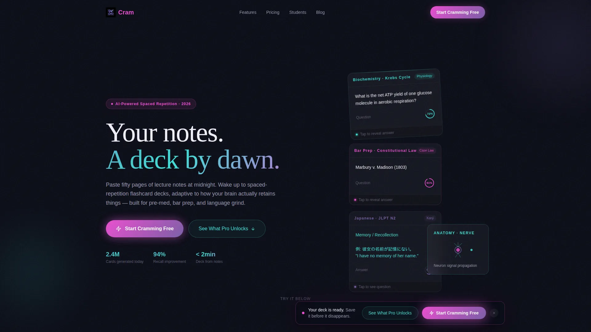
- An animated header with Dark Glass Panels showing live flashcard micro-animations
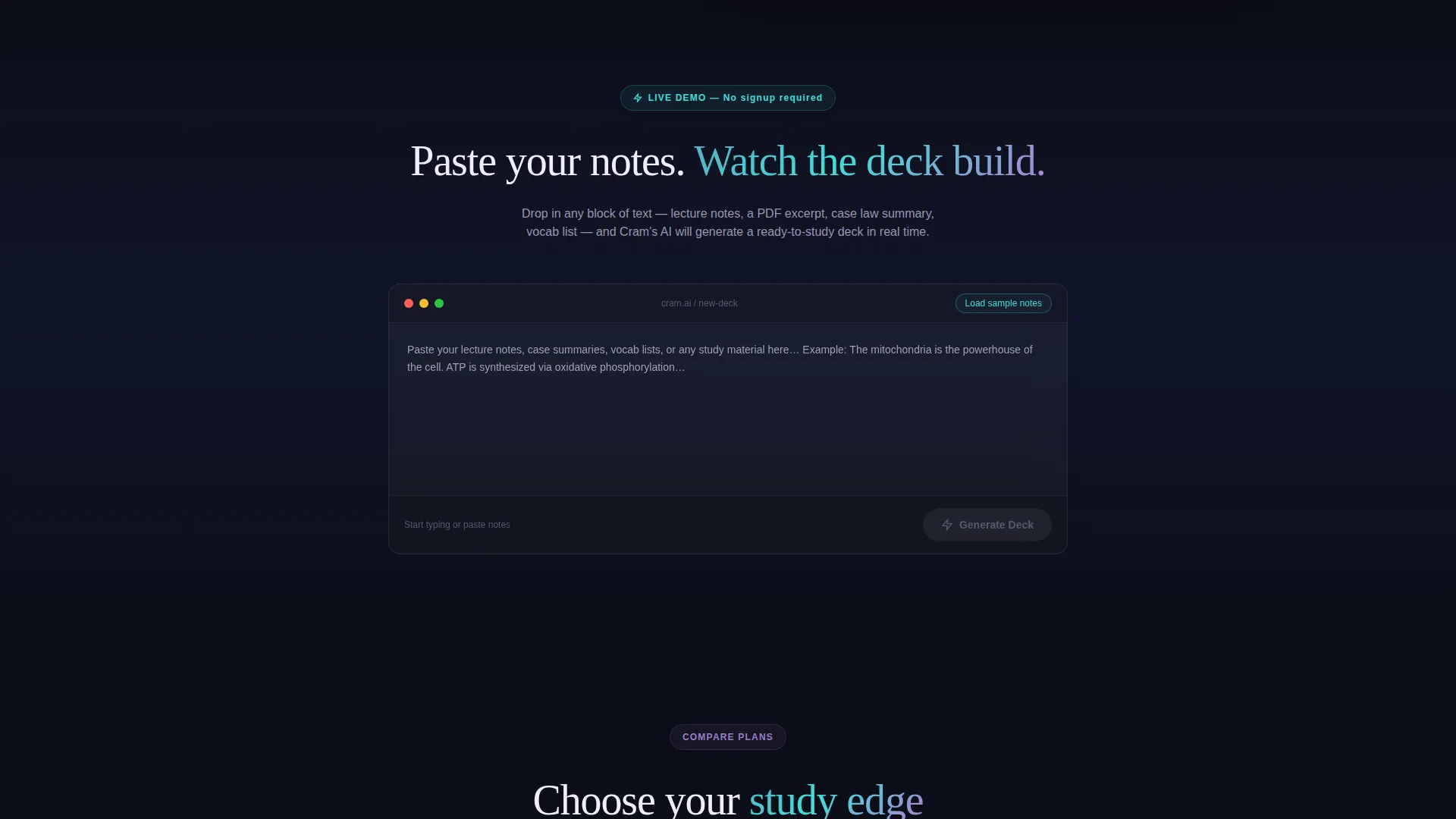
- A Calculator/Tool First demo section where visitors generate a deck before seeing any pricing
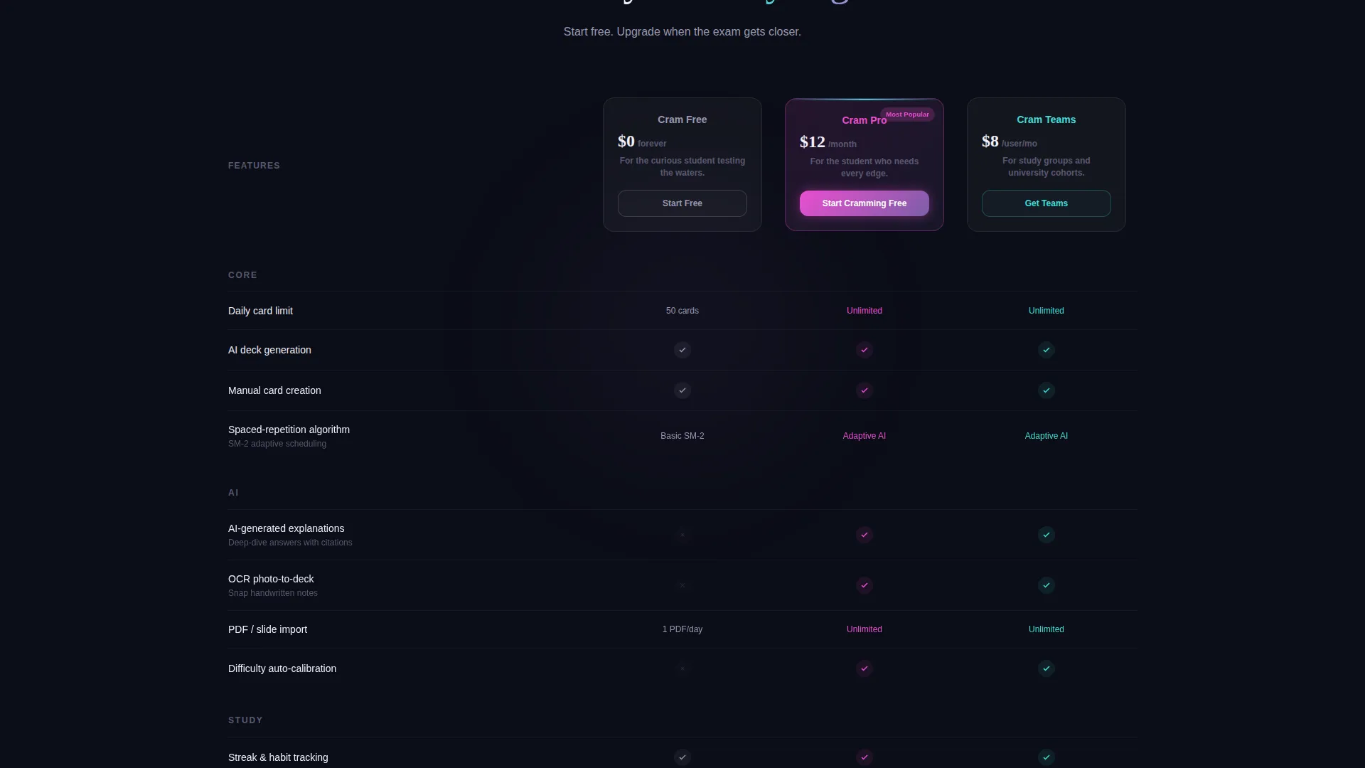
- A Cram Free versus. Cram Pro versus. Cram Teams comparison table with scroll-triggered row animations
Feature list
This template packages several distinct design and interaction systems into one cohesive landing page layout.
Animated Dark Glass Panel Header
The header uses translucent, frosted panel rectangles floating against a void-black background. Each panel displays a different flashcard state mid-flip, including a rotating chemistry structure, a Spanish conjugation table, and a confidence-score heatmap. Panels breathe with micro-animations and iridescent edge lighting that shifts from violet to cyan as the cursor moves.
Live AI Demo Tool Section
Before any comparison copy appears, the visitor can paste a block of text or upload a photo of their notes. The AI parses the input into a live flashcard deck directly on the page. This hands-on experience converts curiosity into genuine product understanding before any pricing context is shown.
Scroll-Triggered Comparison Table
The three-column comparison table covers Cram Free, Cram Pro, and Cram Teams. Feature rows include daily card limits, AI-generated explanations, spaced-repetition algorithms, collaborative decks, and analytics dashboards. Each row animates in on scroll, with checkmarks and cross-marks landing with micro-bounce feedback.
Floating Neural Pink call to action Bar
A sticky bottom bar appears after the visitor interacts with the demo tool. It carries the primary call-to-action button labeled "Start Cramming Free" in neural pink. The bar stays visible without interrupting the scroll experience, appearing only once the visitor has already engaged with the product.
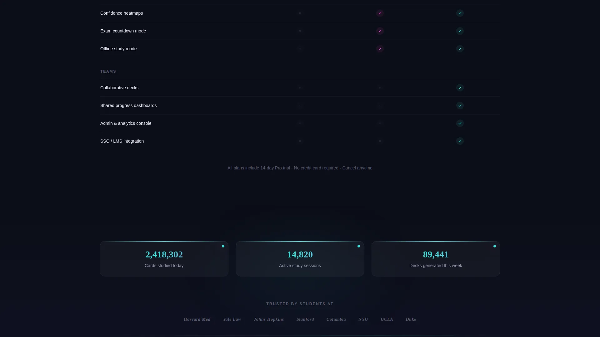
Social Proof Progression Section
Below the comparison table, the layout moves into social proof. This section includes university logos and live session-count tickers. The sequencing is deliberate: generated deck first, then comparison table, then external validation.
Secondary Ghost-Button Navigation
A secondary ghost-style button labeled "See What Pro Unlocks" is available for visitors who have not yet scrolled to the comparison table. It scrolls them down directly to the pricing tier section. This keeps navigation intuitive without cluttering the hero area.
Page sections overview
| Section | Purpose |
|---|---|
| Dark Glass Header | Showcases animated flashcard panels to establish product energy immediately |
| AI Demo Tool | Lets visitors generate a live deck from their own notes before any marketing copy |
| Comparison Table | Stacks Cram Free, Pro, and Teams columns with scroll-animated feature rows |
| Social Proof Rail | Displays university logos and session-count tickers to validate scale |
| Floating call to action Bar | Pins the primary sign-up button after demo interaction to capture conversion intent |
Design & branding system
The visual identity runs on an AI Iridescent color system layered over a Dynamic Motion theme. The overall effect feels like light refracting through a prism on a dark desk late at night: synthetic, alive, and precise.
- Void black (#0B0D17) dominates all backgrounds, keeping contrast sharp and focus clean
- Holographic violet (#7B5EA7) and shifting cyan (#3EDFD7) bleed across card surfaces, dividers, and interactive affordances
- Neural pink (#E94ECF) fires exclusively on conversion moments such as the primary call to action button and toggle active states
Mobile & speed optimization
The template is structured for a focused, linear scroll experience that adapts naturally to smaller screens. The floating call to action bar and demo section are central to the mobile flow.
- The demo tool section is the first interactive touchpoint, keeping the most important element prominent on any screen size
- The floating bottom bar stays pinned to the viewport so the primary call to action is always reachable during scroll
- Micro-animations including card flips, progress ring fills, and streak increments are tied to scroll and interaction triggers rather than page load
How this template helps you convert
The conversion strategy is built entirely on letting the visitor experience the product before seeing a single pricing row. That sequence matters.
- The live demo tool creates a personal proof moment: the visitor sees their own notes turned into flashcards, building immediate trust in the product's core capability.
- The scroll-triggered comparison table arrives only after that proof moment, making the Cram Free versus. Pro versus. Teams decision feel informed rather than premature.
- The floating neural-pink call to action button appears post-interaction and stays pinned, so the path to sign-up is always one tap away without interrupting the content flow.
Other information about this template
This template is designed specifically for the study and flashcard app niche, where users are results-driven and skeptical of vague promises. The layout respects that mindset by leading with a functional demo rather than marketing language.
- The page type is a single landing page, not a multi-page site, keeping the visitor's focus on one conversion path
- The template style is a comparison table layout, making it well-suited for apps with tiered pricing like free, pro, and team plans
- The template fits within the Consumer App and Platform subcategory under the broader Technology category
- No form fields appear on the page itself; the call to action routes directly to an external sign-up flow
Theme
Dynamic Motion
Creative direction
Calculator/Tool First
Color system
AI Iridescent
Style
Comparison Table
Direction
Click-Through
Page Sections
Animated Dark Glass Panel Header
Live AI Deck Generation Demo
Scroll-triggered Comparison Table
Floating Neural Pink Call to Action Bar
Social Proof Progression Rail
Secondary Ghost-button Navigation
Related questions
Who is this landing page template designed for?
Does the page require visitors to fill out a form?
How does the demo tool section work in this template?
Can I use this template for an app with multiple pricing tiers?
What makes the visual design of this template distinctive?



