Automotive Field Service Management Landing Page
Fleet is a modular card-grid landing page template built for automotive field service management platforms. It guides visitors through a sharp Problem-to-Solution arc, anchored by a scrolling logo bar, metric-driven result cards, and a single bold call to action. The dark Monochrome Steel palette with high-voltage green accents gives it the feel of a live dispatch board already running.
by Rocket studio
Quick summary
Fleet is a single-page, click-through landing page template designed for automotive dispatch and field service management platforms. It uses a modular card grid, a Problem-to-Solution creative arc, and a Monochrome Steel color system to move visitors from pain-point recognition to a live demo click without a single form in the way.
Who this template is for
This template is built for teams selling or marketing automotive field service management software. It speaks directly to the buyers who feel the daily cost of disorganized dispatch operations.
- Regional auto glass companies handling high daily job volumes, such as thirty or more windshield replacements per day
- Mobile mechanic franchises whose dispatchers still coordinate work using whiteboards or phone calls
- Fleet maintenance managers at delivery companies where every hour a vehicle sits idle costs real money
What problem this template solves
Dispatch software is genuinely difficult to sell on a static page. Prospects need to feel the problem before they believe the solution. This template solves that credibility gap with a structured visual narrative.
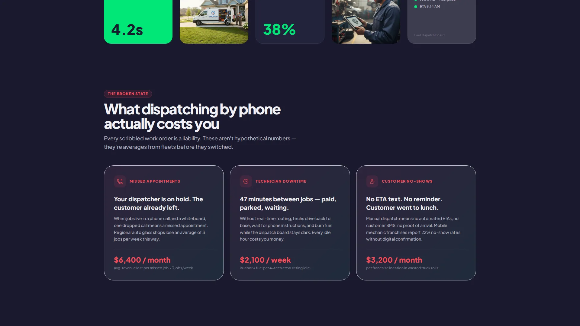
- Missed appointments, technician downtime, and customer no-shows are shown as real cost items with specific dollar figures, not vague complaints
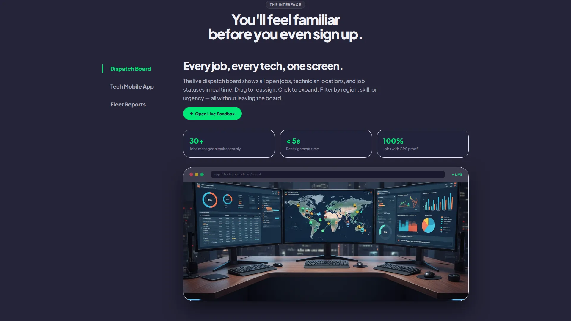
- The page never asks visitors to imagine benefits; it shows real interface screenshots inside solution cards so they arrive at the demo already familiar
- A single focused call to action removes friction by skipping forms entirely and routing visitors straight to a live sandbox environment
What you get with this template
You get a fully structured, modular landing page that handles the entire sales conversation from first impression to demo click. Every section is purpose-built and self-contained.
- A scrolling logo bar header with a visible green call-to-action button above the fold, no scrolling required
- Three rows of modular cards covering pain points with dollar figures, solution features with live-status animations, and metric proof cards showing real customer results
- A sticky mobile bottom bar and a final anchored section that both repeat the primary call to action for visitors who scroll all the way through
Feature list
This template is built around components that do specific conversion work. Each one is grounded in the dispatch platform use case.
Scrolling Logo Bar Header
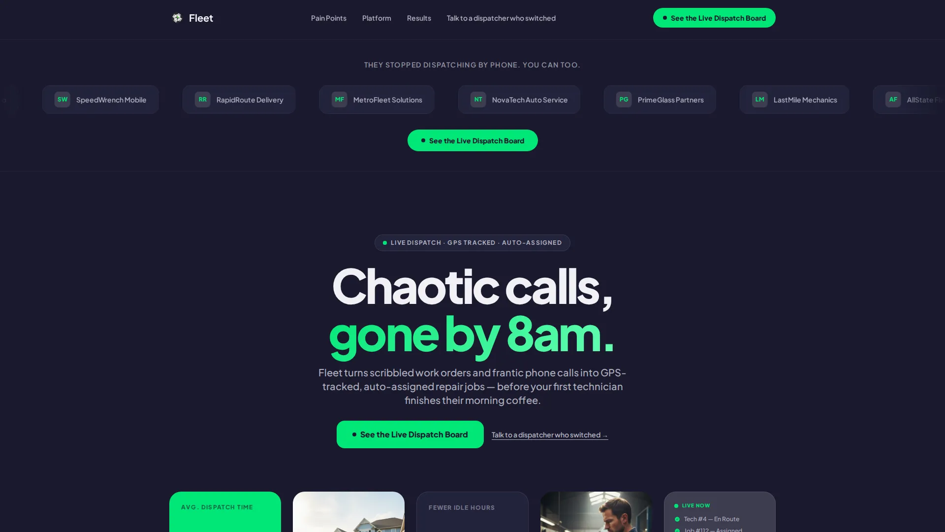
A horizontal strip of automotive and fleet brand logos scrolls at an unhurried pace against a forge black background. A single line of aluminum-white typography sits above it. A green call-to-action button appears below it, fully visible without scrolling. The header creates immediate credibility and sets the tone before a visitor reads a single feature.
Problem Card Row with Cost Indicators
Three cards present the core pain points: missed appointments, technician downtime, and customer no-shows. Each card includes a specific dollar figure showing monthly loss. A subtle red-to-green gradient on each card hints at resolution before the visitor reaches the solution row.
Solution Card Row with Status Animations
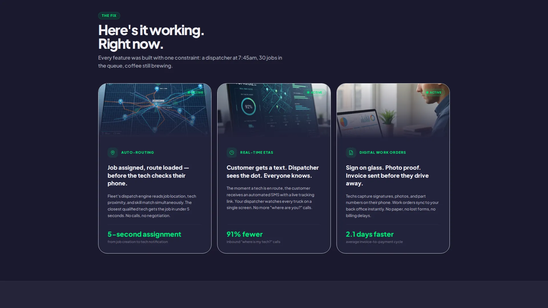
The second card row flips the narrative. Cards cover auto-routing, real-time estimated arrival times, and digital work orders. Each card animates in with a status badge turning green, visually confirming that the problem shown above is now resolved.
Metric Proof Cards
A final card row shows real customer results using specific numbers: 38 percent fewer idle hours and a 4.2-minute average dispatch time. These cards function like a dashboard assembling in real time and give prospects a concrete reason to click through to the demo.
Primary and Secondary Call-to-Action System
The primary call to action, "See the Live Dispatch Board," appears in the header, repeats as a sticky bottom bar on mobile, and anchors the final section. A secondary text link, "Talk to a dispatcher who switched," routes to a calendar booking. No form appears anywhere on the page.
Interface Screenshot Cards
Real product screenshots are embedded inside the solution cards. Visitors see the actual dispatch interface before they reach the demo environment. This reduces hesitation and makes the sandbox feel familiar on arrival.
Page sections overview
| Section | Purpose |
|---|---|
| Logo Bar Header | Builds credibility and delivers the primary call to action above the fold |
| Pain Point Cards | Shows three specific cost problems with dollar figures and gradient indicators |
| Solution Feature Cards | Flips the narrative with auto-routing, real-time ETAs, and digital work orders |
| Metric Result Cards | Proves outcomes with specific customer performance numbers |
| Final call to action Section | Anchors the demo click and repeats the secondary calendar booking link |
Design & branding system
The visual identity follows a Startup Velocity theme built on a Monochrome Steel color system. The palette is intentional and restrained, using darkness to draw full attention to what matters.
- Core colors are forge black (#1A1A2E) for backgrounds, asphalt gray (#3D3D50) for card surfaces, brushed aluminum (#B0B0BF) and off-white (#F0F0F5) for all body and heading text
- High-voltage green (#00E676) is reserved exclusively for interactive elements and status indicators, including buttons, toggles, and live-status dots, so every actionable element stands out immediately
- Typography stays in aluminum and white tones throughout, keeping the reading experience clean against the dark backgrounds while the green accent does all the directional work
Mobile & speed optimization
The template is designed with mobile dispatch users and on-the-go fleet managers in mind. The layout adapts to smaller screens without losing the conversion structure.
- The sticky bottom bar on mobile keeps the primary call to action visible at all times, regardless of how far a visitor scrolls
- The modular card grid reflows cleanly across screen sizes, so each pain-point, solution, and metric card remains readable and self-contained on a phone
- No form fields appear anywhere on the page, which removes a significant source of mobile friction and keeps the path to the demo direct and fast
How this template helps you convert
Every design and copy decision in this template is aimed at one outcome: getting a qualified visitor to click through to the live dispatch board demo. The arc is tight and deliberate.
- The scrolling logo bar and bold header statement establish trust and relevance within the first few seconds, before a visitor has to work for context
- The Problem-to-Solution card arc moves visitors emotionally from recognition of real costs to confidence in the solution, using real numbers and interface visuals rather than generic claims
- The no-form click-through structure removes every barrier between interest and action, placing the primary call to action in three distinct locations so it is always one tap or click away
Other information about this template
This template is categorized under Technology and the Automotive Software subcategory, with a specific focus on the automotive field service management niche. It is built as a single-page, click-through layout using a Card Grid (Modular) template style.
- The creative direction follows a Problem-to-Solution Arc, a structure that works well for software products where the buyer already knows their pain but has not yet seen a platform that addresses it directly
- The template style is modular, meaning individual card rows can be updated or reordered without restructuring the full page layout
- The Startup Velocity theme is expressed through fast visual pacing, high-contrast elements, and motion cues like scrolling logos and animating status badges that give the page a sense of forward momentum
Theme
Startup Velocity
Creative direction
Problem→Solution Arc
Color system
Monochrome Steel
Style
Card Grid (Modular)
Direction
Click-Through
Page Sections
Scrolling Logo Bar with Above-fold Call to Action
Pain-point Cards with Dollar Figures
Animated Solution Cards with Status Badges
Metric Proof Cards with Real Results
No-form Click-through Call to Action System
Embedded Interface Screenshot Cards
Related questions
Who is this landing page template designed for?
Does this template include a lead capture form?
Can I update the card content with my own metrics and screenshots?
What makes the Problem-to-Solution Arc effective for this use case?
What color is used for call-to-action buttons and status indicators?



