Fleet Logistics Trucking — Landing Page Template
Dispatch is a hub-and-spoke landing page template built for trucking booking systems. It guides owner-operators, fleet managers, and mid-size carriers through a Problem-to-Solution arc across five anchored spokes: Book, Track, Invoice, Optimize, and Scale. The dark Dashboard Pro design and freemium trial flow make the page feel ready to work from the first scroll.
by Rocket studio
Quick summary
Dispatch is a single-page, anchor-nav landing page template designed for trucking booking systems. It pairs a live-style dashboard header with a structured five-spoke layout to move freight professionals from frustration to a free trial signup. The Carbon Fiber color system and problem-first creative direction make every section feel operational from the moment it loads.
Who this template is for
This template is built for companies offering trucking booking or dispatch software to freight professionals. It speaks directly to the people who feel that pain every day and positions your platform as the obvious fix.
- Owner-operators managing broker calls and loads on a single device
- Fleet managers trapped in spreadsheets and aging whiteboards
- Mid-size carriers who have outgrown manual coordination but need an affordable entry point
What problem this template solves
Freight software landing pages often lead with feature lists and pricing tables. Dispatch flips that order. It opens with a real-looking dispatch board, recreates specific operational pain points, and only then presents the solution. The result is a page that earns trust before it asks for a signup.
- Missed loads and broker miscommunication caused by fragmented tools
- No clear, fast path from "I'm interested" to "I'm running my first load"
- Generic software pages that don't speak the language of the trucking industry
What you get with this template
You get a complete, single-page landing page structured around five anchor navigation spokes. Each section is designed, labeled, and sequenced to guide a freight professional from recognition to conversion without friction.
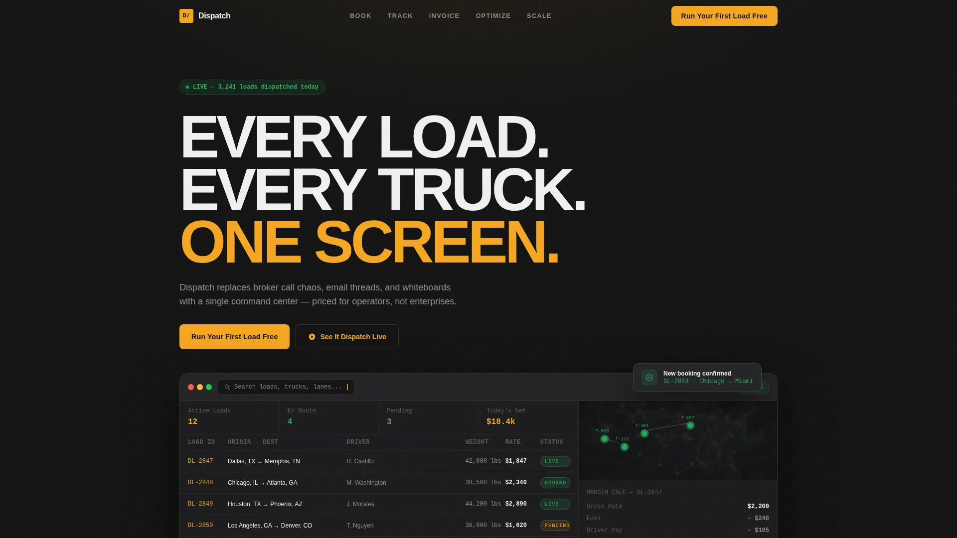
- A full-width dashboard header with live-style data visualization and a blinking amber search cursor
- Five spoke sections (Book, Track, Invoice, Optimize, Scale), each opening with a pain-point scene and resolving to a clean module view
- A three-field freemium trial form, a floating call-to-action button, and a secondary demo-trigger path
Feature list
This template packs a focused set of visual and structural capabilities drawn directly from the brief. Each one serves the conversion goal without adding noise.
Anchor Navigation Bar
A five-item navigation bar pins to the top of the page after the visitor scrolls past the header. The labels Book, Track, Invoice, Optimize, and Scale act as both section anchors and a product overview in five words.
Dashboard Preview Header
The header opens with a full-width screenshot of a dispatch board showing twelve loads, four trucks with pulsing green location indicators on a dark map, an incoming booking notification, and a margin calculator displaying a real lane figure. A blinking amber cursor sits in the search bar, signaling that the system is ready.
Problem-to-Solution Spoke Sections
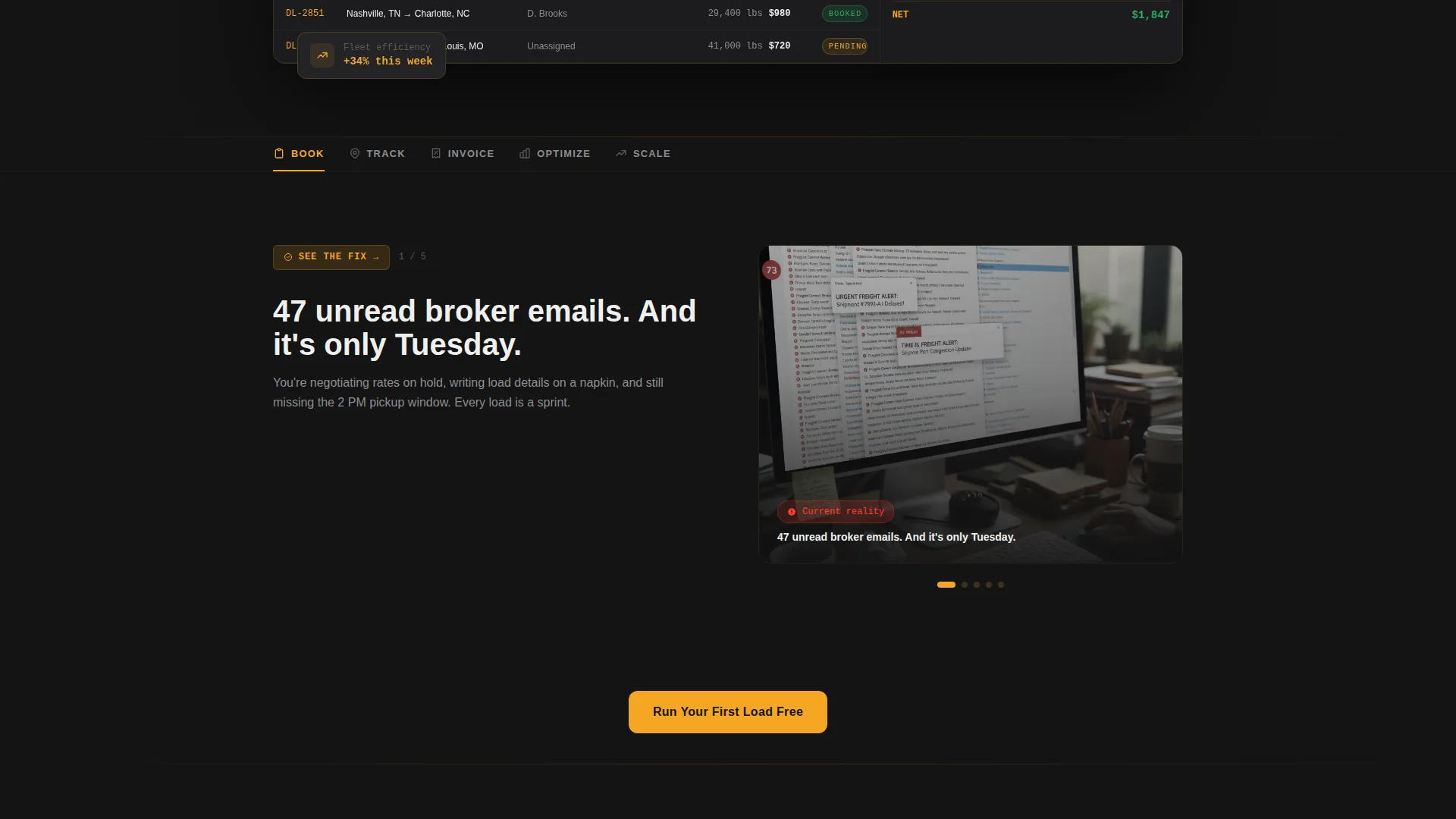
Each of the five spokes opens with a visceral pain-point scene, such as a cluttered inbox or a smeared whiteboard, then transitions to the clean dashboard module that replaces it. The stakes escalate across spokes from a single missed load to a fleet-wide revenue problem.
Freemium Trial Signup Flow
The primary call-to-action, "Run Your First Load Free," appears in the header, after the third spoke, and as a floating button pinned to the bottom-right corner after 40 percent scroll. The signup sequence asks for three fields in order: company name, fleet size (dropdown), and email address. No credit card is required.
Secondary Demo Path
A second conversion path, "See It Dispatch Live," triggers a 90-second recorded demo of a load being booked in real time. It is gated behind a single email field, lowering the barrier for visitors who are not yet ready to sign up.
Carbon Fiber Color System
The color palette uses deep asphalt black for backgrounds, brushed titanium and white for all body text, lane-marker amber for every interactive element and hover state, and status-green exclusively for confirmed or live indicators. Every color communicates a specific system state rather than serving a decorative role.
Page sections overview
| Section | Purpose |
|---|---|
| Dashboard Header | Opens with live-style dispatch board and primary call-to-action |
| Anchor Nav Bar | Pins to top on scroll, links to all five spokes |
| Book Spoke | Shows booking pain point, then the booking module solution |
| Track Spoke | Shows tracking chaos, then the live map module |
| Invoice Spoke | Shows invoicing friction, then the clean invoice view |
| Optimize Spoke | Shows route inefficiency, then the optimization module |
| Scale Spoke | Shows fleet-growth limits, then the scaling tools view |
| Mid-Page Call to Action | Repeats primary trial offer after the third spoke |
| Floating Trial Button | Appears after 40 percent scroll, pinned bottom-right |
| Demo Trigger Section | Secondary path to 90-second recorded demo, email-gated |
Design & branding system
The visual identity follows a Dashboard Pro theme built on the Carbon Fiber color system. The palette is intentionally dark and functional, modeled on the instrument cluster of a modern heavy-duty truck cab at night.
- Backgrounds range from deep asphalt black (#141414) to near-black (#1C1C1E), with text in brushed titanium (#8D8D92) and white (#F0F0F0)
- Lane-marker amber (#F5A623) marks every interactive element, button, hover state, and cursor indicator
- Status-green (#27AE60) appears only on confirmed bookings, live truck indicators, and active status signals
Mobile & speed optimization
The template is designed to remain fully usable on smaller screens, which matters for owner-operators who manage loads from a phone. Every layout decision considers the mobile context of the primary audience.
- The anchor navigation collapses cleanly for smaller viewports so spoke links remain accessible
- The floating trial button and demo-trigger path stay visible and tappable at mobile screen sizes
How this template helps you convert
Dispatch is structured around two conversion paths and a deliberate escalation of urgency. Every layout decision reduces the distance between a skeptical visitor and a submitted trial form.
- The problem-first arc builds recognition before presenting the product, so visitors feel understood before they are asked to act.
- The three-field trial form removes the credit card requirement and limits input to company name, fleet size, and email, cutting signup friction to the minimum.
- The floating amber call-to-action button keeps the trial offer visible throughout the scroll without interrupting the narrative of each spoke.
Other information about this template
This template is categorized under Technology, with a subcategory of Trucking Vertical Software as a Service. It is built specifically for the trucking booking system niche and is optimized for a freemium or free-trial go-to-market motion.
- The template style is Hub and Spoke with Anchor Navigation, making it easy to extend spokes or reorder sections for different product priorities
- The Dashboard Pro theme and Carbon Fiber palette are reusable across other freight-tech or logistics-vertical landing pages with minor color adjustments
- The page earns conversion by showing the dashboard doing real work before asking for any user input, a principle stated explicitly in the brief
Theme
Dashboard Pro
Creative direction
Problem→Solution Arc
Color system
Carbon Fiber
Style
Hub & Spoke (Anchor Nav)
Direction
Freemium/Trial
Page Sections
Anchor Navigation Bar
Dashboard Preview Header
Problem-to-solution Spoke Sections
Freemium Trial Signup Flow
Secondary Demo Trigger Path
Carbon Fiber Color System
Related questions
Can I rename the five spoke sections to match my product's feature names?
Does the trial signup form connect to a backend or email service?
Is the dispatch board in the header a real screenshot?
Who is the floating call-to-action button designed for?
Can I swap the recorded demo for a live demo or a calendar booking link?



