Agriculture Fleet Management Landing Page Template
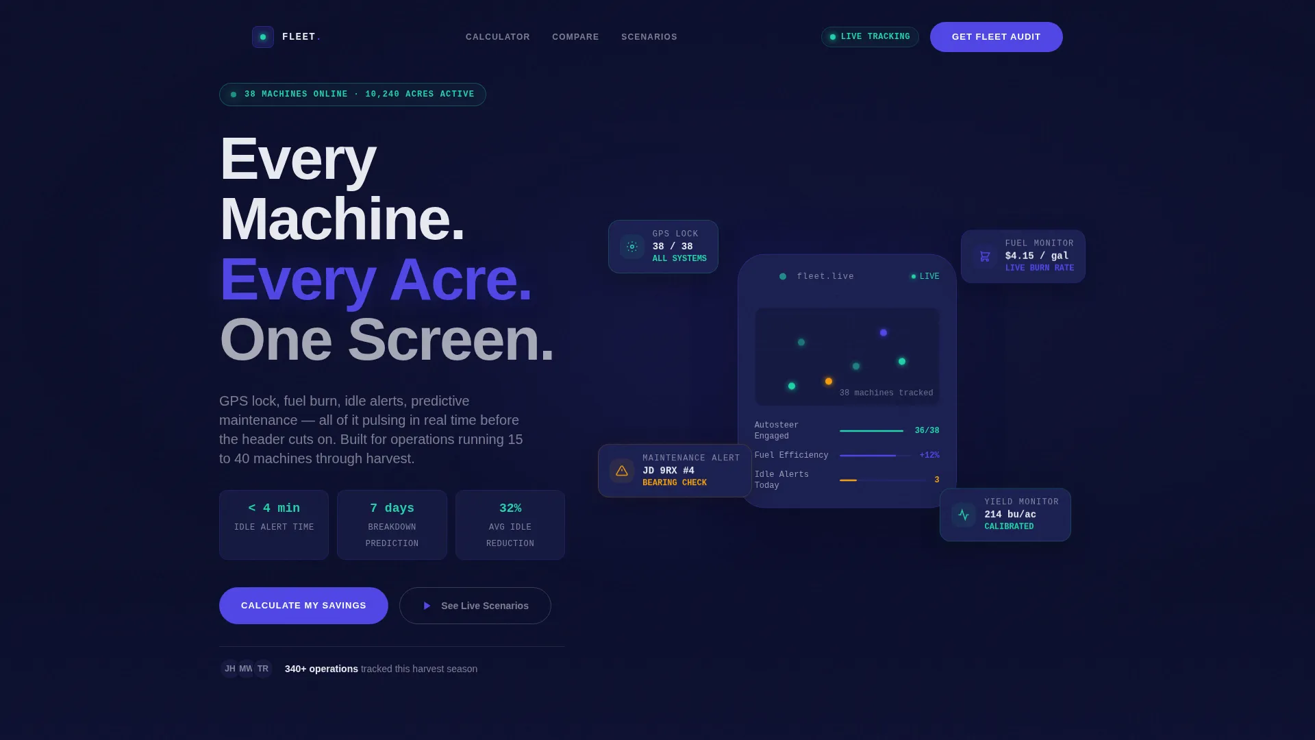
Fleet is a single-page agriculture fleet management landing page template built around a live fuel savings calculator, a twelve-metric comparison table, and an interactive farm scenario explorer. Designed for operations managers, cooperative coordinators, and ag dealership teams, it turns raw fleet data into a persuasive, lead-generating experience that feels purpose-built for harvest season decisions.
by Rocket studio
Quick summary
Fleet is a dark-themed, data-command landing page template for agriculture fleet management platforms. It opens with a working fuel savings calculator, moves into a twelve-row comparison table, and closes with a structured lead capture form. Every section is designed to show value before asking for anything in return.
Who this template is for
This template is built for technology companies and software teams selling fleet management solutions to the agriculture industry. It speaks directly to the people who live inside these decisions every day.
- Operations managers running fifteen to forty machines across mid-size row crop farms during harvest
- Cooperative fleet coordinators juggling shared equipment across multiple member farms
- Agricultural dealership service departments tracking machine health and predicting maintenance needs
What problem this template solves
Selling agriculture fleet software is hard because the value is invisible until someone runs the numbers. Prospects arrive skeptical, unsure whether the platform justifies the switch from their current manual tracking process. This template closes that gap by making the value personal and immediate.
- Visitors see their own projected fuel savings and idle-hour recovery before they ever reach the form
- A side-by-side comparison table makes the gap between manual tracking and the platform impossible to ignore
- The lead form arrives after two rounds of demonstrated value, so it feels like a natural next step rather than a cold ask
What you get with this template
You get a fully structured, single-page layout that guides a prospect from curiosity to conversion using data at every step. The design is complete and ready to adapt to your platform's specific numbers and branding.
- An animated calculator section, a twelve-metric comparison table, an interactive fleet map with three farm scenarios, and a two-placement lead capture form
- A Data Command visual identity using a deep navy background, electric indigo highlights, sensor-green status indicators, and chalk-dust white typography
- Scroll-triggered row animations, a live dashboard mockup that populates with visitor-entered numbers, and a role-based form with a fleet-size slider
Feature list
This template is built around four core interactive components, each earning its place by delivering something a static page cannot.
Fuel Savings Calculator with Live Dashboard Mockup
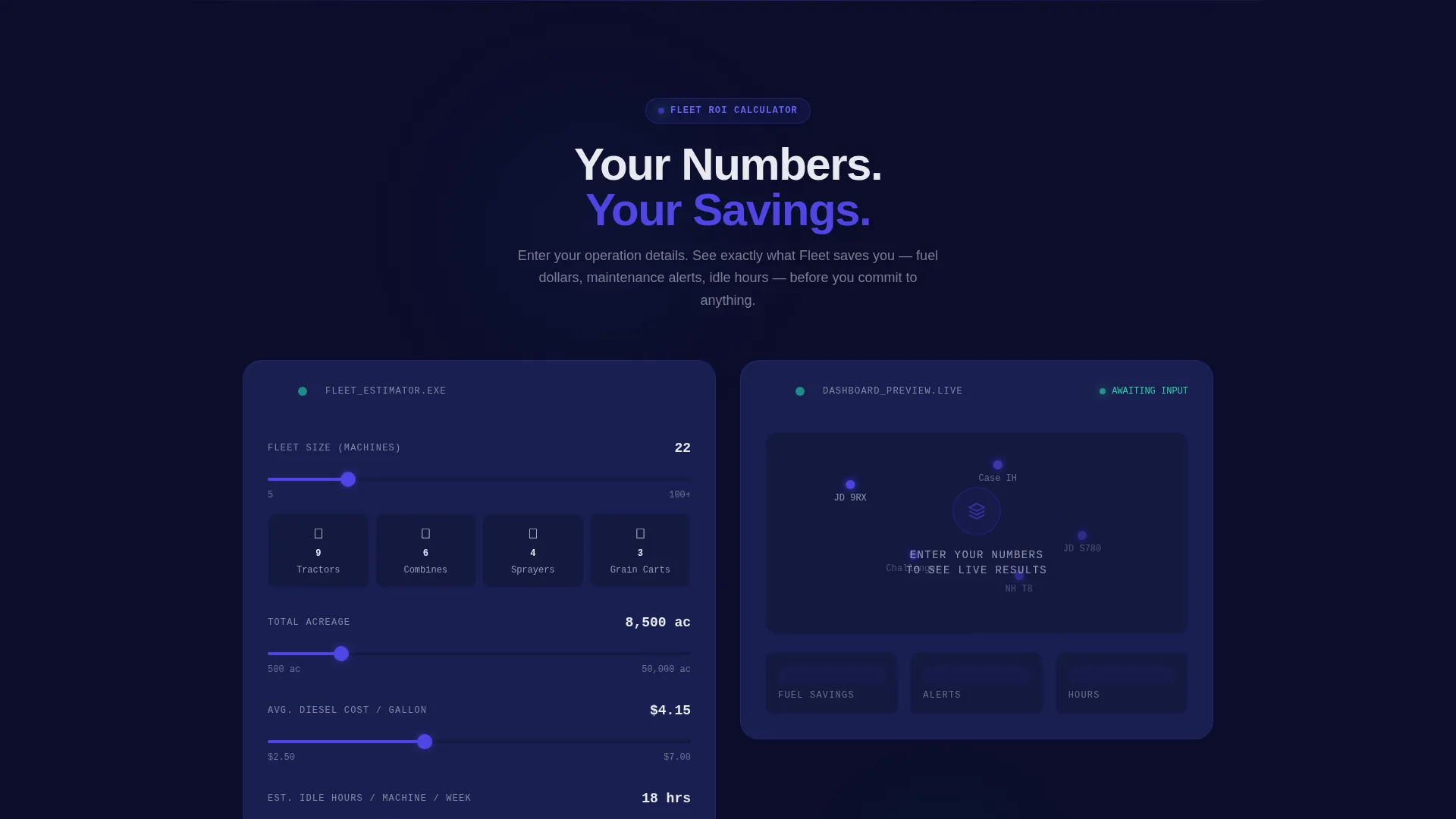
Visitors enter their fleet size, total acreage, average fuel cost per gallon, and estimated idle hours per week. The moment they submit, an animated dashboard mockup populates with their specific numbers: projected annual fuel savings, maintenance alerts prevented, and hours recaptured from idle reduction. The result feels like a personalized audit, not a generic estimate.
Twelve-Metric Comparison Table
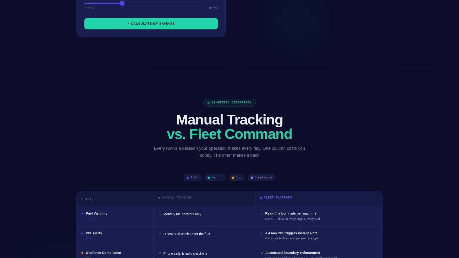
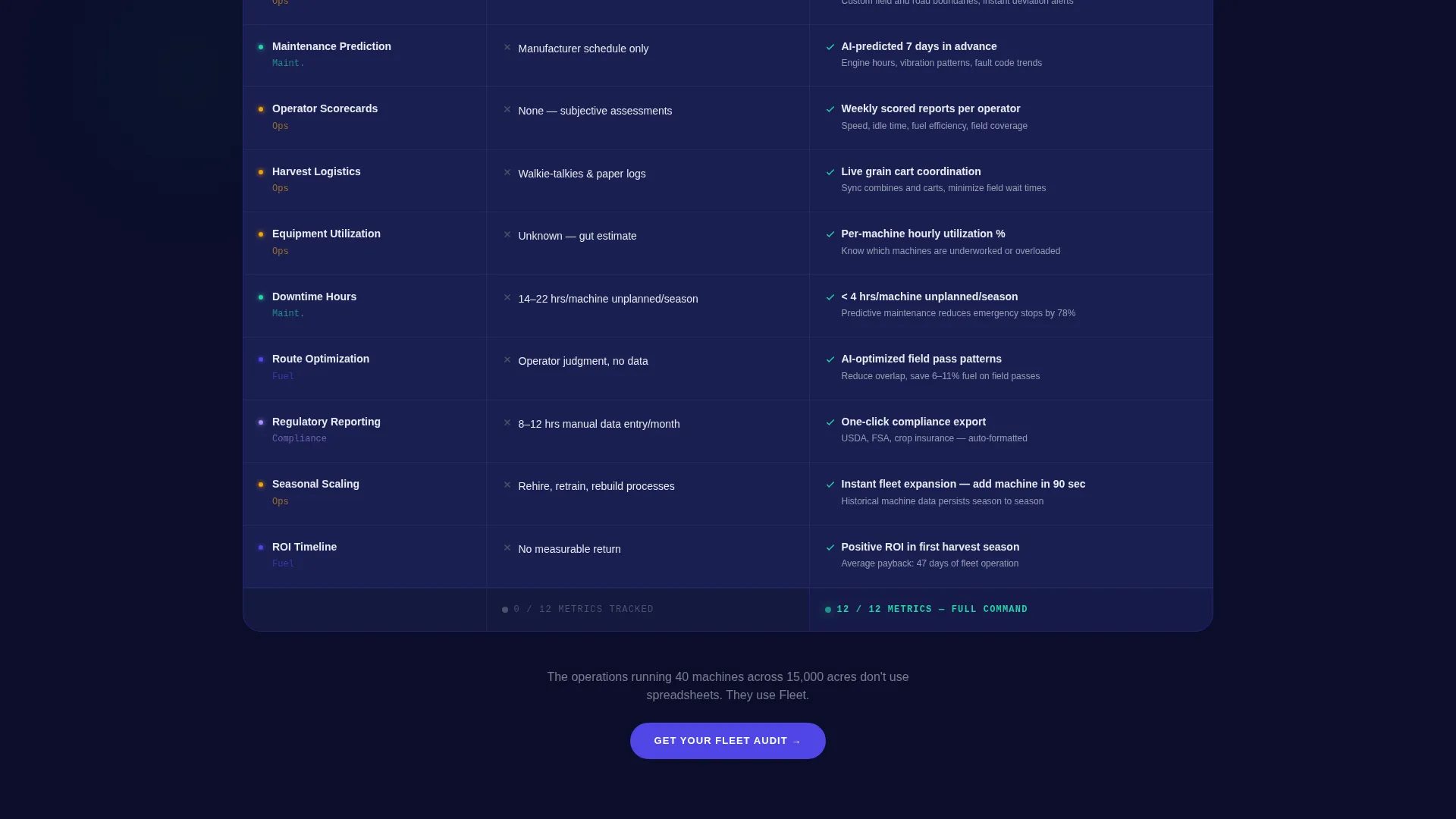
The comparison table pits manual fleet tracking against the platform across twelve operational metrics. These include fuel visibility, idle alerts, geofence compliance, maintenance prediction, operator scorecards, harvest logistics, equipment utilization rate, downtime hours, route optimization, regulatory reporting, seasonal scaling, and return on investment timeline. Each row animates on scroll, with the manual column rendered in muted gray and the platform column lighting up in electric indigo with specific figures.
Interactive Fleet Scenario Map
Below the comparison table, an interactive map lets visitors click through three real farm scenarios: a 5,000-acre corn operation, a 12,000-acre wheat cooperative, and a custom harvesting crew working across state lines. Each scenario reveals a different dashboard view and a corresponding savings breakdown, making the platform feel concrete and field-tested rather than theoretical.
Role-Based Lead Capture Form
The lead form opens with a fleet-size slider ranging from five to one hundred or more machines, followed by crop type and role selection. Role options cover owner-operators, operations managers, cooperative coordinators, and dealer contacts. Email and phone complete the form. The placement strategy, once after the calculator results and once after the comparison table, ensures the form appears only after value has already been shown.
Scroll-Triggered Row Animations
Every row in the comparison table animates independently as the visitor scrolls into view. The muted manual-tracking column loads first, then the platform column illuminates in electric indigo. This sequencing creates a natural visual argument without requiring any extra copy.
Data Command Visual Theme
The dark field-navy background, electric indigo active states, sensor-green positive indicators, and chalk-dust white text work together as a unified system. Every color carries a functional meaning: indigo signals action, green signals savings or positive status, and white carries readable information. Nothing in the palette is decorative.
Page sections overview
| Section | Purpose |
|---|---|
| Calculator / Estimator Header | Lets visitors input their fleet data and instantly see projected fuel savings and idle-hour recovery |
| Live Dashboard Mockup | Animates personalized results in indigo and green after the calculator runs |
| First call to action Placement | Places the "Get Your Fleet Audit" call to action directly below the calculator results |
| Comparison Table | Compares manual tracking against the platform across twelve operational metrics with scroll animations |
| Interactive Fleet Map | Lets visitors explore three farm scenarios and their unique savings breakdowns |
| Second call to action and Form | Captures leads with a role-based form anchored after the comparison table |
Design & branding system
The visual identity is built around a Data Command theme. Every design decision serves the data it frames, and nothing exists purely for decoration.
- Color system: deep field-dark navy (#0B0E2A) as the primary background, electric indigo (#4F46E5) for active data points and interactive highlights, sensor-green (#22D3A7) for positive status and savings callouts, and chalk-dust white (#E8E9F0) for typography and table borders
- The palette evokes a dispatch terminal glowing in a darkened farm office: purposeful, readable, and built for people who trust numbers over aesthetics
Mobile & speed optimization
The template is structured for fast loading and clear readability across device sizes, which matters when a prospect is checking figures from a grain elevator office or a farm truck cab.
- The calculator, comparison table, and interactive map are all designed to render cleanly on smaller screens without losing functional clarity
- Scroll-triggered animations are applied selectively so the page remains responsive and does not rely on heavy background processes to deliver its core value
How this template helps you convert
This template is built around a deliberate conversion sequence. Every section prepares the visitor for the next one.
- The calculator makes the value personal by turning the visitor's own fleet numbers into projected savings figures, so they arrive at the comparison table already invested
- The comparison table then validates that personal value against twelve concrete operational metrics, building the case that manual tracking cannot compete
- The lead form arrives at both natural stopping points with a low-friction entry field first, a fleet-size slider, so the visitor begins completing the form before they even think about it as a commitment
Other information about this template
Fleet is designed to serve a specific type of software buyer: someone who needs proof before they will consider a conversation. The template's structure reflects that reality at every step.
- The template style is a comparison table landing page, which is particularly effective for agriculture software platforms competing against manual or legacy processes
- The header concept is a calculator and estimator, a format that consistently outperforms static hero sections in lead quality for data-driven B2B offers
- The interactive explorer creative direction keeps visitors engaged past the first section because the calculator made the experience personal before the proof sections began
Theme
Data Command
Creative direction
Interactive Explorer
Color system
Electric Indigo
Style
Comparison Table
Direction
Lead Generation
Page Sections
Fuel Savings Calculator with Live Results
Twelve-metric Comparison Table
Interactive Farm Scenario Map
Role-based Lead Capture Form
Data Command Visual Identity
Scroll-triggered Row Animations
Related questions
Who is this template designed for?
Can I adapt the calculator inputs for my platform's specific metrics?
Does the comparison table support more or fewer than twelve metrics?
How does the two-placement form strategy work?
Is this template suitable for a cooperative or dealership audience?



