Automotive Property Management Landing Page Template
Fleet is a single-page automotive property management landing page built around a dark Tech Glass visual identity. It combines a Feature Tab Switcher header, an interactive comparison table, and a freemium conversion model to help multi-site dealership groups, commercial landlords, and fleet operators understand the platform before signing up.
by Rocket studio
Quick summary
Fleet is a comparison table landing page designed for automotive property management platforms. It uses a Midnight Blue color system, a Feature Tab Switcher header, and an Interactive Explorer scroll experience. The page lets visitors engage with lot occupancy, lease tracking, and maintenance cycle data before a single form ever appears.
Who this template is for
This template is built for software companies and product teams selling automotive property management tools to an operational audience. The people evaluating this page manage real assets at real scale and need proof before they commit.
- Multi-site dealership groups managing dozens of rooftops across multiple states
- Commercial landlords whose tenants include tire shops and collision centers
- Fleet operators tracking inbound vehicle volume across multiple yards
What problem this template solves
Managing parking structures, dealership lots, and service bays across multiple locations creates a coordination problem that spreadsheets and fragmented tools cannot solve reliably. Prospects arrive skeptical and need to see the product working before they trust the offer.
- Visitors cannot evaluate complex platform value from static screenshots alone
- Comparison pages that hide features behind walls of text lose high-intent buyers early
- Conversion forms that appear too early push qualified operators away before they are ready
What you get with this template
You get a fully structured single-page layout that teaches the product through interaction. Every section goes one level deeper than the last, so the visitor builds confidence progressively rather than being asked to commit upfront.
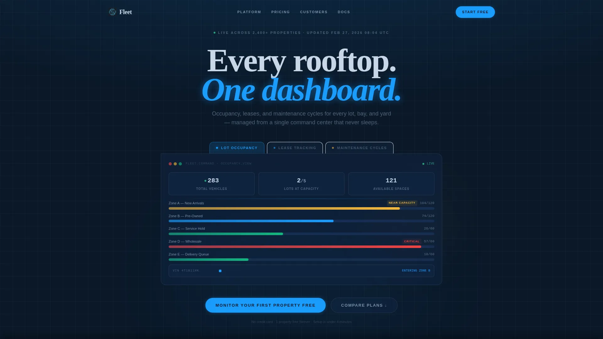
- A Feature Tab Switcher header with three live-data views: Lot Occupancy, Lease Tracking, and Maintenance Cycles
- An interactive comparison table with expandable rows that reveal inline demos for each feature tier
- A sticky freemium conversion bar and a secondary calendar-booking path for longer sales cycles
Feature list
This template includes purpose-built components that work together to demonstrate platform depth without overwhelming the visitor.
Feature Tab Switcher Header
Three glass-panel tabs sit across the top of the viewport. Each tab label corresponds to a core platform function: Lot Occupancy, Lease Tracking, and Maintenance Cycles. Clicking a tab reveals a different live-data view of the same fictional dealership campus, with the default view showing an animated overhead lot map with color-coded zones.
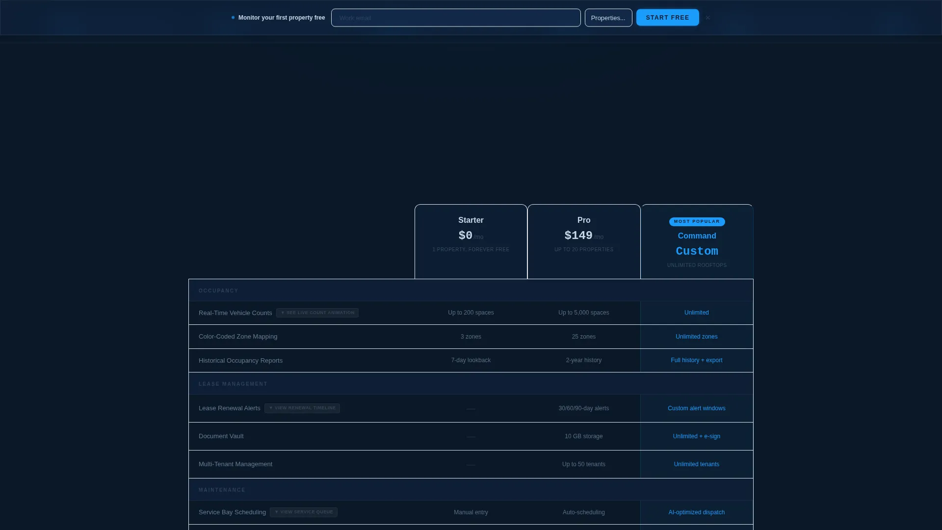
Interactive Comparison Table
Prospects can toggle between Free, Pro, and Enterprise pricing tiers. Each table row is independently explorable. Clicking "Occupancy Tracking" expands an inline demo showing vehicle counts animating across sample lots. Clicking "Lease Management" reveals a mini-timeline of renewal alerts. The table structure makes feature differences tangible rather than theoretical.
Sticky Freemium Conversion Bar
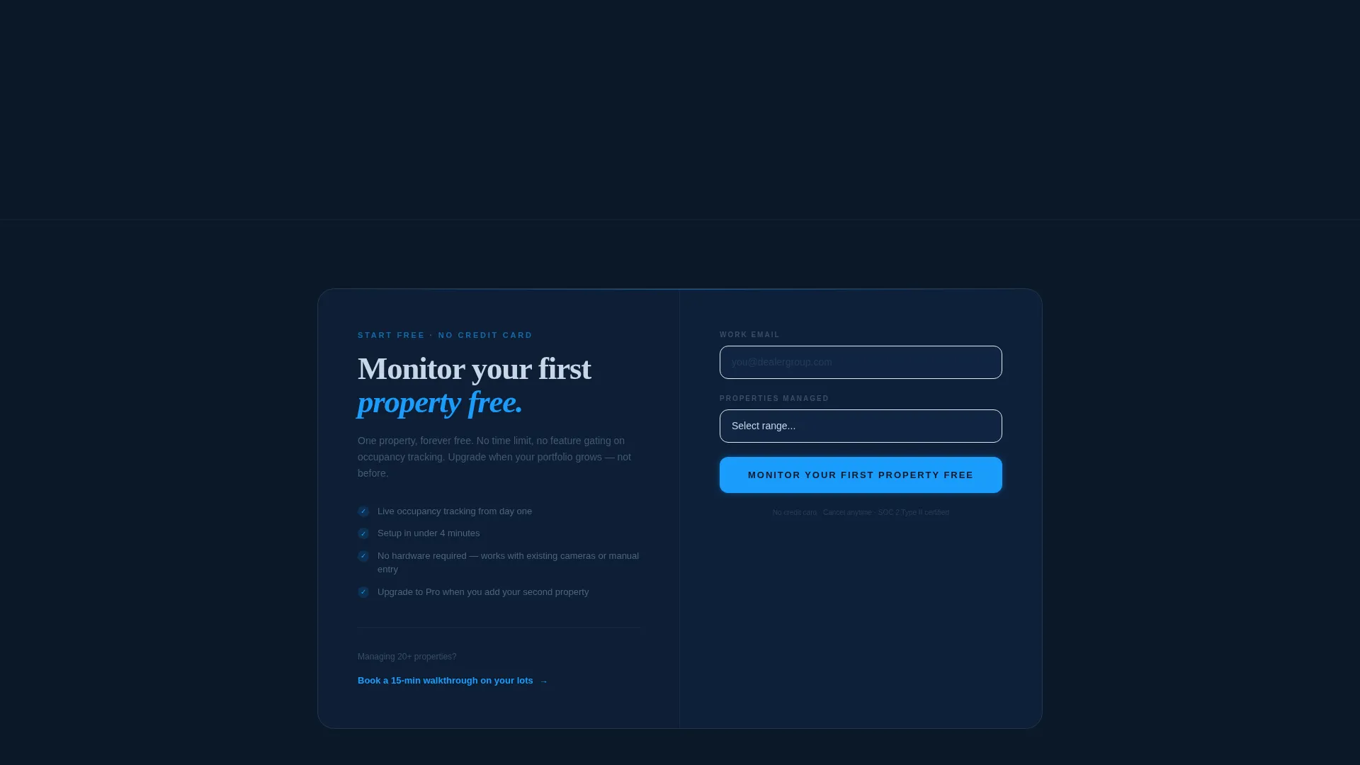
A slim glass-dark sticky bar appears after the visitor interacts with any table row. It carries the primary call to action and a minimal two-field signup form: work email and a dropdown for number of properties managed, with options covering one to five, six to twenty, twenty-one to fifty, and fifty-plus properties.
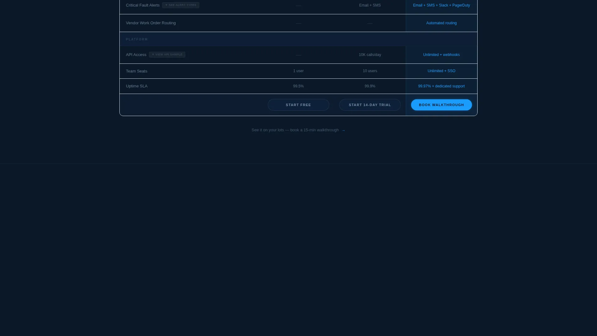
Secondary Booking Path
Below the comparison table, a secondary conversion option reads "See it on your lots, book a 15-min walkthrough" and links to a calendar embed. This path serves buyers in longer sales cycles who need a guided demo before committing to a free trial.
Animated Lot Map
The default header view displays an overhead lot map where color-coded zones fill and empty in a subtle continuous animation. This motion communicates real-time occupancy data without requiring a static screenshot, giving the interface a sense of live operational awareness.
Midnight Blue Tech Glass Design System
The visual identity uses a four-color palette applied with strict hierarchy rules. Deep terminal navy dominates every background surface. Polished chrome carries body text and table borders. Dashboard glow blue highlights active tabs, selected rows, and primary buttons. Alert amber appears only on interactive hover states, capacity warnings, expiring lease flags, and maintenance callouts.
Page sections overview
| Section | Purpose |
|---|---|
| Feature Tab Switcher | Introduce platform functions via three interactive header tabs |
| Animated Lot Map | Show real-time occupancy data as the default header view |
| Comparison Table | Let visitors toggle tiers and expand rows for inline demos |
| Occupancy Tracking Row | Demonstrate live vehicle count animation on expansion |
| Lease Management Row | Reveal a mini renewal-alert timeline on row expansion |
| Sticky Conversion Bar | Surface the primary call to action after first table interaction |
| Signup Form | Capture work email and property count in two fields |
| Secondary Booking Path | Offer a calendar-linked walkthrough for longer sales cycles |
Design & branding system
The Tech Glass theme applies a precise four-color Midnight Blue system that maps each color to a specific functional role. Nothing decorative is arbitrary; every color choice signals meaning to an operational audience.
- Navy (#0B1929) as the dominant background, chrome (#C8D6E5) for body text and borders, glow blue (#1B9CFC) for active states and primary buttons
- Alert amber (#F6B93B) reserved exclusively for hover states, capacity warnings, expiring lease notices, and maintenance flags
- Glass-panel user interface elements with luminous highlights that evoke a digital dashboard reflected on a rain-slicked surface
Mobile & speed optimization
The template is structured so that interactive components translate cleanly to smaller viewports without losing the core experience. Touch-based tab switching and row expansion are central to the design logic.
- Tab switcher and comparison table rows are built for tap interaction on mobile screens
- The sticky conversion bar remains accessible at the bottom of the viewport on all screen sizes
- The two-field signup form keeps friction minimal on mobile by limiting inputs to email and a single dropdown
How this template helps you convert
The page is built on a "touch it three times before the form appears" principle. Visitors earn familiarity with the product through interaction before any commitment is requested.
- The animated header tab views let visitors explore Lot Occupancy, Lease Tracking, and Maintenance Cycles before scrolling, establishing platform credibility immediately.
- The expandable comparison table rows deliver inline product demos at the exact moment a visitor is comparing tiers, turning curiosity into demonstrated value.
- The sticky conversion bar appears only after a table interaction, so the call to action arrives when intent is highest, and the secondary booking path catches buyers who need more time.
Other information about this template
Fleet is categorized under the Technology and Automotive Software intersection, with a niche focus on Automotive Property Management. The template style is a Comparison Table layout with an Interactive Explorer creative direction, a Feature Tab Switcher header concept, and a Freemium/Trial landing-page direction.
- The template is designed for a single-page layout, not a multi-page site
- The Tech Glass theme and Midnight Blue color system are core to the visual identity and should not be replaced with lighter palettes without rebuilding the hierarchy logic
- The fictional dealership campus used in inline demos serves as placeholder content; teams replace it with their own property data or product screenshots during customization
Theme
Tech Glass
Creative direction
Interactive Explorer
Color system
Midnight Blue
Style
Comparison Table
Direction
Freemium/Trial
Page Sections
Feature Tab Switcher Header
Interactive Comparison Table
Sticky Freemium Conversion Bar
Secondary Calendar Booking Path
Animated Overhead Lot Map
Midnight Blue Tech Glass System
Related questions
What types of businesses is this template designed for?
How does the interactive comparison table work?
When does the signup form appear to visitors?
Does the template include a path for visitors who want a guided demo?
Is the alert amber color used throughout the design?



