Fleet - Powerful Home Services Landing Page Template
Fleet is a split-screen landing page template built for home services fleet management platforms. It leads with bold dispatch statistics, a live-feeling dashboard preview, and a zero-friction freemium signup flow. Designed for operators running 15 to 200 vehicles, it pairs sharp Electric Indigo visuals with a stats-first scroll rhythm that turns raw fleet data into immediate trust.
by Rocket studio
Quick summary
Fleet is a single-page landing page template for home services fleet management platforms. It uses a 50/50 split-screen layout, a stats-first creative direction, and a deep Electric Indigo color system. The page is structured to frontload operational proof points, then guide visitors toward a no-credit-card freemium trial with a three-field signup form.
Who this template is for
This template is built for founders, operators, and marketers promoting dispatch and fleet management software to home services businesses. If your platform serves plumbing, HVAC (heating, ventilation, and air conditioning), or electrical crews running multiple vehicles across a metro area, this template speaks directly to your buyer.
- Home services software companies targeting fleet operators with 15 to 200 vehicles
- Dispatch platform teams who need a high-converting freemium or free-trial landing page
- Product marketers who want a data-led visual narrative without custom design work
What problem this template solves
Fleet managers and dispatchers juggle multiple apps, group texts, whiteboards, and fuel receipts every morning. There is no single screen showing every truck location, every job priority, and every at-risk appointment at once. This template solves the marketing communication gap: showing your platform as that one screen before the visitor even signs up.
- Visitors arrive skeptical. The stats-first layout leads with proof before any sales pitch appears.
- Operators need to see the product working, not just described. The dashboard preview section fills that role immediately.
- Conversion barriers are high in B2B (business-to-business) software. The three-field form and zero-cost entry point remove them.
What you get with this template
You get a fully structured, design-ready landing page with every section laid out and every conversion element in place. The layout follows a strict stat-then-screenshot rhythm that escalates through operational savings, driver retention, and customer review lift.
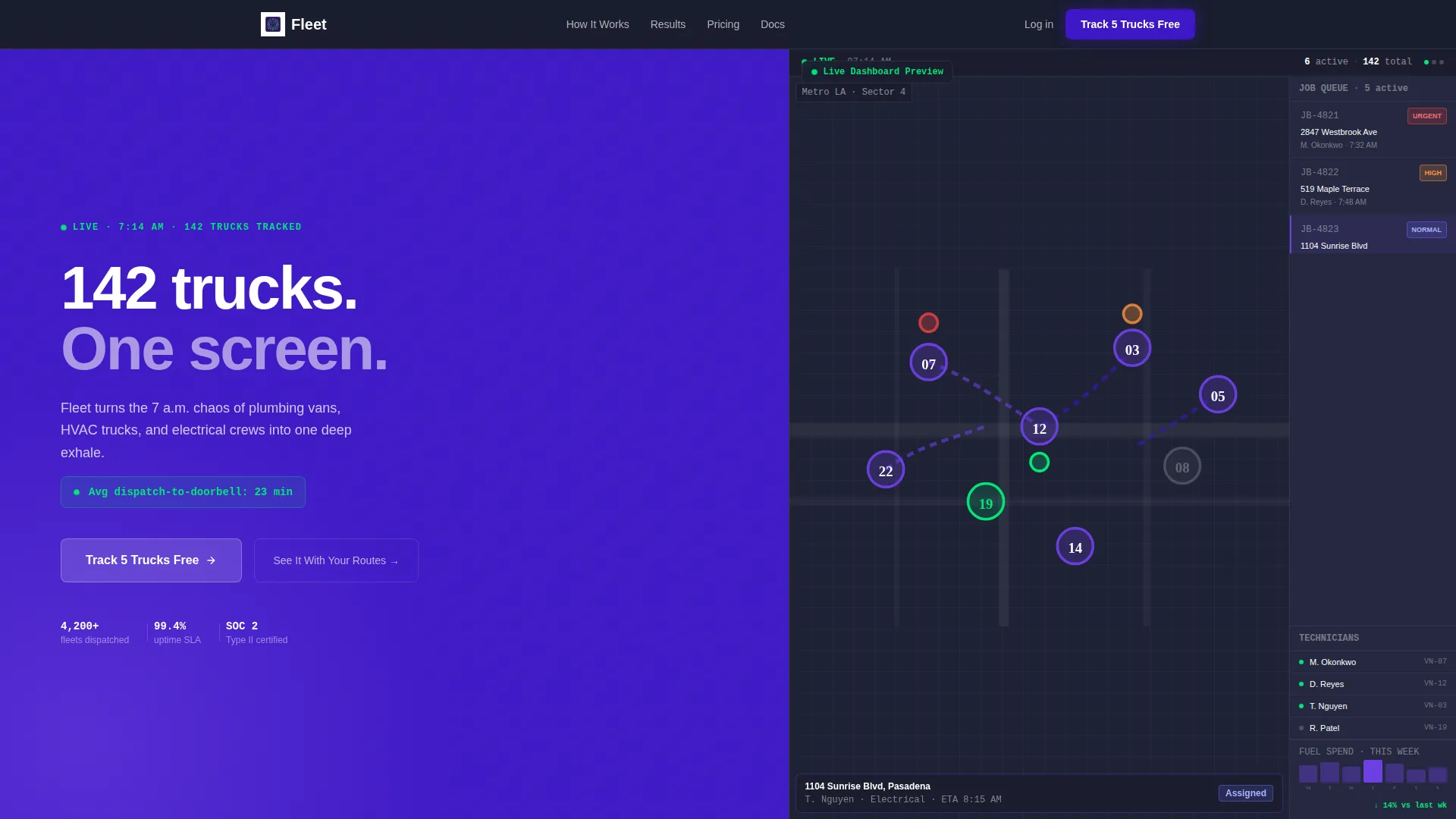
- A 50/50 split-screen header with bold white headline typography on deep indigo and a richly detailed dashboard preview on the right
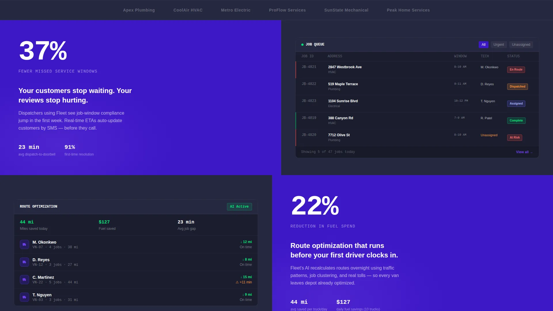
- Alternating stat-and-screenshot scroll sections that build a progressive ROI (return on investment) case from top to bottom
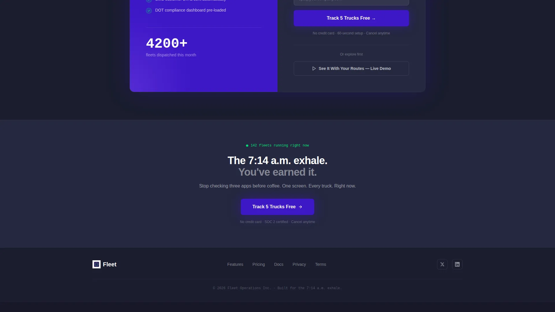
- A sticky bottom conversion bar with the primary call to action, repeating after the third scroll section
Feature list
The Fleet template includes the following built-in components and design decisions, each grounded in the source brief.
Stats-First Scroll Rhythm
Every scroll section opens with a large, animated number before any explanation appears. Proof lands before the pitch. The left panel carries metrics and before-and-after fleet key performance indicators. The right panel shows the product screen that produced those numbers.
Split-Screen Header Layout
The header divides the viewport evenly. The left side uses bold white typography on deep command-center indigo, including a headline and a live-feeling dispatch statistic. The right side displays a richly detailed dashboard preview that looks populated and mid-shift, with route lines, job addresses, and priority flags.
Freemium Signup Form
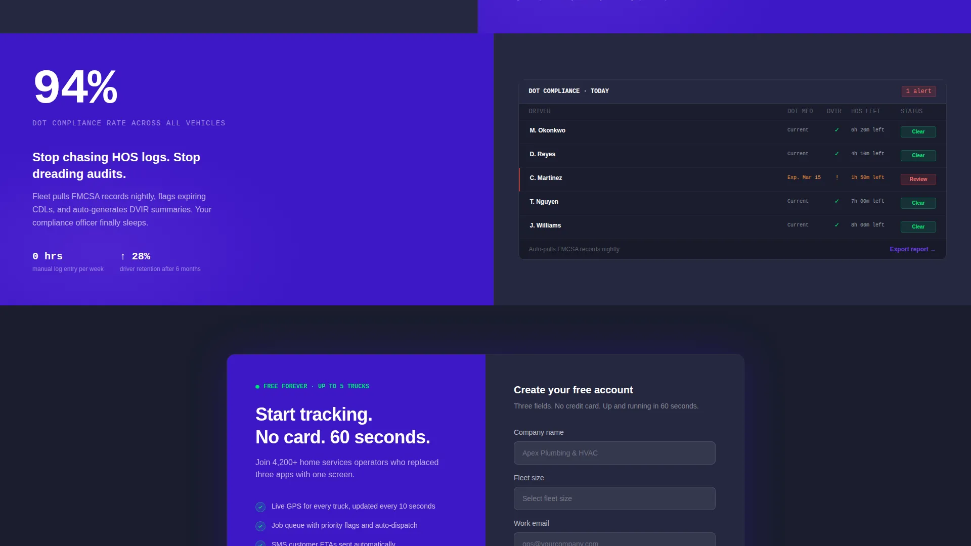
The primary conversion path is a three-field form asking only for company name, fleet size (via dropdown with ranges: 1 to 10, 11 to 50, 51 to 200, and 200 or more), and work email. No credit card is required. The call to action reads "Track 5 Trucks Free."
Sticky Bottom Conversion Bar
After the third scroll section, a sticky bar anchors to the bottom of the viewport and repeats the primary call to action. It keeps the signup option visible without interrupting the reading flow of the main content.
Secondary Interactive Demo Path
A secondary conversion link labeled "See It With Your Routes" connects to a live interactive demo pre-loaded with sample home services data. It serves visitors who want more context before committing to the signup form.
Reactive Green Live-Status Indicators
The reactive green accent color (#00E676) appears exclusively on live-status indicators and success confirmations. It is never used decoratively, which means every green element carries immediate operational meaning to the visitor.
Page sections overview
| Section | Purpose |
|---|---|
| Split-Screen Header | Deliver headline stats and dashboard preview above the fold |
| Dispatch Stat Block | Open first scroll section with animated key performance indicator |
| Operational Savings Panel | Show cost and time savings data alongside product screenshot |
| Driver Retention Section | Present retention metrics with corresponding product view |
| Customer Review Lift | Close the ROI narrative with satisfaction and review data |
| Freemium Signup Form | Capture company name, fleet size, and work email with no credit card |
| Sticky Conversion Bar | Repeat primary call to action after third scroll section |
| Interactive Demo Link | Offer a secondary path to a live demo with sample route data |
Design & branding system
The Electric Indigo color system is built to feel like a command center glowing before dawn. Every color choice has a functional role, and none are decorative without intent. The palette creates immediate visual authority for a dispatch platform.
- Deep command-center indigo (#3D17C6) anchors backgrounds and primary panels; charged violet (#6C3FE2) activates on hover states and interactive elements; cool asphalt (#1A1D2E) grounds text and panel frames
- Reactive green (#00E676) fires only on live-status indicators and success states, giving it clear signal value separate from the rest of the palette
- Typography is bold and white on dark fields for the left-side headline panels, with high-contrast legibility maintained across all stat and data sections
Mobile & speed optimization
The template is designed with a mobile-conscious layout even though its primary visual impact is the split-screen desktop experience. Structural decisions keep the page performant and readable across screen sizes.
- The 50/50 split-screen reflows naturally for narrower viewports so the dashboard preview and headline copy remain readable on mobile devices
- Animated number sequences and stat blocks are built to load without layout-blocking behavior, keeping the above-the-fold experience fast and impactful
- The sticky conversion bar is designed to remain functional and non-intrusive on both desktop and mobile viewport heights
How this template helps you convert
The entire page architecture is built around lowering friction and building trust at every scroll step. Conversion is not added at the end. It is the structural logic of the layout from the first pixel.
- The stats-first rhythm means every visitor reads hard proof before they encounter a single marketing claim, which builds credibility before the ask.
- The three-field form with no credit card requirement and a "Track 5 Trucks Free" headline removes the two most common objections in B2B software signups: effort and financial risk.
- The secondary demo path labeled "See It With Your Routes" captures undecided visitors who need more context, so the page converts two types of buyer intent instead of one.
Other information about this template
Fleet is part of the Startup Velocity theme family and fits naturally within home services software product launches, fleet management platform rebrands, and dispatch software marketing campaigns. It is a strong match for teams that want a design-forward page without starting from scratch.
- The template style is Split Screen (50/50), which works well for software products where showing the product interface alongside the value proposition is the primary conversion strategy
- The Freemium/Trial landing page direction means all layout decisions, call-to-action placements, and form structures are already optimized for low-barrier entry offers
- The Stats-First Impact creative direction suits markets where buyers are data-literate and skeptical of feature-led copy, which matches the home services fleet management niche closely
- No stock photography is used anywhere in the design. All visual elements reference real product interface components, keeping the page grounded in authentic product demonstration
Theme
Startup Velocity
Creative direction
Stats-First Impact
Color system
Electric Indigo
Style
Split Screen (50/50)
Direction
Freemium/Trial
Page Sections
Stats-first Scroll Rhythm
Split-screen Header with Dashboard Preview
Three-field Freemium Signup Form
Sticky Bottom Conversion Bar
Secondary Interactive Demo Path
Reactive Green Live-status Indicators
Related questions
Who is this landing page template built for?
Does the template include the signup form and conversion elements?
Can I adjust the fleet size dropdown to match my product tiers?
What does the dashboard preview in the header look like?
Is this template suitable for a free-trial or freemium offer?



