Open-Source Enterprise Software Expert Professional Website Template
Fleet is a bento grid landing page template built for open-source mobile device management platforms. It combines a Feature Tab Switcher header, spec-sheet bento cells, and a sticky lead-generation bar to show IT buyers exactly what an osquery-powered device management tool can do before asking them to act.
by Rocket studio
Quick summary
Fleet is a single-page bento grid template designed for open-source mobile device management platforms. It opens with an interactive Feature Tab Switcher, moves through dense spec-sheet capability cells, and closes with a sticky call-to-action bar. The design speaks directly to engineers and security leads who need proof before they commit.
Who this template is for
This template is built for technical teams and open-source software companies that need to earn trust fast. It works best when the product is complex but the value can be shown in a live user interface frame or a code snippet.
- Platform engineers at growth-stage startups managing more than 200 endpoints across mixed operating systems
- Security leads at regulated organizations who need to demonstrate device compliance and audit readiness
- DevOps managers at remote-first companies replacing informal spreadsheet-based asset tracking with a real management tool
What problem this template solves
Managing devices across macOS, Linux, and Windows from a single dashboard is a hard product to explain in words alone. Most landing pages for technical tools either over-simplify the capability or bury it in marketing copy that engineers immediately distrust.
- Visitors leave before understanding what the product actually does, because no real user interface or query output is shown
- Enterprise buyers cannot justify a procurement conversation without seeing feature depth and compliance evidence up front
- Teams scaling past a few hundred endpoints need a page that matches the rigor of their own engineering standards
What you get with this template
You get a complete, production-ready landing page layout built around a bento grid structure and a Directory and Discovery visual theme. Every section is purpose-built to accumulate proof for a technical buyer rather than entertain a general audience.
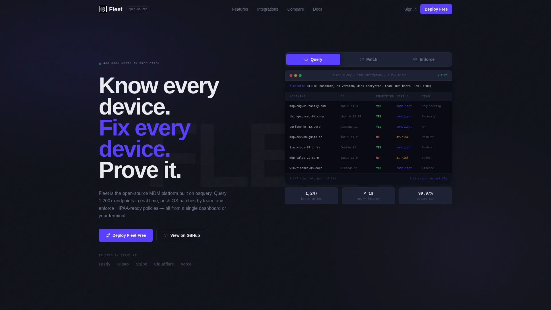
- A Feature Tab Switcher header with three tabs (Query, Patch, Enforce) and live-looking user interface frames showing real query output, rollout progress bars, and a policy YAML diff
- A scrolling bento grid that moves from four large hero feature cells into a tighter integration matrix and a comparison table against proprietary mobile device management tools
- A sticky bottom bar with a primary "Deploy Fleet Free" call-to-action form and a secondary "Talk to an Engineer" ghost-button for enterprise procurement conversations
Feature list
This template organizes its capabilities into discrete, scannable sections. Each component is designed to move a skeptical technical buyer one step closer to deploying.
Interactive Feature Tab Switcher Header
Three clickable tabs labeled Query, Patch, and Enforce sit above a live-looking user interface frame on a deep terminal black background. The default tab displays a simulated osquery result table showing device encryption status across 1,200 hosts. Switching tabs instantly swaps the frame content to show OS update rollout progress or a policy YAML diff being pushed fleet-wide.
Spec-Sheet Bento Grid Layout
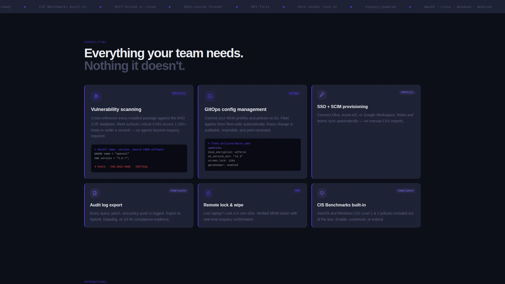
Each bento cell presents a single capability: vulnerability scanning, single sign-on integration, GitOps configuration, or audit log export. Every cell is built with a tight title, a two-line description, and a miniature user interface screenshot or code snippet. Cells sit on slate-colored cards with indigo left-border accents for fast visual scanning.
Scrolling Grid Density Progression
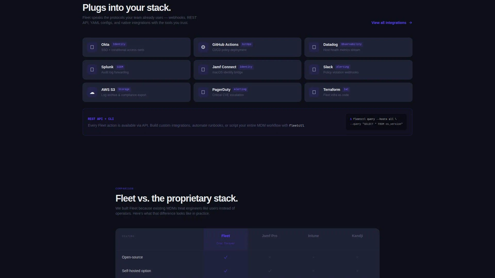
The grid opens with four large hero feature cells, then tightens into a 3x3 integration matrix as the visitor scrolls. This rhythm mirrors how a reference manual builds from overview to detail. It rewards engaged readers and signals product depth without requiring wall-to-wall text.
Comparison Table Against Proprietary Tools
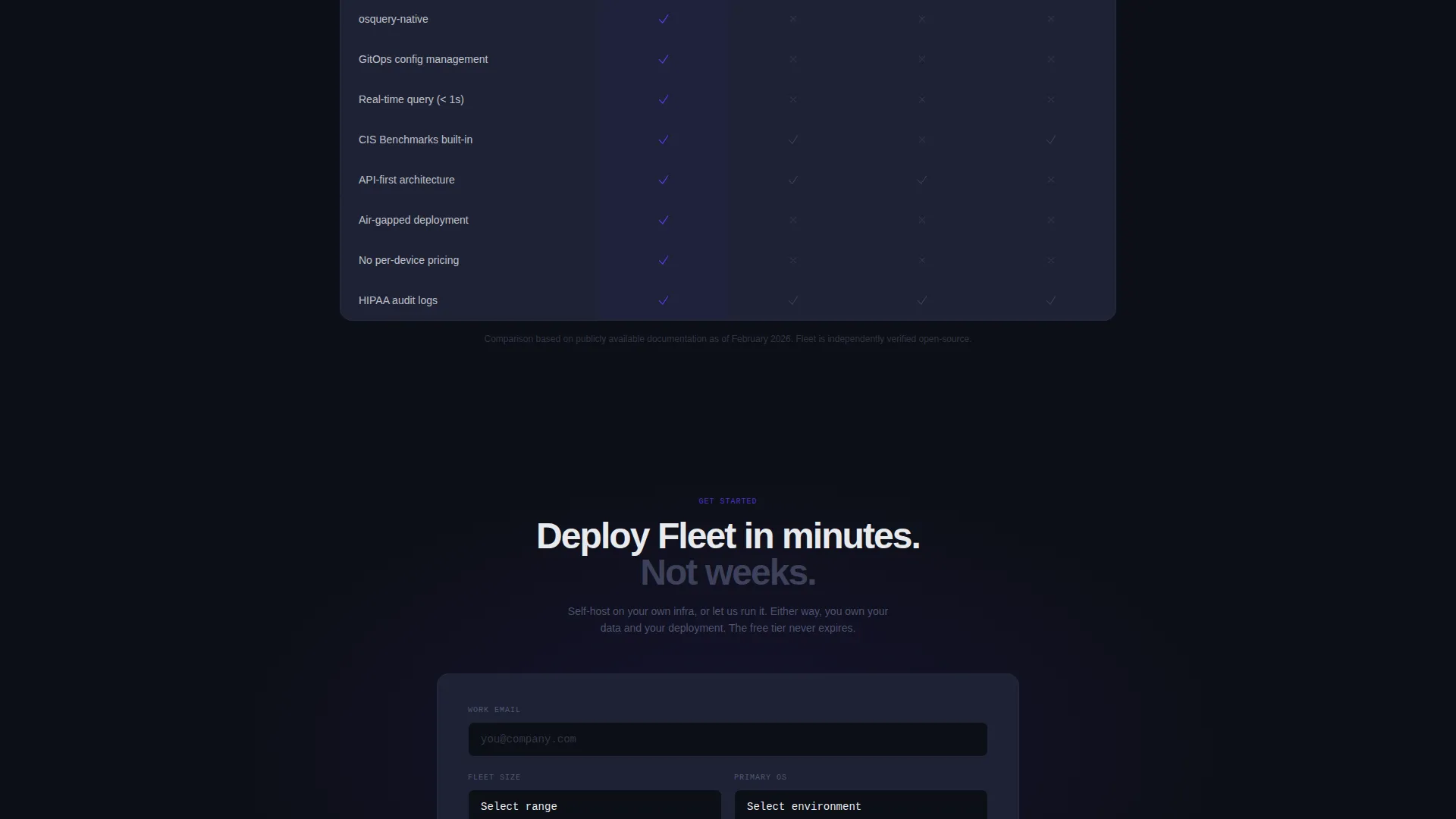
A single-row comparison table sits below the integration matrix and places this open-source platform directly beside proprietary mobile device management alternatives. Checkmarks render in electric indigo, making the feature-parity story immediately clear without needing a paragraph of explanation.
Sticky Lead Generation Bar
A sticky bottom bar appears after the visitor scrolls past the first fold. The primary call-to-action links to a self-hosted install form collecting work email, fleet size range, and primary operating system environment. A ghost-button secondary path offers an enterprise conversation without interrupting the main conversion flow.
Headline and Proof-First Copy Structure
The headline "Know every device. Fix every device. Prove it." sits left of the interactive frame in phosphor white. Copy throughout the page leads with real query syntax and real user interface frames before asking for any user action. This sequencing is built into the template structure, not left to chance.
Page sections overview
| Section | Purpose |
|---|---|
| Tab Switcher Header | Demonstrate Query, Patch, and Enforce capabilities interactively |
| Hero Headline Block | Anchor the value proposition beside the live user interface frame |
| Hero Feature Cells | Present four large bento cells covering primary capabilities |
| Integration Matrix | Show a 3x3 grid of integration and configuration capabilities |
| Comparison Table Row | Compare open-source platform against proprietary MDM alternatives |
| Sticky call to action Bar | Capture leads via install form or enterprise conversation path |
Design & branding system
The Electric Indigo color system is built to feel like a well-configured terminal environment. Every color choice serves a functional purpose and nothing is decorative without reason.
- Core palette: deep terminal black (#0D0F17) for backgrounds, electric indigo (#5A3FFF) for primary accents and checkmarks, cool slate (#1E2235) for bento card surfaces, and phosphor white (#E8EAED) for body text
- Hover states glow in ultraviolet lavender (#8B6FFF), giving interactive elements a clear active signal without breaking the dark palette
- The overall visual identity follows a Directory and Discovery theme, where density and precision replace lifestyle imagery
Mobile & speed optimization
The bento grid layout is structured to reflow naturally at smaller viewport widths. The spec-sheet approach means content is modular and each cell can stack independently without losing its meaning.
- Bento cells are self-contained units, so each card remains readable when stacked vertically on a mobile screen
- The sticky bottom bar is designed to remain accessible at the bottom of the viewport on any screen size, keeping the primary call-to-action within reach throughout the scroll
How this template helps you convert
This template is engineered around a proof-first persuasion sequence. Every scroll event adds evidence before the ask appears.
- The Feature Tab Switcher lets visitors interact with simulated product user interface in the first five seconds, establishing credibility before any marketing claim is made
- The bento grid accumulates specific capability proof across vulnerability scanning, GitOps config, audit log export, and integration depth, so enterprise buyers build confidence through detail rather than promise
- The sticky bar appears only after the first fold, ensuring the call-to-action surfaces at the moment of earned interest rather than interrupting a visitor who has not yet seen the product
Other information about this template
This template is a strong fit for the open-source enterprise software category and is specifically designed around the open-source mobile device management niche. It is built for technology companies that sell to technical buyers through self-serve install flows combined with enterprise sales paths.
- The template style is Bento Grid, suitable for products with multiple discrete capabilities that each deserve their own visual cell
- The creative direction is Spec Sheet, which prioritizes evidence accumulation over narrative storytelling
- The header concept is a Feature Tab Switcher, a pattern well suited to platforms like Fleet where the core workflow has three or four distinct functional modes
- The landing page direction is Lead Generation, balancing a low-friction self-hosted install path with a secondary enterprise conversation option
Theme
Directory & Discovery
Creative direction
Spec Sheet
Color system
Electric Indigo
Style
Bento Grid
Direction
Lead Generation
Page Sections
Feature Tab Switcher Header
Bento Grid Capability Cells
Scrolling Density Progression
Proprietary MDM Comparison Table
Sticky Lead Generation Bar
Related questions
Who is this landing page template designed for?
Can I adapt the bento grid cells to match my own product features?
What does the sticky call to action bar include?
Does this template support multiple operating system contexts?
How does the comparison table work?



