Fleet - Powerful Salon Spa Fleet Landing Page Template
Fleet is a split-screen landing page template built for mobile salon and spa fleet operators. It pairs a live-style fleet map with a real-time stats panel, then walks visitors through three head-to-head comparisons showing old workflows versus the Fleet dashboard. The design uses a deep void-black and electric-violet palette that feels like a premium cockpit instrument panel.
by Rocket studio
Quick summary
Fleet is a single-page, split-screen landing page template for mobile salon and spa fleet management platforms. It opens with a dashboard-style header showing twelve pulsing unit markers on a city grid alongside large live stats. Three comparison panels build a persuasive case, and two conversion paths close the argument with a personalized efficiency projection form and a floating demo-booking badge.
Who this template is for
This template is built for operators and decision-makers who manage scale. If you run a mobile beauty business with multiple units, this page speaks directly to your situation.
- Franchise owners running twelve or more mobile salon vans, spa trailers, or beauty buses across a metro area
- Operations managers coordinating therapist schedules against vehicle maintenance windows
- Regional directors who need to present utilization rates and revenue-per-unit figures to investors
What problem this template solves
Managing a mobile beauty fleet through spreadsheets, group texts, and whiteboards creates blind spots that cost real money. This template addresses that pain head-on by showing visitors exactly what those blind spots cost each month.
- Scheduling conflicts caused by manual coordination between dispatchers and drivers
- Surprise maintenance events that pull revenue-generating units off the road unexpectedly
- End-of-month reporting built from memory rather than clean, per-vehicle data
What you get with this template
You get a fully structured, conversion-focused landing page layout ready to present a fleet management platform. Every section serves a clear persuasive function, and nothing is decorative.
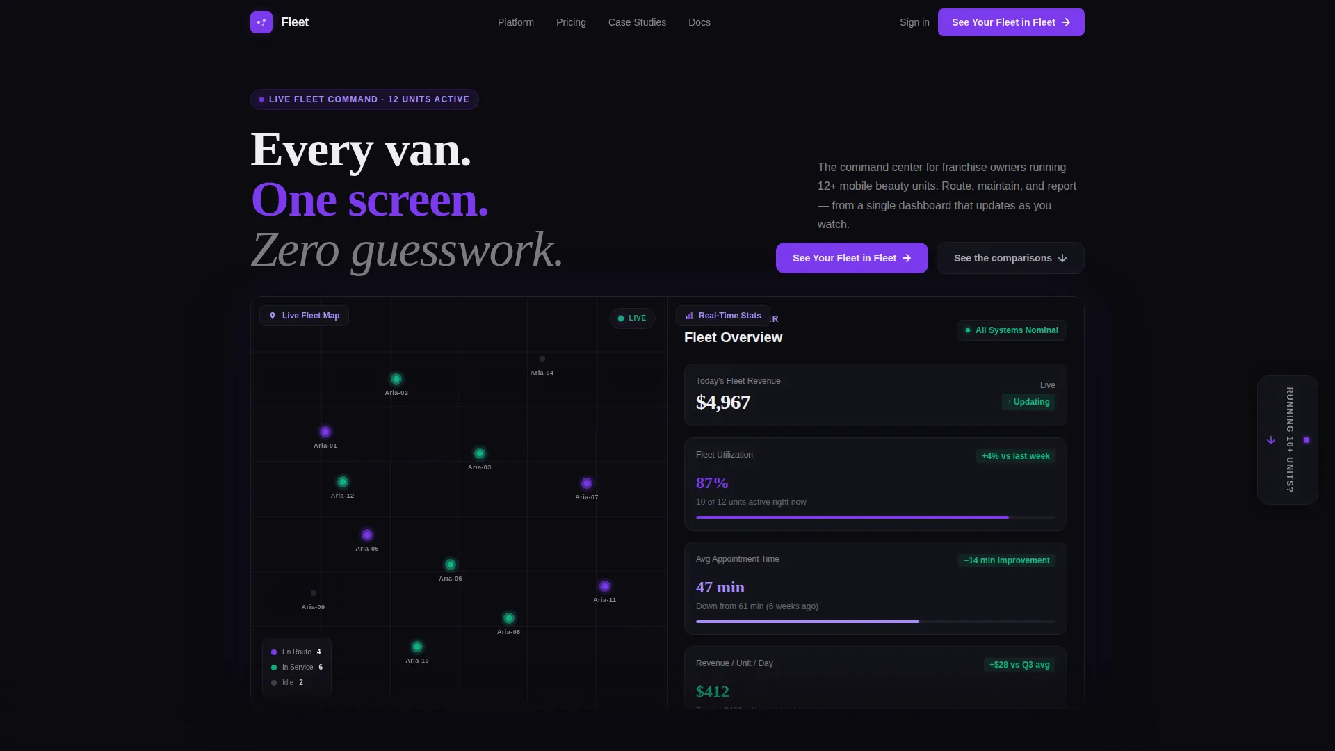
- A Dashboard Preview header with a split fleet map and live-style stats panel
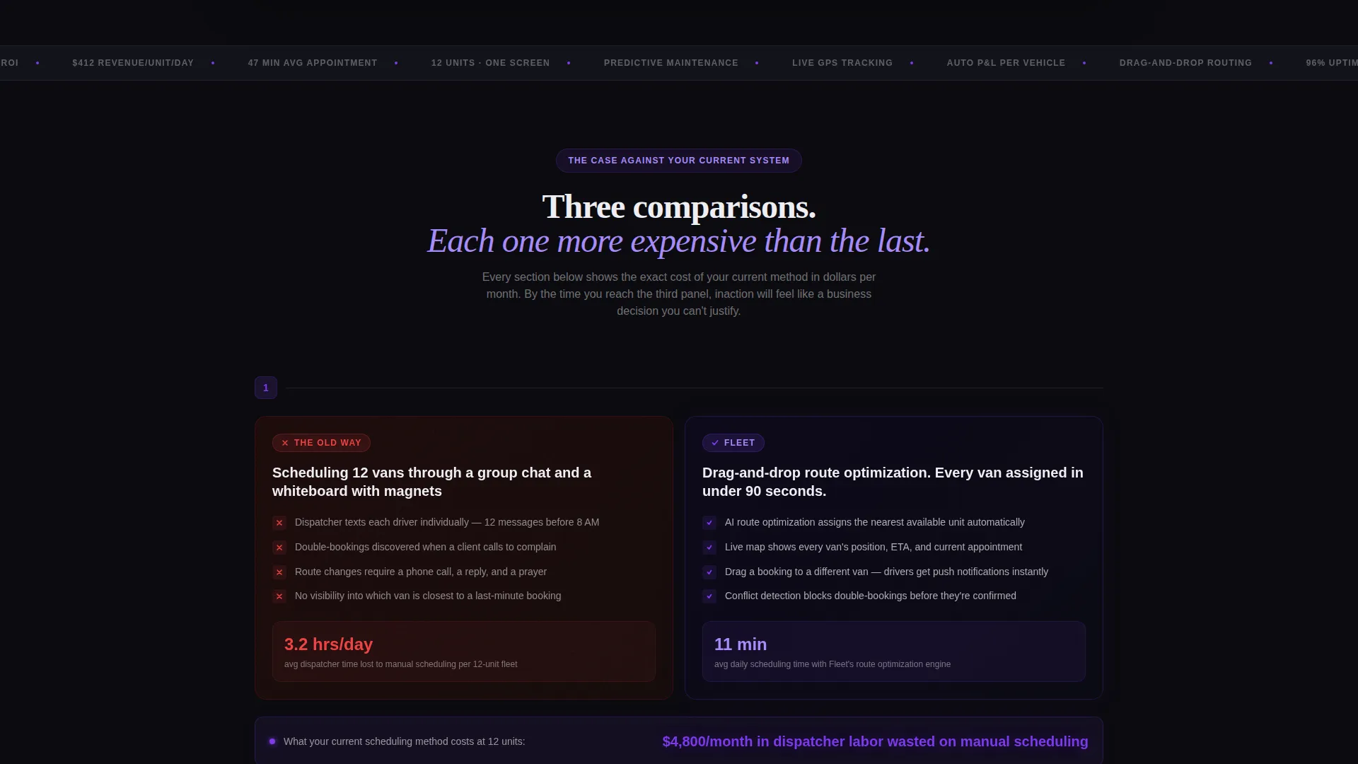
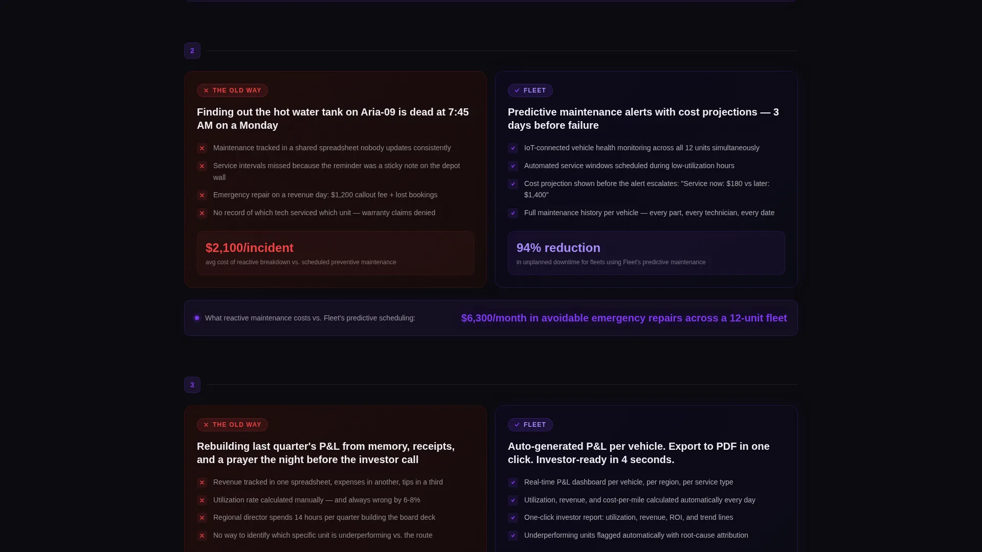
- Three side-by-side comparison sections that contrast old workflows with the platform solution
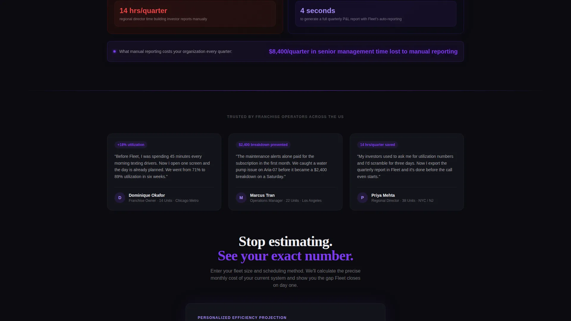
- Two conversion paths: a personalized projection form and a persistent floating demo-booking badge
Feature list
This template ships with six purpose-built layout components, each designed to move a fleet operator from skepticism to action.
Split-Screen Dashboard Header
The header divides the viewport evenly. The left side renders a city-grid fleet map with twelve violet pulsing dots, each labeled with a van name and one of three statuses: EN ROUTE, IN SERVICE, or IDLE. The right side shows four large-format real-time stats: fleet utilization at 87 percent, average appointment completion time of 47 minutes, next maintenance alert in 3 days, and revenue per unit per day of $412.
Stats-First Comparison Panels
Three sequential comparison sections each split the screen between the old way and the Fleet dashboard. Section one contrasts scheduling chaos with drag-and-drop route optimization. Section two contrasts maintenance surprises with predictive alerts and cost projections. Section three contrasts end-of-month reporting from memory with auto-generated profit and loss figures per vehicle.
Cost-Gap Highlight Stats
Every comparison section closes with a violet-highlighted stat block that quantifies the monthly cost of the old approach in hours or dollars. This makes inaction feel specific and expensive rather than abstract.
Personalized Projection Form
After the third comparison panel, the primary call to action invites visitors to enter their fleet size, number of service types offered, and current scheduling method via a dropdown. The form promises a personalized efficiency projection in return, lowering the barrier to engagement.
Persistent Floating Demo Badge
A floating badge anchored to the right gutter reads "Running 10+ units?" and links to a live demo booking calendar. It stays visible as the visitor scrolls, providing a secondary conversion path without interrupting the main narrative.
Void and Violet Design System
The entire layout uses deep void black (#0B0B0F) as the base, electric violet (#7C3AED) for active states and data highlights, muted orchid (#A78BFA) for secondary labels and chart lines, and clinical white (#EEEEF2) for typography and card surfaces. The result is a cockpit-instrument aesthetic where every data point floats in darkness with surgical clarity.
Page sections overview
| Section | Purpose |
|---|---|
| Split Dashboard Header | Establishes platform credibility with live-style fleet map and large stats |
| Scheduling Comparison Panel | Contrasts manual dispatch chaos with drag-and-drop route optimization |
| Maintenance Comparison Panel | Contrasts surprise breakdowns with predictive maintenance alerts |
| Reporting Comparison Panel | Contrasts memory-based reporting with auto-generated per-vehicle financials |
| Personalized Projection Form | Primary call to action capturing fleet size and scheduling method for a custom projection |
| Floating Demo Badge | Persistent secondary call to action linking high-volume operators to a demo calendar |
Design & branding system
The visual language is built around one idea: a premium cockpit instrument panel in a blacked-out cabin. Data is the hero, not photography.
- Color palette: void black (#0B0B0F) base, electric violet (#7C3AED) for active data highlights, muted orchid (#A78BFA) for secondary labels, and clinical white (#EEEEF2) for text and card surfaces
- No stock photography or lifestyle imagery; every visual element is a data point, status label, or metric
- Typography is large enough to read from across a room on the header stats panel, shifting to clean readable sizes in body copy
Mobile & speed optimization
The template is structured for fast load and clear hierarchy across screen sizes. The split-screen layout adapts so that stacked mobile views preserve the stat-panel legibility that makes the template effective.
- Large stat figures retain their visual weight when columns stack on smaller screens
- The floating demo badge repositions cleanly without obscuring the main conversion form
- Comparison panels are structured as two-column blocks that collapse to single-column flow on mobile without losing the before-versus-after narrative
How this template helps you convert
The page is built as a cumulative argument, not a brochure. Each section adds evidence until the visitor's current workflow looks indefensible.
- The header delivers instant credibility by presenting real operational numbers in a live-dashboard format, establishing that this platform understands fleet management at a professional level.
- The three comparison panels build a sequential prosecution of the old way, with each section ending on a concrete dollar or hour figure that makes the cost of inaction visible and specific.
- Two conversion paths serve two different buyer mindsets: the projection form captures operators ready to calculate ROI, and the floating badge captures operators who want to see the product first.
Other information about this template
This template is designed for the salon and spa software category within the broader technology sector, specifically for the salon and spa fleet management niche. A few additional details worth knowing:
- The template style is Split Screen (50/50), meaning left and right halves carry equal visual weight throughout every section
- The theme follows a Dashboard Pro aesthetic, built for data-rich interfaces rather than editorial or lifestyle layouts
- The creative direction is Stats-First Impact, a format where quantified evidence drives scroll behavior rather than narrative copy
- The landing page direction is Comparison/Versus, a persuasion structure particularly effective for convincing operators already using a competing method
- The header concept is Dashboard Preview, designed to show the platform in action before any feature explanation begins
- This template suits any mobile beauty fleet platform looking to present a professional, data-forward first impression to franchise-scale buyers
Theme
Dashboard Pro
Creative direction
Stats-First Impact
Color system
Void & Violet
Style
Split Screen (50/50)
Direction
Comparison/Versus
Page Sections
Split-screen Dashboard Header
Three Comparison Panels
Cost-gap Stat Highlights
Personalized Projection Form
Persistent Floating Demo Badge
Void and Violet Design System
Related questions
Who is this landing page template best suited for?
Does the template include real-time data or live map functionality?
Can I adapt the comparison panels for a different number of service types?
What makes the floating demo badge different from the main call-to-action form?
Is this template appropriate for a platform serving both salon vans and spa trailers?



