Healthcare Software Specialist Cost Calculator Website Template
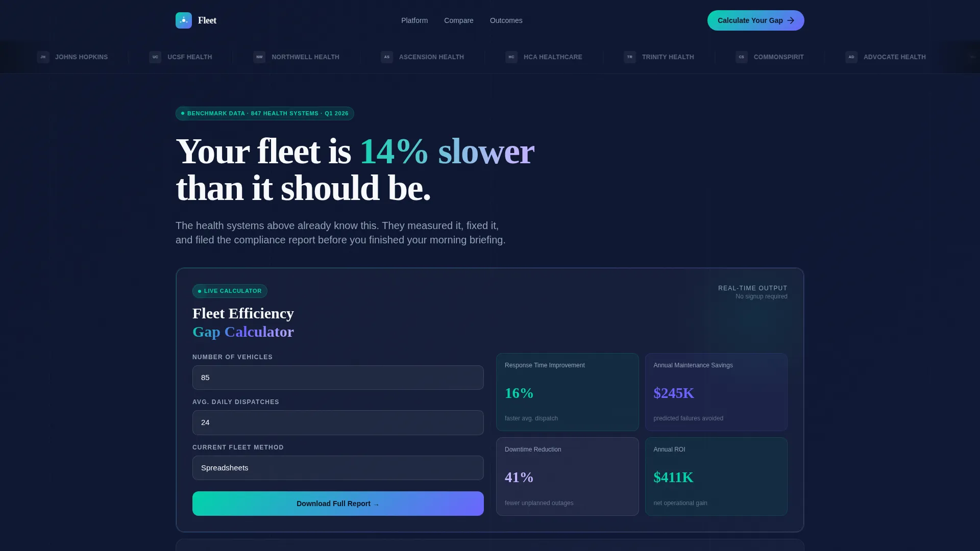
Fleet is a bento grid landing page template built for healthcare fleet management platforms. It leads with a live Fleet Efficiency Calculator, a scrolling logo bar, and a sharp provocation headline. Every section is designed to help operations directors build a budget-ready business case before a single form is filled out.
by Rocket studio
Quick summary
Fleet is a single-page bento grid template purpose-built for healthcare fleet management software. It opens with a scrolling logo bar and a pointed headline, then immediately hands the visitor an interactive calculator. Surrounding tiles reveal comparisons, live-simulated maps, compliance gauges, and maintenance timelines. The result is a page that earns trust through evidence before it ever asks for an email.
Who this template is for
Fleet is designed for healthcare fleet management platforms selling to operations-heavy buyers. These are professionals who evaluate software with data, not demos, and who need to justify a purchase to a finance team before they act.
- Hospital system logistics directors managing 200 or more vehicles across metro service areas
- Rural health network coordinators who stretch thin fleets across county lines with limited support staff
- Emergency medical services operations chiefs who track response-time compliance and sleep poorly before audit season
What problem this template solves
Healthcare fleet operations teams often cannot quickly show the dollar value of switching platforms. Legacy tools and spreadsheets produce vague numbers that are hard to present upward. This template solves the persuasion gap between "we need better software" and "here is what it costs us not to have it."
- Visitors arrive with skepticism; the calculator gives them real projected numbers before any sales conversation begins
- The comparison grid makes gaps between current-state tools and the platform visible in seconds, not slide decks
- The gated comparison report gives buyers a formatted document they can forward directly to a chief financial officer
What you get with this template
This template delivers a complete, conversion-focused landing page layout built around interactive proof. Every bento tile is a self-contained piece of evidence that builds the visitor's internal business case as they scroll.
- A live Fleet Efficiency Calculator tile accepting vehicle count, daily dispatches, and current management method as inputs
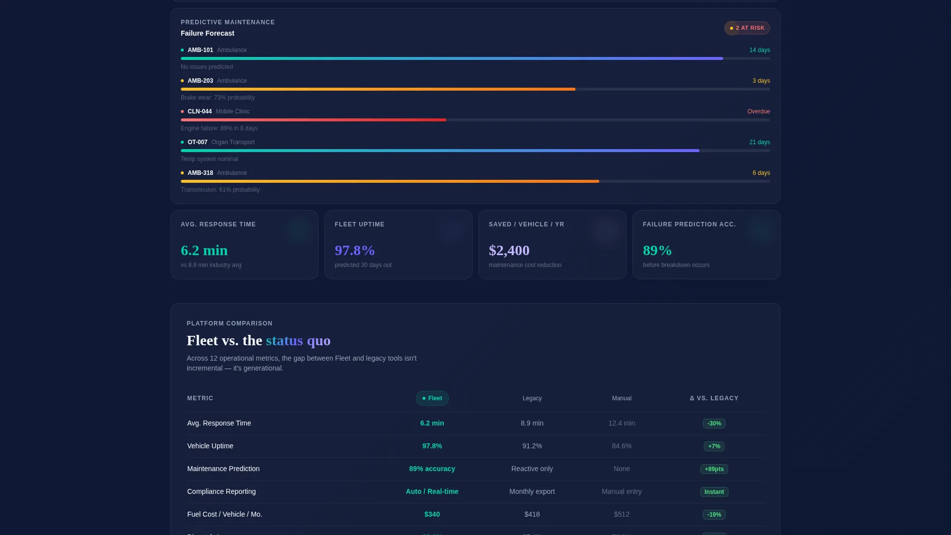
- A side-by-side comparison grid spanning two tiles, covering twelve operational metrics with green and red delta indicators
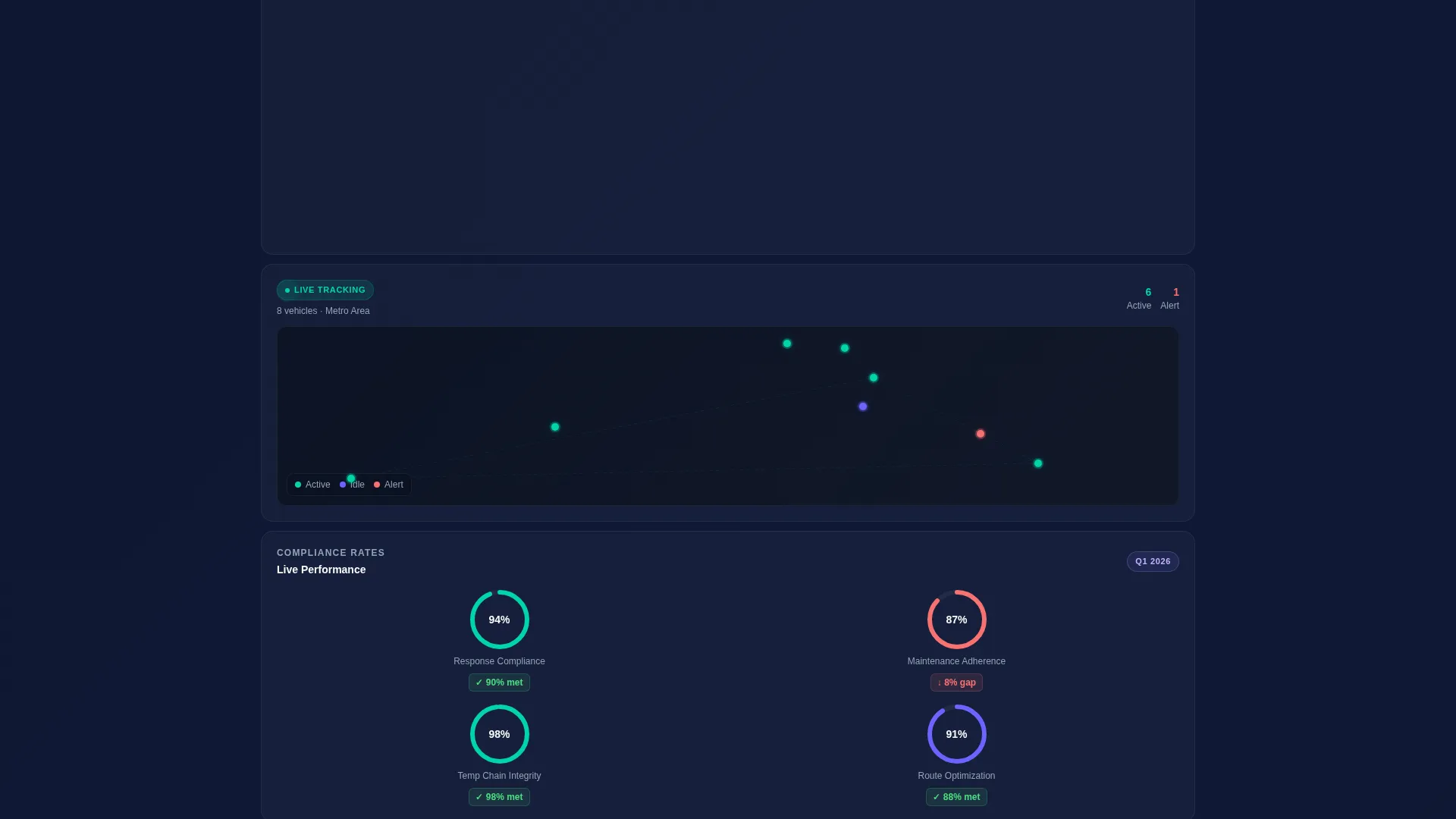
- Animated supporting tiles including a live-simulated vehicle map, compliance-rate gauges, and a maintenance prediction timeline
Feature list
This template is built around one core idea: let the data do the selling. Each feature listed below maps directly to a component described in the source brief.
Interactive Fleet Efficiency Calculator
The largest bento tile houses a three-input calculator. Visitors enter their number of vehicles, average daily dispatches, and current fleet management method from a dropdown. The tool returns projected response-time improvement, estimated annual maintenance savings, and expected downtime reduction in real time as inputs change.
Scrolling Logo Bar Header
The page opens with a horizontal ribbon of hospital system logos, EMS agency badges, and health network emblems. Each logo scrolls in perpetual smooth motion, rendered in monochrome against deep navy. The effect signals peer validation before a single word of copy is read.
Comparison Grid with Delta Indicators
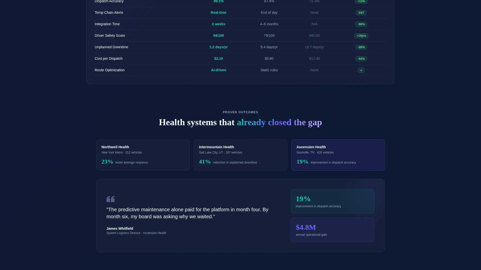
Two bento tiles combine to display a side-by-side comparison of Fleet against legacy platforms and manual tracking across twelve operational metrics. Green and red delta indicators make performance gaps immediate and visceral, giving visitors a quick visual proof point they can reference in budget conversations.
Live-Simulated Vehicle Map Tile
A dedicated tile shows animated dots pulsing along simulated routes. It communicates real-time tracking as a concept without requiring a live data feed, giving the visitor a visceral sense of the platform's dispatch visibility.
Compliance and Maintenance Tiles
Two smaller animated tiles round out the bento grid. One cycles through compliance-rate gauges to reinforce regulatory relevance. The other displays a maintenance prediction timeline where flagged failures appear before they occur, making predictive maintenance tangible rather than abstract.
Sticky call to action and Gated Report Path
A sticky iridescent teal button labeled "Calculate Your Fleet Gap" appears after the visitor scrolls past the calculator tile. A secondary conversion path offers a downloadable comparison report behind a two-field gate asking only for a work email and fleet size.
Page sections overview
| Section | Purpose |
|---|---|
| Logo Bar Header | Establish peer credibility through scrolling hospital and EMS logos |
| Provocation Headline | Deliver a sharp, data-led statement that creates immediate tension |
| Fleet Efficiency Calculator | Let visitors self-qualify by generating their own projected savings numbers |
| Comparison Grid | Visualize the performance gap across twelve metrics with delta indicators |
| Live Vehicle Map | Simulate real-time dispatch tracking to make platform capability feel concrete |
| Compliance Rate Gauges | Reinforce regulatory stakes with animated compliance-rate cycling |
| Maintenance Timeline | Show predictive failure flagging before breakdown as a tangible feature |
| Sticky call to action Bar | Keep the primary call to action visible after the calculator scrolls out of view |
| Gated Report Download | Capture qualified leads with a two-field form tied to a shareable PDF |
Design & branding system
The visual identity follows a Dynamic Motion theme using an AI Iridescent color system. The palette is built to feel technological, alive, and subtly shifting, like light refracting through a prism mounted on a clinical dashboard.
- Deep surgical navy (#0B1120) dominates backgrounds and data-dense tiles; iridescent teal (#00D4AA) pulses on live-status indicators and interactive elements; violet-blue (#6C63FF) anchors headlines and navigation
- Soft holographic lilac (#C4B5FD) appears as hover states and gradient transitions between bento cells, giving the grid a breathing, luminous quality over clinical white (#F8F9FC)
- Typography lands with restraint; the provocation headline uses a single bold line with no supporting imagery, letting the number and the logo bar carry the full emotional weight
Mobile & speed optimization
The bento grid layout is structured to restack cleanly on smaller viewports. Interactive tiles remain functional at mobile widths, and the sticky call to action button stays accessible throughout the scroll journey.
- Each bento tile is a self-contained card, making responsive reflow straightforward without losing the visual hierarchy of the full-width grid
- The calculator and comparison grid are the heaviest interactive components; their layouts are designed to remain readable and usable on narrower screens
- Animated tiles such as the vehicle map and compliance gauges use motion that serves comprehension rather than decoration, keeping the experience purposeful at every screen size
How this template helps you convert
This template is structured around giving value before asking for anything. The conversion architecture follows a clear sequence that moves visitors from curiosity to commitment.
- The calculator delivers personalized projected numbers immediately, making the value proposition concrete and specific to the visitor's own fleet before any form or friction appears
- The comparison grid and animated tiles build cumulative evidence as the visitor scrolls, so by the time the gated report form appears, the visitor has already mentally committed to the business case
- The two-field gated report is designed for internal sharing, giving the visitor a formatted document to forward to a chief financial officer, which extends the conversion beyond the individual visitor to the decision-making team
Other information about this template
This template is a strong fit for healthcare technology companies that sell to institutional buyers through longer evaluation cycles. It is also relevant to any fleet management software vendor targeting regulated industries where compliance and response time carry real operational weight.
- The bento grid layout makes it straightforward to swap individual tiles for A/B testing without rebuilding the full page structure
- The comparison report gate uses only two fields, reducing friction while still capturing the fleet size data most useful for lead qualification
- This template suits platforms positioning against spreadsheet-based workflows or older legacy fleet software where the performance gap is easy to quantify
Theme
Dynamic Motion
Creative direction
Calculator/Tool First
Color system
AI Iridescent
Style
Bento Grid
Direction
Comparison/Versus
Page Sections
Interactive Fleet Efficiency Calculator
Scrolling Logo Bar with Peer Validation
Metric Comparison Grid
Live-simulated Vehicle Map
Compliance Gauges and Maintenance Timeline
Sticky Call to Action and Two-field Report Gate
Related questions
Who is this template designed for?
Does the calculator require a live data connection?
Can I replace the logos in the scrolling logo bar?
What does the gated comparison report section include?
Is this a single-page template or a multi-page layout?



