Bold Brutalist Insurance Fleet Management Landing Page
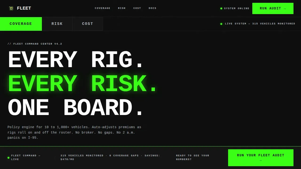
Fleet is a Bold Brutalist insurance fleet management landing page template built for logistics ops managers, construction owners, and courier founders who need total coverage command. Its bento grid layout, hard-cut tab switcher, and head-to-head feature matrix give visitors the information to act fast. Every design decision signals reliability, speed, and zero ambiguity.
by Rocket studio
Quick summary
Fleet is a single-page, bento grid landing page template for insurance fleet management platforms. It uses a Bold Brutalist design language, an Acid Digital color system, and a Feature Tab Switcher header to put real-time vehicle data, driver risk scores, and premium comparisons front and center. The page is built to convert logistics and operations decision-makers into qualified leads.
Who this template is for
This template is built for InsurTech and commercial fleet insurance businesses that need a high-impact landing page. It speaks directly to buyers who manage large vehicle rosters across multiple states and cannot afford coverage gaps.
- Logistics ops managers running 200-plus vehicles across state lines who need real-time fleet management oversight
- Construction company owners whose heavy vehicle operations drive high deductible exposure
- Courier startup founders scaling vehicle fleets rapidly and seeking continuous, gap-free coverage services
What problem this template solves
Fleet management landing pages often fail to show the math. Generic designs bury the value proposition and leave potential clients guessing about cost, risk, and compliance. This template eliminates that ambiguity by presenting a direct, data-led comparison that helps businesses decide before they ever fill out a form.
- Legacy broker delays and generic commercial policy gaps are hard to explain quickly; this template displays the contrast in every bento tile
- Visitors need to monitor performance and evaluate key metrics side by side before committing to a lead form
- Ops managers want to see real-time vehicle status, driver risk, and per-vehicle cost data without digging through brochure copy
What you get with this template
You get a fully structured, section-led landing page designed to serve high-intent fleet management buyers. Every section works together to build a case, show the numbers, and earn the click.
- A Feature Tab Switcher header with three hard-cut tabs: COVERAGE, RISK, and COST, each loading a distinct bento grid of vehicle and policy data
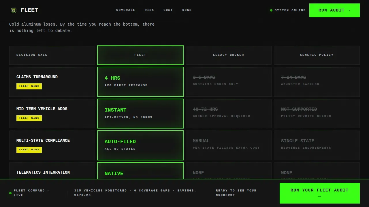
- A Feature Matrix section that pits the platform against legacy brokers and generic commercial policies across five decision axes
- A two-step Fleet Audit lead capture form plus a secondary email-gated PDF download for visitors still benchmarking services
Feature list
This template is designed around the following built-in capabilities, all grounded in the source brief.
Feature Tab Switcher Header
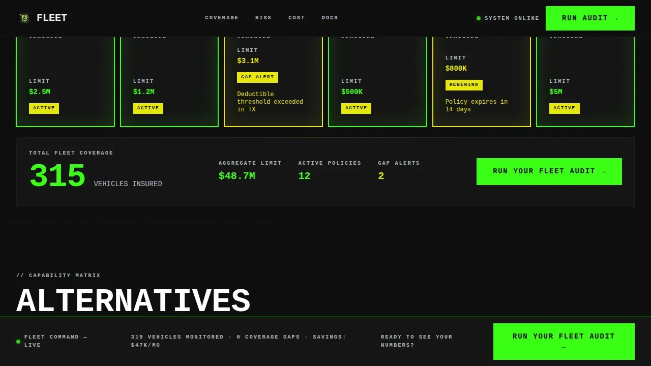
Three oversized tabs, COVERAGE, RISK, and COST, stamp across the top of the viewport. Each tab cuts hard to a new bento grid. COVERAGE shows vehicle-type cards with policy limits and gap alerts. RISK displays a driver scorecard with incident heat bars and compliance badges. COST renders a per-vehicle premium comparison table. No easing, no animation fade. Panels switch like toggling channels on a dispatch monitor.
Bento Grid Feature Matrix
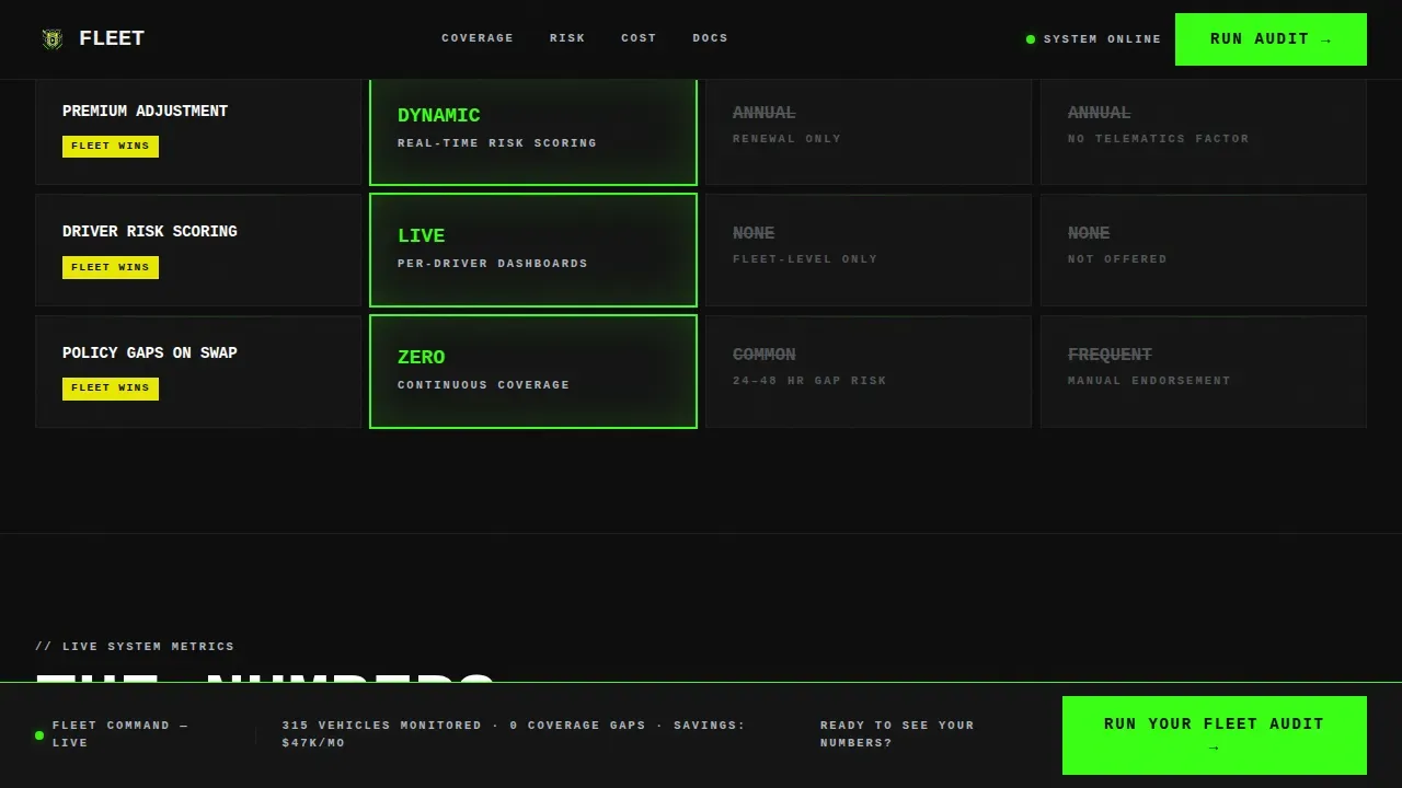
The scroll-driven comparison section stacks capability grids that work through five decision axes: claims turnaround time, mid-term vehicle additions, multi-state compliance filing, telematics integration, and after-hours support. The platform's metric appears in reactor green beside each competitor metric, struck through or dimmed in cold aluminum. The design lets data do the persuading so visitors can monitor performance differences at a glance.
Two-Step Fleet Audit Form
Step one captures fleet size via a slider from 10 to 1,000-plus vehicles, primary vehicle type via dropdown, and operating states via multi-select checkboxes. Step two collects company name, contact email, and current annual premium. Plain text fields and a simple layout ensure the form feels direct and transparent rather than intrusive, building trust before the lead is submitted.
Sticky Bottom Call-to-Action Bar
The primary call to action, "Run Your Fleet Audit," appears first in the COST tab and returns as a sticky bottom bar after the third scroll section. This keeps the conversion path visible for logistics and operations managers who read deep into the comparison data before deciding to engage with fleet management services.
PDF Gate Secondary Conversion
A secondary path, "Download the Comparison Sheet," gates a downloadable PDF behind a single email field. This serves visitors who are still benchmarking fleet management options and are not yet ready for the full audit form. It expands the lead funnel without adding friction to the primary path.
Driver Risk Scorecard Tiles
The RISK tab and live metrics section display driver scorecards with incident heat bars and compliance badges. These tiles help fleet operations teams quickly identify risk exposure across their vehicle roster, supporting better decisions on coverage adjustments and driver safety monitoring.
Page sections overview
| Section | Purpose |
|---|---|
| Feature Tab Switcher | Displays COVERAGE, RISK, and COST bento grids in hard-cut tabs |
| Vehicle Coverage Grid | Shows vehicle-type cards with policy limits and gap alerts |
| Driver Risk Scorecard | Displays incident heat bars, risk scores, and compliance badges |
| Premium Comparison Table | Renders per-vehicle monthly rates side by side |
| Feature Matrix Grid | Compares platform against legacy brokers and generic policies |
| Live Metrics Tiles | Shows claims turnaround, telematics data, and driver safety metrics |
| Comparison Callouts | Highlights per-vehicle cost breakdown with win-state badges |
| Fleet Audit Form | Two-step lead capture with fleet size slider and state multi-select |
| PDF Gate Modal | Email-only gate for the downloadable comparison sheet |
| Minimal Footer | Horizontal flow footer with essential links and information |
Design & branding system
The design follows a Bold Brutalist aesthetic built on an Acid Digital color system. It breaks conventional design norms by using high-contrast color schemes, oversized monospaced typography, and a rigid bento grid layout that feels like a dispatch monitor at midnight. There are no gradients, no decorative shadows, and no soft transitions. Every color is functional. The architectural weight of the design signals the financial solidity of a platform that businesses can rely on.
- Void black (#0D0D0D) dominates every background tile; reactor green (#39FF14) marks active states, live data, and primary calls to action; hazard yellow (#E8E805) fires on win-state badges and comparison callouts; cold aluminum (#B0B8C1) recedes into labels, borders, and fine print
- JetBrains Mono monospaced typography is set at confrontational scale, all uppercase, projecting raw strength and no-nonsense efficiency across every heading and data tile
- Bento grid tiles use hard edges and clear dividers to organize complex fleet management data without distracting graphics, keeping the visual hierarchy clean and skimmable
Mobile & speed optimization
This template is designed desktop-first, matching how logistics ops managers and fleet operations teams actually work. Workstation screens get the full bento grid experience. A mobile fallback layout ensures the landing page remains usable on smaller devices.
- Hard-cut tab switching and scroll-reveal count-up numbers use client-side components only where interactivity is needed, with static sections handled separately to keep the page running efficiently
- The sticky call-to-action bar and PDF gate modal are built as lightweight client components so they load without blocking the core fleet management content
- The Bold Brutalist design approach naturally limits decorative graphics, which helps keep the landing page lean and fast to render across connected devices
How this template helps you convert
This landing page is engineered around a Comparison/Versus conversion strategy. The page earns the click by showing visitors the math before asking for the lead. By the time the audit form appears, every competitor metric has already lost in the comparison grid.
- The Feature Matrix eliminates alternatives row by row. Each bento tile displays the platform's fleet management metric in reactor green beside legacy broker and generic policy numbers, making the winning choice obvious without persuasive copy.
- The sticky "Run Your Fleet Audit" call to action stays visible as visitors scroll through vehicle data, risk metrics, and cost breakdowns, so the moment a client is ready, the action is never more than one click away.
- The PDF gate secondary path captures visitors who are still in research mode, turning passive readers into qualified contacts before they leave the landing page.
Other information about this template
This template is part of a broader library of landing page designs built for B2B software and InsurTech businesses. It can serve as a strong starting point for any fleet management platform that needs a direct, high-converting web presence.
- The Fleet Bold Brutalist Insurance Fleet Management Landing Page Template is designed to display vehicle details clearly, including vehicle type, mileage context, and policy information across bento tiles
- Fleet management systems can integrate with various connected devices and vehicle sensors; the template's data tiles are structured to display real-time metrics, mileage indicators, and telematics information in a way that aligns with how modern fleet management software surfaces that data
- Customizable color tokens, typography settings, and bento grid configurations enable businesses to align the template with their own brand identity while retaining the core Bold Brutalist effectiveness
- Social proof sections are planned with operator quotes and specific metrics such as claims turnaround times, fleet sizes managed, and cost savings percentages to enhance credibility and trust with logistics clients
- The USA localization context, including USD formatting, MM/DD/YYYY date display, and multi-state compliance details, is baked into the template's content structure so it works out of the box for North American fleet operations businesses
- Security and data handling details in the two-step form are left to the implementing team to configure according to their platform's requirements
Theme
Bold Brutalist
Creative direction
Feature Matrix
Color system
Acid Digital
Style
Bento Grid
Direction
Comparison/Versus
Page Sections
Feature Tab Switcher Header
Scroll-driven Feature Matrix
Two-step Fleet Audit Form
Sticky Call-to-action Bar
PDF Gate Secondary Path
Driver Risk Scorecard Tiles
Related questions
Who is this landing page template designed for?
Can I customize the colors and typography?
What does the two-step Fleet Audit form capture?
Does this template include the PDF comparison sheet content?
Is this template suitable for a desktop-heavy audience?



