Cloud-Native Enterprise Software Booking Website Template
Dispatch is a cloud-native transportation management landing page template built for logistics professionals who need a single control point for every load, carrier, and dock appointment. It features a fully interactive above-the-fold dashboard preview, scroll-activated data panels, and a progressive freemium signup flow, all wrapped in a precise Monochrome Steel visual identity.
by Rocket studio
Quick summary
Dispatch is a dashboard-style landing page template for cloud-native transportation management software. It puts a live, clickable TMS preview front and center, then walks visitors through interactive rate intelligence, carrier matching, and document management panels as they scroll. Every module earns trust before asking for a signup.
Who this template is for
This template is designed for logistics and freight technology products that serve operators who know their workflows inside out. If your product replaces spreadsheets, broker calls, or a first-generation transportation management system, this layout speaks directly to that buyer.
- Mid-market third-party logistics operators handling 200 to 2,000 loads per week
- In-house transportation managers at consumer packaged goods companies moving off manual tender sheets
- Freight brokers scaling past entry-level systems who need real-time visibility without enterprise pricing
What problem this template solves
Most logistics software landing pages ask prospects to trust a screenshot and book a demo. That approach loses the buyer before they feel the product. Dispatch solves this by letting visitors interact with a fully rendered dashboard before they ever see a signup form.
- Visitors struggle to evaluate freight software from static images or vague benefit claims
- Buyers in transportation management need to see data density and workflow logic, not marketing copy
- A passive page cannot convey the real-time nature of load tracking, carrier scoring, and rate benchmarking
What you get with this template
You get a complete, single-page landing layout built around interactive proof. Every section is a product moment, not a marketing slide. The template ships with a cohesive visual system and a conversion path that collects buyer intent progressively.
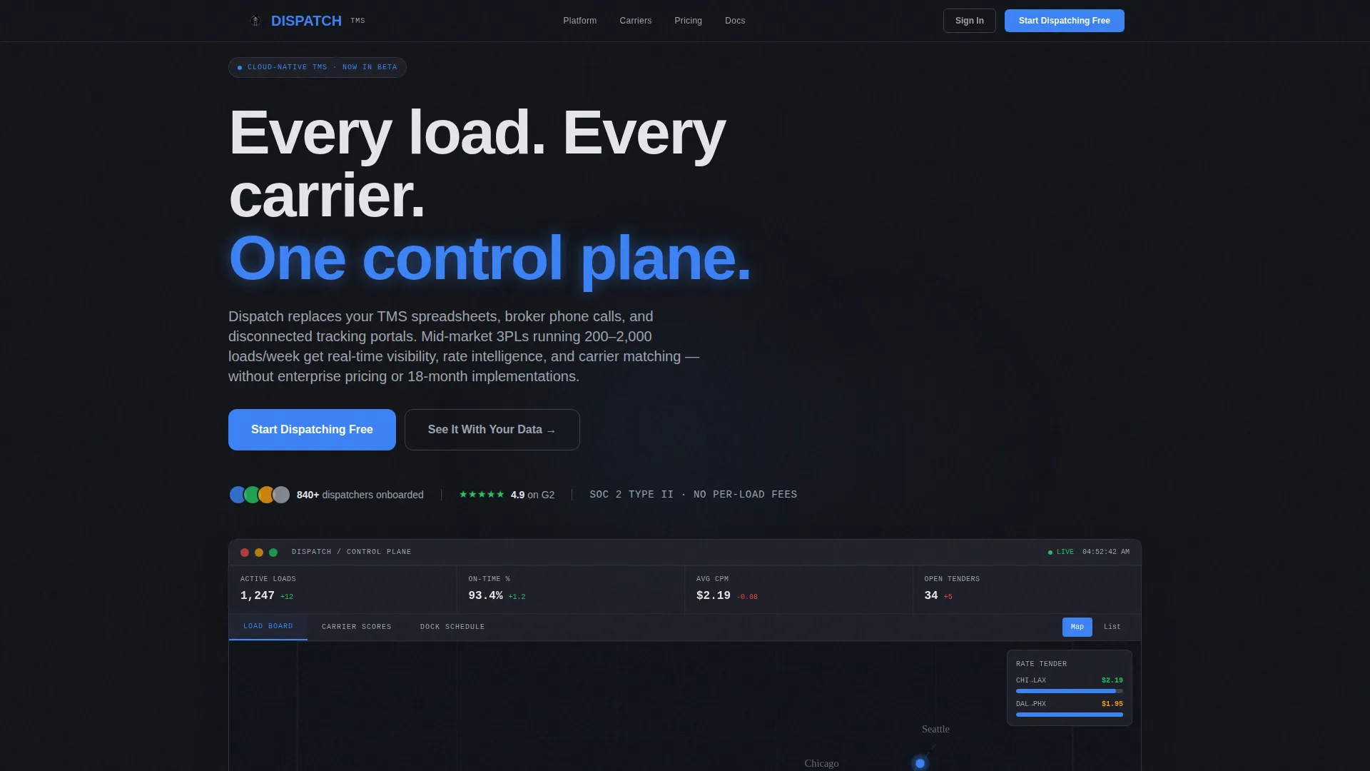
- A fully rendered, clickable TMS dashboard embedded above the fold with animated load data and togglable views
- Scroll-activated data grid panels covering rate intelligence, carrier matching, and document management
- A progressive freemium signup flow starting with email only, with no credit card required
Feature list
This template surfaces a precise set of interactive capabilities derived directly from its design brief. Each feature below is built into the layout as delivered.
Above-the-Fold Interactive Dashboard
The header is a live, clickable transportation management dashboard populated with realistic shipment data. Visitors see animated truck markers moving along major freight corridors, a carrier scorecard column with live on-time percentages, a rate comparison table in mid-tender state, and a dock schedule displayed as a color-coded Gantt chart. They can hover a lane to see cost-per-mile, click any load row to expand details, and toggle between map view and list view. No static screenshot replaces this moment.
Scroll-Activated Data Grid Panels
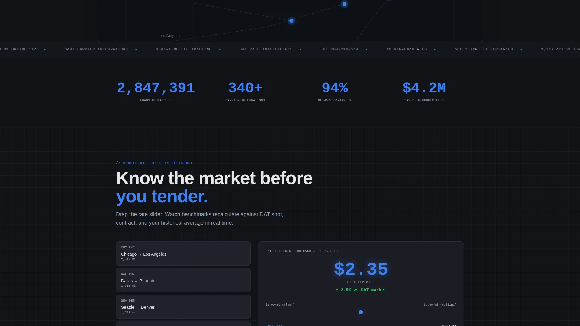
As visitors scroll, each TMS module activates in response to cursor movement or scroll position. The interaction is not decorative. Numbers tick upward, status indicators flip from pending to confirmed, and toast notifications slide in to confirm tender acceptance. Each panel escalates the story from basic load visibility to full network optimization.
Rate Intelligence Explorer
A dedicated panel lets visitors drag a lane slider to watch market rate benchmarks shift in real time. This turns a feature description into a tangible proof point. Buyers immediately understand the depth of the rate intelligence layer without reading a single bullet point.
Real-Time Carrier Matching Engine
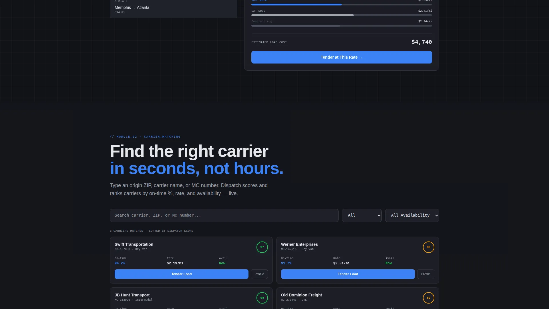
Visitors type an origin ZIP code and watch the carrier list filter live. This interaction demonstrates the matching logic directly inside the landing page. It is one of the clearest ways to communicate responsiveness and data coverage to a skeptical freight buyer.
Document Hub with Card Interaction
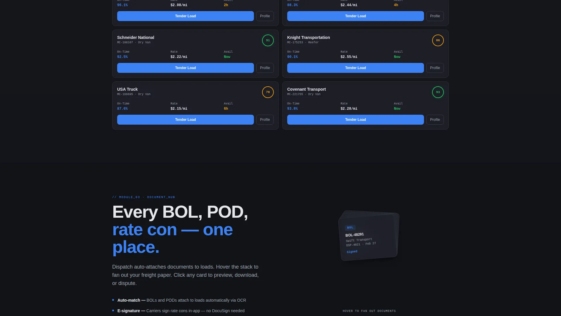
The document management section fans out bills of lading and proof-of-delivery records like a card deck when hovered. Visitors understand the document organization model in seconds. No modal, no tutorial, just an immediate visual of how paperwork lives inside the platform.
Progressive Freemium Conversion Flow
The primary call to action is pinned in a slim top bar that follows the scroll and repeats at the close of every interactive module. The signup form collects only an email on first click, then asks for company name and average weekly load count on the next screen. No credit card is required at any step.
Page sections overview
| Section | Purpose |
|---|---|
| Pinned top bar | Anchors primary call to action during scroll |
| Interactive TMS dashboard | Proves product value above the fold |
| Rate intelligence panel | Demonstrates lane benchmarking live |
| Carrier matching engine | Shows real-time filtering by origin |
| Document hub panel | Visualizes BOL and POD organization |
| Progressive signup form | Collects lead intent in two steps |
Design & branding system
The visual identity follows a Data Command theme. Every design decision prioritizes information density and precision over decoration or warmth. The palette references high-trust professional environments where clarity signals competence.
- Carbon background at hex #111318, brushed steel panel at #1E2028, and a gunmetal divider at #3A3F4B create a layered depth that feels like an active control room
- Cool white text at #E4E6EB keeps body copy readable against dark surfaces without reducing contrast
- A single signal-blue accent at #3B82F6 is reserved exclusively for live data readouts, active state indicators, and primary call-to-action elements
Mobile & speed optimization
The template is built for visitors who may arrive on any screen size, including tablet-sized displays common in warehouse and dispatch environments. The layout adapts the data-dense panels for smaller viewports without stripping out the interactive behavior.
- Interactive panels reflow into vertical scroll sequences on smaller screens so no data grid is cut off
- The pinned top bar and primary call to action remain visible and accessible across all breakpoints
- Micro-interaction layers are scoped to keep the page responsive during scroll-triggered animations
How this template helps you convert
Every layout decision in Dispatch is oriented toward reducing friction between a first visit and a free account signup. The page earns the click by letting visitors experience the product logic before any commitment is requested.
- The above-the-fold interactive dashboard replaces passive hero copy with a live product moment, so buyers form an opinion based on capability rather than claims
- Scroll-activated panels build a progressive case for platform depth, moving the visitor from curiosity to confidence across each data grid section before the final call to action appears
Other information about this template
Dispatch is categorized under the Technology vertical with a Cloud-Native Enterprise Software subcategory. It is purpose-built for the cloud-native transportation management system niche, where buyers are technically literate and skeptical of vague product promises.
- The template style is Dashboard and Data Grid, matching the visual language buyers already associate with operations software
- The creative direction is Interactive Explorer, meaning scroll behavior is functional rather than decorative
- The header concept is Interactive Preview, which means the first thing a visitor sees is a working product simulation, not a tagline
- The conversion direction is Freemium and Trial, supported by a no-credit-card progressive form and a secondary path labeled "See It With Your Data" that leads to a guided CSV upload flow
- The theme is Data Command, referencing the visual density and trust grammar of professional financial and mission-critical interfaces
Theme
Data Command
Creative direction
Interactive Explorer
Color system
Monochrome Steel
Style
Dashboard/Data Grid
Direction
Freemium/Trial
Page Sections
Above-the-fold Interactive Dashboard
Scroll-activated Data Grid Panels
Rate Intelligence Explorer
Real-time Carrier Matching Engine
Document Hub with Card Interaction
Progressive Freemium Conversion Flow
Related questions
What kind of product is this template designed for?
Can visitors interact with the dashboard before signing up?
How does the progressive signup form work?
Who is the target audience this page is written for?
Is the Monochrome Steel color palette easy to adjust?



