Advanced Architecture Firm Software Comparison Website Template
Fleetcommand is a modular card-grid landing page template built for architecture firm fleet management platforms. It combines a full-width dashboard screenshot header, a feature matrix card grid with hover-expand interactions, and a sticky comparison bar with dual calls to action. The design uses a clinical teal and charcoal palette that feels purposeful, operational, and immediately trustworthy.
by Rocket studio
Quick summary
Fleetcommand is a single-page landing page template designed for fleet management platforms serving mid-size architecture practices. It opens with a product screenshot header, flows through a modular feature matrix card grid, and closes conversions with a sticky dual-call to action bar. The visual system reads like a live operations dashboard at 7 AM: clinical, energizing, and clearly in control.
Who this template is for
This template is built for software teams and digital product studios who need to market a fleet management platform to the architecture and built-environment sector. It speaks directly to the decision-makers who carry the weight of a disorganized fleet.
- Operations managers at mid-size architecture practices managing 30 to 200 vehicles across regional studios
- Facilities coordinators who inherited a spreadsheet-based fleet tracking system they did not build
- Chief financial officers who suspect the fleet budget line is leaking money with no clear audit trail
What problem this template solves
Architecture firms run complex, distributed fleets. Senior partner leased vehicles, site-visit pool cars, and regional studio transport all need tracking in one place. Most teams rely on disconnected spreadsheets, and the gap between what the fleet costs and what leadership can see is where money quietly disappears.
- No single view connects vehicle locations, maintenance schedules, fuel card usage, and lease renewal dates
- Facilities teams waste hours chasing odometer readings, Ministry of Transport test (MOT) deadlines, and driver assignment records across multiple files
- CFOs cannot justify or reduce fleet spending without a reliable, consolidated audit baseline
What you get with this template
The template delivers a fully structured, single-page layout ready to communicate every capability of a fleet management platform. It is modular by design, so each card section can be updated independently without rebuilding the full page.
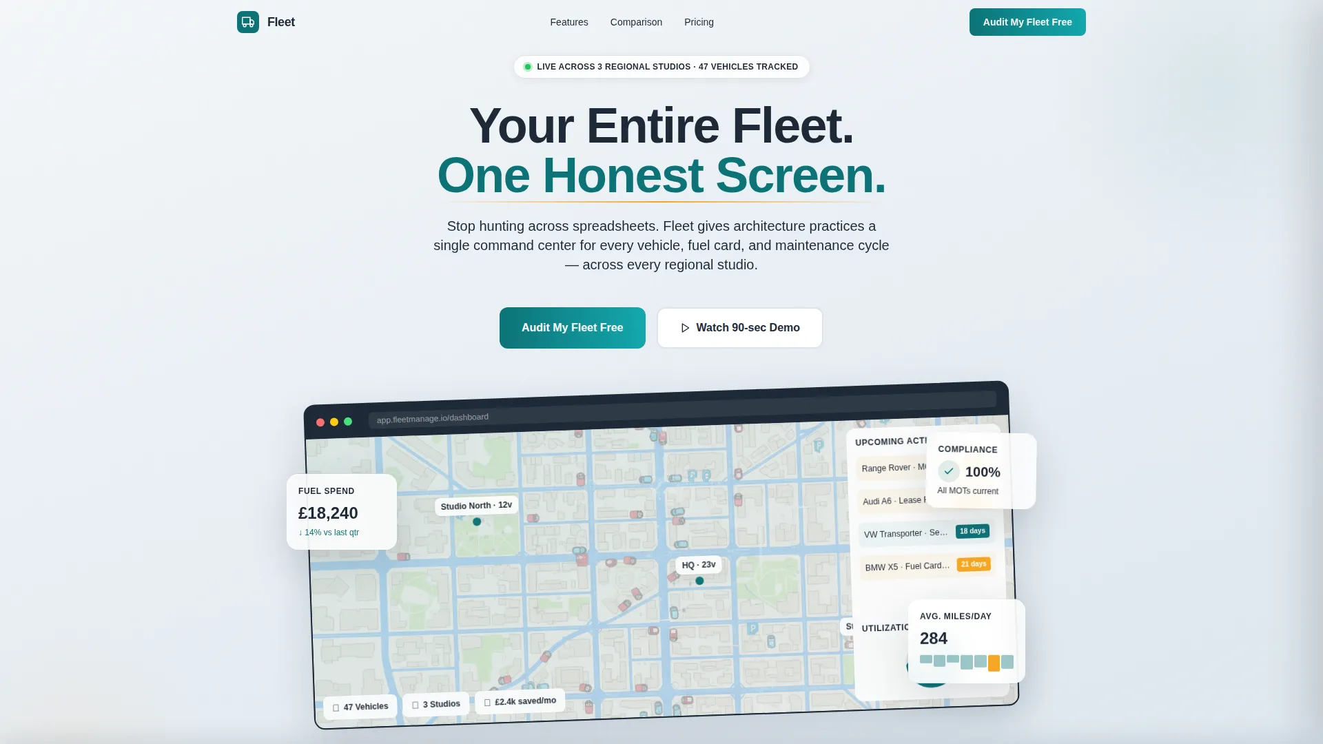
- A product screenshot hero section showing a live-session dashboard with map pins, utilization data, and an amber-flagged sidebar
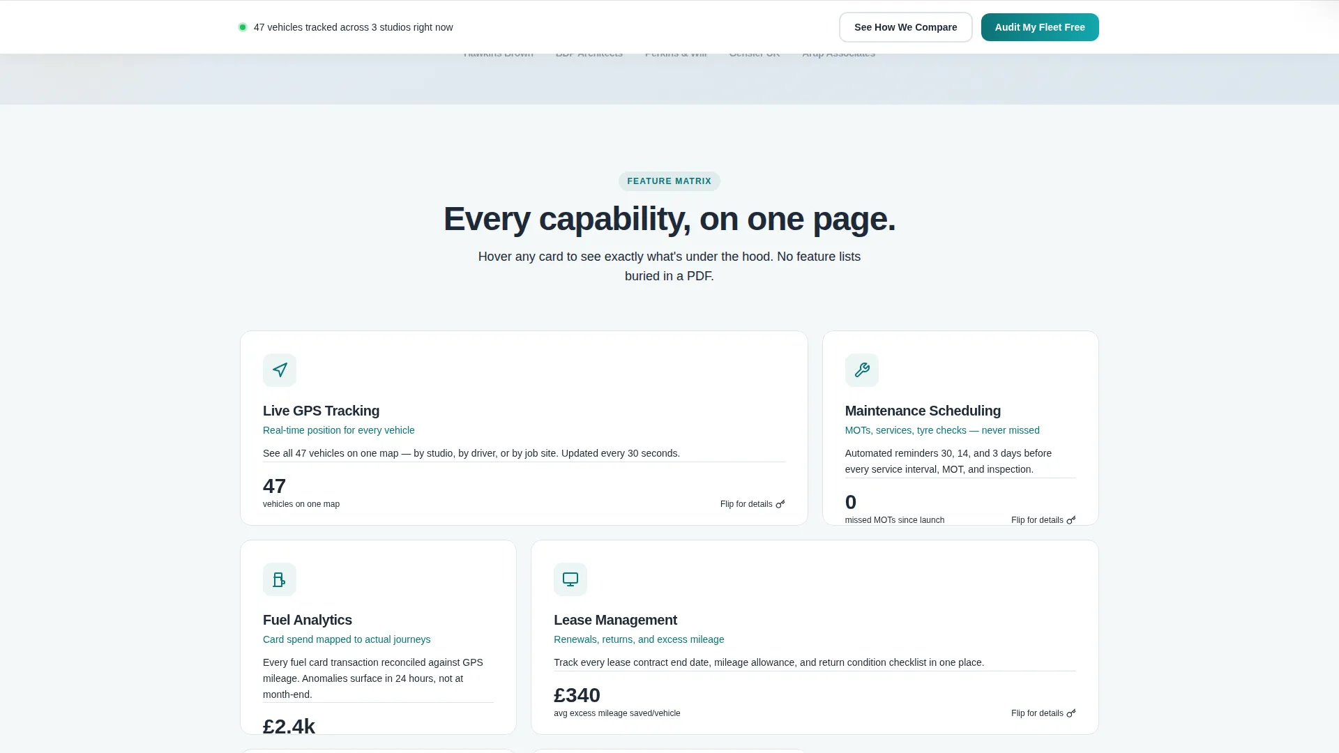
- A six-capability feature matrix card grid with hover-flip or hover-expand interactions per card
- A sticky bottom conversion bar carrying dual calls to action and a slide-out comparison table
Feature list
This template is built around a structured feature matrix layout. Each section below represents a distinct capability card within the modular grid.
Dashboard Screenshot Header
The page opens with a full-width product screenshot showing 47 vehicles pinned across three regional offices, a utilization donut chart at 73% active deployment, and an amber-flagged sidebar listing upcoming MOT deadlines and lease renewals. The screenshot sits inside a charcoal device frame angled two degrees to add depth without distraction.
Modular Feature Matrix Card Grid
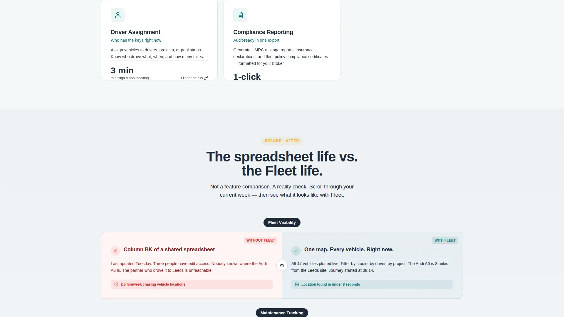
Six capability cards cover GPS tracking, maintenance scheduling, fuel analytics, lease management, driver assignment, and compliance reporting. Each card flips or expands on hover to reveal a second layer of detail. The grid is modular, meaning individual cards can be reordered, removed, or replaced to match any platform's actual feature set.
Without and With Comparison Rows
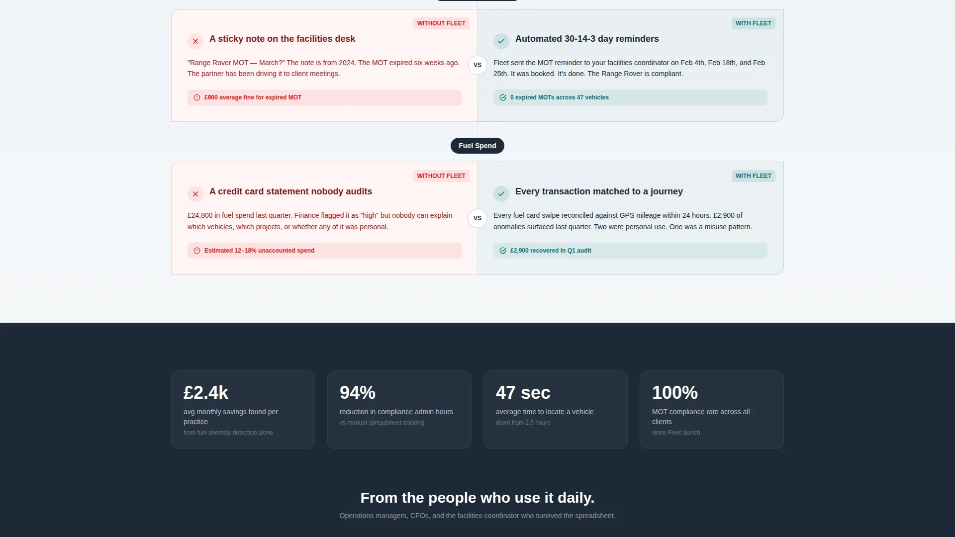
Every third row of the card grid introduces a split-panel "Without" versus "With" layout. The left side shows the chaotic spreadsheet version of each workflow. The right side shows the platform's clean resolution. This pattern builds scroll momentum and makes the platform's value feel earned rather than claimed.
Sticky Dual-call to action Conversion Bar
A sticky bar anchored to the bottom of the viewport carries two persistent calls to action. "See How We Compare" opens a slide-out comparison table pre-populated against generic fleet tools and manual tracking methods. "Audit My Fleet Free" leads to a focused three-field form asking for vehicle count, office location count, and work email.
Slide-Out Comparison Table
The comparison table opens as a side panel and presents the platform's capabilities alongside generic fleet tools and spreadsheet-based tracking. It is pre-populated, so the visitor does not need to configure anything. The table does the convincing before the form asks for commitment.
Three-Field Audit Form
The audit offer frames the first interaction as diagnostic rather than contractual. The form asks only three things: number of vehicles, number of office locations, and work email. This low-friction entry point reduces hesitation and positions the platform as a helpful advisor before any sales conversation begins.
Page sections overview
| Section | Purpose |
|---|---|
| Dashboard Screenshot Header | Opens with a full-width product screenshot to establish platform credibility immediately |
| Feature Matrix Grid | Presents six capability cards with hover-expand interactions in a modular, scannable layout |
| Without versus. With Rows | Alternates split-panel comparison rows every third card row to reinforce platform value |
| Sticky Conversion Bar | Anchors dual calls to action persistently at the bottom of the viewport throughout the entire scroll |
| Slide-Out Comparison Table | Opens on call to action click to compare platform features against generic fleet tools side by side |
| Audit Entry Form | Three-field form captures intent with minimal friction by framing signup as a free audit |
Design & branding system
The Teal Catalyst color system gives the template a clinical but energizing quality. It reads like a well-lit operations room rather than a generic software marketing page.
- Deep operational teal (#0D7377) anchors the primary brand identity across headings, borders, and active state indicators
- Dashboard charcoal (#1E2A38) fills card backgrounds and provides typographic weight across body copy
- Blueprint white (#F4F7F9) covers the page canvas for high contrast and visual breathing room
- Catalyst amber (#F5A623) is reserved exclusively for interactive highlights, toggle states, and comparison badges to keep attention focused where action is required
Mobile & speed optimization
The modular card grid adapts naturally to smaller viewports because each card is an independent unit. The sticky conversion bar remains functional on mobile, keeping both calls to action reachable throughout the full scroll.
- Card modules reflow into a single-column stack on narrow screens without losing the hover-expand interaction concept
- The product screenshot header scales responsively within its charcoal device frame, maintaining the two-degree angle at all sizes
- The slide-out comparison table and three-field audit form are both designed for focused, low-distraction interaction on touch devices
How this template helps you convert
The conversion architecture is layered intentionally. Every scroll interaction builds familiarity before asking for anything.
- The product screenshot header creates an immediate credibility signal by showing a real, data-populated dashboard view rather than a static illustration, setting the tone before any feature claim is made.
- The "Without versus With" card rows accumulate persuasive weight row by row, so by the time the visitor reaches the sticky bar, they have already felt the contrast between their current situation and the platform's resolution.
- The dual-call to action bar separates evaluation intent from purchase intent: the comparison table serves browsers who want proof, while the free audit form captures decision-ready visitors with a minimal three-field commitment.
Other information about this template
Fleetcommand fits naturally within the architecture firm software category, where fleet operations sit alongside project management, studio resource planning, and site logistics tools. The Directory and Discovery theme makes capability browsing feel organized rather than overwhelming.
- The template style is a Card Grid layout, which supports modular content updates without full page redesigns
- The Feature Matrix creative direction ensures each platform capability gets its own visual and narrative moment
- The Comparison/Versus landing page direction is built into the structural DNA, not added as an afterthought
- The Teal Catalyst palette and charcoal typography system are consistent with operational software products in the architecture firm technology space
- This template is suited to teams launching a new fleet platform, refreshing an existing product page, or testing conversion messaging against a segmented architecture firm audience
Theme
Directory & Discovery
Creative direction
Feature Matrix
Color system
Teal Catalyst
Style
Card Grid (Modular)
Direction
Comparison/Versus
Page Sections
Product Screenshot Hero Section
Six-capability Feature Matrix
Without Versus. with Comparison Rows
Sticky Dual-cta Conversion Bar
Slide-out Comparison Table
Low-friction Audit Entry Form
Related questions
Can I change which fleet capabilities appear in the card grid?
What does the Audit My Fleet Free form actually collect?
Is the comparison table pre-filled, or do I need to populate it?
Who is this landing page template best suited for?
Can the Without versus With comparison rows be removed or repositioned?



