Advanced Pharmacy Software Professional Website Template
Fleetcommand is a hub-and-spoke landing page template built for pharmacy fleet management platforms. It leads with an interactive dashboard mockup, walks visitors through five focused problem-solution sections, and funnels them toward a live demo with a single-field form. The design uses a dark cockpit color system that makes every data point feel intentional and urgent.
by Rocket studio
Quick summary
Fleetcommand is a single-page, anchor-navigated landing page template for pharmacy fleet management software. It opens with a live-style dashboard preview, guides visitors through five pain-point spokes, and ends with a low-friction demo request. Every section is built to earn trust before asking for anything.
Who this template is for
This template is built for software teams and product marketers promoting pharmacy fleet management platforms. The end buyer persona is a regional pharmacy chain operations director who manages refrigerated vans, controlled-substance deliveries, and driver schedules across dozens of vehicles.
- Operations directors at regional pharmacy chains managing complex, multi-vehicle fleets
- Software vendors selling real-time fleet visibility, compliance, or cold-chain monitoring tools
- Product teams who want a high-fidelity, demo-first landing page to qualify leads by fleet size
What problem this template solves
Pharmacy fleet operators face a specific, high-stakes problem: critical exceptions happen quietly. A temperature breach, a missed DEA (Drug Enforcement Administration) compliance log, or a delayed last-mile route surfaces too late to act on. Generic fleet or logistics page templates do not speak to that urgency.
- Visitors see a flat brochure page instead of a working product, which kills credibility before the pitch begins
- No clear problem-to-solution flow means operations directors bounce before reaching the demo request
- Regulatory and patient-safety stakes are never surfaced, so the value feels operational rather than essential
What you get with this template
You get a fully structured, dark-themed hub-and-spoke landing page with a sticky left-rail navigation and five anchored spoke sections. Each element is designed to reflect a real pharmacy fleet command workflow, from the interactive header preview to the final demo-request section.
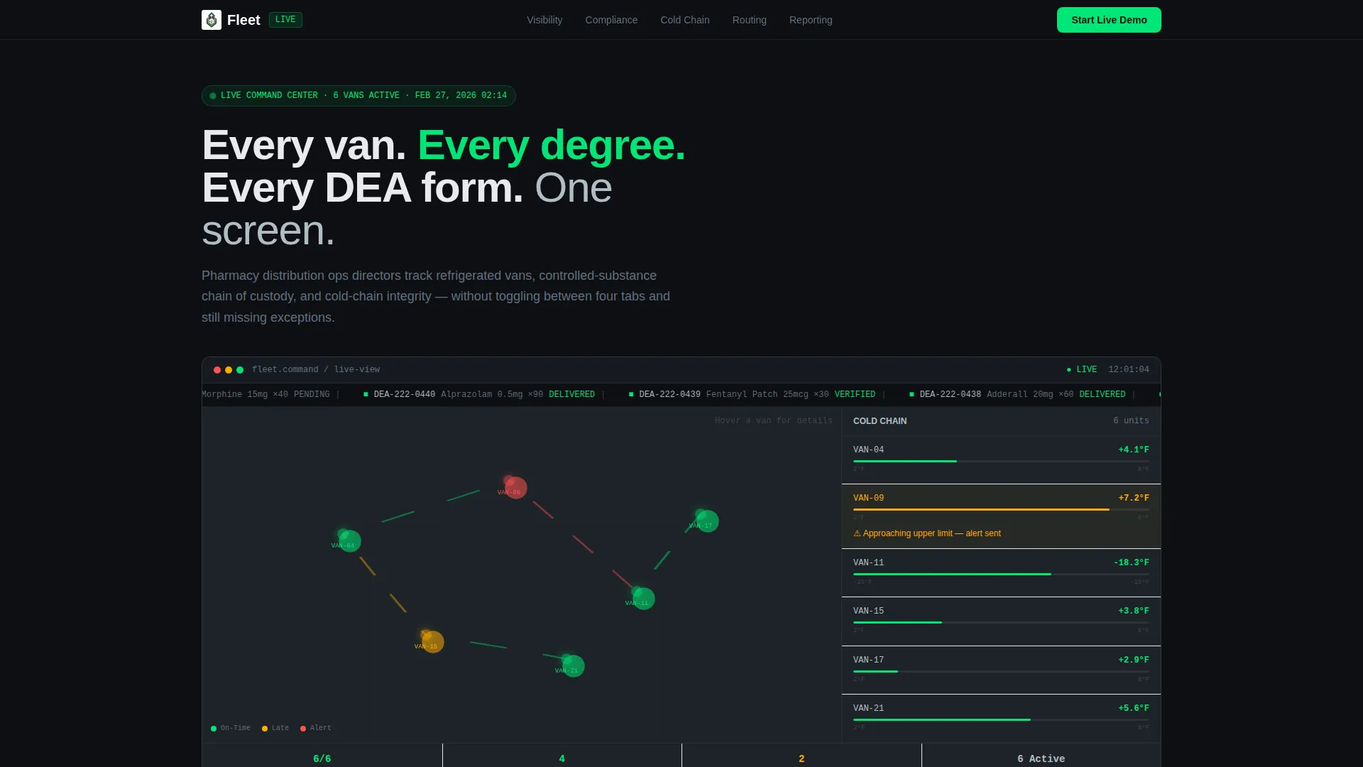
- An interactive dashboard hero with a live map, cold-chain temperature sidebar, and compliance ticker mockup
- Five problem-solution spoke sections covering Visibility, Compliance, Cold Chain, Routing, and Reporting
- A full-width demo-request section with a single fleet-size dropdown and a primary call-to-action button
Feature list
This template ships with purpose-built components that reflect the real decisions a pharmacy fleet operator makes every day. Each feature is designed to do one clear job in the conversion flow.
Interactive Dashboard Hero
The header section renders a full-fidelity dashboard mockup showing six pharmacy vans moving along delivery routes on a live map. A cold-chain temperature sidebar flags one unit at 7.2°C in amber, and a compliance ticker scrolls DEA Form 222 statuses. Hovering on a van reveals the driver name, payload class, and estimated time of arrival.
Sticky Hub-and-Spoke Navigation
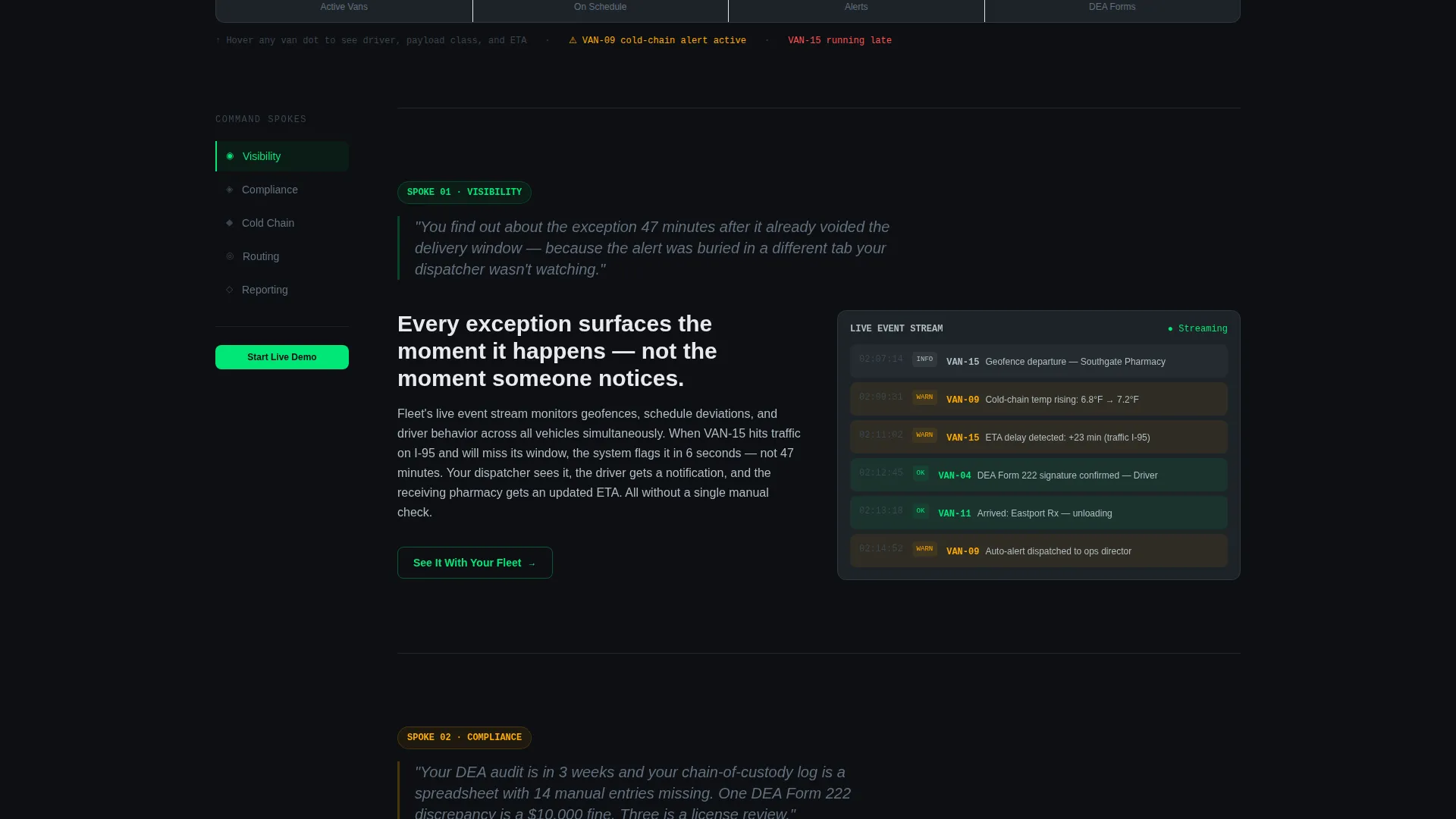
A sticky left-rail navigation anchors five spoke sections: Visibility, Compliance, Cold Chain, Routing, and Reporting. Visitors can jump directly to any spoke without losing their place. This structure keeps long-scroll fatigue low and lets each spoke stand on its own.
Problem-Solution Spoke Sections
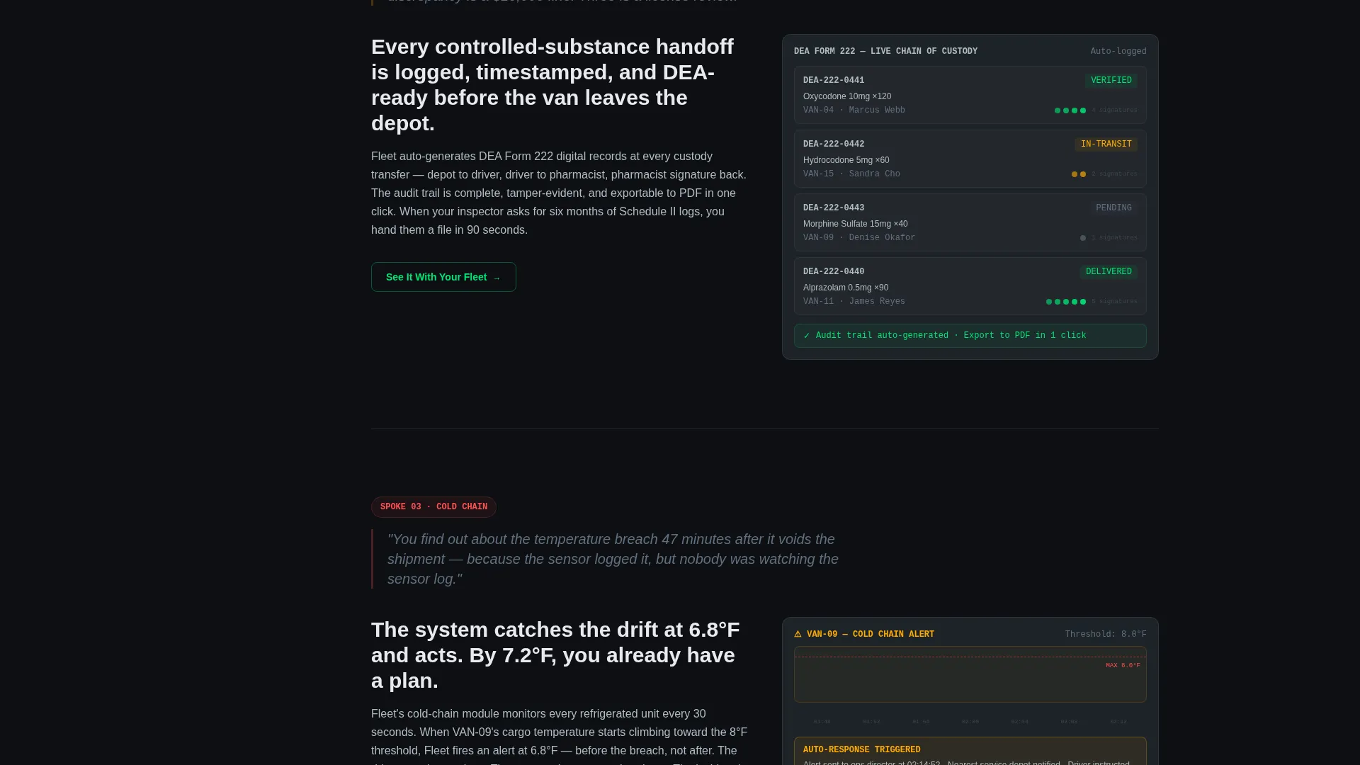
Each spoke opens with a single high-stakes pain sentence in titanium text, then immediately resolves it with a product screenshot and a two-line explanation. Stakes escalate from operational inconvenience through regulatory risk to patient safety, building urgency across the scroll.
Ghost-Button Spoke calls to action
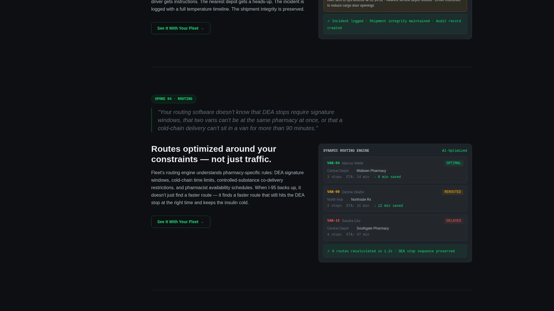
Every spoke ends with a ghost-button call to action reading "See It With Your Fleet." Each button scrolls the visitor to the demo-request section. This creates a consistent conversion path without interrupting the reading flow mid-section.
Fleet-Size Demo Funnel
The final full-width section pairs the primary "Start Your Live Demo" button with a single dropdown field asking only for fleet size: 5 to 15, 16 to 50, 51 to 200, or 200 and above. No email or phone number is required. Fleet size alone routes the visitor to a tailored demo environment.
Carbon Fiber Color System
The dark cockpit palette uses deep black, instrument charcoal, telemetry green, caution amber, and titanium as a precise visual language. Every color carries a specific meaning: green for live status, amber for threshold alerts, titanium for secondary context. Nothing glows without purpose.
Page sections overview
| Section | Purpose |
|---|---|
| Interactive Dashboard Hero | Drops visitors into a live-style fleet map with cold-chain and compliance indicators |
| Sticky Left-Rail Nav | Anchors the five spokes and lets visitors jump directly to any pain point |
| Visibility Spoke | Addresses real-time fleet location and missed-exception blind spots |
| Compliance Spoke | Surfaces DEA log risk and shows the automated audit trail already generated |
| Cold Chain Spoke | Highlights temperature breach timing and the automated alert response |
| Routing Spoke | Shows last-mile reroute logic when a delivery runs late |
| Reporting Spoke | Connects operational data to regulatory reporting and liability protection |
| Demo Request Section | Captures fleet size via dropdown and routes visitors to a tailored demo |
Design & branding system
The visual identity follows a Dashboard Pro theme built on the Carbon Fiber color system. The palette reads like the interior of a long-haul cab at 2 a.m., where every light carries a specific meaning and the dark space between elements is intentional.
- Core colors: deep cockpit black (#0D0F12) for backgrounds, instrument charcoal (#1E2328) for panels, telemetry green (#00E676) for live-status indicators and positive metrics, caution amber (#FFAB00) for threshold alerts, and cool titanium (#B0BEC5) for secondary text and dividers
- No stock photography or illustration is used anywhere; the product dashboard mockup serves as the sole hero visual, rendered at full fidelity with realistic data
- Typography and layout follow a dense, data-rich instrument-cluster style where hierarchy is communicated through color weight and spatial contrast rather than decorative elements
Mobile & speed optimization
The template is structured to translate its dark, data-dense layout to smaller viewports without losing the cockpit feel. Sticky navigation, layered panels, and the interactive hero are all sized for readability at mobile scale.
- The sticky left-rail navigation collapses cleanly on narrow screens so spoke anchors remain accessible without obscuring content
- The dashboard hero mockup is laid out to maintain its core data story, including the map, temperature sidebar, and compliance ticker, across device widths
- Ghost-button calls to action and the fleet-size dropdown are sized for comfortable touch interaction on mobile devices
How this template helps you convert
The conversion strategy is built around proving competence before asking for commitment. Visitors interact with the product before they are asked to identify themselves, which removes the trust gap that typically kills demo request rates.
- The interactive dashboard hero gives visitors a tactile product experience in the first scroll, so they arrive at the spoke sections already oriented to the platform's capability
- Each spoke section ends with a ghost-button call to action that feeds the same demo funnel, creating multiple low-pressure entry points across the full page scroll
- The fleet-size-only form field removes friction at the final conversion point and signals that the demo experience will be relevant to the visitor's actual operation size
Other information about this template
This template sits at the intersection of the Technology category and the Pharmacy Software subcategory, purpose-built for the pharmacy fleet management niche. It is designed as a click-through funnel, meaning its primary goal is to move a qualified visitor toward a demo request rather than collect broad lead data.
- The template style is Hub and Spoke with Anchor Navigation, making it well suited for platforms with multiple distinct feature areas that each need their own focused pitch moment
- The creative direction follows a Problem to Solution Arc, so each section is sequenced to escalate stakes rather than present features in a flat list
- The header concept is an Interactive Preview, which means the product itself carries the hero moment rather than a headline or stock visual
- The page is built for operations-level buyers who respond to specificity: realistic data labels, plausible vehicle counts, actual regulatory form references like DEA Form 222, and real temperature thresholds like 7.2°C all signal that this product understands their world
Theme
Dashboard Pro
Creative direction
Problem→Solution Arc
Color system
Carbon Fiber
Style
Hub & Spoke (Anchor Nav)
Direction
Click-Through
Page Sections
Interactive Dashboard Hero Section
Hub-and-spoke Anchor Navigation
Escalating Problem-solution Spokes
Ghost-button Spoke Calls to Action
Single-field Fleet-size Demo Funnel
Related questions
Who is this landing page template designed for?
Does the hero section require a live data feed to work?
Can the five spoke section topics be changed?
Why does the demo form only ask for fleet size?
What sets this apart from a generic logistics page template?



