Church Transportation Landing Page Template
Flock is a church transportation landing page template built for route optimization apps. It uses a modular card grid layout with a Stats-First Impact creative direction, pulling visitors in with hard numbers before the call to action. The Void and Violet color system gives it the authority of a dispatch console built for congregational use.
by Rocket studio
Quick summary
Flock is a single-page, card-grid landing page template designed for church transportation and route optimization apps. It opens with institutional trust signals, delivers proof through metric-led cards, and drives visitors toward an app download. The Data Command theme makes every stat feel authoritative and every section feel purposeful.
Who this template is for
This template is built for teams and individuals who coordinate religious transportation at any scale. Whether you manage a fleet or drive the route yourself, Flock speaks directly to your reality.
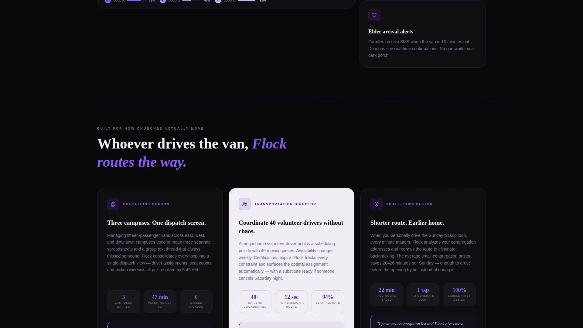
- Operations deacons managing fifteen-passenger vans across multiple campuses
- Megachurch transportation directors coordinating pools of volunteer drivers
- Small-town pastors who personally drive routes and need to cut travel time
What problem this template solves
Church transportation scheduling is fragmented. Sunday shuttle loops, midweek Bible-study pickups, and holiday outreach caravans each carry their own logistics, and most teams manage them without a unified system. A landing page that cannot communicate this complexity quickly loses the very people it needs to reach.
- Visitors leave before trusting an app that handles something as sensitive as elder pickups
- Route coordinators cannot quickly see whether the app fits their congregation size or campus structure
- The case for downloading never gets made because proof arrives too late in the page flow
What you get with this template
You get a fully structured, modular card-grid landing page that builds its case from the first scroll. Every section is designed to earn trust before asking for a tap.
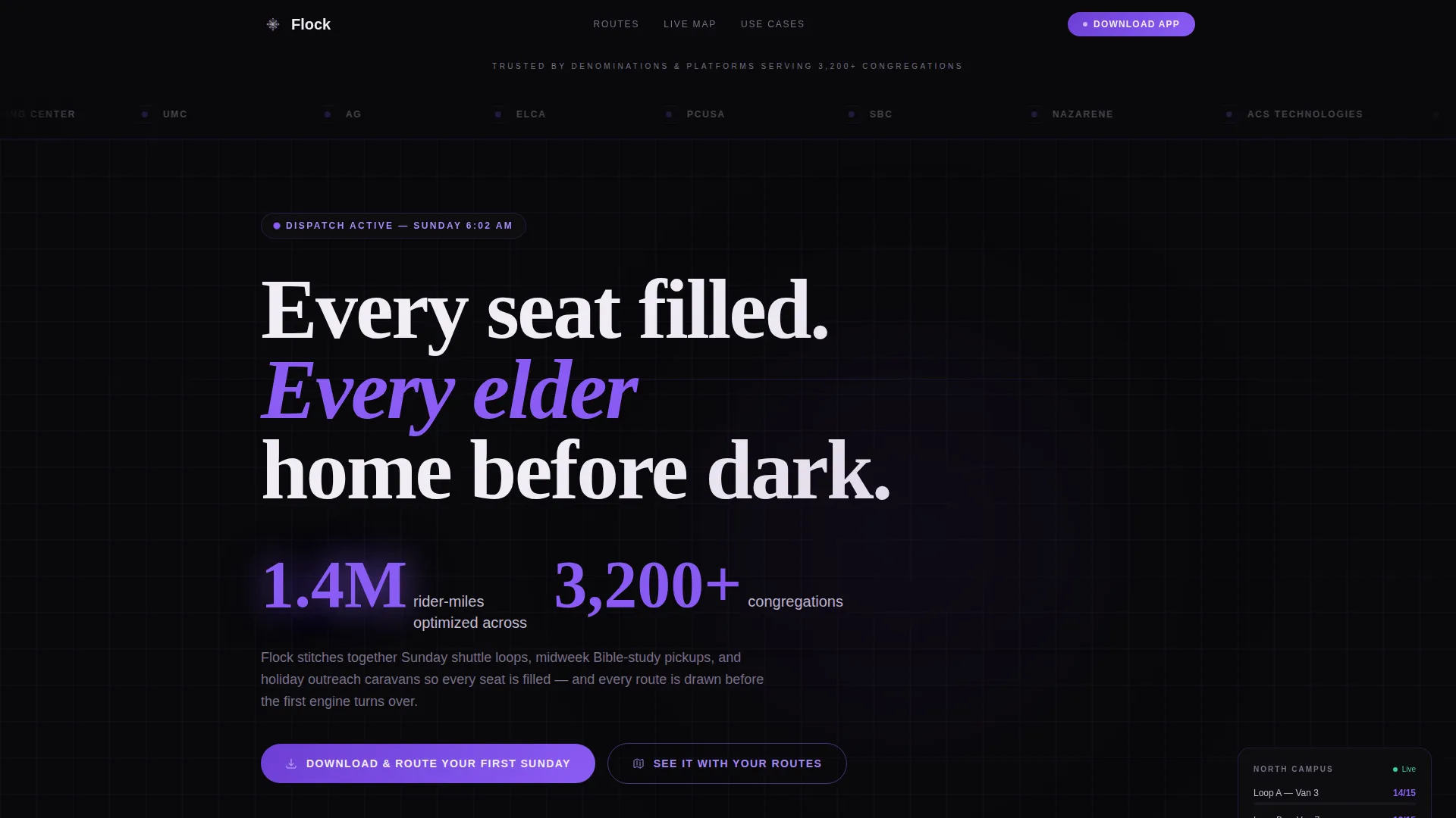
- A Logo Bar header strip with denomination and partner trust signals scrolling against a void black background
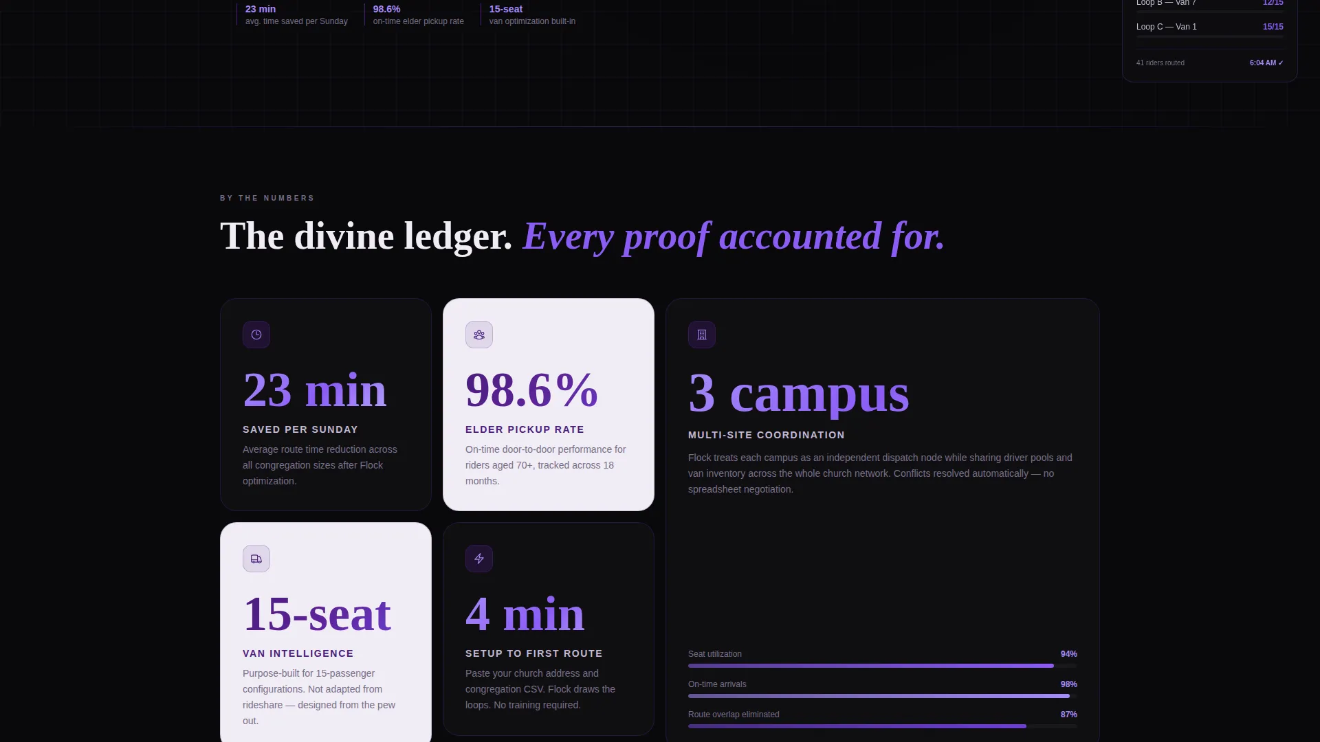
- A modular stats card grid where every card leads with a metric before revealing its context
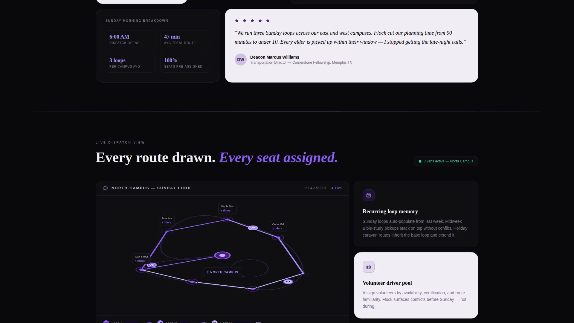
- A live-map card spanning two columns with animated van routes converging on a church pin
- Paired App Store and Google Play download calls to action with a secondary demo path
Feature list
This template covers every section a church route optimization app needs to convert first-time visitors into active users.
Stats-First Card Grid
Each card in the modular grid leads with a bold metric before delivering its explanation. Sample cards include "23 min" for average route time saved per Sunday and "98.6%" for on-time elder pickup rate. Cards alternate between void black and communion white backgrounds, creating a rhythmic visual pulse across the grid.
Logo Bar Trust Header
A slim header strip scrolls denomination and partner logos slowly against a void black background. This establishes institutional credibility before the visitor reads a single word of body copy. The strip sits directly above the hero stat block for immediate authority stacking.
Hero Stat Block
A single oversized statement lands below the Logo Bar as the page's thesis. The primary number glows in electric violet against communion white, making the scale of the app's impact immediately legible and memorable.
Live-Map Route Card
A two-column-spanning card displays animated van routes converging on a church pin. Route trails glow in electric violet, giving visitors a visual proof of the routing engine at work without requiring them to download anything first.
App Download Call to Action
The primary call to action reads "Download and Route Your First Sunday" with paired App Store and Google Play badges rendered in violet monochrome. A secondary path labeled "See It With Your Routes" links to a demo where users can paste their church address and congregation data to preview optimized loops.
Dual-Path Conversion Flow
The page supports two distinct visitor journeys. Ready-to-act users tap directly to the app download. Evaluating users follow the demo path to preview real route outputs for their own congregation before committing.
Page sections overview
| Section | Purpose |
|---|---|
| Logo Bar Strip | Scrolling denomination and partner logos establish institutional trust immediately |
| Hero Stat Block | Oversized metric statement delivers the app's impact thesis above the fold |
| Stats Card Grid | Metric-led modular cards accumulate proof across route time, reliability, and scale |
| Live-Map Card | Two-column animated route visualization shows the routing engine working in context |
| App Download Cards | Primary call to action with App Store and Google Play badges drives the main conversion action |
| Demo Path Link | Secondary call to action lets evaluating visitors preview optimized loops with their own data |
Design & branding system
The Void and Violet color system gives Flock the visual gravity of a dispatch console and the reverence of a cathedral interior. Every color choice is intentional and serves a functional role in the layout.
- Absolute void black (#09090B) as the primary page background, deep episcopal purple (#4A1C7B) for card borders and section dividers, electric violet (#8B5CF6) on live data points and interactive highlights, and communion-cloth white (#F0ECF5) for all text and card surfaces
- Cards alternate between dark void backgrounds with violet data labels and light communion-white backgrounds with deep purple text, creating a rhythmic pulse that keeps the grid scannable
- The overall aesthetic is described in the brief as a spacecraft console built for a cathedral, with luminous violet pulses making every number feel precise and authoritative
Mobile & speed optimization
The modular card grid is structured to reflow cleanly across screen sizes. Visitors arriving from a smartphone after seeing an app store link will find a layout that holds its visual authority on smaller viewports.
- The grid-based card structure naturally collapses from multi-column desktop layouts to single-column mobile stacks without losing the stats-first reading order
- The two-column live-map card is designed as a focal anchor that remains prominent whether the visitor is on a tablet, phone, or desktop screen
- Lightweight badge-style elements for the App Store and Google Play calls to action keep the download path uncluttered on any device
How this template helps you convert
Flock is built around a specific conversion logic: earn the tap by proving scale and reliability before asking for it. Every layout decision supports that sequence.
- The Logo Bar and hero stat block establish trust and impact in the first viewport, so the visitor's first impression is institutional credibility backed by a hard number.
- The stats card grid accumulates proof across multiple dimensions, route time savings, elder pickup reliability, and congregation scale, so by the midpoint of the page the case is already made.
- The dual-path call to action meets visitors where they are, giving committed users a direct download and evaluating users a no-commitment demo, removing the main reason someone would leave without acting.
Other information about this template
Flock is categorized under Technology, specifically within the Church and Religious Software subcategory, and targets the Church and Religious Route Optimization niche. It is well suited for organizations using tools like Planning Center for congregation management or ACS Technologies for church administration, as the landing page is designed to speak the language those communities already trust. The template style is Card Grid (Modular), the theme is Data Command, and the header concept is Logo Bar. The landing page direction is App Download, and the color system is Void and Violet. The intersection match score for this template's niche and design combination is 13, indicating a precise alignment between the visual system and the audience's expectations.
- Built as a single-page, section-led landing page, not a multi-page website
- Template style is Card Grid (Modular) with a Data Command theme
- Designed to support church transportation apps targeting congregations of any size, from single-campus small towns to multi-campus megachurches
- Color system and layout are production-ready and require no additional design tooling to launch
Theme
Data Command
Creative direction
Stats-First Impact
Color system
Void & Violet
Style
Card Grid (Modular)
Direction
App Download
Page Sections
Stats-first Modular Card Grid
Logo Bar Trust Header
Hero Stat Block
Animated Live-map Route Card
Dual-path App Download Call to Action
Related questions
Who is the primary audience for this landing page template?
Does the template include the routing engine or app functionality itself?
Can I use this template if my congregation is small?
How does the dual-path conversion flow work?
Is this template easy to customize for a specific denomination or campus structure?



