Church & Religious Org Professional Website Template
Flock is a single-page comparison table landing page built for a church and religious organization discovery platform. It combines animated live-count metrics, an interactive filtering explorer, and a side-by-side congregation comparison tool into one cohesive layout. The goal is simple: help spiritual seekers find their Sunday community and guide them toward downloading the app.
by Rocket studio
Quick summary
Flock is a discovery-focused landing page template designed for a church directory platform. It opens with animated live metrics, flows into an interactive comparison explorer, and closes with a clear app download call to action. The layout guides curious visitors from broad browsing to confident decisions without ever feeling pushy or overwhelming.
Who this template is for
This template suits platform builders and product teams launching a faith-based directory app. It is built for audiences who value intuitive browsing over dense listings, and for teams who want a landing page that demonstrates the product's value before asking for a sign-up.
- Digital product founders building a church or religious organization discovery platform
- Community-focused teams who need to showcase a searchable directory with real social proof
- Designers and developers who want a ready-made, conversion-oriented layout for a faith-tech app
What problem this template solves
Finding a new spiritual community in an unfamiliar city is genuinely hard. Generic church directories feel like phone books. They offer no sense of atmosphere, no way to filter by worship style, and no tool to compare options side by side. Flock solves the mismatch between what seekers need and what most directory pages provide.
- Seekers have no easy way to filter congregations by denomination, worship style, language, or accessibility features in one place
- Landing pages for directory apps often ask for a download before proving any value to the visitor
- Side-by-side congregation comparison is rarely available in a single, scrollable page layout
What you get with this template
The template delivers a complete single-page layout structured around discovery, exploration, and action. Every section serves a specific role in moving the visitor from curiosity to commitment, and the visual system reinforces that journey without distracting from it.
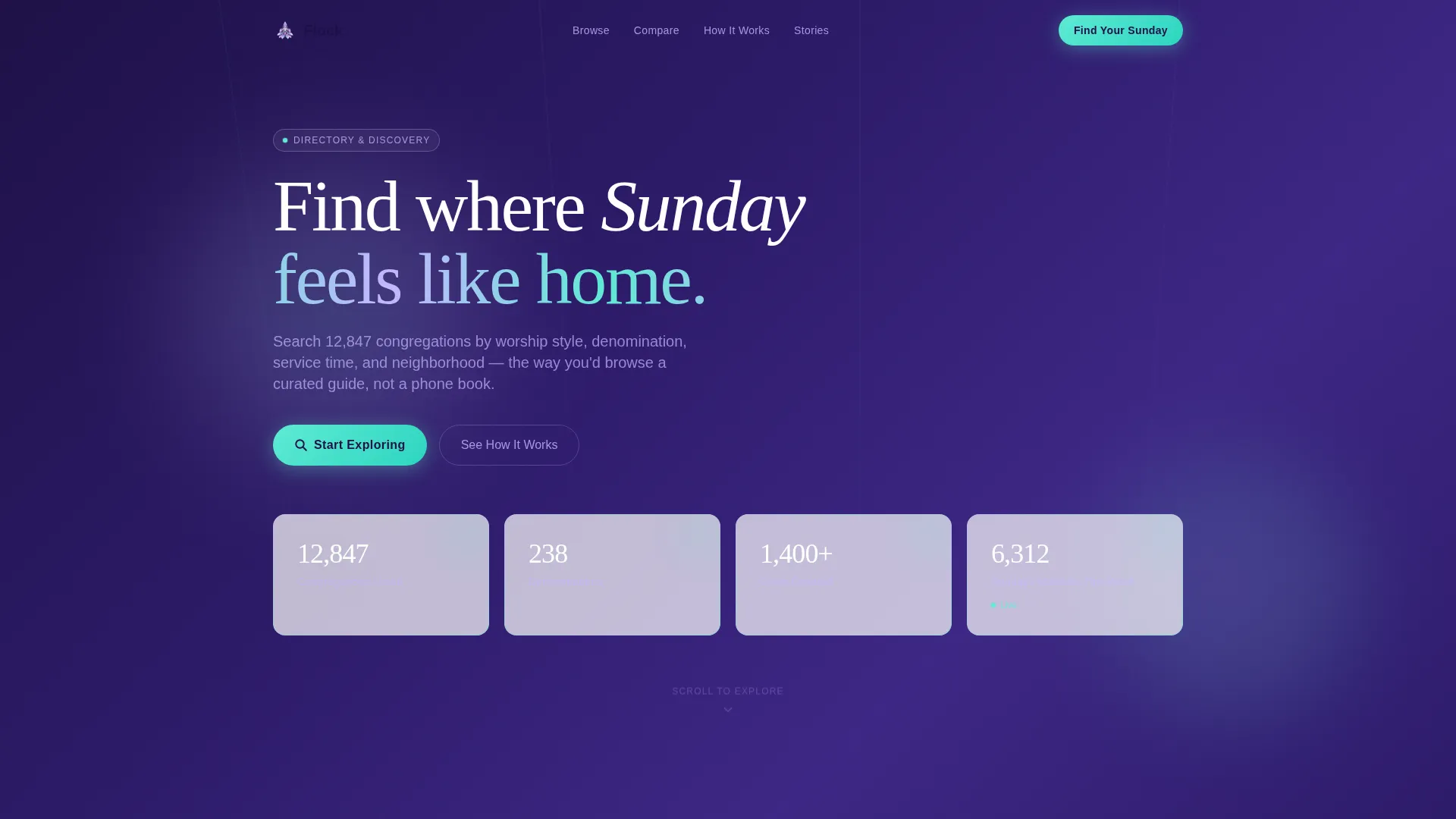
- An animated stats header section with frosted-glass metric cards and live-count counters
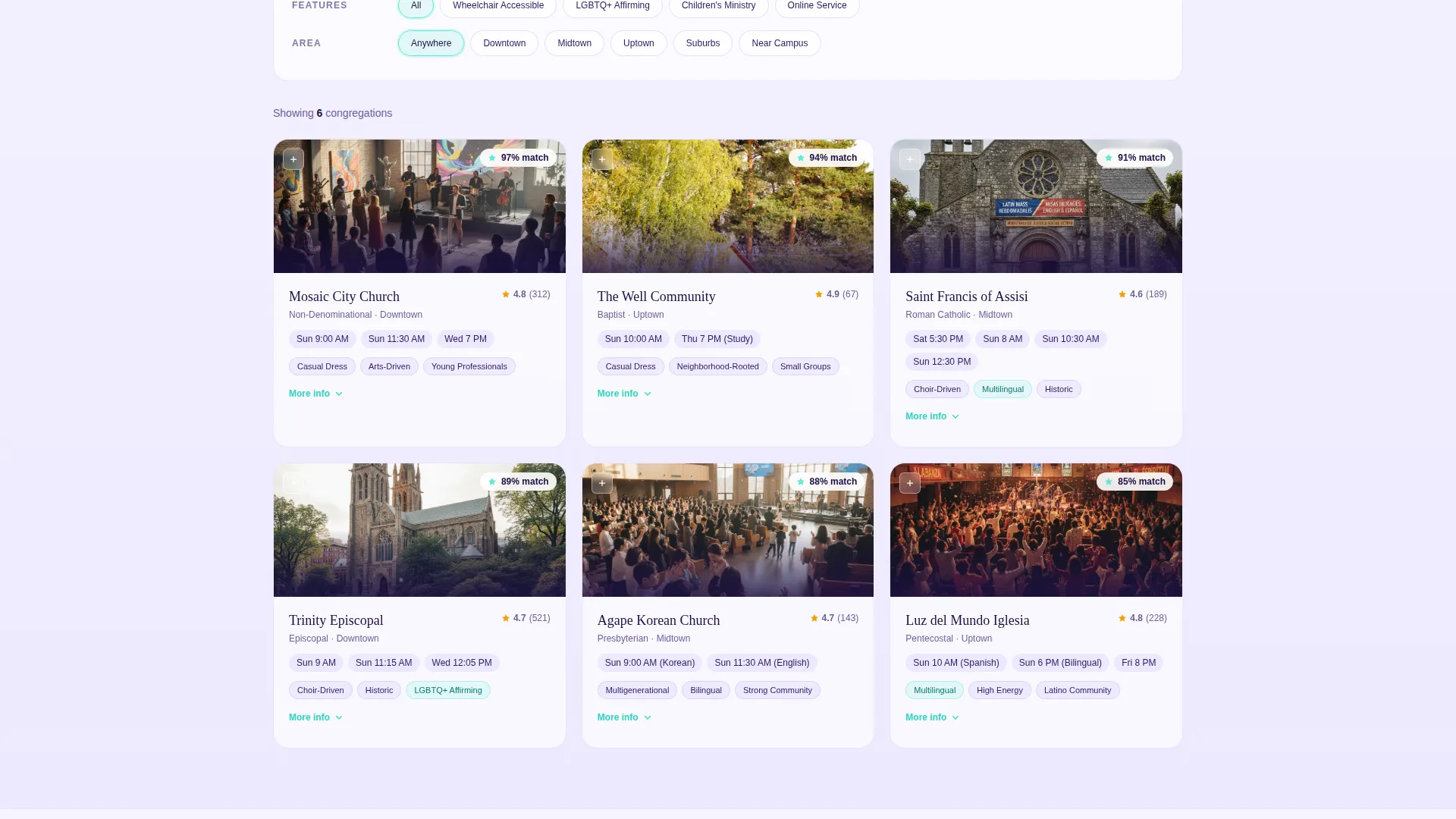
- An interactive comparison table with real-time filtering, expandable church cards, and a side-by-side finalist view
- A sticky app download call-to-action bar on mobile and an anchored desktop button, plus a secondary email capture prompt
Feature list
This template packs several purpose-built components into a focused single-page layout. Each one is designed to reduce friction and build trust during the browsing experience.
Animated Live Metrics Header
The header opens with four key platform statistics displayed inside frosted-glass cards against a deep violet background. Each number ticks upward as the page loads, communicating scale and activity before any body copy is read. The iridescent card borders shift hue subtly as the cursor moves across them.
Interactive Filtering Explorer
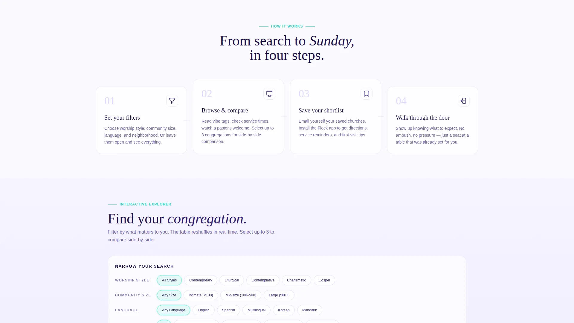
Visitors select preferences such as worship style, community size, language, and accessibility features using a filter panel directly above the comparison table. The table reshuffles and reorders rows with smooth animation in real time. This makes the page feel like a live tool rather than a static brochure.
Expandable Church Comparison Cards
Each congregation row in the table expands on click to reveal service times, a pastor welcome video thumbnail, and a tag system for community attributes like casual dress, choir-driven worship, multilingual services, and affirming community notes. Visitors can shortlist up to three congregations for a dedicated side-by-side view.
Sticky App Download Call to Action
On mobile, a prismatic teal "Find Your Sunday" button lives in a sticky bottom bar that travels with the scroll. On desktop, it anchors beside the comparison table. The button appears after visitors have already engaged with the explorer, so the ask feels earned rather than intrusive.
Secondary Email Capture Prompt
A lightweight "Save and Compare Later" prompt lets visitors capture their shortlisted churches via email. The copy makes it clear that saved selections sync to the app on install, giving users a personal reason to complete the download.
Testimonial Social Proof Section
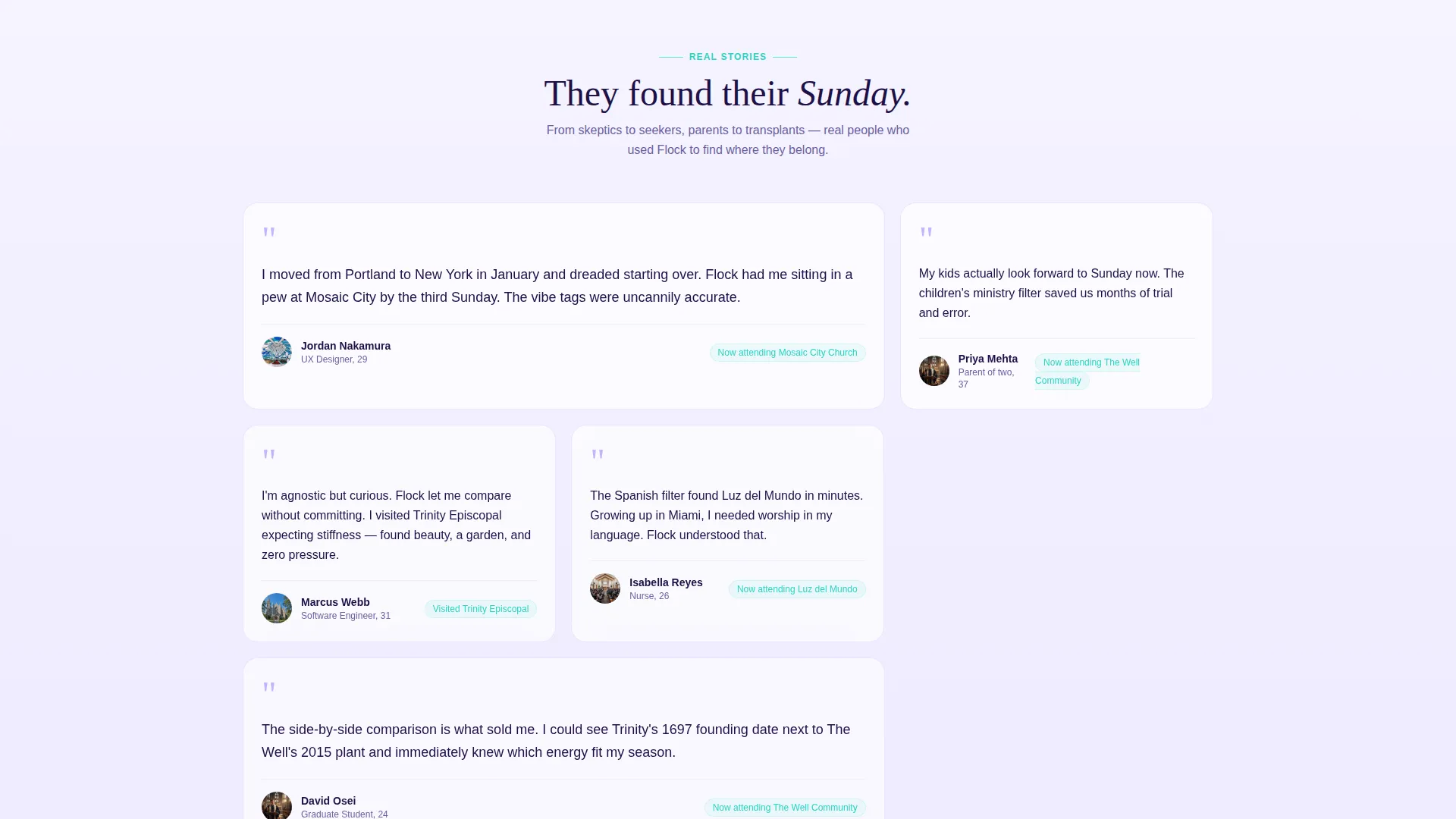
Below the comparison explorer, a testimonial section features real stories from people who found their community through the platform. These accounts speak directly to the template's three core audience types: relocating young professionals, parents seeking children's ministry, and curious first-time visitors.
Page sections overview
| Section | Purpose |
|---|---|
| Stats Metrics Header | Builds immediate trust with animated live platform counters |
| Filter Preference Panel | Lets visitors set worship style, size, language, and access needs |
| Live Comparison Table | Displays reshuffling congregation rows based on active filters |
| Expandable Church Cards | Reveals service times, video thumbnails, and community vibe tags |
| Finalist Side-by-Side | Compares three shortlisted congregations in a focused layout |
| Testimonial Stories | Provides social proof from real community finders |
| App Download call to action | Drives the primary conversion with a sticky and anchored button |
| Email Capture Prompt | Collects emails and syncs saved church lists to the app |
Design & branding system
The visual identity follows a Directory and Discovery theme expressed through an AI Iridescent color palette. The system feels spiritual without leaning on traditional religious iconography, and technological without feeling sterile. Every color plays a specific structural role throughout the layout.
- Deep sanctuary violet (#2D1B69) anchors headers, navigation, and section titles; soft holographic lilac (#C4B5FD) softens card borders and dividers
- Luminous pearl white (#F5F3FF) grounds the page background, keeping content readable and open; shifting prismatic teal (#5EEAD4) activates on buttons, hover states, active filters, and selected comparison rows
- The frosted-glass card treatment with iridescent borders creates a sense of depth and light without stock photography, reinforcing the metaphor of light refracting through a crystal
Mobile & speed optimization
The template is built with mobile visitors clearly in mind. The sticky bottom bar keeps the primary call to action accessible throughout the entire scroll without interrupting the browsing experience.
- The sticky "Find Your Sunday" button on mobile stays visible at all times without blocking the comparison table content
- Filter controls and expandable church cards are designed for touch interaction, with tap-friendly targets throughout the layout
- The layout prioritizes content hierarchy on smaller screens so that metrics, filters, and the comparison table each have clear visual breathing room
How this template helps you convert
Flock earns the conversion by making the product genuinely useful before any commitment is requested. The page structure is intentionally sequenced to move visitors from awareness through engagement to action.
- The animated metrics header establishes platform credibility immediately, so visitors understand the scale of the directory before reading a single line of descriptive copy
- The interactive explorer lets visitors filter, compare, and shortlist real congregations, making the app feel familiar and trustworthy before the download prompt ever appears
- The dual call-to-action system, a direct app download button and a lighter email capture option, gives visitors two natural exit points that match different levels of readiness
Other information about this template
Flock sits within the Church and Religious Org Website Templates subcategory and is built specifically to serve the discovery and comparison needs of faith-tech platforms. The template style is a comparison table layout, which is well suited to directory products where side-by-side evaluation is central to the user experience.
- The template theme is Directory and Discovery, making it relevant for any searchable-guide platform beyond strictly religious contexts
- The header concept is Stats and Metrics, a pattern that works well for any platform that wants to lead with volume and social proof rather than marketing language
- The creative direction is an Interactive Explorer, meaning the page positions the product as a tool the visitor uses, not a pitch they endure
- The landing page direction is App Download, so every section is sequenced to justify and motivate that single primary conversion
Theme
Directory & Discovery
Creative direction
Interactive Explorer
Color system
AI Iridescent
Style
Comparison Table
Direction
App Download
Page Sections
Animated Live Metrics Header
Interactive Filtering Explorer
Expandable Congregation Cards
Sticky App Download Button
Email Capture and Save Prompt
Testimonial Social Proof Section
Related questions
Who is the Flock template designed for?
Can visitors actually use the comparison table before downloading the app?
What filter options does the interactive explorer support?
What does the secondary call to action do?
Is this template suitable for audiences who are not already churchgoers?



