Church & Religious Org Expert Professional Website Template
Flock is a dashboard-style ministry landing page template built for church leaders who need every key metric in one place. It pairs a dark Midnight Blue visual system with Spirit gold accents to surface attendance, giving, volunteers, and small group data at a glance. The design makes data feel purposeful, not clinical, and guides visitors toward a free signup.
by Rocket studio
Quick summary
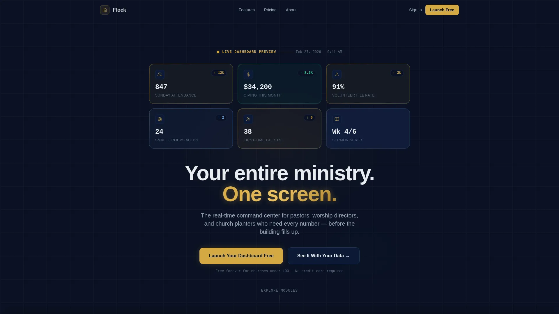
Flock is a single-page, dashboard-first landing page template designed for church and ministry platforms. It opens with a 3×2 grid of frosted-glass metric cards and walks visitors through capability panels covering attendance, giving, volunteers, and small groups. The Midnight Blue and Spirit gold palette gives every data point weight and clarity from the very first scroll.
Who this template is for
This template is built for ministry technology platforms serving church leadership at every scale. It speaks directly to the people responsible for keeping congregational operations on track.
- Executive pastors managing multiple campuses who need a single view of every location
- Worship directors and volunteer coordinators tracking team fill rates across multiple weekly services
- Church planters who need to know whether their launch team is genuinely growing
What problem this template solves
Church leaders often work with scattered spreadsheets, disconnected tools, and delayed reports. By the time Sunday morning arrives, the data they need is already stale. This template solves the problem of making a ministry dashboard product feel real and trustworthy before a visitor ever signs up.
- Visitors leave a page when it only describes features in plain text; this template shows live-looking metrics so the product feels tangible
- Ministry leaders struggle to see giving trends, volunteer gaps, and attendance patterns side by side; the layout mirrors that exact need
- Generic SaaS landing pages feel misaligned for church audiences; this template speaks the language of congregational life directly
What you get with this template
You get a fully structured, single-page landing page layout built around a data-forward visual system. Every section is purpose-built to demonstrate one capability of a ministry dashboard product.
- A 3×2 frosted-glass header card grid displaying six live-style church metrics with parallax scroll depth
- Three exploded capability panels covering Attendance, Giving, and Volunteer management in a spec-sheet rhythm
- A freemium conversion flow with a primary call to action, a fixed viewport call to action, and a secondary guided-demo path
Feature list
This template is organized around six core design and layout capabilities pulled directly from its brief.
Live-Looking Metric Header Grid
Six frosted-glass cards arranged in a 3×2 formation open the page. Each card displays a specific church metric, including Sunday attendance with a growth indicator, monthly giving totals, volunteer fill rate, active small groups, first-time guest count, and current sermon series progress. Spirit gold light refracts along card edges to signal active data points.
Attendance Tracker Panel
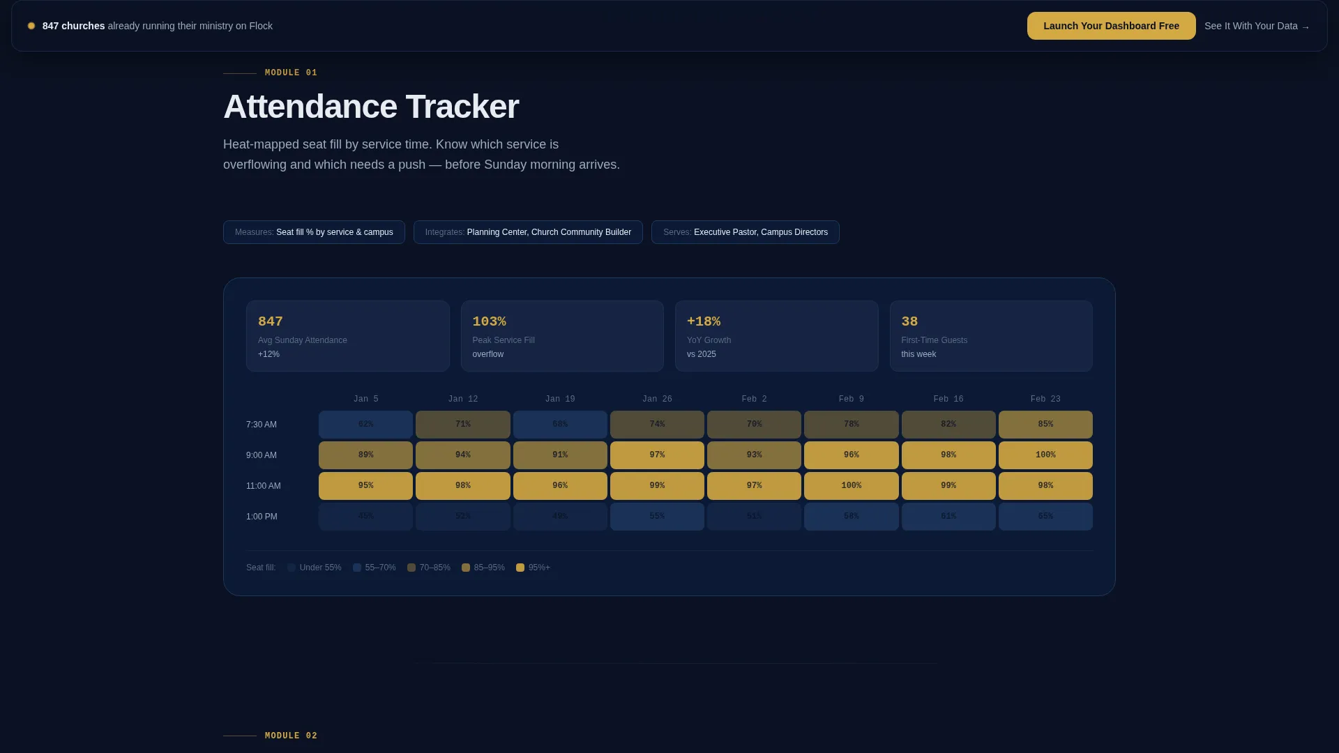
A dedicated scroll section isolates the attendance capability and presents it as a heat map of seat fill by service time. The layout reads like a product specification, naming what the panel measures, which staff role it serves, and what pattern it reveals. Visitors understand the feature without needing a separate explainer page.
Giving Dashboard Panel
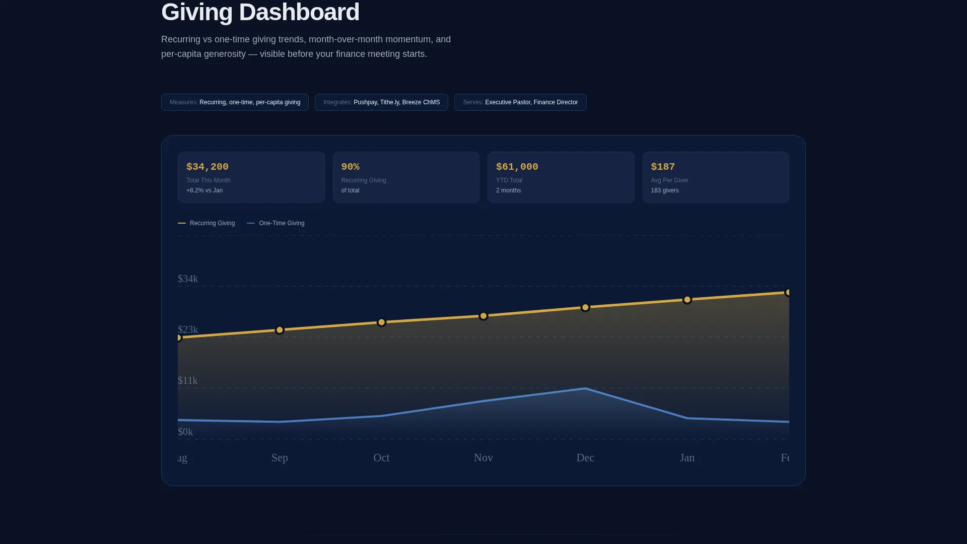
This section surfaces recurring versus one-time giving as a trend-line view. The panel separates the two giving types visually so finance teams and executive pastors can read the health of church generosity at a glance. Spirit gold highlights the metrics that need immediate attention.
Volunteer Grid Panel
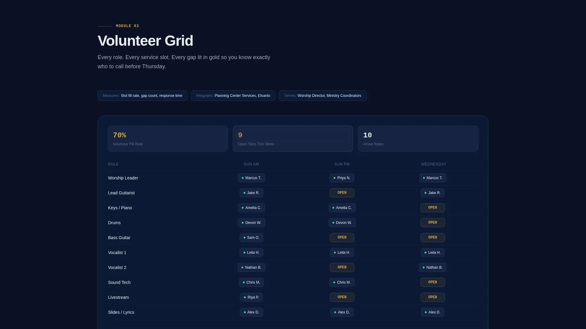
The volunteer section presents every role, every scheduling slot, and every open gap in a structured grid. Unfilled slots appear highlighted in Spirit gold so coordinators can see coverage problems instantly. The panel is built to serve worship directors and operations staff simultaneously.
Fixed Viewport call to action Bar
After the second scroll section, a dark glass call-to-action bar locks to the bottom of the viewport. It carries the primary action throughout the rest of the page so visitors never lose access to the signup trigger. The button label "Launch Your Dashboard Free" is styled in Spirit gold against the deep navy glass.
Guided Demo Signup Path
A secondary conversion path invites visitors to paste a church management data file and receive a preview dashboard in sixty seconds. This path reduces signup friction for ministry leaders who want to see results before committing. The form asks only for church name, average weekly attendance range, and email address.
Page sections overview
| Section | Purpose |
|---|---|
| Header Metric Grid | Opens the page with six live-style church data cards in a 3×2 frosted-glass layout |
| Hero Headline Block | Delivers the single-line value statement beneath the metric grid |
| Primary call to action Block | First placement of the "Launch Your Dashboard Free" signup form |
| Attendance Tracker Panel | Explodes the attendance heat-map feature with spec-sheet detail |
| Giving Dashboard Panel | Presents recurring versus. one-time giving trend lines and their staff use case |
| Volunteer Grid Panel | Shows every role, slot, and gap with Spirit gold gap highlights |
| Fixed Viewport call to action | Persists the primary action button after the second scroll section |
| Guided Demo Path | Secondary conversion block for the CSV preview demo offer |
Design & branding system
The visual identity runs on a Midnight Blue color system that channels focused, early-morning energy. Every color choice is functional, not decorative.
- Deep sanctuary navy (#0B1224) forms the primary background; steel-blue panel borders (#1E3A5F) define card edges and grid lines; soft altar white (#E8ECF1) carries all typography and data labels
- Spirit gold (#D4A843) is reserved exclusively for active states, key metrics, call to action pulses, and highlighted volunteer gaps, so every gold element signals something actionable
- Data cards float on slightly lighter glass-tile panels against the deep navy void, and parallax scroll depth adds a subtle sense of dimension without distracting from the numbers
Mobile & speed optimization
The template is structured with a lightweight single-page layout that keeps scroll sections lean and visually focused. Each capability panel is self-contained, which keeps the reading experience clean on smaller screens.
- The 3×2 card grid and data panels are designed to reflow cleanly at mobile widths without losing the metric-card identity
- The fixed viewport call to action bar is sized for thumb reach so mobile visitors always have the primary action within easy reach
How this template helps you convert
The page is engineered around a freemium model that removes every barrier between a first visit and a first signup. The conversion strategy works in layers.
- The metric header grid makes visitors feel like they are already inside the product before they read a single word of copy, building confidence in the platform's depth
- The spec-sheet scroll rhythm builds cumulative desire by isolating each capability panel, so by the third section the visitor has mentally mapped the product to their own church's needs
- The fixed call to action bar and the secondary guided demo path create two distinct conversion lanes, one for visitors ready to sign up and one for those who need to see their own data first
Other information about this template
Flock sits at the intersection of ministry operations and startup product design. A few additional details help round out the full picture.
- The template falls under the Church and Religious Organization website templates category within the Technology niche, making it well-suited for portfolio pages that serve this audience
- The Startup Velocity theme means the layout borrows visual patterns from modern SaaS dashboards while keeping the tone and language grounded in church culture
- The signup form uses a dropdown for average weekly attendance with four ranges: Under 100, 100 to 500, 500 to 1500, and 1500 plus, which helps segment church size without adding friction
- No credit card is required at the primary call to action step, and the secondary demo path asks only for a data file paste, keeping both conversion paths low-commitment
Theme
Startup Velocity
Creative direction
Spec Sheet
Color system
Midnight Blue
Style
Dashboard/Data Grid
Direction
Freemium/Trial
Page Sections
Frosted-glass Metric Header Grid
Spec-sheet Capability Panels
Attendance Heat Map Section
Giving Trend Line Dashboard
Volunteer Role and Gap Grid
Dual Conversion Path Layout
Related questions
Who is this landing page template designed for?
Does the signup flow require a credit card?
Can I edit the metric cards in the header grid?
What is the guided demo path and how does it work?
Is Flock a single-page or multi-page template?



