Church Email Marketing Landing Page Template
The Flock automated church email marketing landing page template is a bento grid layout built for church communications directors, executive pastors, and multi-campus operations managers. It showcases an email marketing platform that replaces manual BCC workflows with automated, segmented sequences, organized around a tab-switching product hero, evidence-stacking metric cards, a sticky comparison table, and a personalized open rate calculator.
by Rocket studio
Quick summary
This template presents a premium SaaS dashboard for churches that want smarter email marketing. It uses a bento grid layout with high interactivity, tab-switching product screens, animated metric cards, a sticky comparison table, and an open rate calculator. The design speaks directly to executive pastors and communications teams who need every message to feel personal across every ministry.
Who this template is for
Churches of all sizes rely on email to keep their congregation connected, but not everyone has time to build campaigns from scratch. This template is built for communications professionals and ministry leaders who need a platform that works as hard as they do.
- Church communications directors who currently copy-paste into BCC fields every week
- Executive pastors managing multiple volunteers, ministries, and campuses at once
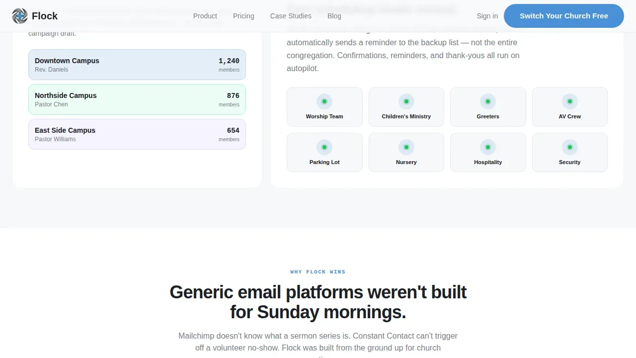
- Multi-campus operations managers who need one message to feel personal across different zip codes
What problem this template solves
Many churches still rely on manual, one-size-fits-all email systems that fail to engage their congregation. Sunday bulletins get ignored. Prayers go unshared. Upcoming events never reach the right people. This template demonstrates a platform that solves those exact problems.
- Generic email tools do not support sermon series automation, volunteer triggers, or prayer request privacy
- Communications teams waste hours each week formatting and sending emails by hand
- Messages lack segmentation, so new members and older members receive the same content regardless of their needs
What you get with this template
You get a fully structured, visually appealing bento grid landing page built around a Stats-First creative direction and a Comparison/Versus layout strategy. Every section is designed to stack evidence and move skeptical church leaders toward action.
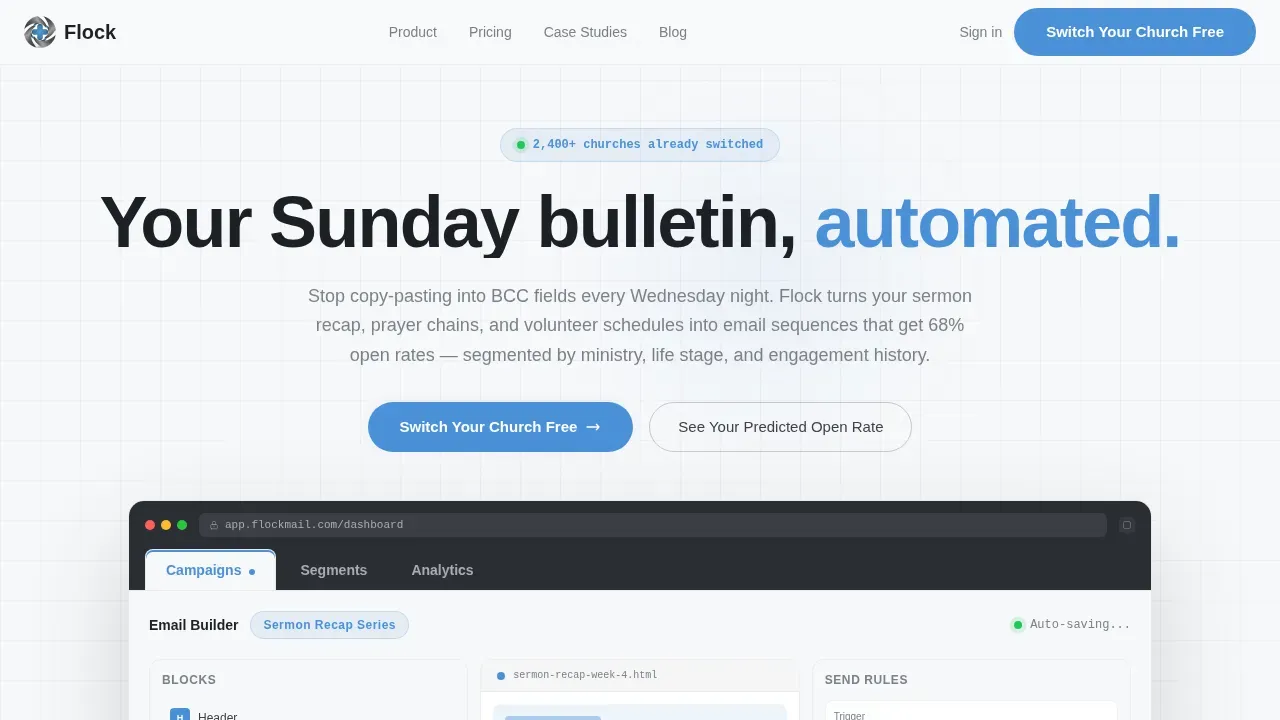
- A Feature Tab Switcher hero with three realistic product screens: Campaigns, Segments, and Analytics
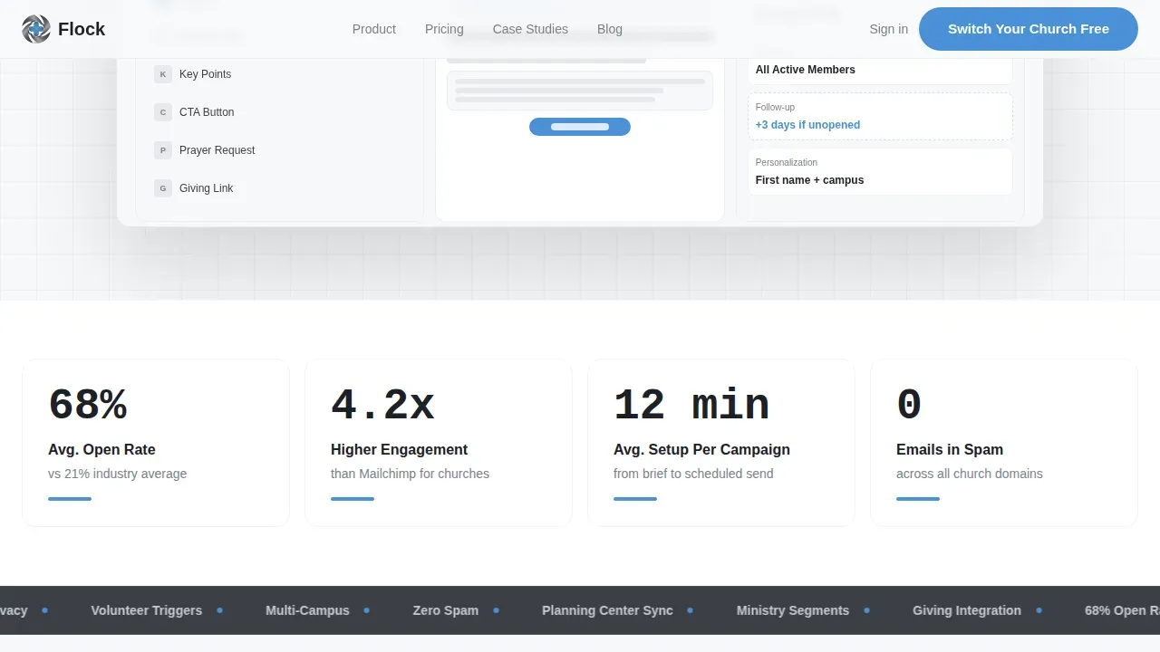
- Four animated metric cards showing open rates, engagement lift, setup time, and spam performance
- A sticky comparison table, deep feature cards with hover effects, a social proof rail, and an open rate calculator
Feature list
This template includes several distinct interactive components. Each one is designed to communicate the platform's value and invite readers to take the next step.
Feature Tab Switcher Hero
The header places a browser-chrome frame front and center. Three tabs, Campaigns, Segments, and Analytics, each reveal a different product screen on click. The active tab glows in pastoral blue. The product itself becomes the hero, with no stock photography of steeples in sight.
Stats Bento Metric Row
Below the hero, four stat cards open the scroll with hard numbers. Each card uses counter animations to display figures like average open rates and setup time per campaign. JetBrains Mono typography makes every metric feel precise and credible to readers who want proof before they commit.
Sticky Comparison Table
A two-column table anchors the middle section of the page. It pits the platform against generic email tools across twelve church-specific criteria, including sermon series automation, volunteer scheduling triggers, prayer request privacy controls, giving campaign integration, and multi-campus sending. This section is one of the most essential conversion tools in the layout.
Deep Feature Cards with Hover
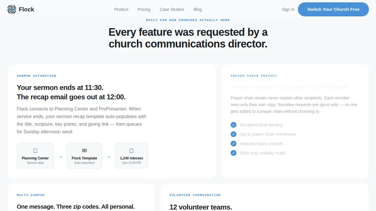
The bento grid alternates between feature-rich tiles and comparison cards. Each tile reveals additional depth on hover, giving readers a sense of discovery as they scroll. This progressive reveal keeps engagement high without overwhelming the page with text at once.
Open Rate Calculator
A secondary conversion path lets visitors enter their denomination and congregation size to receive a personalized predicted open rate. This tool gives value before asking for commitment, which is one of the most effective church marketing moves a landing page can make.
Three-Field Signup Form
The primary call to action, "Switch Your Church Free", leads to a focused three-field form: church name, weekly attendance range, and current email tool. Keeping the form short reduces friction and respects the time of a busy pastor or team member.
Page sections overview
| Section | Purpose |
|---|---|
| Tab Switcher Hero | Show real product screens across Campaigns, Segments, and Analytics tabs |
| Stats Bento Row | Display four animated metric cards to open with evidence |
| Feature Deep Cards | Highlight platform capabilities through bento tiles with hover depth |
| Sticky Comparison Table | Compare platform against generic tools across twelve church-specific criteria |
| Testimonials Rail | Share social proof from communications directors |
| Open Rate Calculator | Deliver a personalized predicted open rate before asking for signup |
| Footer Row | Single-row linear footer with key links and legal text |
Design & branding system
The visual identity follows a Dashboard Pro theme using a Monochrome Steel color system. The palette feels like a premium SaaS control panel, authoritative without being corporate, and clean without being cold.
- Gunmetal base (#3B3F45), brushed aluminum (#A8ADB3), and bright white card surface (#F7F8FA) form the neutral foundation
- Pastoral blue (#4A90D9) is reserved for active tab states, toggle highlights, and primary buttons only
- DM Sans handles bold headings while JetBrains Mono renders all metrics and numbers for a precision dashboard feel
Mobile & speed optimization
The template is built desktop-first, reflecting the reality that executive pastors and communications directors review dashboards on Monday mornings at their desks. However, the layout still considers mobile visitors.
- Static sections use server-side rendering patterns to keep initial load fast for non-interactive content
- Interactive components, the tab switcher, comparison table, and open rate calculator, are separated into client-rendered zones
- Card layouts reflow cleanly for smaller screens so visitors on phones can still read key points and access the signup form
How this template helps you convert
Every scroll adds another layer of proof. The layout is engineered so that skepticism runs out of oxygen before a visitor reaches the footer. This is a deliberate, evidence-stacking approach to church marketing conversion.
- The tab-switching hero creates an immediate first impression by showing real product screens instead of abstract promises, pulling visitors in before they read a single word of body copy
- The metric row, comparison table, and open rate calculator work together as a three-stage trust sequence, each stage answers a different objection and moves the reader closer to clicking "Switch Your Church Free"
Other information about this template
This template is designed to support a specific communications platform niche: automated email marketing for churches. It is not a general productivity tool. Below are a few additional points worth knowing before you build with it.
- The Flock automated church email marketing landing page template is purpose-built for the church and religious software category, not for generic B2B SaaS
- A well-crafted church newsletter reflects the heartbeat of your church family, and this template's layout supports consistent, on-brand newsletter communications every week
- Ministry-specific email templates designed for church programs, e-bulletins, and digital newsletters can be showcased inside the feature cards section
- Including direct links for actions like online giving, event RSVPs, or volunteer signups inside email templates drastically increases results, this template's comparison table highlights that advantage
- Using headings, bullet points, and short sections helps readers find what matters to them quickly, and the bento grid enforces that structure by design
- A good church newsletter invites people in, keeps them informed, and shows that something meaningful is happening week by week, this template communicates exactly that mission
- The open rate calculator section supports the idea that your website is more than an online business card; it is a tool for generating trust and capturing leads on its own
- Direct mail can still reach older audiences effectively, but this platform's landing page makes the case that email outperforms print for growing churches that want measurable results
- Videos and YouTube sermon links can be embedded inside the email templates promoted on this page, expanding the platform's reach to a wider audience
- Templates in this library support interactive tools like quick polls, RSVPs, and signups for Sunday school and other ministry events
- Segmented communications ensure that prayers, updates, and upcoming events reach the right person at the right time, not just whoever is still on the BCC list
- Building a plan for your church marketing strategies can save you time and money, and this template gives communications teams a conversion-focused starting point to do exactly that
- A database of congregation segments, new visitors, youth group parents, giving history, is visualized directly in the Segments product screen inside the hero tab switcher
Theme
Dashboard Pro
Creative direction
Stats-First Impact
Color system
Monochrome Steel
Style
Bento Grid
Direction
Comparison/Versus
Page Sections
Tab-switching Product Hero
Animated Stats Bento Row
Sticky Comparison Table
Personalized Open Rate Calculator
Deep Feature Cards with Hover Reveal
Three-field Conversion Form
Related questions
Is this template suitable for small churches as well as large ones?
Does the template include ready-to-use email templates?
Can the open rate calculator section be customized?
How does the sticky comparison table work?
What typography and colors does this template use?



