Bold Hydration Tracking Landing Page Template
The Hydrate template is a bold brutalist landing page built for B2B wellness brands that want to ship a white-label water intake tracker app fast. It combines a Midnight Blue color system, monospaced stark typography, and a modular card grid layout to present industry data, a seven-day integration timeline, pricing tiers, and a demo download flow that converts technical and business buyers alike.
by Rocket studio
Quick summary
Hydrate is a single-page, card-grid landing page template built for wellness brands, gym chains, and corporate health programs that need to launch a white-label water intake tracker app without writing a line of product code from scratch. The template uses a Bold Brutalist visual system, a Midnight Blue color palette, and heavy monospaced fonts to turn a procurement argument into a high-impact scrolling experience that ends in a demo download.
Who this template is for
This template is designed for a niche modern brand targeting tech-savvy users who prioritize efficiency. It speaks directly to decision-makers in health tech who need to ship fast and look credible doing it. The layout and content system are built for buyers, not browsers.
- Startup founders building health super-apps who need a hydration tracking module integrated into their product without burning runway on custom development.
- Corporate wellness directors who want branded tools their employees will actually use, replacing spreadsheet-based challenges with a dedicated app experience.
- Boutique fitness studio owners who want their members to track water intake between classes with the studio's brand on every screen.
What problem this template solves
Building a consumer-grade hydration tracker app in-house takes months of engineering time, design cycles, and quality-assurance rounds. Most wellness brands and gym chains do not have that runway. They need a white-label solution they can brand, configure, and ship to users within days. The problem is that existing pages selling white-label health tech look generic. They fail to make the business case with data. They bury the demo behind a wall of marketing copy that does not convert technical buyers or procurement teams.
This template solves that by leading with evidence. Every section of the landing page stacks the business case like a procurement deck, giving visitors the numbers they need to justify the decision internally. Stark typography, high contrast data cards, and a hard-cut tab switcher all communicate that this product is engineered, not decorated.
- Most wellness app landing pages rely on soft gradients and emotional copy that fail to convert B2B buyers who want numbers, not vibes.
- In-house development of a hydration tracking app is slow and expensive, and many teams lack the specialized health-tech code needed to build it right.
- Generic white-label pages do not show the brand potential of the product, leaving buyers unable to visualize their own logo on the final app.
What you get with this template
You get a fully structured, modular card-grid landing page template with every section pre-built and ready to customize. The template delivers a complete website experience from header to footer, with interactive components, a conversion-focused form, and a visual system that makes your brand look authoritative on day one. Developers and designers can explore the code, swap brand assets, and launch without rebuilding the structure from zero.
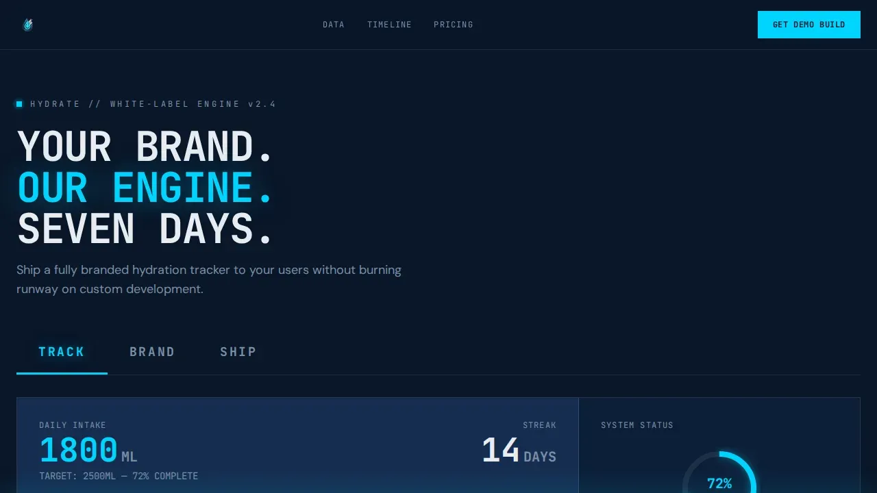
- A Feature Tab Switcher hero section with three brutalist tabs (TRACK, BRAND, SHIP) that hard-cut between product views inside a device mockup, showing the intake dashboard, brand reskin previews, and app store listings.
- A scrolling Industry Report card grid with oversized stat numbers, source citations, integration diagrams, a full-width four-column timeline (DAY 1 through DAY 7), shoulder-to-shoulder pricing tier cards, and a partner logo wall.
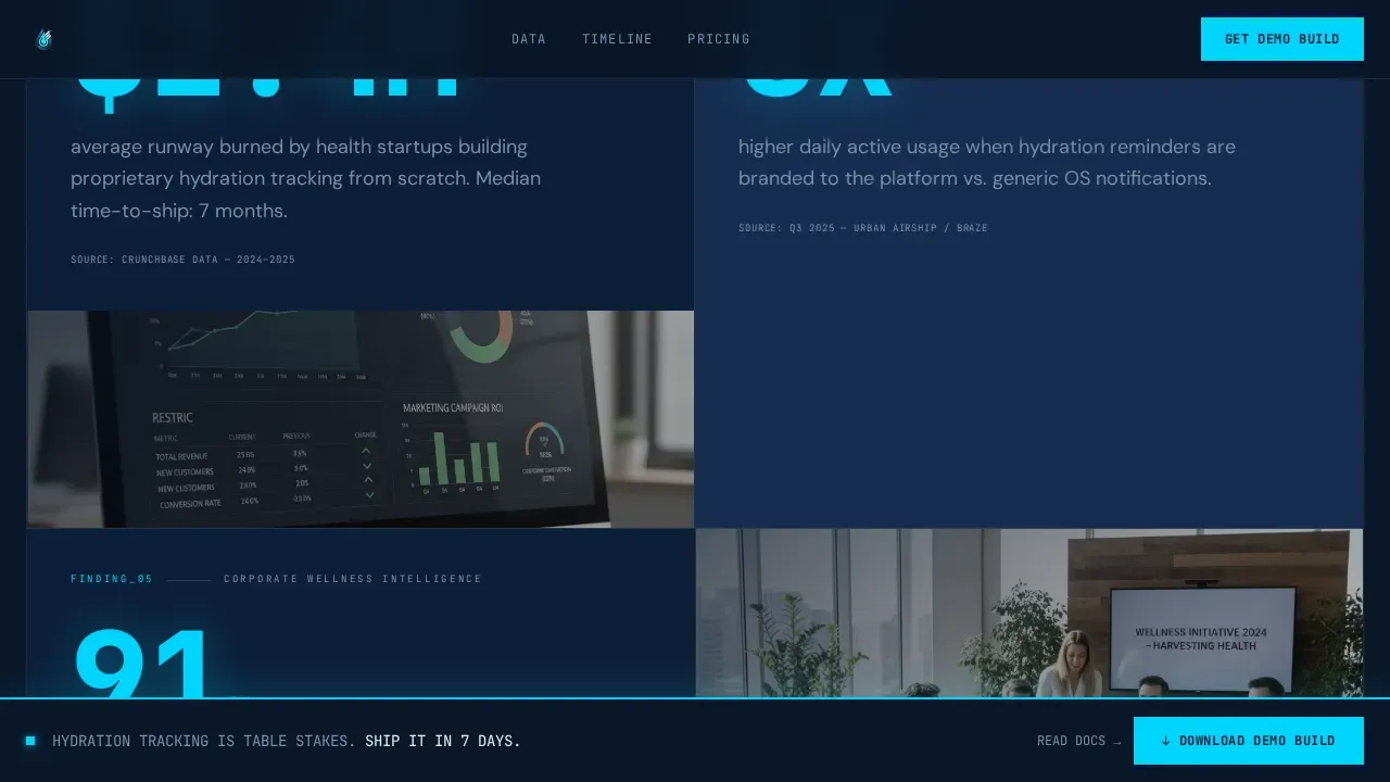
- A sticky demo download bar that triggers after scroll depth, a two-field modal form capturing work email and platform preferences, and a secondary path linking to integration documentation for technical leads.
Feature list
This template packages a focused set of high-impact features that serve both the visual and conversion goals of a white-label health tech launch. Each feature reflects a deliberate design decision rooted in the source brief, built to help the page perform as both a sales tool and a brand statement.
Feature Tab Switcher Hero
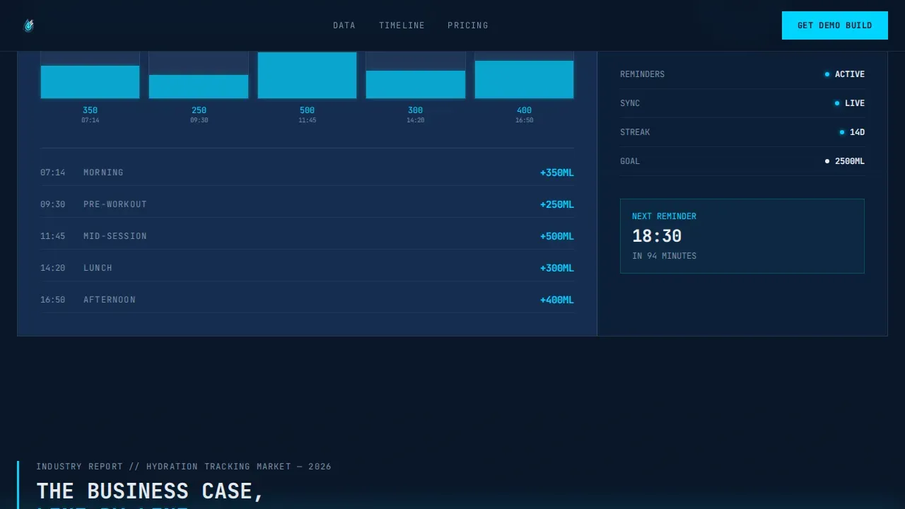
The header section presents three oversized brutalist tabs labeled TRACK, BRAND, and SHIP. Each tab hard-cuts a different product view into a device mockup below it. TRACK shows an animated fill meter and streak counter inside the intake dashboard. BRAND displays the same app screen reskinned in three color schemes with different logos, demonstrating how editable branding allows easy swapping of colors and logo placement. SHIP renders app store listings with star ratings and download counts. The active tab glows in electric ice against the midnight background, creating a high contrast focal point that guides visitors without any soft easing or polished transitions.
Industry Report Data Cards
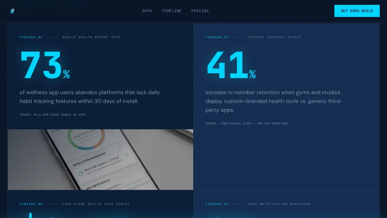
The scrolling card grid presents each data point as its own brutalist module. Stat numbers render at maximum typographic weight, sources appear in small caps below, and supporting product screenshots or integration diagrams sit beside each figure. Hydration tracking tools help users monitor their water intake, and using hydration tracking tools can lead to improved health outcomes. The cards use this factual structure to build a procurement-style argument. Visual data visualization features simple, harshly drawn graphics to show hydration percentage alongside each claim. The scroll does not rely on emotion. It stacks evidence card by card, giving every visitor the data they need to justify the decision to their team.
Seven-Day Integration Timeline
A full-width card breaks the modular grid midway through the page. It presents four brutal columns: DAY 1 for the API key, DAY 3 for brand assets, DAY 5 for the quality-assurance build, and DAY 7 for going live. White label solutions for hydration tracking applications help companies enter the market quickly without developing their own technology from scratch, and this timeline makes that promise visible and concrete. The structure is intentionally minimal, no padding between columns, no decorative elements, just the process laid flat across the viewport.
Pricing Tier Cards and Partner Logo Wall
Pricing cards sit shoulder to shoulder with no visual padding between them. The layout uses the same exposed-border brutalist system as the rest of the page, so pricing feels like data, not a sales pitch. A partner logo wall follows, arranged without spacing, filling the grid in a way that signals community and market validation. Both sections extend the industrial visual language of the full page system.
Sticky Demo Download Bar and Form Modal
After 40 percent scroll depth, a fixed brutalist bar appears at the bottom of the viewport. It carries the primary call to action. Tapping it opens a two-field modal form asking for a work email and platform preferences, specifically iOS, Android, or both. On submission, the system delivers a demo build link to the inbox. A secondary conversion path inside the same section links to the integration documentation for developers who need architecture details before committing to the project.
Modular Card Grid Layout
Every section of the landing page is built on a consistent modular card grid. Cards sit with visible borders, raw edges, and no rounded corners. The layout uses heavy monospaced fonts for labels and data, with a clean sans-serif for body text. This structure makes it easy for developers to extend, reorder, or replace individual components without breaking the overall system. The template is static-heavy by design, with client-side JavaScript reserved only for the tab switcher and form modal, keeping the code lean and the page smooth.
Page sections overview
| Section | Purpose |
|---|---|
| Feature Tab Switcher | Hero with three hard-cut product views inside a device mockup |
| TRACK Tab View | Shows animated intake dashboard with fill meters and streak counters |
| BRAND Tab View | Displays three logo and color reskins to demonstrate white-label branding |
| SHIP Tab View | Renders app store listings with ratings, reviews, and download counts |
| Industry Report Cards | Stacked brutalist data cards that build the procurement business case |
| Integration Timeline | Full-width four-column DAY 1 to DAY 7 launch process card |
| Pricing Tier Cards | Shoulder-to-shoulder pricing modules with no visual padding |
| Partner Logo Wall | Dense logo grid signaling market validation and community reach |
| Sticky call to action Bar | Fixed demo download bar activating after 40 percent scroll depth |
| Demo Download Form | Two-field modal capturing work email and platform preferences |
| Page Footer | Linear single-row footer with navigation links and secondary actions |
Design & branding system
The design rejects polished, soft aesthetics in favor of high-contrast, blocky, and intentionally unrefined visuals. Every design decision serves the submarine control panel aesthetic described in the brief. The color system, typography, and component borders all reinforce a single idea: this product is engineered, not decorated. Brutalist design principles include stark typography and exposed grid structures that create a bold visual impact, and this template applies every one of those principles without compromise.
The minimalist and asymmetric layout feels deliberately unpolished, breaking traditional alignment rules to create tension that keeps visitors engaged. A testimonial block uses a monospace font to give a raw user feedback appearance, consistent with the industrial theme throughout. The design emphasizes an unforgettable brand impression through unconventional aesthetics that stand out against homogeneous wellness designs, helping brands build a distinctive brand identity the moment the page loads.
- Color system: Abyssal Navy (#0A1628) as the dominant background, Deep Atlantic (#162D50) for card surfaces, Electric Ice (#00D4FF) as the primary accent on buttons and data highlights, and Concrete White (#E8ECF1) for all typography and borders.
- Typography system: JetBrains Mono for all statistics, labels, tab headings, and data callouts; DM Sans for body text and supporting copy. Massive typography is achieved using bold sans-serif fonts for headlines, often in all caps, while monospaced fonts carry all data-facing elements.
- Component style: No rounded corners, no soft gradients, no shadows that soften edges. Visible borders, raw card edges, heavy mono type, and high contrast between every surface create a sheet-metal-stamped look that is direct and unapologetic.
Mobile & speed optimization
Brutalist web design often incorporates a mobile-first approach, ensuring clarity and usability on smaller screens. This template is built desktop-first, with strong mobile adaptation that preserves the grid logic and typographic hierarchy on smaller viewports. Fast loading time is achieved through minimalist code and low reliance on images. Cost-effective development is supported by relying on simple colors, standard fonts, and raw layouts that do not require heavy asset loading. Responsive design is crucial for landing pages at this conversion level, and the template structure accommodates it without sacrificing the bold visual language.
- The card grid reflows cleanly on mobile, stacking modules vertically while preserving border structure, stark typography scale, and the high contrast color logic of the full desktop layout.
- JavaScript is scoped to interactive components only, specifically the tab switcher and the demo download modal form. All other sections are static HTML and CSS, keeping the code footprint minimal and smooth to load.
- The sticky call to action bar adapts to mobile viewports without layout breakage, maintaining the full conversion path from scroll trigger to form submission to demo delivery on any screen size.
How this template helps you convert
Effective landing pages include a clear call to action that stands out against the background to drive conversions, and this template builds toward that call to action through every scroll step. Functionality first focus aims to highlight data tracking without decorative elements. Interactive elements, including animations and hover effects, are used to engage users and guide them through the content. The template earns the demo download click before the call to action even appears, by front-loading the business case across the data card grid.
- The Feature Tab Switcher header puts the product's core value on screen immediately. Visitors see TRACK, BRAND, and SHIP in the first moment, giving them three concrete reasons to keep scrolling before they have read a single line of body text.
- The Industry Report card grid stacks numerical evidence card by card, building confidence with each scroll step. By the time visitors reach the pricing tier section, the data has already made the case. The sticky demo download bar then appears at exactly the right moment, after the argument is complete and the visitor is ready to act.
Other information about this template
This section covers additional practical details about the template that matter to buyers evaluating it for a real project. The template is designed for a niche modern brand targeting tech-savvy users who prioritize efficiency, and it reflects that in both its visual packaging and its code architecture. Hydration tracking applications can be tailored to meet specific branding and functionality needs of different businesses, and the template is structured to support that tailoring with minimal effort.
Hydration tracking can be beneficial for athletes and active individuals to optimize performance and recovery, and the TRACK tab view makes that use case immediately visible through animated fill meters and streak counters. Integrating hydration tracking into a daily routine can be done by using reminders or scheduling water breaks throughout the day, and the app dashboard mockup shown inside the template communicates exactly that habit-building function to prospective buyers.
Many hydration tracking tools can be integrated into daily routines through mobile apps or wearable devices. White label hydration trackers can integrate with existing health and wellness platforms to provide a comprehensive user experience. The template communicates both of these capabilities through the integration diagram cards and the DAY 1 to DAY 7 timeline section, giving technical visitors confidence in the product's architecture without requiring them to read the full documentation.
Businesses can leverage white label hydration trackers to enhance customer engagement and promote healthy habits. The template supports this message across multiple sections, from the stat cards citing member retention data to the BRAND tab showing three different logo and color configurations on the same app screen.
The Hydrate Bold Brutalist White Label Hydration Tracker Landing Page Template is built for developers and designers who want to explore a complete brutalist design system without building it from scratch. The CSS architecture follows the same raw, functional logic as the visual design, using simple color variables, standard system fonts as fallbacks, and a grid structure that is easy to extend or recreate for related project pages.
- The template uses JetBrains Mono and DM Sans as its primary fonts. Both are open-licensed and load efficiently. Designers can match these fonts to their existing brand system or swap them through CSS variables without touching the component code.
- The footer uses a linear single-row pattern, keeping navigation links and secondary calls to action clean and minimal at the bottom of the page. The footer structure is easy to customize with additional links, legal text, or brand assets.
- The template is portfolio-ready for designers and developers who want to showcase brutalist web work. Its code is clean, well-structured, and easy to present in a professional portfolio context. Developers can also use the components as a starting point to develop related landing pages within the same design system.
- The retro-industrial aesthetic of the template gives it a distinct visual world separate from typical wellness app pages. This helps brands using it stand out in a market where most health app landing pages follow predictable, polished patterns.
- Each section of the template is a self-contained component. Teams can access individual modules, reorder them, or remove sections that do not match their specific project scope. The modular system makes it efficient to adapt the template for different brand contexts without a full redesign.
- The template supports the journey from first landing to demo download in a single page scroll, with no redirects and no dead-end pages. All conversion paths stay on-site, keeping visitors focused and the funnel tight.
- The template is built for production use. The code is organized, commented, and ready to hand off to a development team or deploy directly. There are no placeholder components left in the production build, and every interactive element ships with its functional JavaScript included.
- Community-focused features like the partner logo wall and the app store ratings inside the SHIP tab help visitors understand that this product has real-world traction, not just a design concept.
Theme
Bold Brutalist
Creative direction
Industry Report
Color system
Midnight Blue
Style
Card Grid (Modular)
Direction
App Download
Page Sections
Feature Tab Switcher Hero Section
Industry Report Data Card Grid
Seven-day Integration Timeline
Sticky Demo Download Bar and Form
Pricing Tiers and Partner Logo Wall
Related questions
Can I replace the logo and brand colors without rewriting the code?
Is this template suitable for a technical audience like developers and integration leads?
How does the demo download flow work inside the template?
Does the template include the actual hydration tracker app?
Can designers customize the card grid layout without breaking the brutalist style?



