Dynamic Manufacturing Management Landing Page Template
Caseflow is a scroll-reveal landing page template built for manufacturing quality management platforms. It pairs a dark, SCADA-inspired visual identity with a Problem→Solution Arc layout that guides quality managers, plant directors, and continuous improvement leads from recognizing the cost of open cases to committing to an automated, data-driven resolution framework.
by Rocket studio
Quick summary
This template delivers a high-motion, single-page experience designed around the full lifecycle of a manufacturing quality case. Visitors scroll through escalating problem reveals, a horizontal-wipe solution break, and an interactive comparison tool that makes the cost of inaction calculable. The aesthetic is industrial control room: deep black, glowing indigo, and amber alert accents.
Who this template is for
Quality operations teams and platform founders who need to convert skeptical plant-floor professionals will find this template ready to do real persuasion work. It speaks the language of Corrective and Preventive Action (CAPA) workflows, non-conformance reports (NCRs), and 8D problem-solving without requiring a word of explanation.
- Quality managers tracking a large number of open cases across spreadsheets and email threads
- Plant directors and operations leads who need audit-ready documentation at a moment's notice
- Continuous improvement leads whose time is consumed chasing status updates instead of solving root causes
What problem this template solves
Manufacturing quality teams lose hours every day because cases are scattered across disconnected tools. Deadlines stack up, audit findings multiply, and a supplier corrective action message gets buried in an inbox. No single view exists to determine where each case stands, and caseworkers must manually chase every update.
- Cases fall through the gaps between email, spreadsheets, and legacy systems
- Stakeholders cannot quickly access live case information or track case progress without requesting manual reports
- Audit trails are incomplete because documents and files are stored in different places
What you get with this template
You get a full scroll-reveal landing page that walks every visitor through a structured Problem→Solution Arc. The layout is built to build trust, create urgency, and guide users toward a self-qualifying comparison tool. All sections are customized to manufacturing terminology and visual conventions.
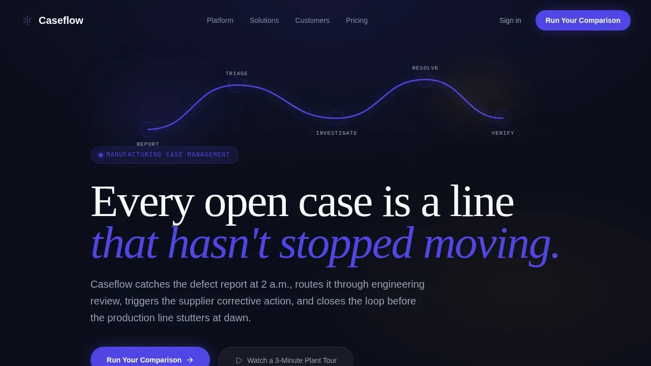
- Animated hero section with an SVG circuit-line tracing the case lifecycle from Report through Triage, Investigate, Resolve, and Verify
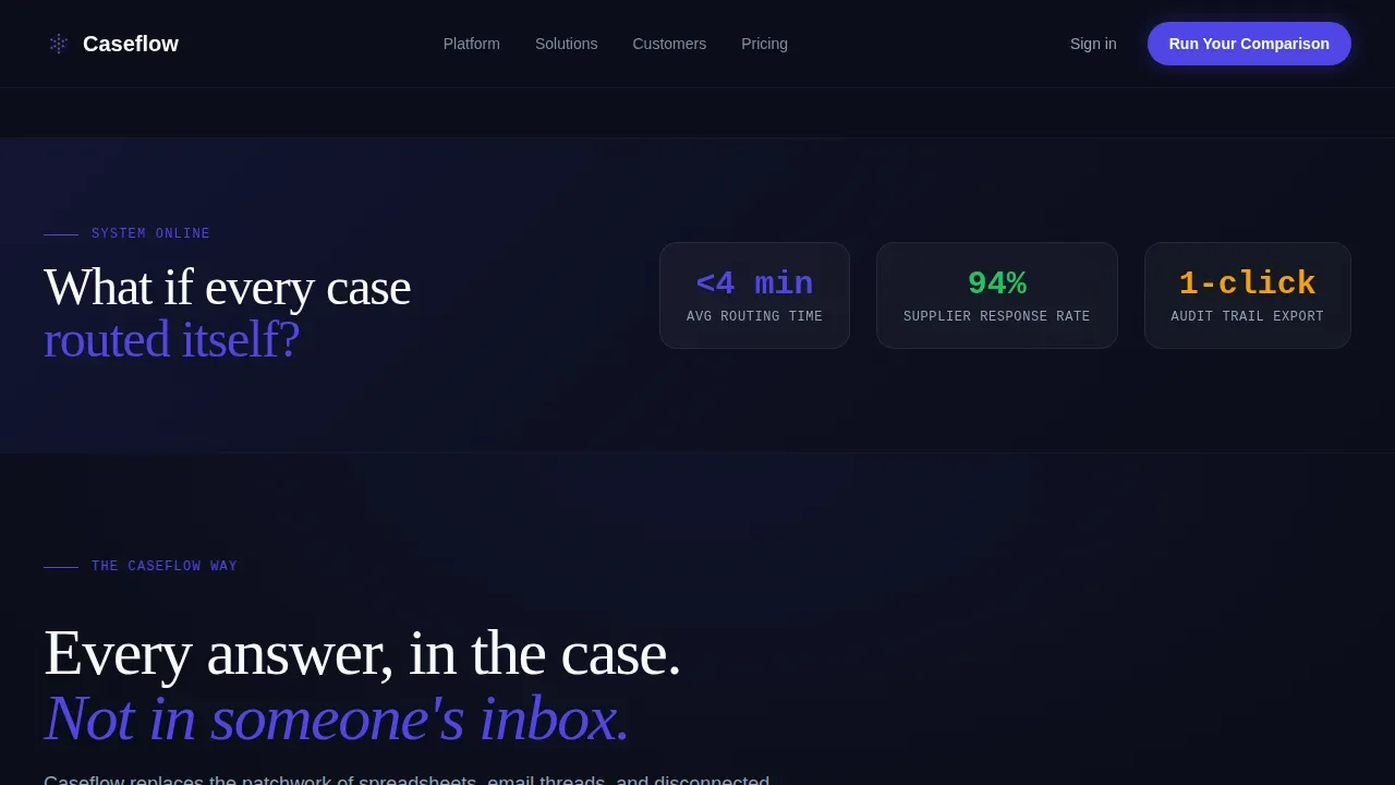
- Three progressive problem-reveal sections followed by a horizontal-wipe break into the indigo solution space
- Interactive three-question comparison assessment with a side-by-side current-state versus projected-performance output
Feature list
This template comes with a focused set of features designed to move manufacturing software buyers from awareness to action.
Animated Case Lifecycle Hero
The header section uses an SVG circuit-line animation to trace the steps of a resolved case. Each node pulses as the line passes through it. The headline fades in over the animation, immediately communicating the platform's core promise without a single screenshot.
Problem→Solution Arc Layout
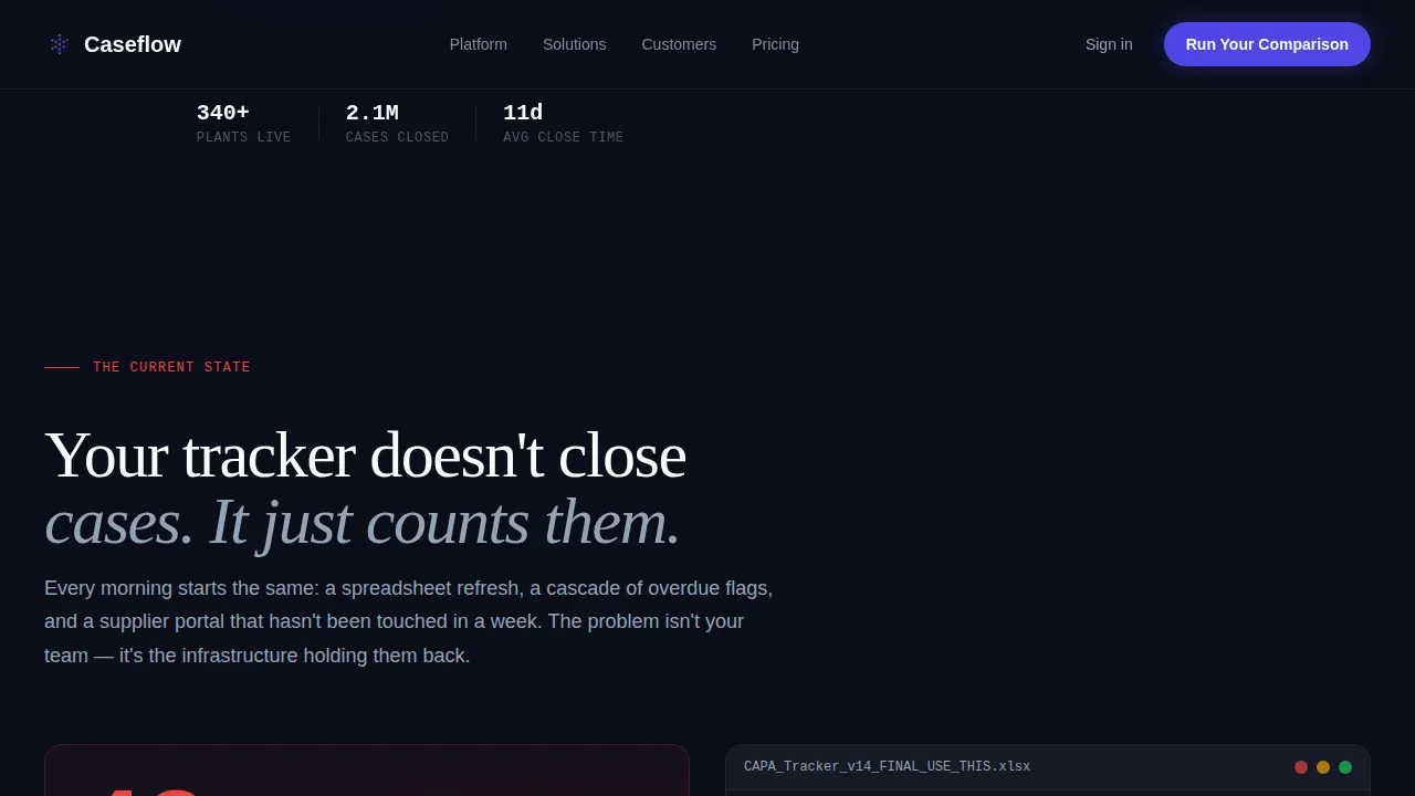
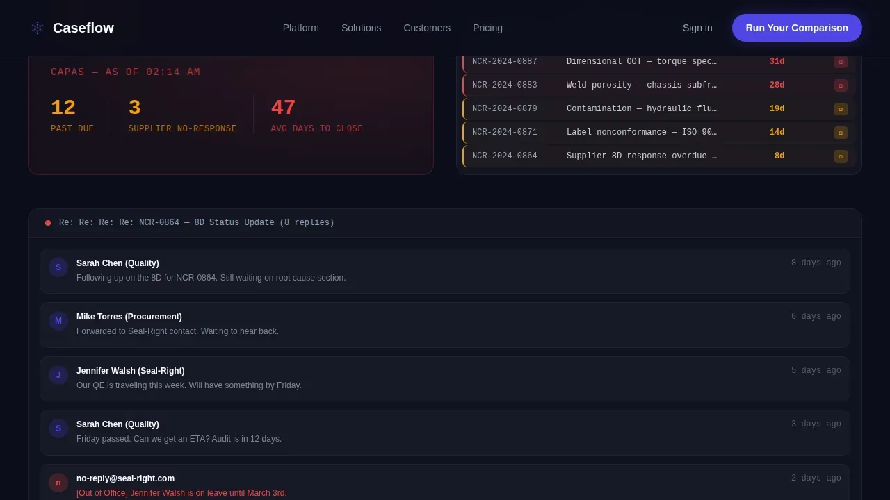
Three scroll-triggered problem panels escalate the pain: missed deadlines shown as stacking counters, multiplying audit findings in a simulated tracker, and a lost supplier email chain recreation. Each panel then mirrors with a solution answer below the wipe break. Visitors build the comparison instinctively as they scroll.
Interactive Comparison Assessment Tool
A three-question tool asks visitors about their current case volume per month, average days to close, and whether they track in spreadsheets, email, or an existing quality management system. Based on answers, the tool generates a customized side-by-side projection. This feature converts passive readers into self-identified prospects.
Sticky Mid-Scroll Conversion Bar
After the midpoint wipe break, a persistent bar appears with the message "See How You Compare" and links directly to the assessment. The bar keeps the primary call to action visible without interrupting the scroll experience. It disappears cleanly when the visitor reaches the bottom section.
Dual Call-to-Action Footer
The page closes with two paths: a primary "Run Your Comparison" button and a secondary "Watch a 3-Minute Plant Tour" button for visitors who are not yet ready to self-identify. Both options bring users into the platform funnel at the appropriate readiness stage.
Social Proof and Metrics Section
A dedicated results section is built to display specific outcome data: days-to-close reductions, CAPA closure rates, and role-specific testimonials from manufacturing customers. The section uses JetBrains Mono typography for data figures, reinforcing the control-room aesthetic and making metrics feel precise rather than promotional.
Page sections overview
| Section | Purpose |
|---|---|
| Hero Animation | Introduce case lifecycle visually |
| Problem Reveal One | Show missed deadline cost |
| Problem Reveal Two | Escalate audit finding risk |
| Problem Reveal Three | Recreate lost supplier email |
| Solution Mirror Break | Horizontal wipe into platform answer |
| Automated Routing Panel | Show automated case routing |
| Timeline and Audit Panel | Demonstrate embedded timelines |
| Comparison Assessment | Interactive self-qualification tool |
| Sticky Conversion Bar | Persistent mid-scroll call to action |
| Social Proof Metrics | Display customer outcome data |
| Dual call to action Footer | Close with two action paths |
Design & branding system
The visual system is built around a Dynamic Motion theme using the Electric Indigo color palette. Every color choice is functional: deep operational black frames the content, charged indigo signals active processes, cool steel carries secondary information, and hot amber draws attention to alerts and deadlines. Typography choices reinforce the control-room tone at every stage.
- Color palette: deep operational black (#0B0E1A), charged indigo (#4F46E5), cool steel (#94A3B8), arc-flash white (#F8FAFC), hot amber (#F59E0B)
- Typography: DM Sans for body and interface copy, Fraunces for editorial headlines, JetBrains Mono for data fields and metrics
- Animation style: SVG circuit-line draw, staggered node pulses, scroll-velocity-aware reveals, and a horizontal wipe transition at the solution break
Mobile & speed optimization
The template is built desktop-first, reflecting the reality that plant directors and quality managers work from wide-viewport workstations. Static sections use server-side rendering for fast initial load. Interactive and animated components are isolated as client-side elements so they do not delay the core content.
- Desktop-first layout prioritizes the control-room wide-viewport experience required by the design
- Client components handle all animations and interactivity, keeping static content fast to load
- Mobile layouts adapt the scroll-reveal steps and comparison tool for smaller screens without removing core functionality
How this template helps you convert
This template is built around a Comparison/Versus conversion model. Every scroll step teaches the visitor to measure their current pain against the platform's answer, so the decision to act feels logical rather than pressured.
- The Problem→Solution Arc creates a direct before-and-after contrast that makes the value of automated case workflows immediately clear to any quality manager or plant director who recognizes their own processes on screen.
- The interactive comparison assessment turns anonymous visitors into identified leads by asking three simple, non-threatening questions about their current practice and generating a personalized projection they can take back to their team.
- The dual call-to-action footer captures both high-intent visitors ready to run a comparison and lower-intent visitors who need more time, ensuring no qualified prospect leaves without a next step.
Other information about this template
This template is built to serve the full range of manufacturing quality software buyers. It handles the complexity that comes with a large number of simultaneous open cases, multiple stakeholders, and cross-functional workflows. Note that the comparison assessment and analytics output panels are designed to be customized to match a specific platform's data model and case volume benchmarks.
- The template supports the practice of dynamic case management (DCM), where caseworkers can respond to changes quickly and determine the required action based on full case context
- Inline forms and intake fields can be configured so users create new cases directly from a button, pulling data from connected online forms
- The client portal section can be extended to allow clients to submit inquiries, upload documents, and track case progress in real-time
- Analytics and predictive analytics display panels can be added to the social proof section to provide insights into practice performance across customer accounts
- The framework is scalable: whether a firm manages dozens or thousands of cases per month, the layout and assessment tool adjust to reflect the right message for each visitor segment
- The template is also relevant to adjacent case-intensive fields; for example, firms handling personal injury case workflows will find the DCM framework and document management sections equally applicable
- As mentioned in the brief, the caseflow dynamic manufacturing case management landing page template ships with Vercel Horizontal Flow footer styling and full scroll-reveal JavaScript hooks pre-wired
Theme
Dynamic Motion
Creative direction
Problem→Solution Arc
Color system
Electric Indigo
Style
Scroll Reveal (Progressive)
Direction
Comparison/Versus
Page Sections
Animated Case Lifecycle Hero Section
Progressive Problem Reveal Panels
Interactive Comparison Assessment
Sticky Conversion Bar
Dual Call-to-action Footer
Social Proof Metrics Section
Related questions
What types of manufacturing cases does this template support showcasing?
Can the interactive comparison assessment tool be customized?
How does the scroll-reveal animation perform on slower connections?
Is this template suitable for a software company outside manufacturing?
Where does the social proof section pull its data from?



