Voice-Activated Enterprise Software Reviews Website Template
Pulse is an AI powered landing page template built for voice-activated business process management platforms. It delivers a mission-control dashboard aesthetic with animated KPIs, a scroll-triggered comparison grid, voice command replay sections, and flip-card social proof panels. Operations teams can present complex AI workflows with clarity, drive conversion, and save time on landing page design from day one.
by Rocket studio
Quick summary
Pulse is a dashboard-style landing page template designed for AI powered workflow command platforms targeting operations directors, RevOps leads, and COOs. It combines a live-data hero section with seven animated KPIs, a scroll-triggered comparison grid, voice command replay panels, and metric trading cards. The result is a high-impact, conversion-focused landing page that makes AI automation feel real and immediately credible.
Who this template is for
This template is built for B2B software teams that need to present complex AI workflows to skeptical, time-poor buyers. It suits teams who want a landing page design that does the selling without requiring an AI expert to build it from scratch.
- Ops directors and RevOps leads at 30- to 200-person companies drowning in legacy automation debt
- COOs who inherited undocumented workflows and need to demonstrate a smarter way forward to stakeholders
- Founders and product marketers launching AI automation tools who want high converting landing pages without writing a single line of code
What problem this template solves
The biggest challenge for voice-AI and workflow automation platforms is credibility. Visitors interact with a landing page for seconds before deciding whether to trust the product. Generic templates cannot show how AI agents reroute approval chains in real time or how a spoken sentence can replace five stitched-together apps. Pulse solves this by making the product itself the visual proof.
- Ops buyers need to see data move, not read about it. Static pages kill conversion rates for technical products.
- Teams struggle to document and present the delta between their platform and legacy tools without a side-by-side comparison that visitors can absorb quickly.
- Without animated process maps and live metrics, visitors leave before taking action and conversion drops.
What you get with this template
Pulse delivers a complete, ready-to-use landing page structured around comparison and demonstration. Every section is engineered to move skeptical buyers closer to the primary call to action. AI powered visuals and scroll-triggered interactions do the persuasion work automatically.
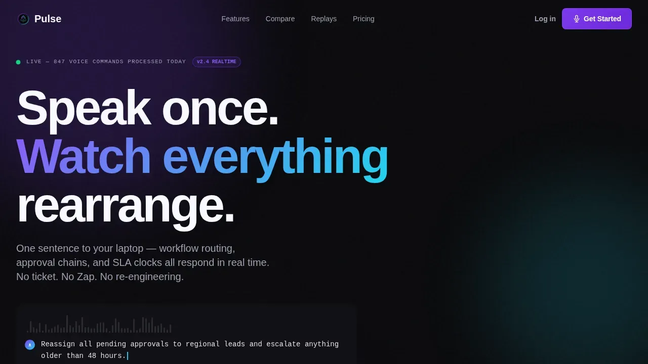
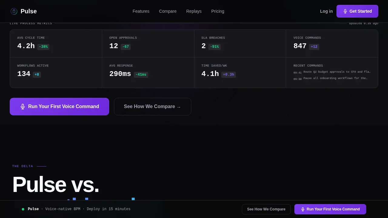
- A full-viewport hero dashboard with seven animated KPIs, a live voice waveform, and a scrolling transcript showing a real voice command in progress
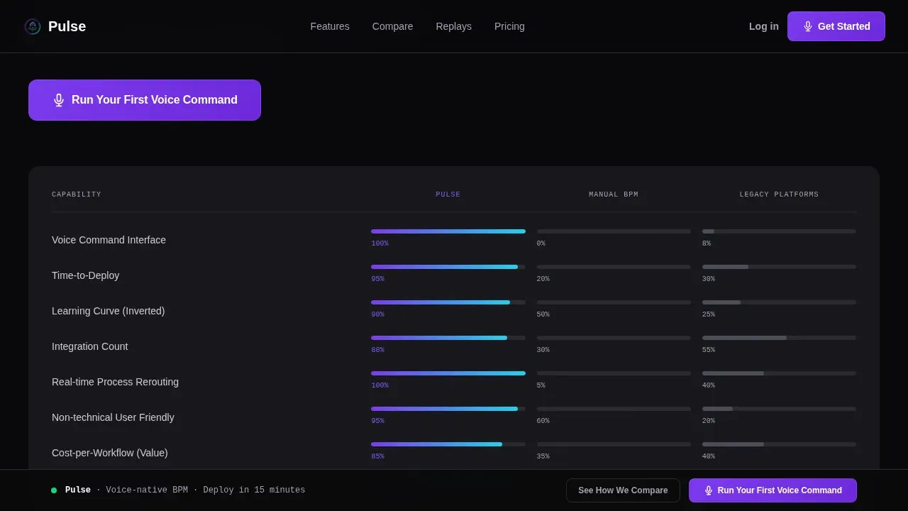
- A scroll-triggered comparison grid: Pulse versus manual BPM versus legacy platforms, with animated cells filling in as visitors scroll through the page
- Three voice command replay panels with before-and-after process maps that redraw themselves, plus flip-on-hover metric trading cards showing customer outcomes
Feature list
This section covers the key features built into the Pulse template. Each feature is grounded in the source brief and reflects what the template actually delivers to users and their clients.
Animated Mission Control Hero
The hero occupies the full viewport and functions as a live-data stats wall. Seven KPIs animate in real time: cycle time dropping, bottlenecks clearing, SLA clocks ticking. A voice waveform SVG pulses across the top while a typed transcript reads out a real command. This section proves the product is alive before the user scrolls an inch. Visuals showing real-time execution status and performance metrics build trust in the AI's reliability faster than any headline.
Scroll-Triggered Comparison Grid
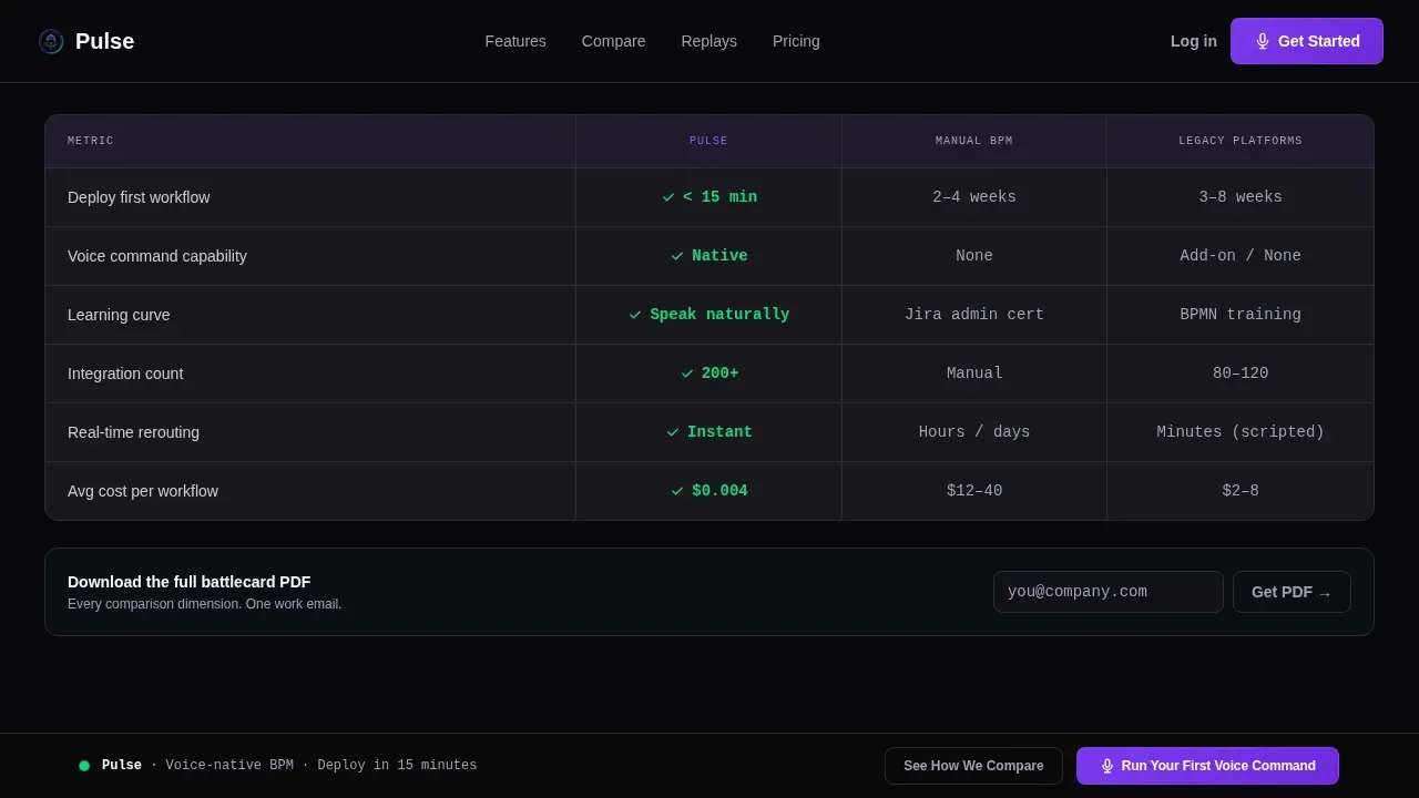
Section two places the product inside a head-to-head grid: Pulse versus manual BPM versus traditional automation platforms. Cells animate in as visitors scroll, filling columns for time-to-deploy, learning curve, voice capability, integration count, and cost-per-workflow. This structure lets the data do the selling. By the time visitors reach the bottom, the delta is visually obvious and taking action feels natural.
Voice Command Replay Panels
Three tabbed replay panels each show a real voice command followed by a before-and-after process map that redraws itself. This interactive feature demonstrates that AI workflows can be created by simply describing the desired outcome in plain language, without scripts, code, or manual work. It removes abstraction and shows exactly how the platform handles repetitive tasks at the process level.
Flip-Card Metric Trading Cards
Customer result cards are stacked in a trading-card layout. Each card shows a headline metric on the front: for example, "72% faster routing" or "4.1 hours saved per manager per week." On hover, the card flips to reveal company context. This format delivers social proof with specificity, helping clients and prospects trust the numbers rather than skim past them.
Sticky Call-to-Action Bar
The primary call to action, "Run Your First Voice Command," appears at the top of the comparison grid and persists as a sticky bar after visitors scroll past it. A secondary path offers a downloadable PDF battlecard gated behind a single work-email field. This dual-path structure supports both high-intent buyers ready to convert and researchers who need more data before taking action.
Dark Dashboard Design System
The template uses a void-dark canvas with an iridescent AI color system. Holographic violet handles active states and voice waveform visuals. Shimmer cyan highlights data and metric deltas. Pearl card surfaces float above the dark ground. Typography combines DM Sans for headings, JetBrains Mono for data and code readouts, and Manrope for body copy. The result is a landing page design that feels authoritative without being cold.
Page sections overview
| Section | Purpose |
|---|---|
| Hero Dashboard | Animates seven KPIs and a live voice waveform to prove the product is active |
| Comparison Grid | Head-to-head animated cells show Pulse versus manual BPM versus legacy tools |
| Voice Replay Panels | Three tabbed panels replay real commands with process maps that redraw |
| Metric Trading Cards | Flip-on-hover cards deliver customer outcome data with company context |
| call to action and Sticky Bar | Primary and secondary conversion paths with email-gated battlecard PDF |
| Footer | Single-row linear footer pattern |
Design & branding system
The Pulse landing page uses the AI Iridescent color system laid over a Startup Velocity theme. Every color choice signals something functional: violet for active AI states, cyan for live data, pearl for elevated card surfaces. No stock imagery appears anywhere on the page. The visual language is pure product, pure data.
- Color palette: void black (#09090B) canvas, holographic violet (#7C3AED) for active states, shimmer cyan (#22D3EE) for data highlights, soft pearl (#F0EAFF) for card surfaces
- Typography: DM Sans for display headings, JetBrains Mono for metrics and code values, Manrope for body description text throughout the page
- Animation level is set to high: waveform SVG animation, counter animations, scroll-triggered cell fills, card flip scripts, and process map redraws are all included
Mobile & speed optimization
Pulse is built desktop-first, reflecting the mission-control context where ops directors and RevOps leads typically work. The landing page design prioritizes clarity and density on large screens while remaining responsive across device sizes. For AI powered workflow command landing pages, speed, clarity, and technical trust must be prioritized to protect website performance and conversion rates.
- Static sections use server components to reduce initial loading time; animated dashboards and interactive panels use client components to keep the page fast and reliable
- The template is responsive and adapts to smaller device viewports, ensuring a better user experience without sacrificing dashboard density on desktop
- Scroll-triggered animations activate progressively, so the page remains functional even when visitors interact with it on lower-power devices
How this template helps you convert
Pulse is structured as a Comparison and Versus conversion machine. Each scroll deeper compounds the evidence and reduces friction. Good landing page design builds trust, and trust is what guides visitors from curiosity to commitment.
- The hero dashboard delivers immediate proof that the platform is alive and computing. Seven animated KPIs and a live voice waveform create a "mission control" first impression that improves conversion rates by establishing credibility before a single word is read.
- The animated comparison grid eliminates the need for the visitor to do mental work. Cells fill in automatically as they scroll, making the cost, speed, and capability gap between Pulse and every alternative impossible to ignore. This structure is a game changer for ops buyers who compare tools before committing.
- The sticky call-to-action bar and email-gated battlecard PDF create two clear paths for two types of buyer, keeping both high-intent and research-mode visitors moving toward the same funnel. This dual-path approach is proven to improve conversions across B2B software landing pages.
Other information about this template
This template is designed to support teams launching AI automation platforms that rely on natural language interfaces. It serves as a practical command center landing page, connecting visual data narratives with direct conversion paths. The pulse ai powered workflow command landing page template is a strong fit for any team that needs to present AI workflows to buyers who have never seen voice-activated BPM in action.
- AI powered workflows can automate complex tasks without requiring coding or scripting knowledge, and this template communicates that fact visually through its replay panels and comparison grid
- AI is expected to be integrated into over 80% of enterprises' IT workflows by 2026, making the window for early-mover landing pages especially valuable right now
- Artificial intelligence can generate complete, validated workflows in seconds based on plain language descriptions; the template's voice replay section demonstrates this capability directly to visitors
- AI agents can assist with internal support, user onboarding, and compliance-related process queries; the template's use-case framing can accommodate these services within its existing section structure
- The template supports teams that want to optimize for collected data and feedback loops: the email-gated battlecard captures lead data, and the comparison grid surfaces performance metrics that reinforce the platform's service quality
- Workflows can scale to handle higher volumes of tasks without a proportional increase in headcount, and the metric trading cards are the right place to communicate that kind of time savings to prospects
- The landing page can support integrations messaging and apps compatibility claims within the comparison grid cells, keeping the description of technical benefits specific and scannable
Theme
Startup Velocity
Creative direction
Launch Energy
Color system
AI Iridescent
Style
Dashboard/Data Grid
Direction
Comparison/Versus
Page Sections
Animated Mission Control Hero Dashboard
Scroll-triggered Comparison Grid
Voice Command Replay Panels
Flip-card Metric Trading Cards
Sticky Dual-path Call to Action
AI Iridescent Dark Design System
Related questions
What types of teams benefit most from this template?
Do I need coding skills to customize this template?
How does the scroll-triggered comparison grid support conversion?
Can I adapt the voice replay panels for different commands or use cases?
Is the sticky call-to-action bar included and ready to use?



