Software & SaaS Professional Website Template
Flow is a split-screen queue management landing page template built for organizations that need to show control, not chaos. It pairs a live-data dashboard panel with a calm lobby visual, making the case for your system at a glance. Designed for healthcare, banking, and government audiences, Flow is built to convert skeptical evaluators into trial signups.
by Rocket studio
Quick summary
Flow is a single-page, split-screen landing page template for queue management software. It combines a dark-mode metrics dashboard on the left with real-world lobby visuals on the right. The layout is built around a Spec Sheet creative direction, guiding visitors through capability evidence before asking them to sign up.
Who this template is for
Flow is designed for software teams and product marketers selling queue management systems to operations-focused buyers. These are decision-makers who need proof before they commit, not just a polished pitch.
- Hospital administrators managing emergency room and outpatient lobby flow
- Bank branch managers and government office directors dealing with high daily visitor volumes
- SaaS founders and marketing teams launching or relaunching a queue management product
What problem this template solves
Buyers of queue management software are skeptical by nature. They have tried manual systems, whiteboards, and basic ticketing tools. They need to see hard numbers and recognizable scenarios before they trust a new platform.
- Generic landing pages fail to speak the language of operations managers who evaluate on throughput, wait times, and service points
- Without structured proof sections, visitors leave before reaching the call to action
- The template removes that friction by pairing every capability claim with a measurable outcome or real-world visual
What you get with this template
Flow delivers a fully structured, conversion-ready landing page layout. Every section is purposefully ordered to build confidence and move visitors toward the free trial.
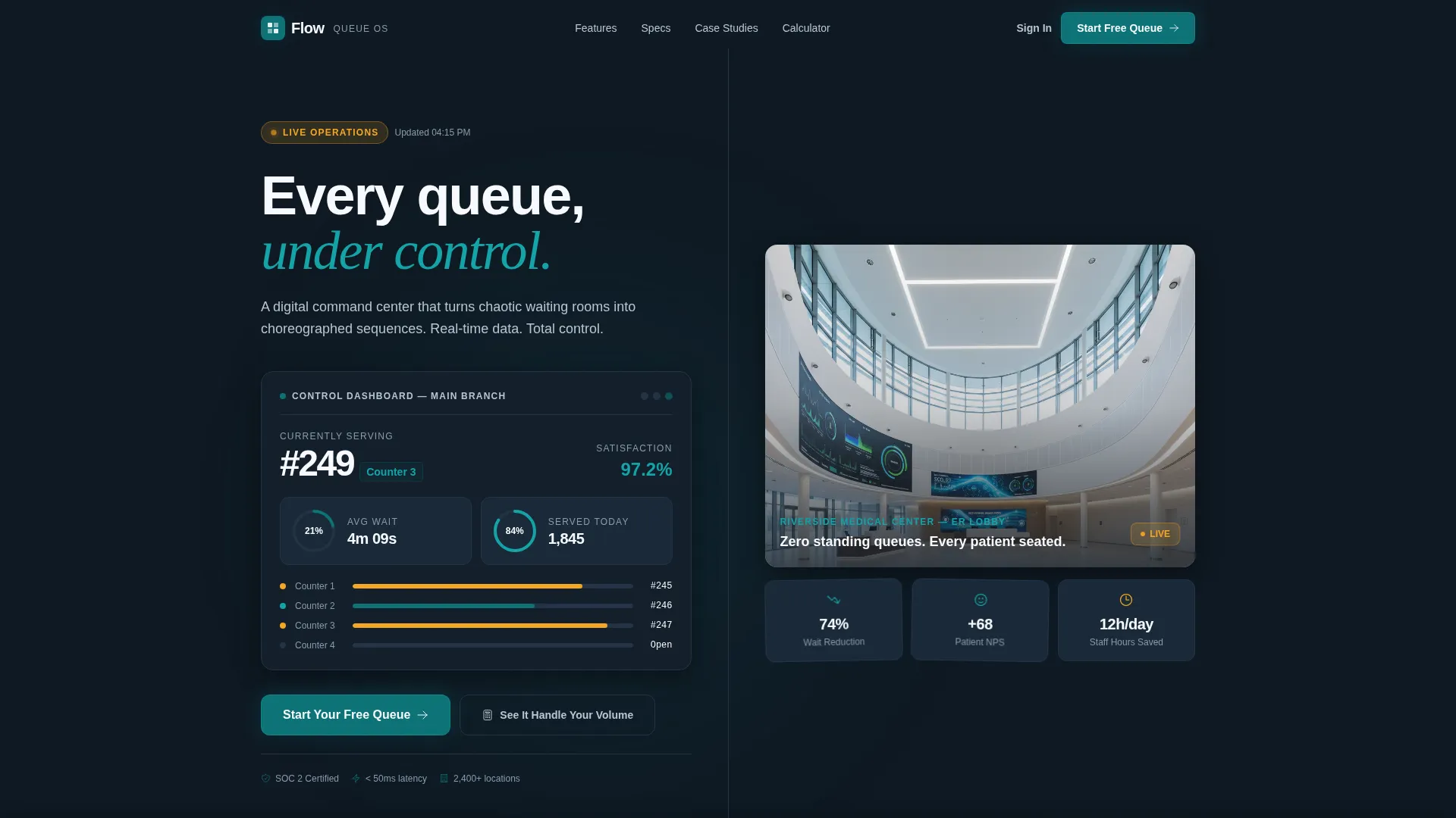
- A live stats header panel showing metrics like currently serving number, average wait time, daily served count, and customer satisfaction score
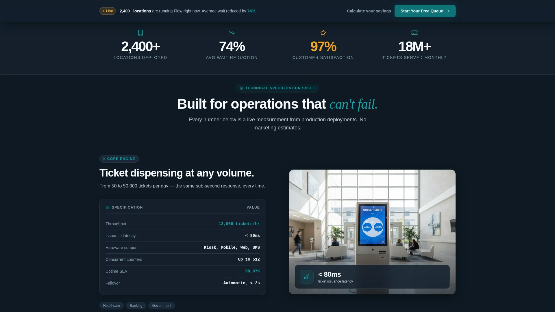
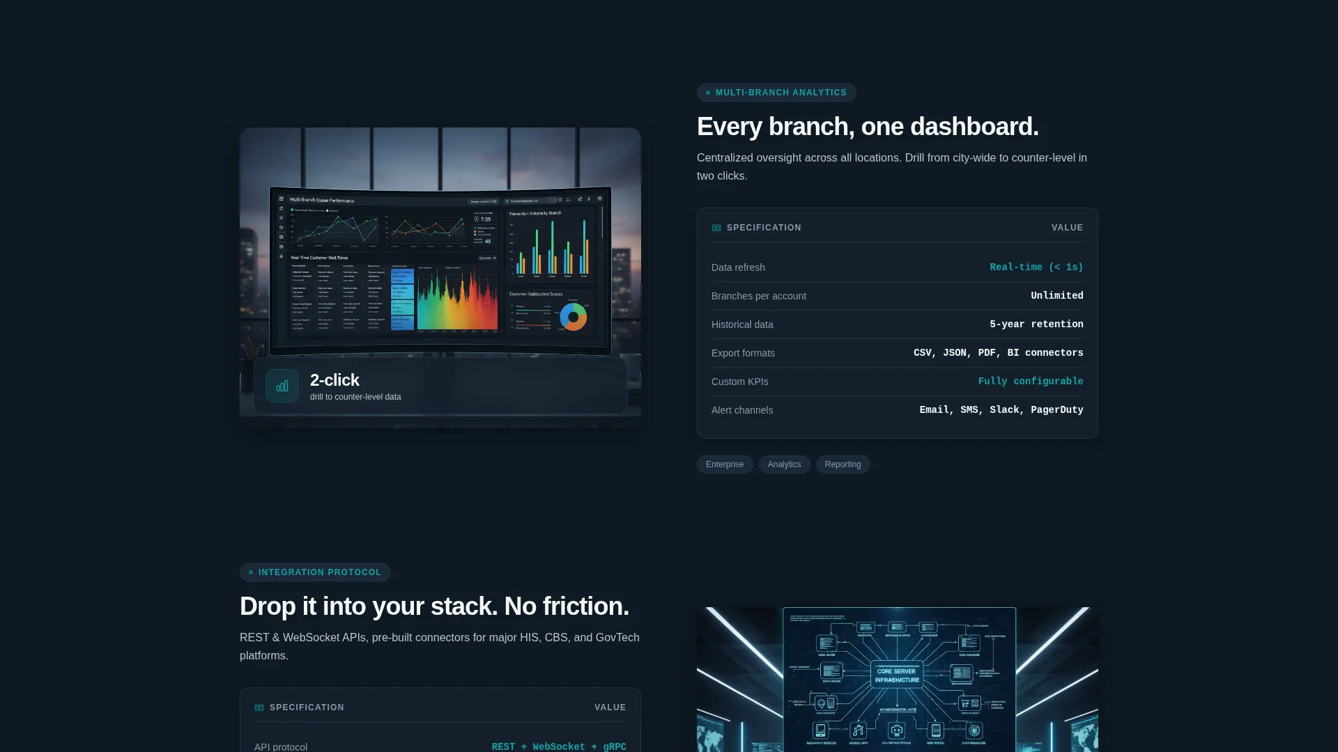
- A scrollable Spec Sheet body with alternating split-screen sections covering ticket dispensing, multi-branch analytics, and integration protocols
- A sticky bottom bar call to action that appears after the second scroll, anchoring the trial signup throughout the page
Feature list
Flow includes purpose-built sections and interface components drawn directly from its brief. Each one serves a specific role in the evaluation journey.
Live Metrics Dashboard Header
The header splits into two panels. The left panel displays a dark-mode control interface with real queue data: currently serving number, average wait time, served today count, and customer satisfaction score. Teal progress rings fill near-completion around each metric. The right panel shows a modern lobby where visitors are seated and relaxed, reinforcing the data story visually.
Primary Call to Action in Dashboard Panel
The primary call to action, labeled "Start Your Free Queue," appears as a teal button inside the left dashboard panel. It is the first conversion touchpoint on the page. No credit card is required to begin the trial.
Three-Field Sequential Trial Signup
The trial form collects three fields in order: organization type via dropdown (healthcare, banking, government, retail, education), number of service points, and work email. The sequence feels intentional rather than demanding, reducing friction at the conversion step.
Sticky Bottom Bar After Scroll
After the visitor passes the second scroll threshold, a sticky bottom bar anchors the trial call to action at the bottom of the viewport. This keeps the primary offer visible throughout the spec evaluation journey without interrupting the reading flow.
Interactive Capacity Calculator
A secondary conversion path links to a capacity calculator. Visitors enter their daily foot traffic and watch projected wait-time reductions animate in real time. This tool converts skeptics by letting them see outcome projections before filling out any form.
Escalating Spec Sheet Scroll Sections
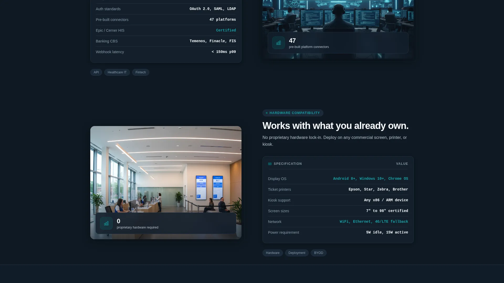
Each body section follows a split-screen pattern: feature specifications and throughput numbers on the left, lobby photography or satisfaction graphs on the right. Sections escalate from basic ticket dispensing to multi-branch analytics to application programming interface (API) documentation, building a layered technical case with each scroll.
Page sections overview
| Section | Purpose |
|---|---|
| Live Stats Header | Anchor attention with real metrics and lobby visual contrast |
| Primary call to action Panel | Deliver the first "Start Your Free Queue" conversion prompt |
| Ticket Dispensing Specs | Introduce core queue functionality with throughput detail |
| Multi-Branch Analytics | Show scalability across locations with data evidence |
| API Documentation Section | Address technical evaluators with integration protocol detail |
| Capacity Calculator call to action | Convert skeptics via interactive wait-time projection tool |
| Sticky Bottom Bar | Keep trial signup visible throughout the scroll journey |
Design & branding system
Flow uses the Teal Catalyst color system within a Dashboard Pro theme. The palette is built for trust and focus, designed to feel like a monitoring station rather than a marketing page.
- Deep operations teal (#0D7377) drives buttons, active borders, and progress rings; midnight dashboard (#0F1923) fills background panels; clinical white (#F7F9FC) surfaces data text
- Catalyst amber (#F5A623) is reserved exclusively for live-state indicators and alert badges, training the eye to act only when amber appears
Mobile & speed optimization
The split-screen layout is designed with responsive behavior in mind. Each 50/50 panel is structured to reflow gracefully on smaller screens without losing the data-to-outcome narrative.
- Dashboard metrics and lobby visuals are organized so they stack clearly on mobile without losing their paired storytelling logic
- The sticky bottom bar and primary call to action remain accessible and prominent across all viewport sizes
How this template helps you convert
Flow is built around a dual-path conversion strategy. It meets evaluative buyers where they are, whether they are ready to sign up or still building confidence.
- The primary path uses a low-friction three-field signup with no credit card required, placed first in the dashboard header and reinforced by the sticky bottom bar throughout the scroll.
- The secondary path offers an interactive capacity calculator where visitors input their daily foot traffic and watch projected wait-time reductions animate live, turning hesitant browsers into engaged prospects before any form is submitted.
Other information about this template
Flow is categorized under Technology, specifically the Software and Software as a Service (SaaS) subcategory, with a niche focus on queue management systems. The template is well suited for teams evaluating purpose-built queue management solutions for service-heavy environments.
- The Intersection Match Score of 13 reflects a strong alignment between the template style, creative direction, color system, and landing page conversion model
- The template style is Split Screen (50/50), the theme is Dashboard Pro, the creative direction is Spec Sheet, and the conversion model is Freemium and Trial
- This template is a strong starting point for teams building or relaunching a queue management product page, particularly those targeting healthcare, banking, or government verticals
Theme
Dashboard Pro
Creative direction
Spec Sheet
Color system
Teal Catalyst
Style
Split Screen (50/50)
Direction
Freemium/Trial
Page Sections
Live Dashboard Metrics Header
Split-screen Spec Sheet Layout
Three-field Sequential Signup Form
Sticky Bottom Bar Call to Action
Interactive Capacity Calculator
Teal Catalyst Color System
Related questions
What types of organizations is this template designed for?
Does the free trial signup require a credit card?
What does the interactive capacity calculator do?
Can technical buyers find integration information in this template?
How does the split-screen layout support the sales message?



