Yoga Mats Print-on-Demand Landing Page Template
Flow is a masonry-grid landing page template built for print-on-demand yoga mat stores. It pairs a price-anchored hero with an interactive before-and-after product reveal, collection dividers, and a persistent mobile call-to-action bar. The warm sunset palette and card-grid layout turn original mat artwork into an experience that moves visitors straight to the product page.
by Rocket studio
Quick summary
Flow is a single-page, scroll-driven landing page template for print-on-demand yoga mat and accessories stores. It opens with a bold price-anchored header, flows through an interactive masonry grid with before-and-after artwork reveals, and closes every section with a clear path to the product page. The design feels warm, tactile, and intentional, right for the audience it serves.
Who this template is for
This template is built for creative product sellers who need visual storytelling to close the sale. It suits independent studio owners, print-on-demand entrepreneurs, and yoga-adjacent gift retailers who rely on strong imagery and a curated aesthetic to earn trust.
- Print-on-demand store owners selling original-artwork yoga mats and accessories
- Yoga teachers or studio owners building a retail page for class merchandise
- Gift-focused sellers who want a page that feels personal, not generic
What problem this template solves
Most e-commerce landing pages treat yoga mats like commodity items. They show a flat product photo, list a price, and expect the visitor to connect. Flow solves the gap between "this looks nice online" and "I want this on my studio floor."
- Visitors cannot feel texture or quality through a screen, so the before-and-after reveal closes that gap visually
- Generic layouts fail to communicate the difference between mass-produced and artist-made products
- Shoppers need to see the full lifestyle context before they trust a purchase decision
What you get with this template
You get a complete, ready-to-customise landing page designed specifically for yoga mat print-on-demand retail. Every section is purposeful, and every element routes the visitor toward a click.
- A price-anchored split hero with struck-through competitor pricing, three micro-icons, and a mat lifestyle image
- A masonry card grid with before-and-after interactive reveals, collection dividers, and per-card call-to-action buttons
- A persistent mobile bottom bar and a secondary custom-upload path for visitors who want to bring their own artwork
Feature list
This template ships with six purpose-built features grounded in the source brief. Each one serves the core job: turning a curious visitor into a confident buyer.
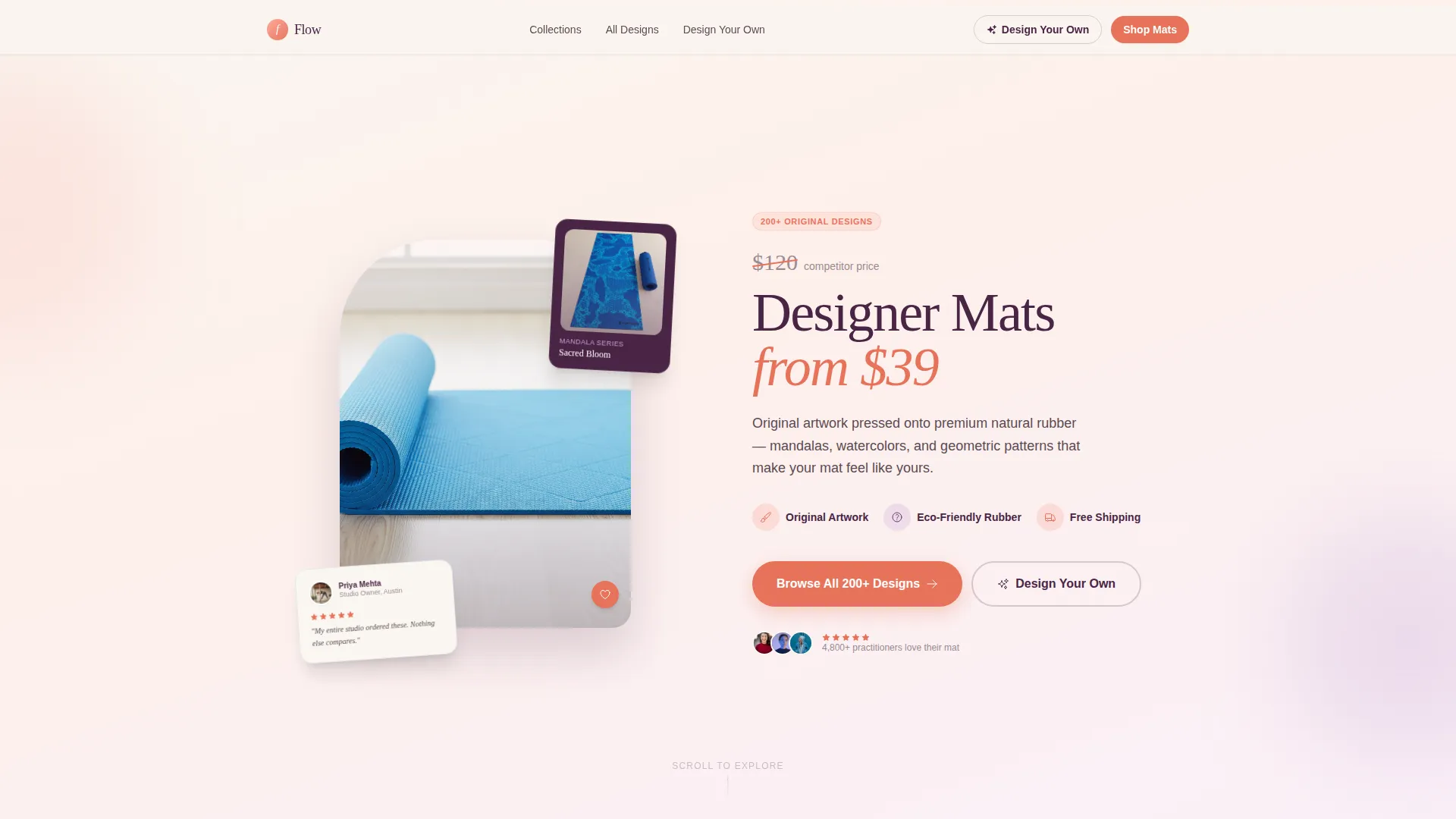
Price-Anchored Split Hero
The header opens with a studio-quality mat image on the left and large price-anchored typography on the right. A struck-through competitor price sits above the live price, making the value case immediately visible. Three micro-icons below confirm original artwork, eco-friendly rubber, and free shipping.
Interactive Before-and-After Masonry Grid
Each card in the masonry grid shows flat digital artwork on one side. A slide interaction reveals the same design photographed on a real mat in a real studio setting. The reveal escalates row by row from a single mat to a full coordinated class setup.
Collection Divider Banners
Full-bleed gradient dividers break the masonry grid into named collections. Each banner introduces its own micro-palette and routes the visitor to a focused product category. Collection names like "Dawn Practice," "Studio Neutrals," and "Bold Geometry" give the page editorial structure.
Per-Card Shop Call-to-Action
Every masonry card carries a "Shop This Design" primary call-to-action button in coral. No cart lives on this page. The sole job of each card is to earn the click through to the product page, keeping the conversion path simple and direct.
Persistent Mobile Bottom Bar
On mobile, a fixed bottom bar reads "Browse All 200+ Designs" in coral on linen white. It stays visible as the visitor scrolls, removing the need to hunt for a navigation element. It is the single most visible call to action on small screens.
Design Your Own Secondary Path
A "Design Your Own" button in deep twilight plum provides an alternative conversion route. It routes visitors to a custom artwork upload tool, capturing buyers who love the concept but want their own design pressed onto a mat.
Page sections overview
| Section | Purpose |
|---|---|
| Price-Anchored Hero | Opens with split layout, struck-through pricing, and lifestyle mat image |
| Micro-Icon Strip | Confirms artwork quality, eco rubber, and free shipping in three icons |
| Masonry Grid Row One | Single mat before-and-after reveal at card level |
| Masonry Grid Row Two | Mat with matching strap and towel accessory reveal |
| Masonry Grid Row Three | Full studio setup with six coordinated mats for class |
| Collection Divider One | Introduces Dawn Practice collection with its own gradient palette |
| Collection Divider Two | Introduces Studio Neutrals collection mid-scroll |
| Collection Divider Three | Introduces Bold Geometry collection before the final grid section |
| Mobile Bottom Bar | Persistent call-to-action visible on all scroll positions on mobile |
| Design Your Own Button | Secondary path routed to custom upload tool |
Design & branding system
The visual identity uses a Soft Gradient theme built around a Sunset Gradient color system. The palette moves from warm peach through diffused coral and dusky lavender into deep twilight plum, with a grounding linen white behind the masonry cards. The mood is the last fifteen minutes of a beach sunset.
- Core palette: warm peach (#FDAB9E), diffused coral (#E8735A), dusky lavender (#C4A1D4), deep twilight plum (#4A2545), and linen white (#FAF6F1)
- Coral drives all hover states and primary buttons; plum anchors headlines and the footer
- Backgrounds wash from peach to lavender as the visitor scrolls, and every card floats on linen white with a barely-there shadow
Mobile & speed optimization
The template is structured for a clean mobile experience without sacrificing the visual richness of the desktop masonry layout. The persistent bottom bar is the anchor of the mobile conversion flow.
- The masonry grid adapts to a single-column card stack on smaller screens
- The persistent coral-on-linen bottom bar keeps the primary call to action visible at all scroll depths
- Full-bleed collection dividers retain their gradient wash on mobile, preserving the editorial pace of the page
How this template helps you convert
Every layout decision in Flow is built to reduce hesitation and earn the click. The page does not ask visitors to add to cart. It asks them to believe the mat is worth seeing up close.
- The price-anchored hero removes the first objection immediately by showing the value gap against premium competitor pricing before the visitor has even scrolled
- The before-and-after masonry reveal builds progressive trust by showing the artwork as a flat file, then as a real product in use, then as a full studio environment, each step raising confidence
- The persistent mobile bottom bar and per-card call-to-action buttons create multiple low-friction entry points to the product page without cluttering the visual experience
Other information about this template
Flow is categorised under Retail and E-Commerce with a specific focus on yoga mats and accessories as its primary store type. The template style is Card Grid with a modular structure, and the landing page direction is set for a marketplace or multi-collection retail context. The intersection niche is a yoga mats and accessories dropshipping store, making it equally suited to dropshipping operators who want a premium storefront without a premium build budget.
- The creative direction is a Before-and-After Reveal, matching the core masonry interaction described throughout the brief
- The header concept is Price-Anchored, meaning the value proposition is visual and immediate rather than copy-led
- The template theme is Soft Gradient, derived from the Sunset Gradient color system, and pairs naturally with warm product photography


Theme
Soft Gradient
Creative direction
Before/After Reveal
Color system
Cloud Canvas
Style
Card Grid (Modular)
Direction
Marketplace/Multi
Page Sections
Price-anchored Split Hero
Before-and-after Masonry Grid
Collection Divider Banners
Per-card Shop Call-to-action
Persistent Mobile Bottom Bar
Design Your Own Secondary Path
Related questions
Does this template include a shopping cart or checkout?
Can I swap in my own artwork and mat photos?
Is this template suitable for a dropshipping store rather than a print-on-demand brand?
How does the before-and-after reveal work on mobile?
Can I add more collections beyond the three dividers shown?


