No-Code Enterprise Software Specialist Cost Calculator Website Template
Flowstate is a modular, glassmorphic landing page template built for a no-code CRM product. It leads with an interactive cost calculator, delivers feature comparisons through animated card grids, and drives sign-ups with a pre-filled form tied to calculator results. It is designed for SaaS-focused sales and revenue operations teams ready to ditch overcomplicated tools.
by Rocket studio
Quick summary
Flowstate is a single-page, card-grid landing page template for a drag-and-drop, no-code CRM builder. The page opens with a motion logo bar, moves immediately into an interactive cost calculator, and flows through animated versus card modules. Every visual decision reinforces one idea: your pipeline, your rules, zero code required.
Who this template is for
This template is built for product teams and marketers launching a no-code CRM to a very specific audience. If your buyers are hands-on operators who distrust enterprise software bloat, this page speaks directly to them.
- Revenue operations managers at 50 to 200 person SaaS companies who need a custom pipeline without IT dependency
- Agency owners running client pipelines on spreadsheets and ready to move to a real system
- Founding sales leaders who have outgrown entry-level CRM tools but will not commit to expensive enterprise platforms
What problem this template solves
Sales teams at growing companies face a painful gap. Off-the-shelf CRM platforms are either too rigid or too expensive, and building something custom means filing IT tickets for months. This template exists to show visitors that there is a faster, cheaper path.
- Visitors arrive skeptical, comparing costs in their heads; the calculator section surfaces real numbers before any persuasion copy appears
- Feature comparison sections are buried on most product pages; here they are the main event, making it easy to see exactly what a no-code CRM builder delivers versus legacy tools
- Sign-up friction kills conversions; the pre-filled form removes re-entry by carrying calculator inputs directly into the registration flow
What you get with this template
You get a fully structured, single-page layout with every section, interaction pattern, and design component described below. Nothing needs to be built from scratch.
- A dynamic motion, glassmorphic card-grid layout with deep void black canvas, frosted glass card surfaces, electric indigo active states, and mint green call-to-action elements
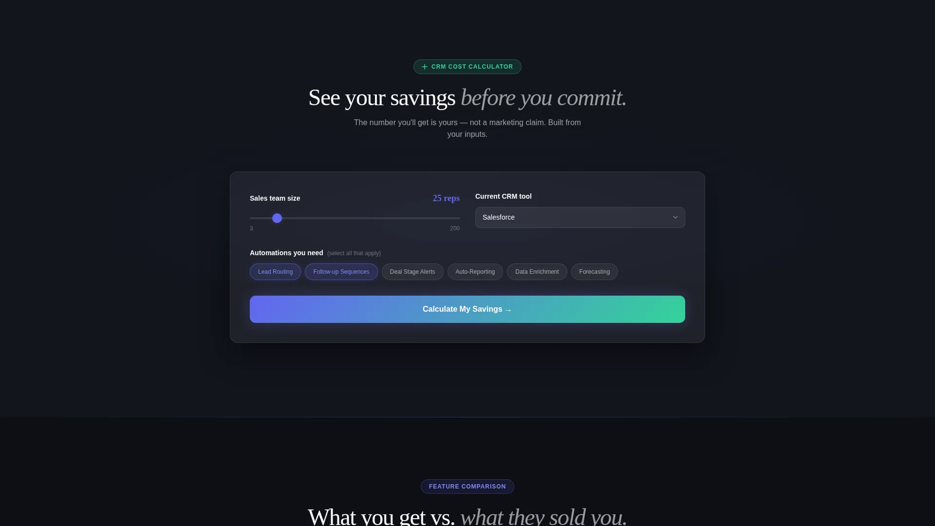
- An interactive CRM cost calculator section with team-size slider, tool dropdown, and automation toggle chips, plus animated side-by-side result cards
- A floating primary call-to-action button and a pre-filled sign-up form that inherits calculator inputs automatically
Feature list
This template includes the following built-in sections and interaction patterns, all sourced directly from the design brief.
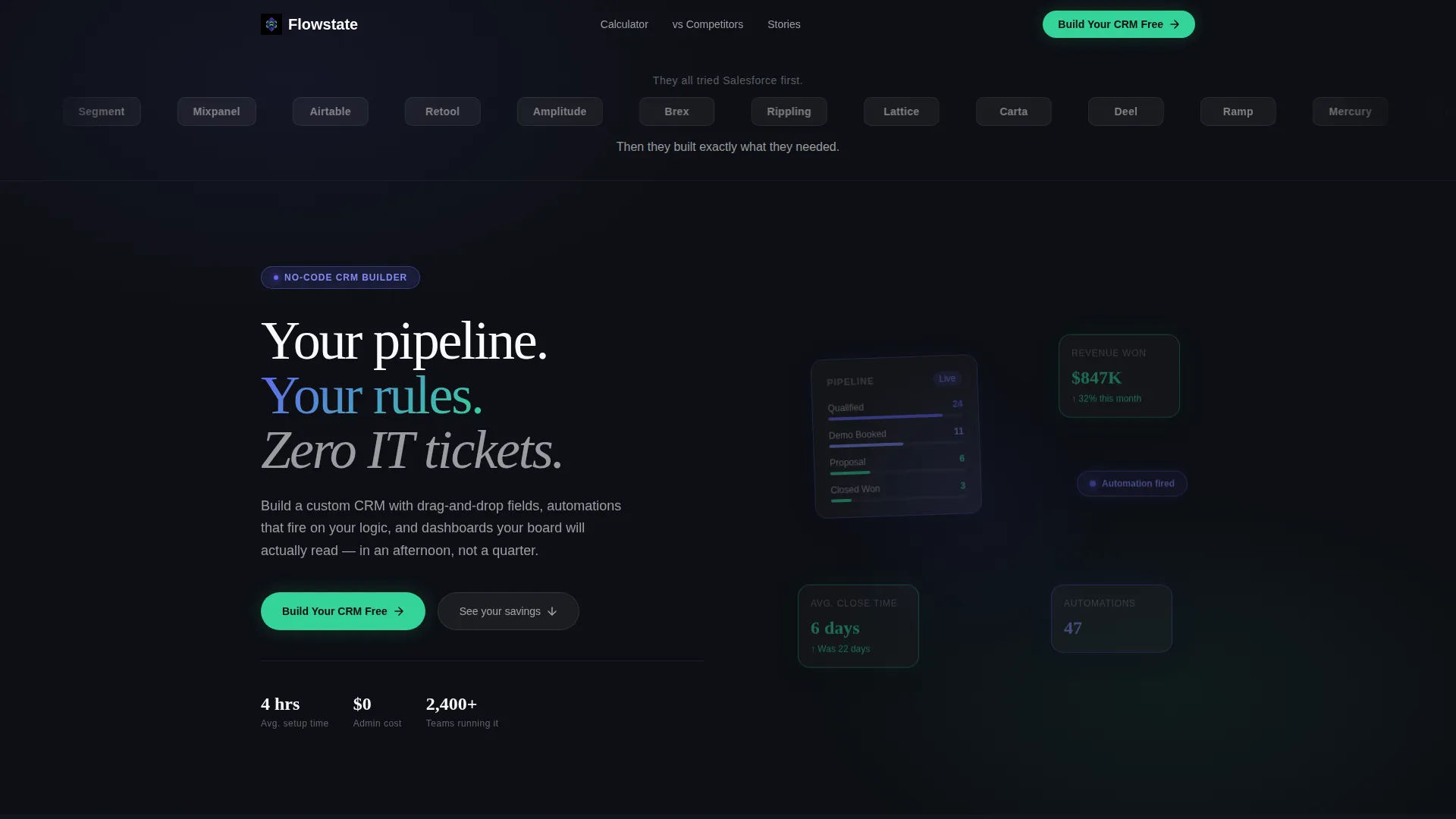
Motion Logo Bar Header
A horizontal, continuously scrolling logo ticker sits at the top of the page. It displays 40 or more recognizable company logos rendered in monochrome glass against the void-black background. Two short lines of copy frame the ticker above and below to set the competitive context immediately.
Interactive CRM Cost Calculator
Visitors configure their team size using a slider, choose their current tool from a dropdown, and select the number of custom automations they need using toggle chips. The tool instantly renders a frosted-glass comparison card showing annual cost, implementation time, and admin headcount side by side. The competitor column renders in muted gray; the Flowstate column glows in an indigo-to-mint gradient.
Animated Versus Card Grid
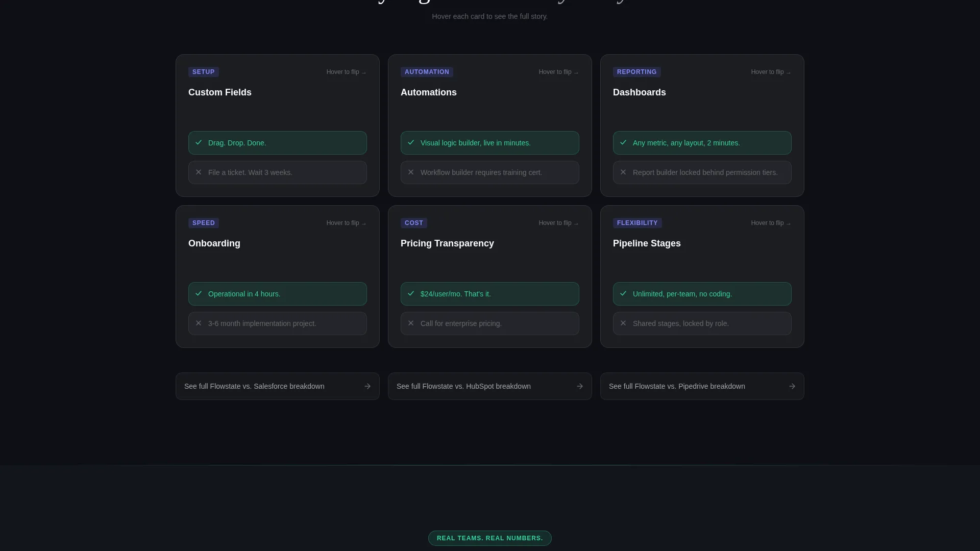
Each feature comparison is presented as a modular card. Cards drift upward on scroll and flip on hover to reveal the competing tool's limitation on the back face. Comparison bars fill like loading indicators, making the performance gap feel immediate and tangible rather than abstract.
Pre-Filled Sign-Up Form
When a visitor completes the calculator interaction, their team size and current tool selection carry over automatically into the sign-up form fields. This removes re-entry friction and makes the sign-up feel like a natural next step rather than a separate task.
Floating Primary call to action Button
A mint green "Build Your CRM Free" button pins itself as a floating element once the visitor has passed the calculator section. It appears at the moment the visitor has already seen their own savings number, so the click feels earned rather than forced.
Secondary Comparison Deep-Dive Links
A subtle frosted-glass card appears beneath every versus module. It offers a secondary conversion path by linking to dedicated competitor comparison pages. Visitors who need more detail can go deeper without leaving the main page flow.
Page sections overview
| Section | Purpose |
|---|---|
| Logo Bar Header | Establish social proof through recognizable brand names in motion |
| CRM Cost Calculator | Let visitors calculate their own savings before seeing any persuasion copy |
| Calculator Results Cards | Display animated cost, time, and headcount comparisons side by side |
| Versus Card Grid | Compare features module by module using flip cards and fill animations |
| Floating call to action Button | Pin the primary sign-up action after calculator interaction is complete |
| Pre-Filled Sign-Up Form | Carry calculator inputs into the form to reduce friction at conversion |
| Secondary Comparison Links | Offer deep-dive competitor breakdowns beneath each versus section |
Design & branding system
The visual identity follows a Dynamic Motion theme built on a Glassmorphic color system. Every design decision reinforces the feeling of a high-precision cockpit at night, where only the instruments that matter emit light.
- Color palette: deep void black (#0D0F14) canvas, frosted glass white (#FFFFFF at 8% opacity) on card surfaces, electric indigo (#6366F1) for borders and active states, and mint signal green (#34D399) reserved for positive metrics and call-to-action buttons
- Motion principles: cards drift upward on scroll, borders pulse softly, comparison bars fill like loading indicators, and the logo ticker scrolls in continuous motion
- Layering and depth: frosted transparency on every card surface reveals just enough of the layer beneath to feel three-dimensional without visual clutter
Mobile & speed optimization
The card-grid layout is modular by design, which means each section stacks and reflows naturally at smaller screen sizes. The template is structured to support responsive behavior without sacrificing the glassmorphic depth effect.
- Modular card blocks adapt to narrower viewports without breaking the comparison layout
- Motion interactions are scoped to individual card components, keeping animation logic isolated and manageable
- The floating call to action button remains accessible at all scroll positions on both desktop and mobile layouts
How this template helps you convert
This template is built around a single strategic insight: let the visitor reach their own conclusion rather than telling them what to think. Every section earns the next click.
- The cost calculator forces active engagement before any marketing copy appears, so the visitor's first emotional response is a number they calculated themselves, not a claim a brand made
- The versus card grid keeps the competitive context visible throughout the entire scroll, reinforcing the value gap at every section rather than in a single buried comparison table
- The pre-filled form and floating call to action button reduce the distance between "I see the value" and "I clicked sign up" to a single intentional tap
Other information about this template
This template is designed for the no-code CRM market, where buyers are actively comparing platforms before committing. The layout supports that comparison-driven buying behavior at every scroll depth.
- The template style is Card Grid (Modular), making it straightforward to add, remove, or reorder sections without disrupting the overall page flow
- The page is built for a Comparison/Versus conversion strategy, meaning the content architecture is optimized for buyers who arrive already considering alternatives
- The creative direction is Calculator/Tool First, placing the most persuasive interactive element at the top of the page where attention is highest
- This template is well-suited for no-code CRM products competing against established platforms, including options like Salesforce, HubSpot, and Pipedrive, since those brand comparisons are baked into the calculator and versus card sections by design
Theme
Dynamic Motion
Creative direction
Calculator/Tool First
Color system
Glassmorphic
Style
Card Grid (Modular)
Direction
Comparison/Versus
Page Sections
Motion Logo Bar with Social Proof Copy
Interactive CRM Cost Calculator
Flip-on-hover Versus Card Grid
Pre-filled Sign-up Form
Floating Primary Call to Action Button
Secondary Competitor Comparison Links
Related questions
Can I change the competitor names in the calculator and versus cards?
Does the pre-filled form require a specific integration to work?
Is the floating call to action button a built-in component?
How many versus card modules does the template include?
Who is this landing page template best suited for?



