Next-Gen Photonic Engineering Landing Page Template
Photon is a split-screen landing page template built for photonic computing platforms. It pairs a live cost-savings calculator with stats-first scroll sections to turn skeptical ML engineers and cost-conscious CTOs into trial signups. The Teal Catalyst color system and Startup Velocity theme give the page a clinical, high-energy feel that matches the technology it represents.
by Rocket studio
Quick summary
Photon is a high-performance photonic computing landing page template built on a 50/50 split-screen layout. It leads with a live inference cost calculator and follows with stat-heavy scroll sections that build an undeniable evidence case. The design uses deep void black, electric teal, and phosphor white to create an interface that feels as precise and alive as the technology it showcases.
Who this template is for
This template is purpose-built for teams launching or promoting a photonic computing platform to a technically sophisticated audience. It speaks the language of infrastructure benchmarks, latency figures, and cloud cost reduction without watering anything down.
- ML infrastructure engineers who benchmark inference latency and need hard numbers fast
- Quantum computing researchers and optical circuit simulation teams evaluating new hardware platforms
- CTOs at growth-stage startups facing large cloud bills who need a credible, proof-first introduction to photonic compute
What problem this template solves
Most technology landing pages lead with narrative and bury proof. For a photonic computing platform, that order is backwards. Technical buyers distrust marketing copy and scroll past it. They stop for a benchmark figure or a cost comparison they can verify against their own workloads.
- Visitors arrive skeptical and leave before a narrative pitch finishes making its case
- Generic SaaS templates lack the visual weight and data-forward structure that hardware-adjacent platforms require
- Trial signups stall because buyers feel the product is unproven until they see their own numbers
What you get with this template
You get a fully structured, single-page layout designed to convert technically rigorous visitors through evidence, not persuasion. Every section is built around a specific conversion moment, from first scroll to final call to action.
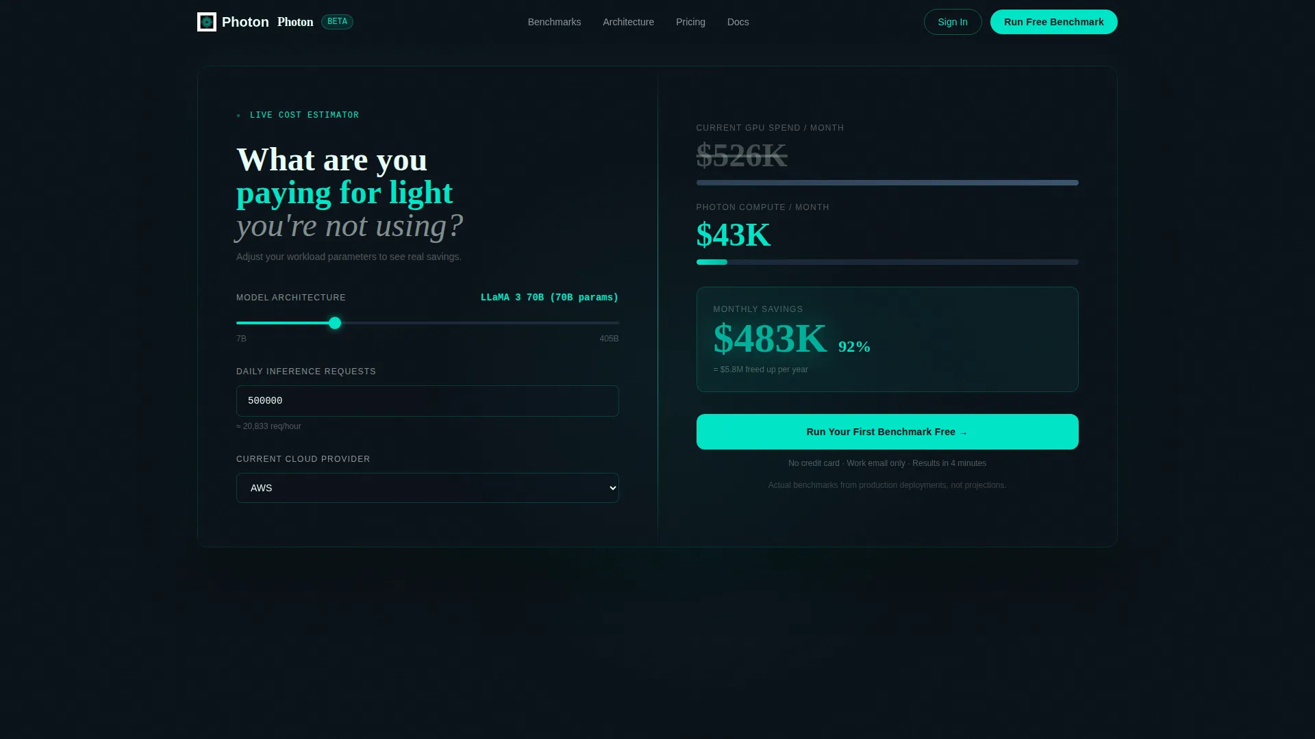
- A live split-screen calculator that renders GPU versus photonic compute cost in real time as visitors adjust inputs
- Six animated benchmark stat sections, each leading with a headline number before the explanation arrives
- Three strategically placed "Run Your First Benchmark Free" calls to action, each with increasing surrounding context
Feature list
This template includes a focused set of purpose-built components. Each one is designed to do a specific job in the visitor's journey from curiosity to signup.
Live Cost Calculator Header
The header occupies the full viewport in a 50/50 split. The left panel holds three inputs: a model parameter slider ranging from 7B to 405B, a daily inference request field, and a cloud provider dropdown covering major platforms. The right panel updates in real time, showing GPU cost versus photonic compute cost with the savings figure animating in electric teal.
Stats-First Scroll Sections
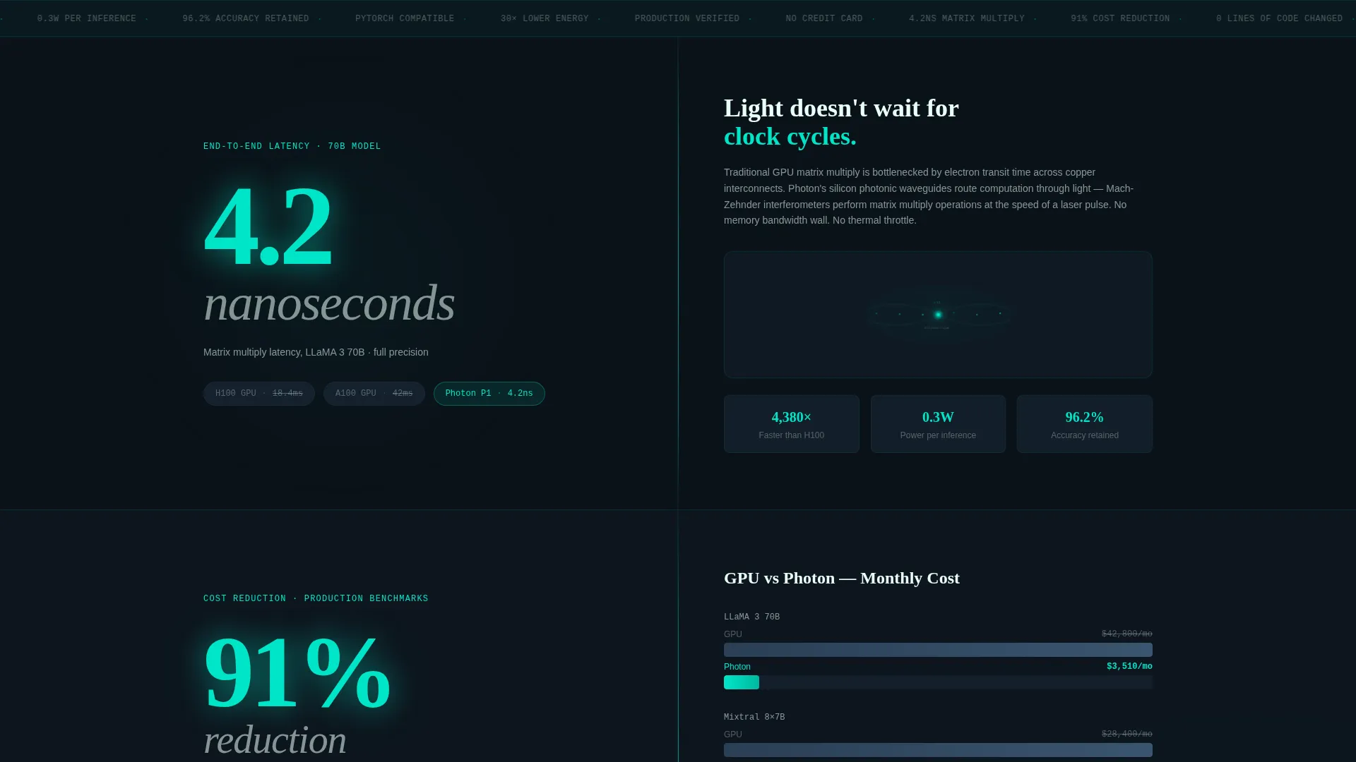
Each scroll section leads with a single oversized number before any explanatory copy appears. The sequence moves from a 4.2-nanosecond matrix multiply latency figure through a 91% cost reduction bar chart to a zero-lines-of-code-changed workflow comparison. The structure is cumulative: every stat makes the next one harder to dismiss.
Animated Cost Comparison Chart
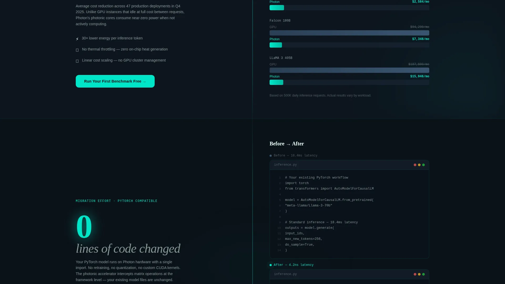
The 91% reduction section includes a live-animated bar chart that visualizes the cost gap between traditional GPU infrastructure and photonic compute. The animation triggers on scroll, so the comparison unfolds in front of the visitor rather than sitting static on the page.
Zero-Code Migration Panel
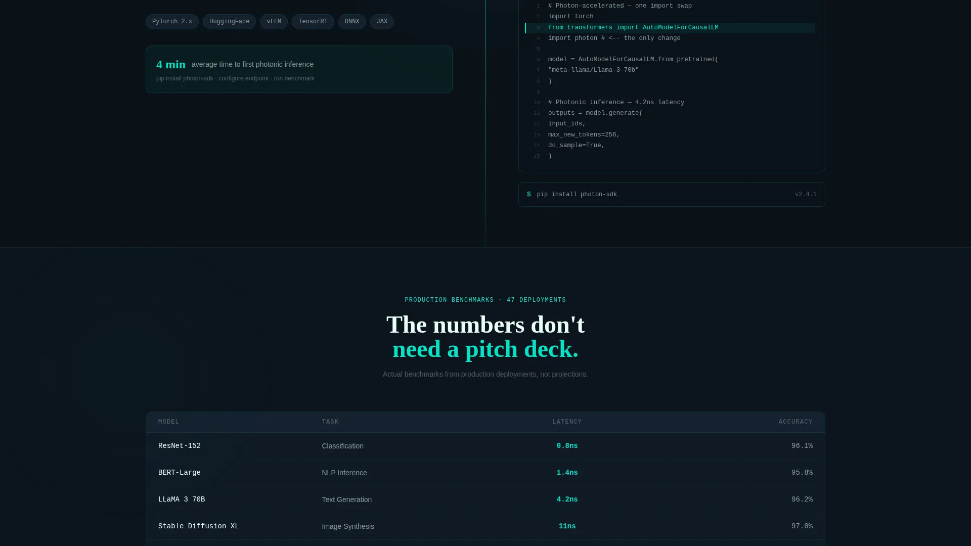
A side-by-side code panel shows a visitor's existing workflow alongside a version with a single import swap. The visual makes the adoption barrier feel negligible, which directly reduces friction at the trial signup step.
Freemium Trial Conversion Flow
The primary call to action asks for a work email only. No credit card, no company size, no sales qualification form. A secondary path, labeled "Compare Your Model," deep-links back to the header calculator pre-filled with common large language model architectures for instant personalized comparison.
Teal Catalyst Visual System
The color system uses deep void black (#0B1219) as the primary background, electric teal (#00E5C7) for all active and animated elements, cold slate (#1C2A3A) for card surfaces, and phosphor white (#E8FFF8) for body typography. The palette creates a high-contrast, clinical interface where every color cue signals a live data point or interactive element.
Page sections overview
| Section | Purpose |
|---|---|
| Calculator Estimator Header | Real-time cost comparison between GPU and photonic compute |
| Latency Stat Panel | Anchors the page with a 4.2-nanosecond matrix multiply benchmark |
| Cost Reduction Section | Animated 91% savings bar chart with live comparison |
| Code Migration Panel | Side-by-side import swap showing zero workflow changes needed |
| Primary Trial call to action (First) | Early signup prompt after the first stat section |
| Primary Trial call to action (Second) | Mid-page signup with benchmark context surrounding it |
| Model Comparison Path | Secondary call to action deep-linking to pre-filled calculator |
| Final Trial call to action | Closing signup prompt after all six benchmarks have animated |
Design & branding system
The Teal Catalyst color system is built to feel like the cross-section of a lit optical fiber: a single luminous core against controlled darkness. Every color choice is functional, not decorative.
- Deep void black (#0B1219) as the primary canvas keeps visual noise at zero and makes data pop
- Electric teal (#00E5C7) pulses across calls to action, savings figures, and animated data points to signal live activity
- Cold slate (#1C2A3A) surfaces card and panel backgrounds, separating content zones without breaking the dark-mode immersion
- Phosphor white (#E8FFF8) typography carries a faint warm glow that reads cleanly at all sizes against the dark background
Mobile & speed optimization
The split-screen layout is designed to reflow naturally on smaller viewports. Both panels stack vertically on mobile so the calculator and results remain fully usable without horizontal scrolling.
- Input fields and the real-time cost readout are sized for touch interaction on mobile screens
- Scroll-triggered animations are scoped to viewport entry so they fire correctly regardless of device speed or scroll behavior
How this template helps you convert
The conversion architecture in this template is deliberate. Every layout decision reduces the distance between a visitor's first impression and their decision to start a free benchmark.
- The header calculator personalizes the value proposition immediately. A visitor who enters their own model size and request volume sees a savings figure tied to their specific workload before they read a single line of marketing copy.
- Six animated benchmark sections build an evidence stack that compounds scroll by scroll. By the time a visitor reaches the final call to action, they have already watched their own numbers and six independent proof points animate in front of them, making the signup feel like confirmation rather than a leap of faith.
Other information about this template
This template is built specifically for the photonic computing technology category and is well-suited to platforms operating at the intersection of silicon photonic hardware and machine learning inference infrastructure.
- The template style is Split Screen (50/50), making it easy to present two parallel data states side by side throughout the page
- The Startup Velocity theme gives the layout forward momentum, with a visual rhythm suited to a Series B or growth-stage company making a bold technical claim
- The Stats-First Impact creative direction is a deliberate choice for this niche: technical buyers respond to evidence before narrative, and the layout reflects that
- The Freemium/Trial landing-page direction means the page is optimized for low-friction entry, with no qualification gates before the first benchmark run
- The Calculator/Estimator header concept is the single most important trust-building element on the page; it turns abstract platform claims into a visitor's own personalized cost projection
Theme
Startup Velocity
Creative direction
Stats-First Impact
Color system
Teal Catalyst
Style
Split Screen (50/50)
Direction
Freemium/Trial
Page Sections
Live Split-screen Cost Calculator
Stats-first Scroll Architecture
Animated Cost Comparison Chart
Zero-code Migration Side-by-side
Low-friction Freemium Trial Flow
Teal Catalyst Color System
Related questions
What kind of product is this template designed for?
Can I adapt the calculator inputs for a different model range or cloud provider list?
Does the trial signup require payment details from the visitor?
Who is the ideal visitor this template is designed to reach?
How does the 'Compare Your Model' secondary path work?



