Stream Processing Technology Cost Calculator Website Template
Pipeline is a Bold Brutalist landing page template built for a stream processing managed service. It combines a live dashboard header, a seven-row competitor comparison table, a 12-month cost simulation chart, and an inline savings calculator. The design uses a Monochrome Steel palette with signal green calls to action to push platform engineers and data leaders toward a clear conversion path.
by Rocket studio
Quick summary
Pipeline is a single-page, lead generation landing page template designed for a stream processing managed service. It opens with a full-viewport dashboard screenshot, then walks technically minded visitors through benchmark data, cost projections, and anonymized case studies before asking for their contact details. The page earns trust by showing hard numbers first.
Who this template is for
This template is built for teams marketing a managed stream processing service to a technical buyer audience. If your product handles real-time event ingestion at scale, this layout speaks directly to the people who feel that pain every day.
- Platform engineers who manage Kafka clusters and want a faster path to reliability
- Data team leads who have lost sprint cycles to backfill jobs and data pipeline failures
- CTOs reviewing a large infrastructure bill and looking for a defensible cost reduction
What problem this template solves
Technical buyers distrust marketing pages that lead with emotion and bury the evidence. This template flips that sequence. It presents raw benchmark data, cost comparisons, and case study metrics before it ever asks for an email address.
- Visitors leave competing pages because they cannot find the numbers they need to make a case internally
- Generic SaaS landing page layouts do not reflect the precision that infrastructure buyers expect
- A disorganized page structure forces engineers to hunt for information, reducing the chance they convert
What you get with this template
You get a fully structured, single-page layout built around evidence-led selling for a stream processing managed service. Every section has a defined job, from the dashboard header down to the sticky calculator bar.
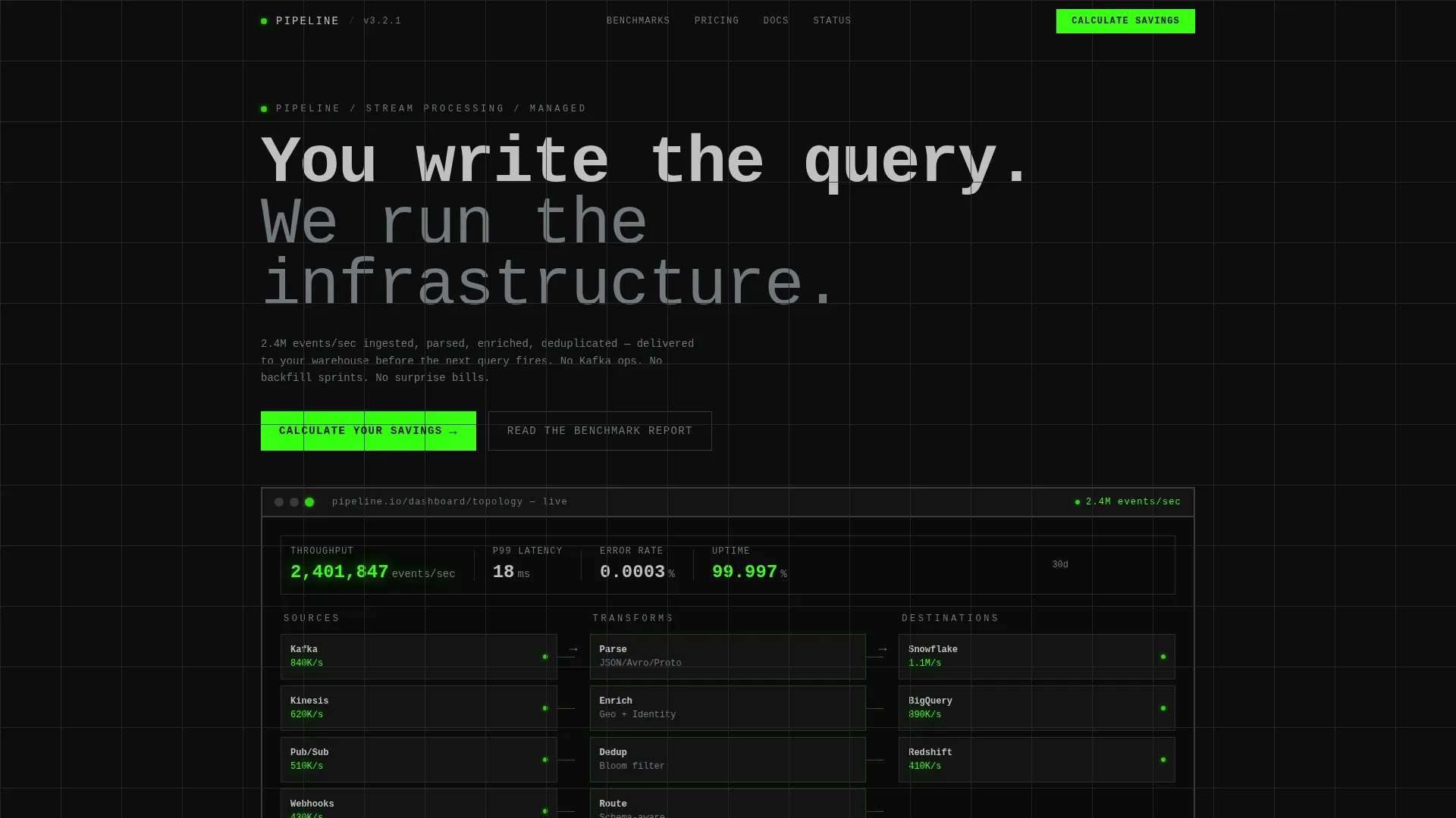
- A full-viewport product screenshot header showing a live topology view with throughput and latency indicators
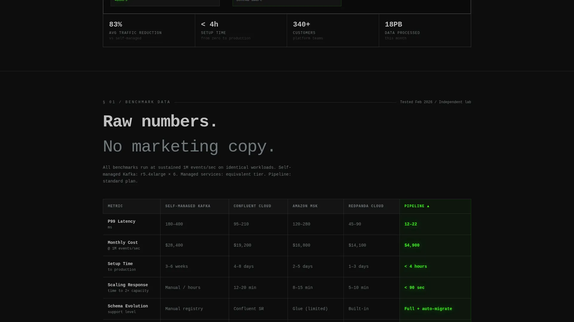
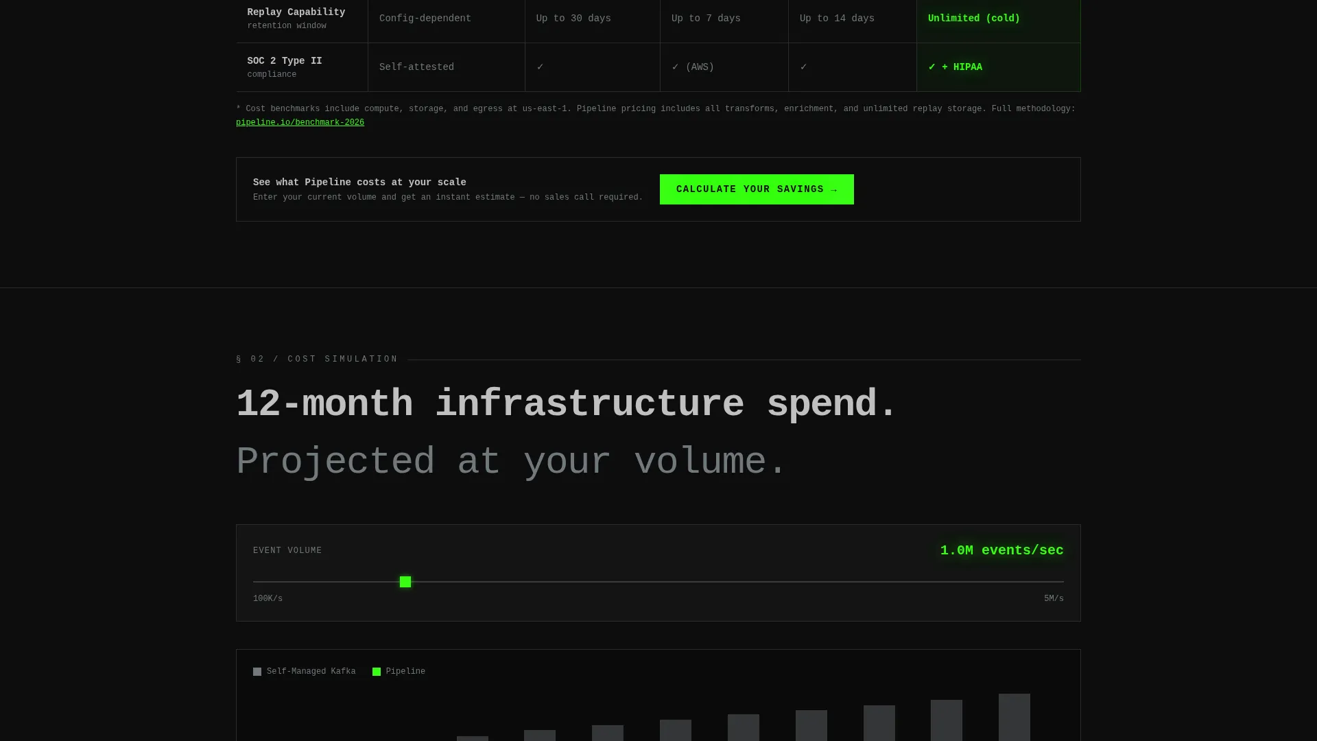
- A seven-row comparison table covering latency, cost, setup time, scaling, schema evolution, replay capability, and compliance status
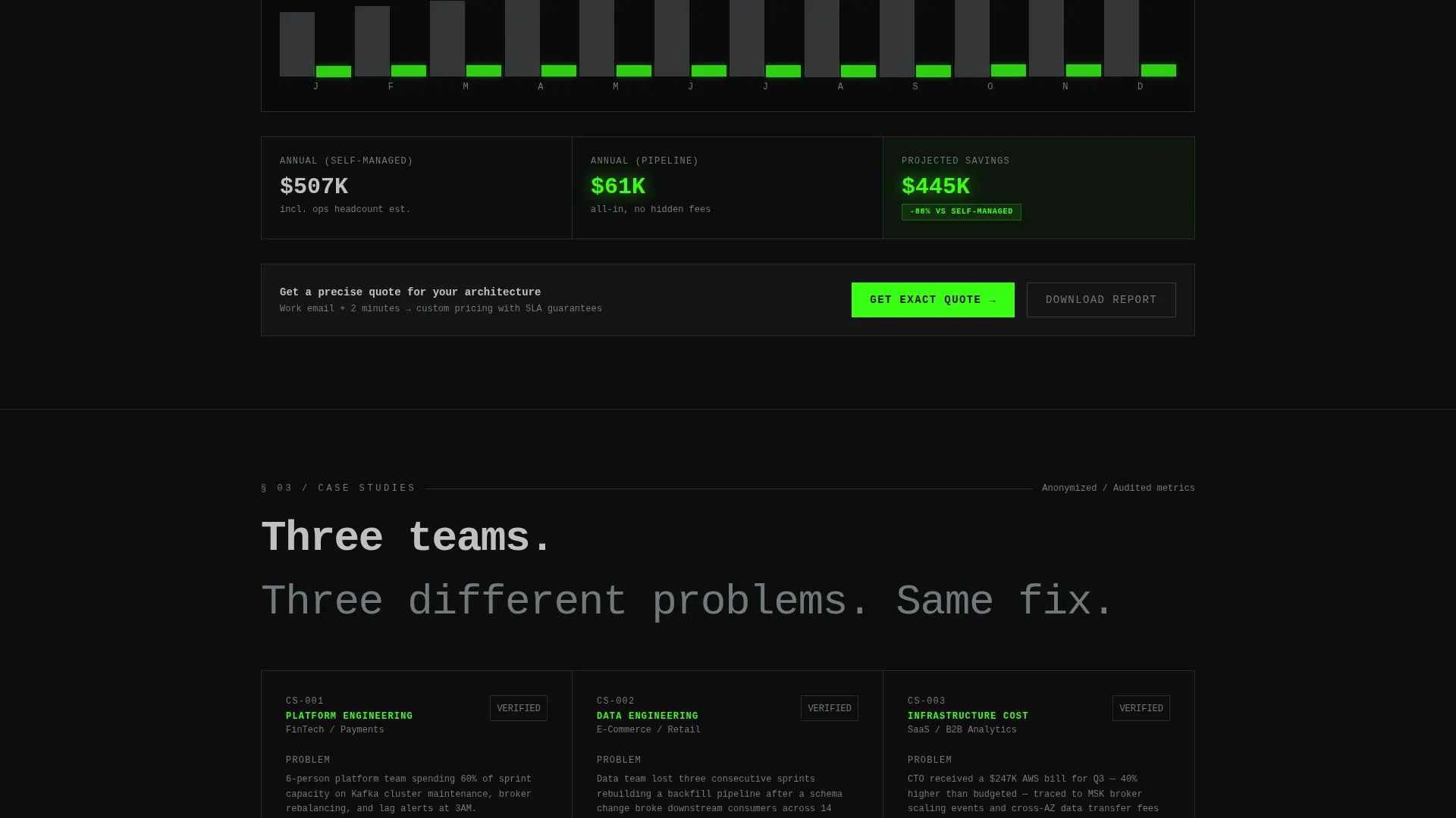
- A 12-month cost simulation chart, three anonymized case study data cards, and a dual-path lead capture system
Feature list
This template's components are drawn directly from the source brief. Each section has a specific role in the conversion sequence.
Full-Viewport Dashboard Header
The header fills the entire screen with a real dashboard capture. It shows source connectors, transformation nodes, and sink destinations in a live topology layout. Throughput numbers glow in signal green beside each node, and latency sparklines sit below. A brutalist browser chrome frame with thick borders and monospaced window title text holds everything together. One bold headline sits beneath: "You write the query. We run the infrastructure."
Seven-Row Competitor Comparison Table
The comparison table runs self-managed infrastructure against three competing managed services and the featured service across seven measurable rows. Those rows cover p99 latency, monthly cost at one million events per second, setup time, scaling response, schema evolution support, replay capability, and compliance status. Numbers are set large in monospaced steel type. The featured service column uses signal green text to make differentiation immediately visible.
12-Month Cost Simulation Chart
This section visualizes infrastructure spend over a full year. The self-managed cost curve climbs steeply while the managed service line stays flat. The contrast makes the financial argument without requiring a paragraph of explanation. It is the most persuasive section for budget-conscious CTOs.
Anonymized Case Study Data Cards
Three data cards present before-and-after performance metrics from real-world deployments. Percentage improvements appear inside brutalist pill badges. The anonymized format keeps the data credible while protecting client identities. Each card reads like a condensed technical report, not a testimonial.
Inline Savings Calculator
The primary call to action, "Calculate Your Savings," opens an inline form directly on the page. Visitors input their current event volume via a slider, number of sources, destination type via multi-select, and a work email. Submitting the form returns an instant cost estimate before routing to a sales conversation.
Gated Benchmark Report Download
A secondary conversion path, "Read the Benchmark Report," captures top-of-funnel engineers who are not ready to speak to sales. It requires only an email address in exchange for a downloadable PDF. This path widens the funnel without distracting from the primary calculator call to action.
Page sections overview
| Section | Purpose |
|---|---|
| Full-viewport header | Establish product credibility with a live dashboard screenshot and a single confident headline |
| Comparison table | Show measurable differentiation across seven rows against competing services |
| Cost simulation chart | Visualize 12-month spend divergence between self-managed and managed service paths |
| Case study cards | Provide anonymized before-and-after proof with percentage improvement badges |
| Inline calculator form | Capture qualified leads through a personalized cost estimate flow |
| Sticky bottom bar | Re-surface the primary call to action after 60 percent scroll depth for returning attention |
| Gated report section | Convert top-of-funnel engineers with an email-only benchmark PDF download |
Design & branding system
The visual identity follows a Bold Brutalist theme built on a Monochrome Steel color system. The palette is deliberately industrial: no gradients, no rounded softness, no decorative motion.
- Core colors are slab black (#0D0D0D) for backgrounds, mill-finish steel (#71797E) for body text, cold-rolled silver (#C0C0C0) for headers, and signal green (#39FF14) reserved strictly for active-state indicators and primary call-to-action elements
- Typography is monospaced throughout, reinforcing the terminal aesthetic; benchmark numbers are typeset large to function as visual anchors
- Layout is built on a visible structural grid with generous gutters that feel load-bearing rather than decorative, with no animations or parallax effects
Mobile & speed optimization
The layout is designed for clarity at any viewport width. The Bold Brutalist grid system scales down without losing its structural logic.
- The comparison table is built to reflow cleanly on smaller screens so benchmark data remains readable without horizontal scrolling
- The sticky bottom bar with the primary call to action remains anchored and visible on mobile viewports after the 60 percent scroll threshold
- The inline calculator form uses a slider and multi-select inputs that are touch-friendly and easy to complete on a phone
How this template helps you convert
This template is built around a specific conversion logic: show evidence first, ask for information second. Every layout decision supports that sequence.
- The comparison table and cost chart give visitors the data they need to build an internal business case before they ever see a form field, which reduces resistance at the moment of conversion
- The dual-path call to action system captures both sales-ready leads through the savings calculator and research-phase engineers through the gated benchmark report, widening the total addressable funnel without adding friction to either path
Other information about this template
This template is part of a broader category of high-specificity landing page templates built for technical product marketing. A few additional details are worth noting for teams evaluating it.
- The template style is a Comparison Table layout, making it well suited for any stream processing managed service that competes directly with self-managed infrastructure like Apache Kafka
- The creative direction follows an Industry Report format, meaning the page reads more like a technical whitepaper than a traditional SaaS marketing page
- The header concept is a Product Screenshot rather than an illustration or abstract hero, which signals product maturity and real-world deployment to skeptical engineering audiences
- The lead generation direction is reinforced by two distinct capture mechanisms: a high-intent calculator and a low-friction gated report, giving sales teams both warm and cold leads from the same page
Theme
Bold Brutalist
Creative direction
Industry Report
Color system
Monochrome Steel
Style
Comparison Table
Direction
Lead Generation
Page Sections
Full-viewport Dashboard Header
Seven-row Competitor Comparison Table
Month Cost Simulation Chart
Anonymized Case Study Data Cards
Inline Savings Calculator with Dual-path Ctas
Sticky Bottom Bar Call to Action
Related questions
Who is this template designed for?
Can I customize the comparison table rows and competitor columns?
How does the inline savings calculator work?
Can I replace the gated benchmark report with a different lead magnet?
Does the Bold Brutalist design work for a dark-mode brand identity?



