Healthcare Email Marketing Cost Calculator Website Template
Followup is a Bold Brutalist healthcare landing page template built for post-visit email platforms. It features a live revenue-recovery calculator, a confrontational feature matrix, and a click-through funnel flow. The split-screen layout uses Midnight Blue and signal cyan to make the cost of patient no-shows impossible to ignore, driving visitors toward a free trial signup.
by Rocket studio
Quick summary
Followup is a single-page, split-screen landing page template designed for healthcare follow-up email platforms. It opens with a working revenue calculator and scrolls through a brutalist feature matrix that exposes the real cost of manual patient outreach. The page pushes visitors through a click-through funnel toward a free trial, carrying their estimator results forward so the signup feels personal.
Who this template is for
This template was built for teams selling or launching automated patient follow-up tools. It speaks directly to decision-makers who understand that missed appointments mean lost revenue, not just inconvenience.
- Office managers at multi-provider practices buried in manual outreach tasks
- Telehealth startups scaling faster than their administrative staff can keep up
- Specialty clinics where a single lapsed follow-up can cost thousands in lost procedure revenue
What problem this template solves
Healthcare practices lose predictable revenue every week because follow-up communication falls through the gaps. Staff send reminders manually, patients miss care instructions, and no-shows pile up without a clear picture of the financial damage. This template makes that damage visible and frames the solution as the obvious fix.
- No structured way to show prospects the real dollar cost of their current no-show rate
- Generic landing pages that describe features without confronting the inefficiency directly
- Funnels that ask visitors to commit before they feel the value of what they are signing up for
What you get with this template
You get a fully structured landing page built around a single, high-conviction funnel flow. Every section is designed to move a skeptical buyer from "how bad is the problem" to "I need to claim this now."
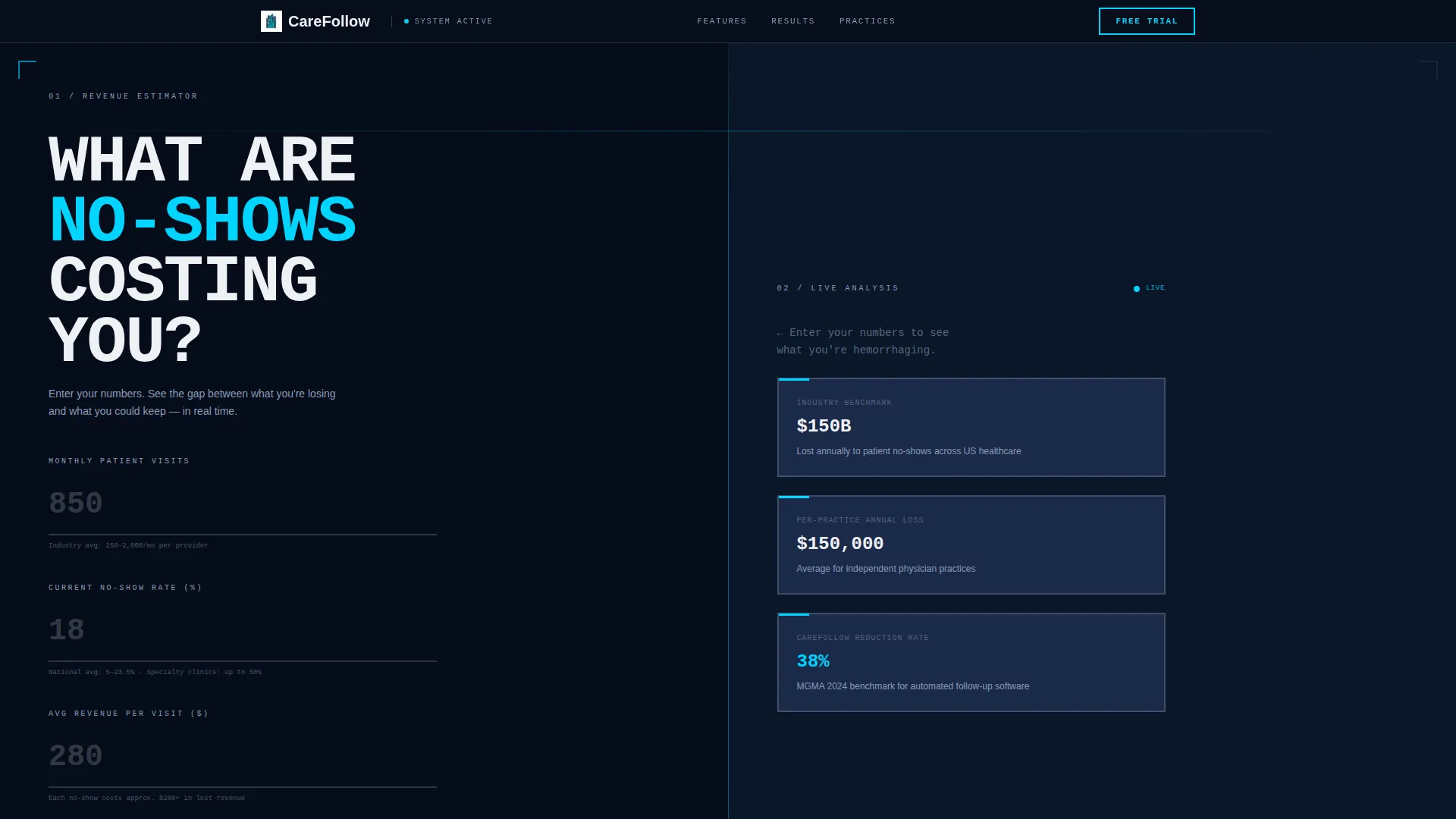
- A live calculator header with input fields for monthly patients, no-show rate, and average revenue per visit
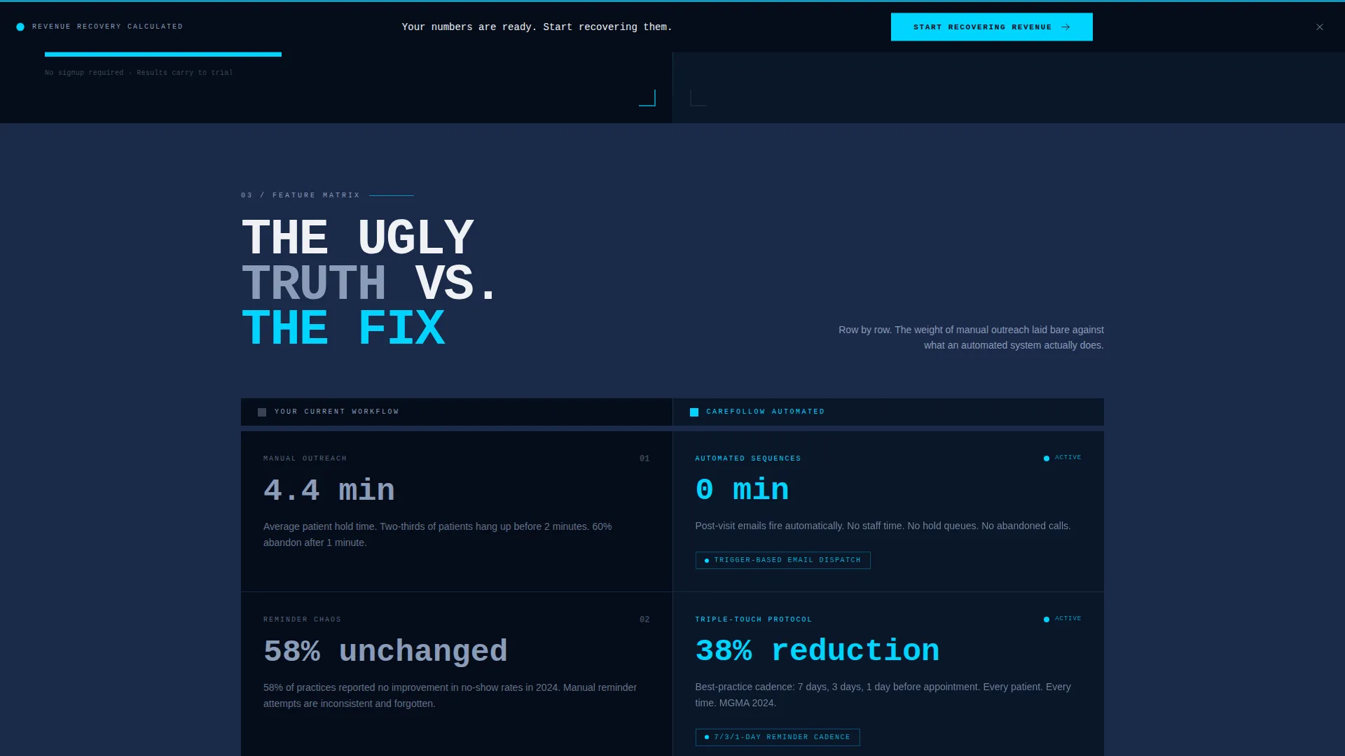
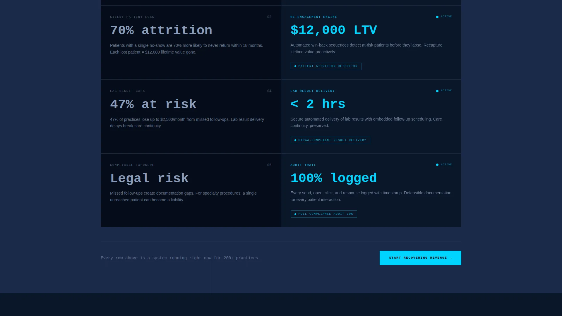
- A scrollable feature matrix comparing manual workflow pain against automated platform responses
- A persistent bottom call-to-action bar that appears after the visitor engages the calculator
Feature list
This template delivers a focused set of purpose-built components. Each one serves the funnel and nothing else.
Live Revenue Recovery Calculator
The header splits the screen 50/50. The left panel holds bold input fields for monthly patient volume, current no-show rate, and average revenue per visit. The right panel renders recovered appointments per month, projected annual revenue saved, and a pulsing cyan dollar figure in real time against a deep navy background.
Confrontational Feature Matrix
On scroll, each section divides into a raw grid. The left column displays the visitor's current manual workflow in plain monospace type, including wasted staff hours and missed emails. The right column answers each pain point with a brutalist card, a thick border, a cyan status indicator, and one defining metric.
Click-Through Funnel Flow
There is no form on this page. The primary call-to-action reads "Calculate Your Recovery" inside the estimator. A persistent bottom bar reading "Start Recovering Revenue" appears after the visitor engages the calculator. The estimator results carry forward to the signup page so the click feels like claiming something already built for them.
Personalized Summary Handoff
The calculator generates a personalized summary based on the visitor's own numbers. That summary travels to the next page, giving the signup step immediate context and reducing the friction that comes from starting over on a blank form.
Bold Brutalist Visual System
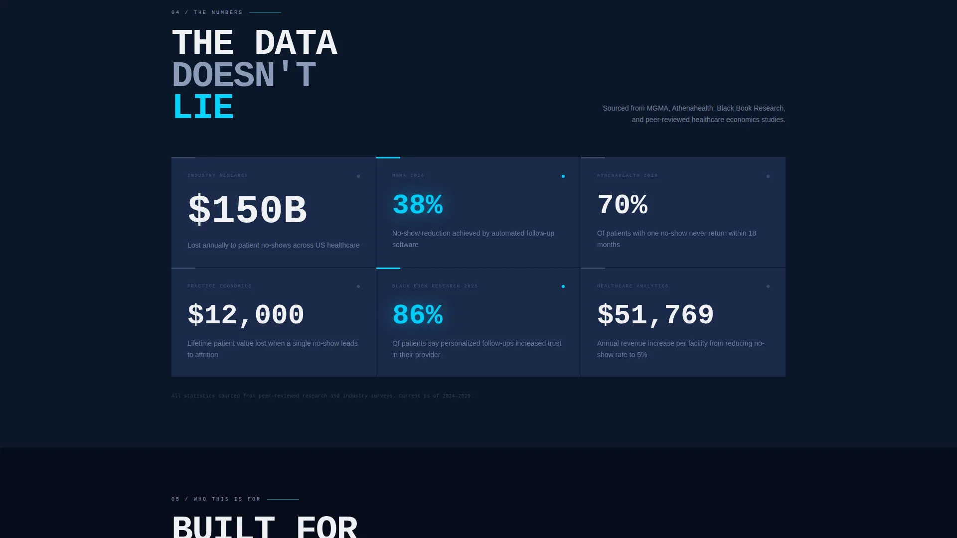
The layout uses full-bleed background slabs, raw monospace type stacks, and thick-bordered cards. Signal cyan burns on every interactive element and data point. The visual language is entirely functional, designed to hold attention through contrast rather than decoration.
Page sections overview
| Section | Purpose |
|---|---|
| Calculator Header | Expose the revenue gap using the visitor's own numbers |
| Feature Matrix Grid | Confront manual workflow costs row by row |
| Persistent call to action Bar | Keep the signup action visible after calculator engagement |
Design & branding system
The visual identity is Bold Brutalist, built entirely on a Midnight Blue color system. Every design decision prioritizes function and contrast over comfort or decoration.
- Deep terminal navy (#0A1628) anchors full-bleed background slabs; clinical steel blue (#1B2A4A) alternates on content panels; stark white (#F0F1F5) drives typography contrast
- Signal cyan (#00D4FF) marks every interactive element, data point, and status indicator, functioning like a vitals monitor blip that pulls the eye exactly where it needs to go
- Concrete-weight monospace type sits raw and unadorned, reinforcing the brutalist identity without relying on photography, illustration, or decorative elements
Mobile & speed optimization
The split-screen layout is structured to adapt across screen sizes without losing the visual impact of the calculator or the feature matrix. The template keeps layout logic clean and load-friendly by design.
- The 50/50 split-screen panels stack vertically on smaller screens, preserving the calculator input and result hierarchy
- No stock photography, no image-heavy hero sections, and no decorative assets that add weight without purpose
- The persistent bottom call-to-action bar remains accessible on mobile, keeping the funnel action within thumb reach at all times
How this template helps you convert
This template is engineered as a click-through funnel. Every section removes a reason to delay and adds a reason to act.
- The calculator forces the visitor to self-qualify by entering their own numbers, making the revenue loss concrete and personal before any feature is presented.
- The feature matrix builds cumulative pressure through scroll, turning the weight of manual inefficiency into a felt experience rather than a stated claim.
- The personalized summary handoff means the call-to-action click carries the visitor's own data forward, so the signup page feels like the logical next step rather than a cold start.
Other information about this template
This template is part of the Healthcare Email Templates subcategory under the Technology category. It is purpose-built for the healthcare follow-up email niche and scored a strong intersection match across theme, creative direction, color system, template style, and funnel direction.
- The template style is Split Screen (50/50), the theme is Bold Brutalist, and the header concept is a Calculator/Estimator
- The landing page direction is Click-Through, meaning the page's sole job is to drive a qualified click to a free trial signup page
- This template does not include a contact form, embedded video, or multi-page navigation; it is a single focused funnel page
Theme
Bold Brutalist
Creative direction
Feature Matrix
Color system
Midnight Blue
Style
Split Screen (50/50)
Direction
Click-Through
Page Sections
Live Revenue Recovery Calculator
Confrontational Feature Matrix
Click-through Funnel Design
Personalized Summary Handoff
Persistent Bottom Call to Action Bar
Bold Brutalist Visual System
Related questions
Does this template include a signup form?
Can I edit the calculator inputs to match my platform's metrics?
Who is the intended buyer for this template?
Does the template use any stock photography or medical imagery?
Is this a single-page template or a multi-page website?



