Restaurant Follow-Up Email Landing Page Template
Followup is a modular landing page template built for restaurant follow-up email platforms. It pairs a live-feeling interactive email dashboard with a card grid layout that lets visitors explore campaigns, integrations, and real results at their own pace. The design uses a Data Command visual theme to signal precision and urgency, while a freemium signup flow removes friction from the first conversion step.
by Rocket studio
Quick summary
Followup is a single-page landing page template designed for restaurant follow-up email platforms. It opens with a simulated campaign dashboard, flows through an interactive card grid, and closes with a low-friction freemium signup. Every section is built to let visitors explore the product before they commit.
Who this template is for
This template is built for restaurant-focused software products that use behavioral email to bring diners back. It speaks directly to the operators and marketers who manage those campaigns day to day.
- Independent restaurant owners who check performance on their phone between service shifts
- Multi-unit general managers reviewing open rates and campaign results across locations
- Marketing managers at fast-casual chains who need to prove that win-back campaigns moved real covers
What problem this template solves
Most email platform landing pages describe features in static bullet points. Visitors read, skim, and leave without ever feeling what the product does. This template solves that by making the page itself behave like the product.
- Visitors interact with live-looking campaign data before they ever read a feature description
- The card grid lets each visitor pull toward the section that matches their operation, rather than reading in a forced sequence
- The freemium flow removes the credit card barrier, lowering the cost of a first commitment
What you get with this template
You get a fully designed, single-page modular layout built around an interactive explorer creative direction. Every section is self-contained and purposeful.
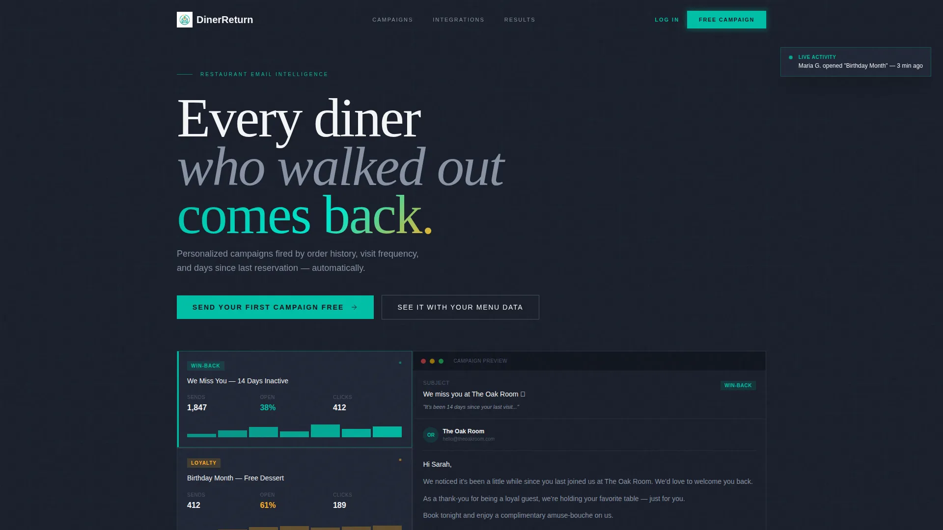
- A full-viewport interactive email dashboard header showing animated campaign metrics and a slide-out email preview
- Three card grid rows covering campaign types, point-of-sale integrations, and anonymized result metrics
- A persistent mobile bottom bar and contextual in-grid calls to action pointing to the freemium signup form
Feature list
This template ships with a specific set of designed components. Each one is grounded in the brief and serves a clear role in the page.
Live Campaign Dashboard Header
The header renders a simulated restaurant campaign grid at full viewport width. Cards show metrics like open rates and send counts. Hovering a card animates the numbers, and clicking a campaign type slides the actual email preview in from the right. A small toast notification fires periodically to reinforce real-time activity.
Flippable Campaign Type Cards
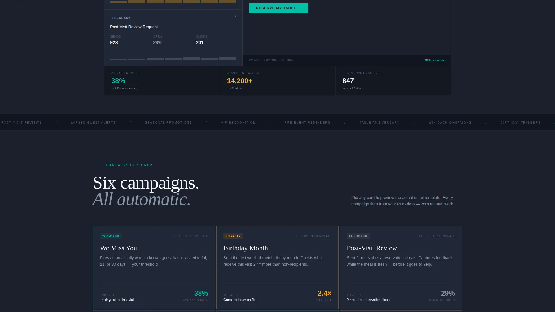
The first card grid row shows campaign types that visitors can physically flip. The front shows the campaign name and a key metric. The back reveals the actual email template layout. This mechanic turns passive reading into active discovery.
Integration Card Row
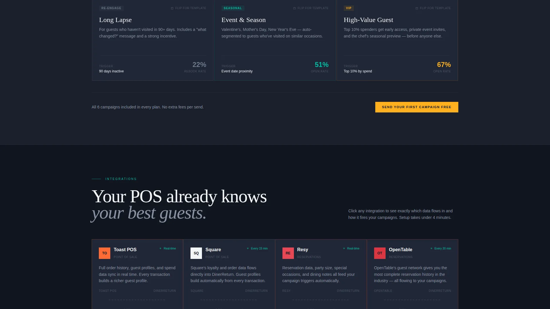
The second row presents point-of-sale integration cards. Each card is clickable and opens a view showing how guest data flows from that system into the email platform. This section answers the "does it work with my setup?" question without requiring a sales call.
Sortable Results Card Row
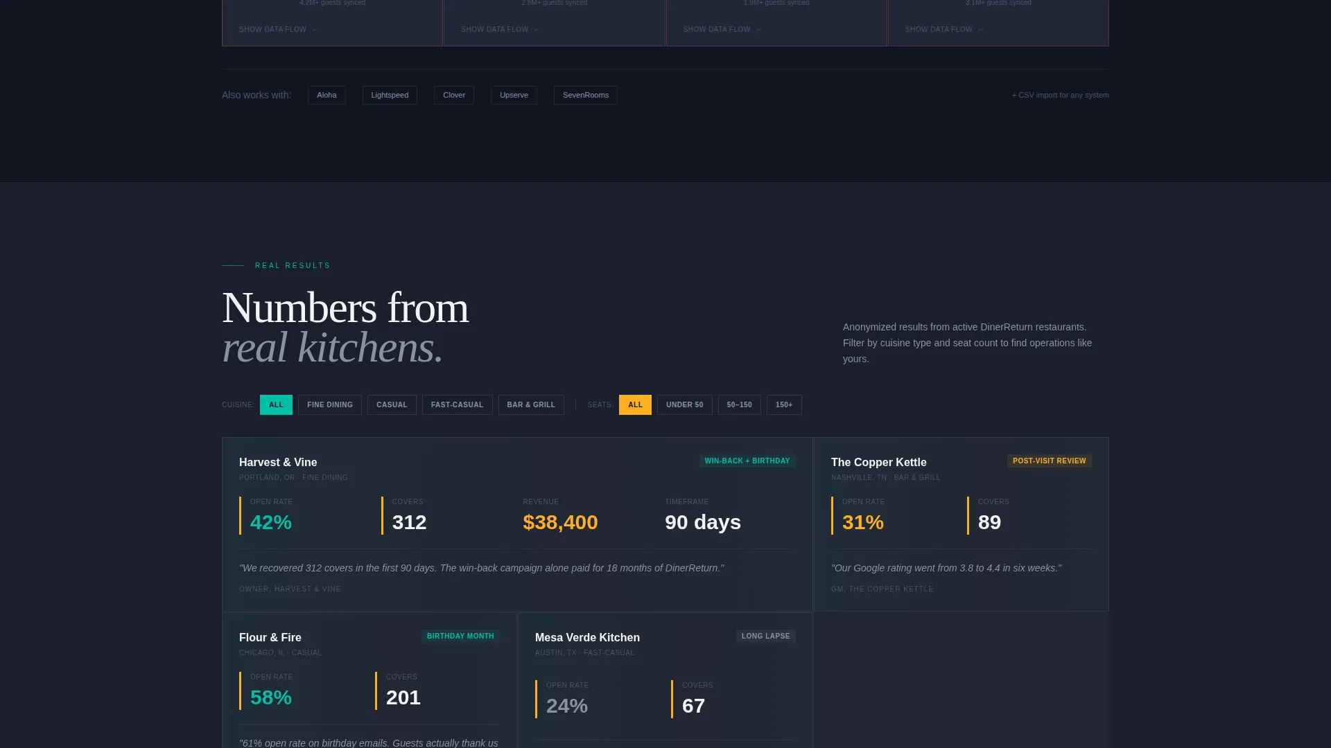
The third row shows real metrics from anonymized restaurants. Visitors can sort cards by cuisine type and seat count to find results that match their own operation. This makes social proof feel relevant rather than generic.
Freemium Signup Form
The signup form asks for three fields only: restaurant name, point-of-sale system, and email address. No credit card is required. A secondary call to action offers a guided demo booking through a calendar embed for visitors who want a deeper look first.
Persistent Mobile Call-to-Action Bar
On mobile, a fixed bottom bar carries the primary call to action throughout the entire scroll. Contextual nudges inside each card cluster repeat the same message at natural decision points, so the offer is always one tap away.
Page sections overview
| Section | Purpose |
|---|---|
| Interactive Dashboard Header | Opens with a live-feeling campaign grid; animates metrics and shows email previews on click |
| Campaign Type Cards | Lets visitors flip cards to reveal email templates behind each campaign type |
| Integration Cards Row | Shows how guest data flows in from point-of-sale systems via clickable integration cards |
| Results Metrics Cards | Displays anonymized restaurant results, sortable by cuisine and seat count |
| Freemium Signup Form | Captures restaurant name, point-of-sale system, and email in three fields, no credit card |
| Demo Booking Path | Secondary conversion path with a calendar embed for guided demo scheduling |
Design & branding system
The visual identity follows a Data Command theme. It is built to feel like a point-of-sale screen glowing in a dimly lit dining room: precise, always-on, and quietly urgent.
- Deep charcoal (#1A1F2B) as the primary background, electric teal (#00BFA6) for active data points and hover states, and warm plate-white (#F4F5F7) for card surfaces
- Seared amber (#FFB020) is reserved strictly for conversion triggers and metric highlights, giving calls to action a distinct visual weight
- The overall palette keeps contrast high between data elements and background, making the card grid easy to scan at a glance
Mobile & speed optimization
The template is designed with mobile restaurant operators in mind. Independent owners and general managers check performance on a phone, often between service moments, so the mobile experience must match the desktop experience in clarity.
- The persistent bottom bar keeps the primary call to action visible throughout the entire mobile scroll without interrupting the content flow
- Card grid sections are modular and stack cleanly on smaller screens, preserving the flip and click interactions in a touch-friendly format
How this template helps you convert
The conversion strategy is built on letting visitors feel the product before they read about it. Every design decision reduces the distance between first impression and first signup.
- The interactive header gives visitors a hands-on preview of the platform the moment the page loads, creating product familiarity before any copy is read
- The three-field freemium form with no credit card requirement removes the single biggest barrier to a first signup, making the ask feel proportional to the commitment
- Contextual calls to action inside every card cluster catch visitors at peak interest moments rather than waiting for them to scroll to the bottom
Other information about this template
This template is designed for a specific niche at the intersection of restaurant technology and behavioral email marketing. A few additional details are worth noting for anyone evaluating it for their platform.
- The template style is a card grid modular layout, meaning individual sections can be adapted or reordered without breaking the overall design logic
- The creative direction is built around an interactive explorer model, which means the page rewards curiosity rather than demanding linear reading
- The header concept is an interactive preview, not a static screenshot or video embed, which sets a higher expectation for the page's technical implementation
- This template suits platforms that send triggered emails based on behavioral signals such as order history, visit frequency, and days since last reservation
- The secondary demo booking path with a calendar embed provides a meaningful conversion route for visitors who are not yet ready for a self-serve signup
Theme
Data Command
Creative direction
Interactive Explorer
Color system
Teal Catalyst
Style
Card Grid (Modular)
Direction
Freemium/Trial
Page Sections
Interactive Campaign Dashboard Header
Flippable Campaign Type Card Grid
Clickable Integration Cards
Sortable Restaurant Results Cards
Three-field Freemium Signup Form
Persistent Mobile Call-to-action Bar
Related questions
What type of businesses will this landing page template work best for?
Does the template include a working email preview or is it a design mockup?
How many fields does the signup form include?
Can visitors book a demo directly from this landing page?
Is the card grid layout flexible enough to highlight different campaign types?



