Forage - Discoverable Fooddirectory Landing Page Template
Forage is a card grid landing page template built for food and beverage directory sites. It combines a product screenshot header, a draggable comparison slider, and a live filter sandbox to let visitors explore listings before committing. The dark iridescent visual identity and coral call-to-action accents make the page feel as alive as the city it maps.
by Rocket studio
Quick summary
Forage is a single-page directory landing page template designed for food and beverage discovery platforms. It guides visitors from a rich product screenshot through hands-on filtering and comparison tools, building confidence before any sign-up is required. The modular card grid layout and iridescent color palette give the page a distinctive, urban energy that matches the audiences it serves.
Who this template is for
This template is built for anyone launching or promoting a searchable food and beverage directory. It suits both the platform builder and the end user in equal measure.
- Directory founders and product teams who want to showcase a city-wide food discovery tool to early adopters
- Food bloggers and local city guide creators building curated, filterable listing hubs for their audiences
- Restaurant owners and small food business operators looking for a platform that lets them list their spot without friction
What problem this template solves
Most food discovery pages dump visitors into a wall of links with no sense of how the tool actually works. Visitors bounce before they ever experience the value. Forage solves this by putting the product experience directly inside the landing page.
- Visitors see a realistic mid-search screenshot before scrolling a single pixel, so the product speaks for itself immediately
- The comparison slider and filter sandbox let visitors interact with real-feeling data, removing doubt before the call to action appears
- The two-path conversion design serves both hungry explorers and restaurant owners without making either group feel like an afterthought
What you get with this template
Forage delivers a fully structured, section-led landing page with a clear visual hierarchy and interactive demonstration zones built in. Every section has a defined job, and the flow escalates from passive to active to converted.
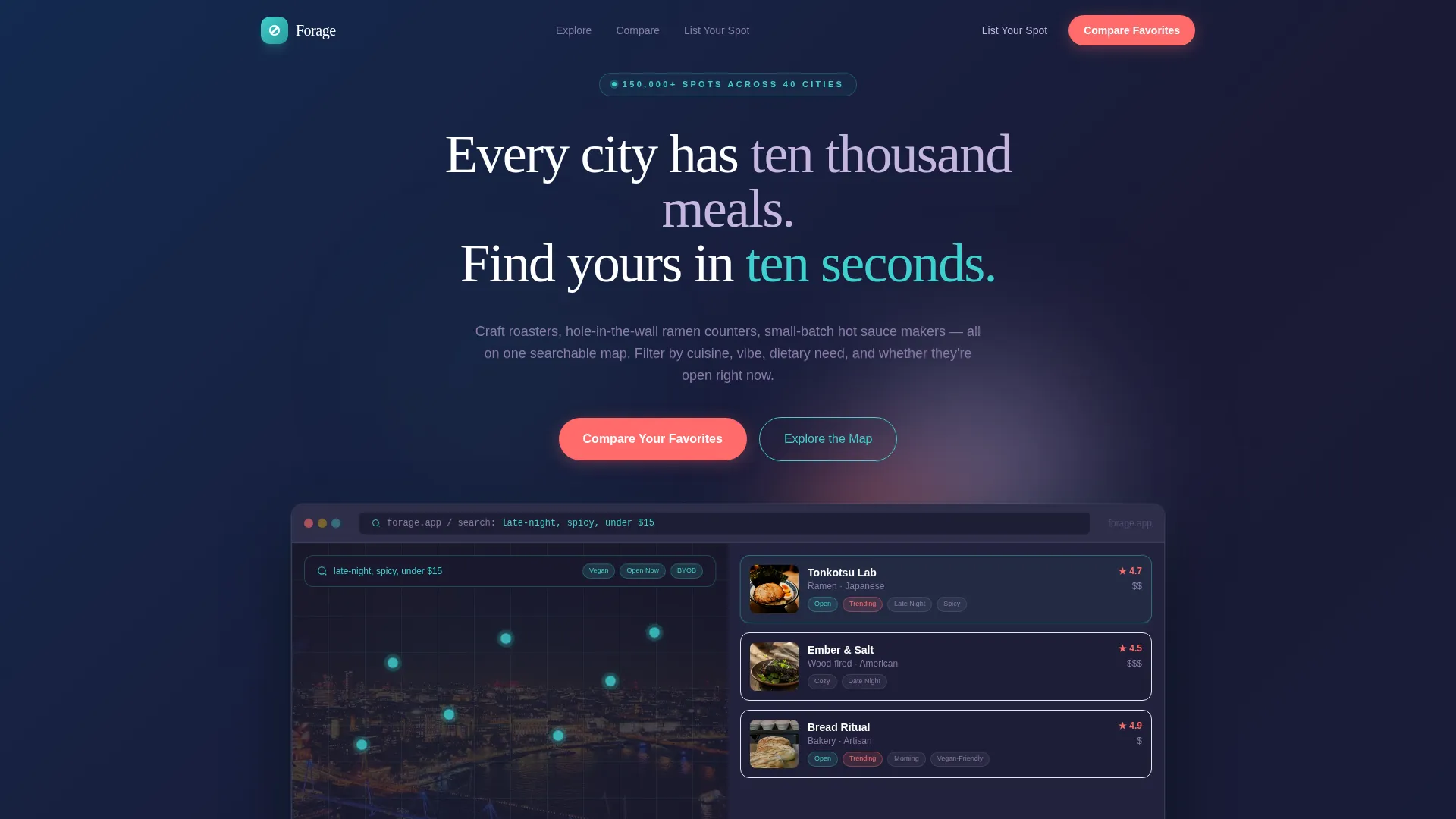
- A browser-framed product screenshot header showing a live map view, expanded listing card, and a filled search bar that communicates filter depth instantly
- A modular card grid with hover states, holographic border effects, and coral-accented rating badges and trending tags
- A sticky bottom call-to-action bar, a draggable comparison slider section, and a live filter pill sandbox that reshuffles cards with micro-animations
Feature list
This section covers the core built-in capabilities that define how Forage works as a landing page template.
Browser-Framed Product Screenshot Header
The header presents a pixel-perfect, browser-framed capture of the directory interface mid-search. The map shows glowing teal pins on the left, a cascade of listing cards on the right, and one expanded ramen shop card with hours and a coral 4.7-star badge. The search bar reads "late-night, spicy, under $15" to demonstrate filter depth at first glance.
Draggable Comparison Slider
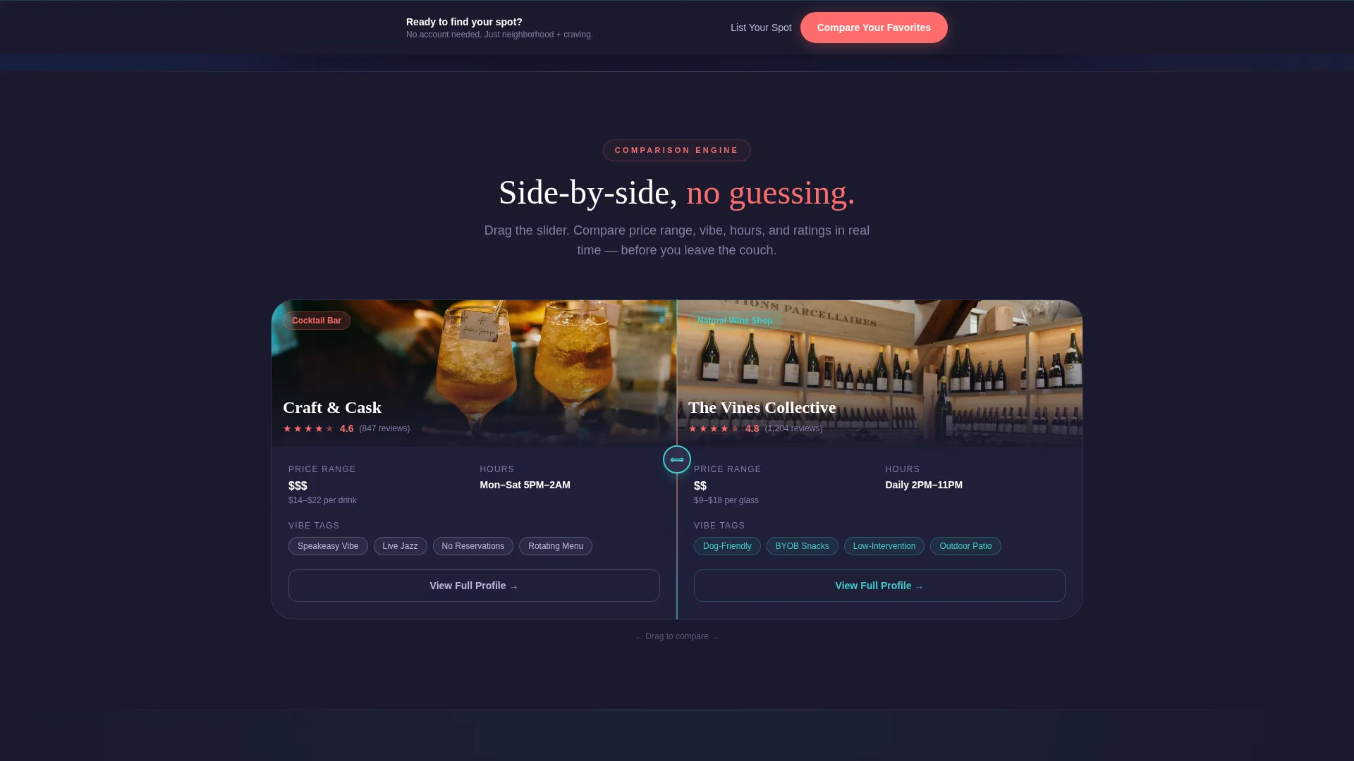
Section two places two listing cards side by side. A draggable slider reveals price range, vibe tags, hours, and user ratings for a craft cocktail bar versus a natural wine shop. This proves the comparison engine to visitors in real time, without requiring an account or any data entry.
Live Filter Pill Sandbox
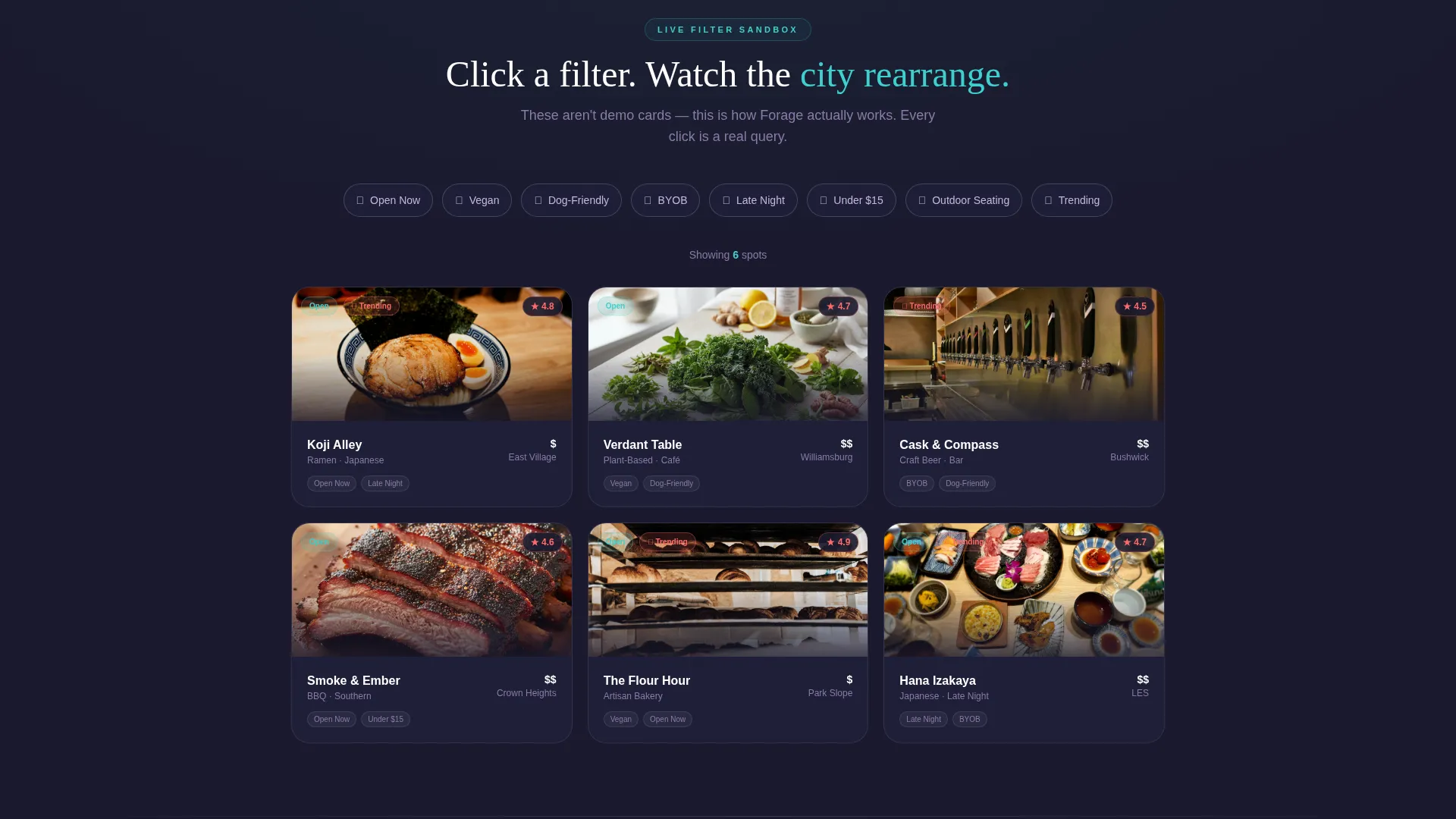
A row of clickable filter pills sits above a mini card grid. Pills include options such as vegan, open now, dog-friendly, and BYOB. Each click triggers a micro-animation of cards flipping and re-sorting, giving visitors a tactile sense of how the directory filters actually behave.
Modular Card Grid Layout
All listing cards share a consistent modular structure. Each card carries a faint holographic border on hover, coral rating badges, and "trending" tag accents. The grid is easy to scan and designed to create the pleasurable tension of too many good options before a filter resolves the choice.
Dual-Path Conversion Design
The page serves two distinct visitor types without confusion. The primary call to action reads "Compare Your Favorites" and leads to a two-field entry form asking for neighborhood or zip code and cuisine type, with no account creation required. A secondary path reads "List Your Spot" in lilac-silver for restaurant owners scanning the page.
Sticky Bottom Call-to-Action Bar
After the comparison slider section, a sticky bottom bar appears and persists through the rest of the scroll. It carries the primary "Compare Your Favorites" call to action and ensures the conversion prompt stays visible without interrupting the interactive sections above it.
Page sections overview
| Section | Purpose |
|---|---|
| Product Screenshot Header | Shows the directory interface mid-search to communicate tool depth instantly |
| Headline Fade-In | Delivers the core value statement directly below the screenshot |
| Comparison Slider Section | Lets visitors drag between two listings to experience the comparison engine |
| Filter Pill Sandbox | Provides hands-on filtering with animated card resorting |
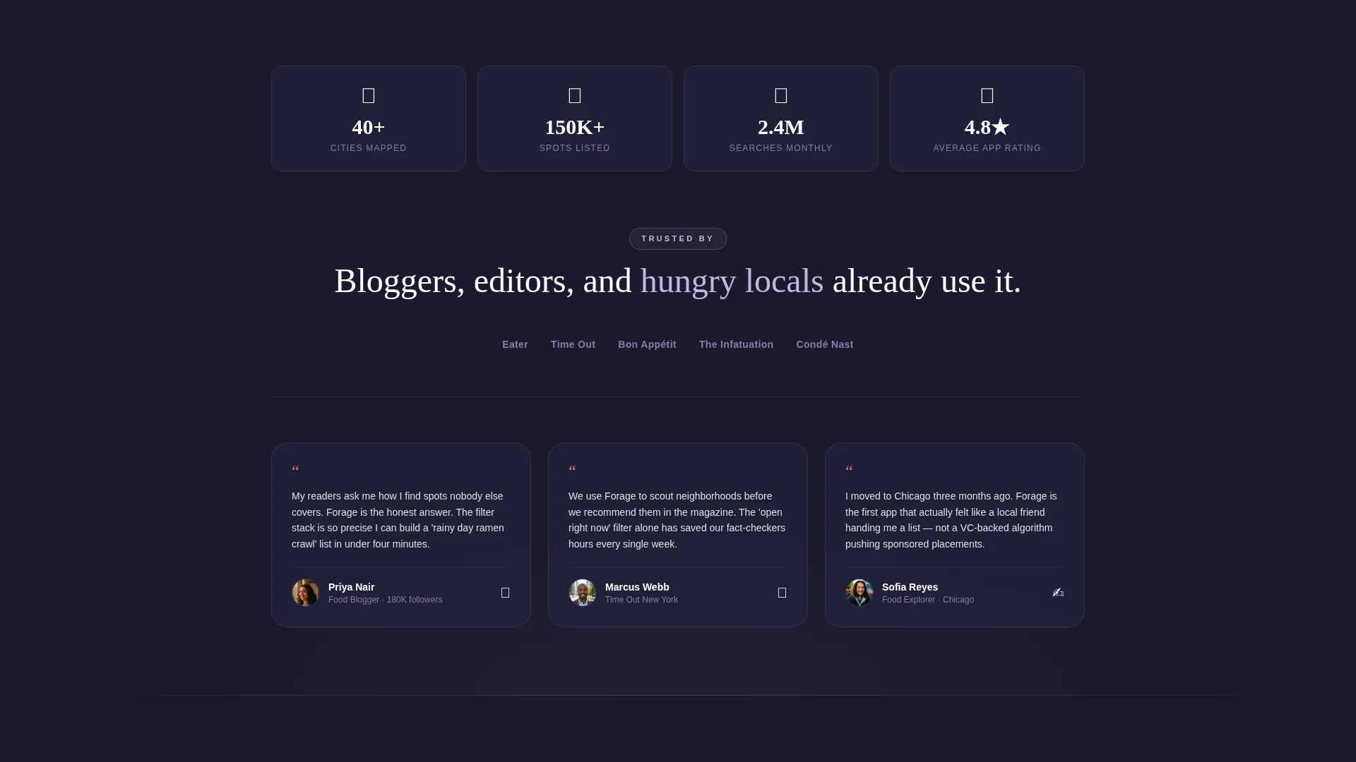
| Social Proof Strip | Builds trust through blogger and city guide endorsements |
| Primary call to action Block | Drives "Compare Your Favorites" conversion with a two-field entry form |
| Sticky Bottom Bar | Keeps the primary call to action visible throughout the scroll |
| List Your Spot Path | Gives restaurant owners a clearly visible secondary entry point |
Design & branding system
Forage uses an AI Iridescent color system built on four intentional colors. The palette feels like oil on wet asphalt at night: dark and grounded until light catches it.
- Deep graphite (#1A1A2E) anchors all backgrounds and card shells; shimmering lilac-silver (#C4B5E0) washes over section dividers, inactive text, and the secondary call-to-action label
- Prismatic teal (#3ECFCF) pulses through the search bar, active filter pills, and map pins; hot coral (#FF6B6B) fires on call-to-action buttons, rating badges, and trending tags
- Cards carry a faint holographic border on hover, making each listing feel like a living thing responding to the visitor's attention
Mobile & speed optimization
The modular card grid layout is designed to reflow naturally across screen sizes. The section-led structure keeps the page readable whether a visitor is browsing on a phone at midnight or a desktop during lunch.
- The card grid collapses cleanly to single-column on smaller screens, keeping listing cards readable without horizontal scrolling
- Interactive elements such as filter pills and the comparison slider are sized for touch input, supporting the late-night mobile use case the template is built around
How this template helps you convert
Forage earns the click by letting visitors play with the product before asking for anything. The conversion architecture is deliberate and escalating.
- The product screenshot and headline immediately show what the directory does, so visitors understand the value within the first viewport without reading a single paragraph of explanation
- The comparison slider and filter sandbox turn passive readers into active participants, creating investment in the tool before the call to action appears
- The no-gate entry form asks only for neighborhood or zip code and cuisine type, removing every friction point between interest and first use
Other information about this template
Forage is built specifically for the food and beverage directory and listing site niche, sitting at the intersection of technology and food and beverage digital presence. A few additional details worth noting before you decide.
- The template style is Card Grid (Modular), making it straightforward to expand the number of listing cards or swap in new cuisine categories as the directory grows
- The Directory and Discovery theme and Interactive Explorer creative direction were matched specifically to this template, ensuring the design decisions support the discovery use case rather than a generic product launch pattern
- The Comparison/Versus landing page direction means the layout is optimized for visitors who arrive already weighing options, not just browsing passively
- The two-field entry form is designed to work without an email gate or account creation, which directly reduces drop-off at the conversion step
Theme
Directory & Discovery
Creative direction
Interactive Explorer
Color system
AI Iridescent
Style
Card Grid (Modular)
Direction
Comparison/Versus
Page Sections
Browser-framed Product Screenshot Header
Draggable Listing Comparison Slider
Live Filter Pill Sandbox
Modular Card Grid with Hover Effects
Dual-path Conversion Architecture
Sticky Bottom Call-to-action Bar
Related questions
Who is this landing page template designed for?
Do visitors need to create an account to use the comparison feature shown on the page?
Can I use this template if my directory covers a specific niche like vegan food or late-night spots?
What makes the visual design of this template different from a standard directory layout?



